Files
"use client"

import { useState } from "react"
import {
  ArrowRight,
  BookOpen,
  ChevronDown,
  FileText,
  Layers,
  LayoutGrid,
  Sparkles,
  Users,
} from "@designali/icons"

import { Button } from "@/components/ui/button"
import { cn } from "@/lib/utils"

import { Logo } from "@/components/logo"

const menus = [
  {
    label: "Library",
    items: [
      { icon: LayoutGrid, title: "Blocks", text: "460+ production-ready sections." },
      { icon: Layers, title: "Templates", text: "Full sites built with Next.js." },
      { icon: Sparkles, title: "Icons", text: "4000+ icons in @designali/icons." },
      { icon: Users, title: "UI Designs", text: "2300+ UI examples to remix." },
    ],
  },
  {
    label: "Resources",
    items: [
      { icon: BookOpen, title: "Docs", text: "Install and customise Designali blocks." },
      { icon: FileText, title: "Blog", text: "Notes on design and code from Ali Imam." },
    ],
  },
]

export function Navigation01() {
  const [open, setOpen] = useState<string | null>(null)
  const current = menus.find((menu) => menu.label === open)

  return (
    <section className="relative w-full border-b bg-background" onMouseLeave={() => setOpen(null)}>
      <nav className="mx-auto flex h-16 max-w-7xl items-center gap-8 px-6">
        <a href="#" className="flex items-center gap-2 font-semibold tracking-tight">
          <Logo className="h-4 w-auto" />
          designali
        </a>
        <ul className="hidden items-center gap-1 md:flex">
          {menus.map((menu) => (
            <li key={menu.label}>
              <button
                type="button"
                onMouseEnter={() => setOpen(menu.label)}
                onClick={() => setOpen(open === menu.label ? null : menu.label)}
                className={cn(
                  "flex h-9 items-center gap-1 px-3 text-sm text-muted-foreground transition-colors hover:text-foreground",
                  open === menu.label && "text-foreground"
                )}
              >
                {menu.label}
                <ChevronDown
                  className={cn("size-3.5 transition-transform", open === menu.label && "rotate-180")}
                />
              </button>
            </li>
          ))}
          {["Pricing", "Work"].map((link) => (
            <li key={link}>
              <a
                href="#"
                onMouseEnter={() => setOpen(null)}
                className="flex h-9 items-center px-3 text-sm text-muted-foreground transition-colors hover:text-foreground"
              >
                {link}
              </a>
            </li>
          ))}
        </ul>
        <div className="ms-auto flex items-center gap-2">
          <Button variant="ghost" className="hidden sm:inline-flex">
            Sign in
          </Button>
          <Button>Get started</Button>
        </div>
      </nav>

      {current && (
        <div className="absolute inset-x-0 top-full z-20 border-y bg-background">
          <div className="mx-auto grid max-w-7xl gap-px bg-border md:grid-cols-[1fr_300px]">
            <div className="grid gap-px bg-border sm:grid-cols-2">
              {current.items.map((item) => (
                <a
                  key={item.title}
                  href="#"
                  className="group flex gap-4 bg-background p-6 transition-colors hover:bg-muted/50"
                >
                  <span className="flex size-10 shrink-0 items-center justify-center border">
                    <item.icon className="size-4" />
                  </span>
                  <span>
                    <span className="block text-sm font-medium">{item.title}</span>
                    <span className="block text-sm text-muted-foreground">{item.text}</span>
                  </span>
                </a>
              ))}
            </div>
            <a href="#" className="group flex flex-col justify-end gap-2 bg-muted p-6">
              <span className="text-xs tracking-widest text-muted-foreground uppercase">New</span>
              <span className="font-medium">460+ Designali blocks are live</span>
              <span className="flex items-center gap-1 text-sm text-muted-foreground group-hover:text-foreground">
                Browse the blocks
                <ArrowRight className="size-3.5" />
              </span>
            </a>
          </div>
        </div>
      )}
      <div className="h-72" aria-hidden />
    </section>
  )
}
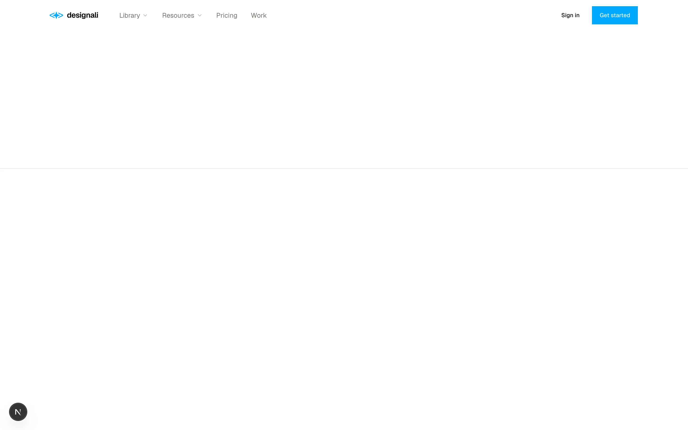
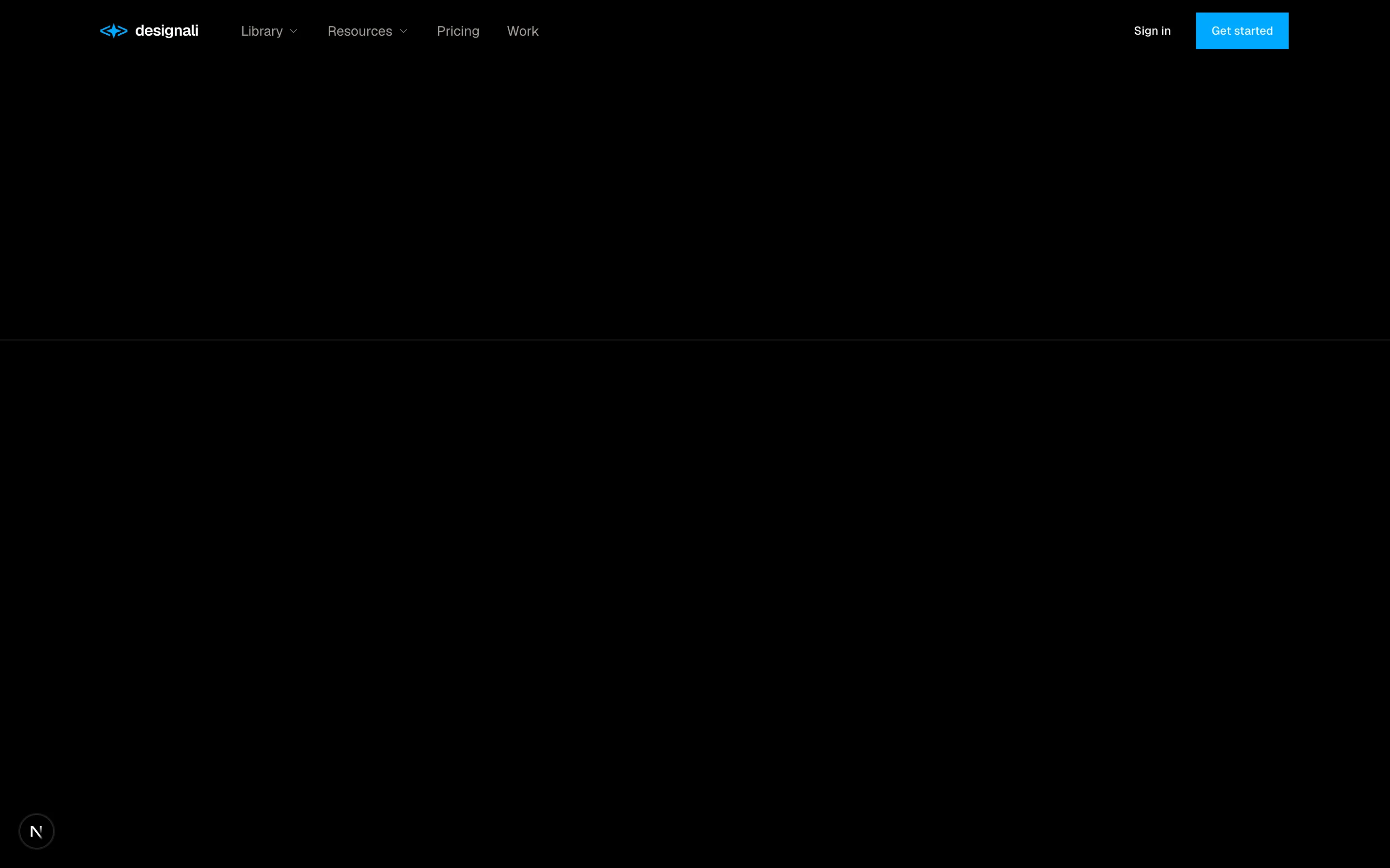
A mega menu navigation with product and resource columns.
navigation-01
Files
import {
  Bell,
  CreditCard,
  Folder,
  House,
  Inbox,
  LogOut,
  Settings,
  Star,
  User,
} from "@designali/icons"

import { cn } from "@/lib/utils"

import { Logo } from "@/components/logo"

const groups = [
  {
    title: "Workspace",
    links: [
      { icon: House, label: "Overview", active: true },
      { icon: Inbox, label: "Inbox", count: 12 },
      { icon: Folder, label: "Projects" },
      { icon: Star, label: "Favorites" },
    ],
  },
  {
    title: "Account",
    links: [
      { icon: User, label: "Profile" },
      { icon: Bell, label: "Notifications", count: 3 },
      { icon: CreditCard, label: "Billing" },
      { icon: Settings, label: "Settings" },
    ],
  },
]

const projects = [
  { name: "designali.com refresh", color: "bg-chart-1" },
  { name: "Dalim UI kit", color: "bg-chart-2" },
  { name: "Portfolio template", color: "bg-chart-3" },
]

export function Navigation02() {
  return (
    <section className="flex min-h-[640px] w-full bg-background">
      <aside className="flex w-64 shrink-0 flex-col border-e bg-muted/30">
        <div className="flex h-14 items-center gap-2 border-b px-5 font-semibold">
          <Logo className="h-5 w-auto" />
          Designali
        </div>
        <nav className="flex-1 space-y-6 p-3">
          {groups.map((group) => (
            <div key={group.title}>
              <p className="px-3 pb-2 text-xs text-muted-foreground">{group.title}</p>
              <ul className="space-y-0.5">
                {group.links.map((link) => (
                  <li key={link.label}>
                    <a
                      href="#"
                      className={cn(
                        "flex h-9 items-center gap-3 px-3 text-sm transition-colors hover:bg-muted",
                        link.active
                          ? "border-s-2 border-foreground bg-background font-medium"
                          : "text-muted-foreground hover:text-foreground"
                      )}
                    >
                      <link.icon className="size-4" />
                      {link.label}
                      {link.count && (
                        <span className="ms-auto bg-foreground px-1.5 text-[10px] leading-4 text-background">
                          {link.count}
                        </span>
                      )}
                    </a>
                  </li>
                ))}
              </ul>
            </div>
          ))}
          <div>
            <p className="px-3 pb-2 text-xs text-muted-foreground">Pinned projects</p>
            <ul className="space-y-0.5">
              {projects.map((project) => (
                <li key={project.name}>
                  <a
                    href="#"
                    className="flex h-9 items-center gap-3 px-3 text-sm text-muted-foreground hover:bg-muted hover:text-foreground"
                  >
                    <span className={cn("size-2", project.color)} />
                    {project.name}
                  </a>
                </li>
              ))}
            </ul>
          </div>
        </nav>
        <div className="flex items-center gap-3 border-t p-4">
          <span className="flex size-8 items-center justify-center rounded-full bg-muted text-xs font-medium">
            AI
          </span>
          <div className="min-w-0 flex-1 text-sm">
            <p className="truncate font-medium">Ali Imam</p>
            <p className="truncate text-xs text-muted-foreground">ali@designali.com</p>
          </div>
          <a href="#" aria-label="Sign out" className="text-muted-foreground hover:text-foreground">
            <LogOut className="size-4" />
          </a>
        </div>
      </aside>
      <div className="hidden flex-1 flex-col sm:flex">
        <div className="flex h-14 items-center border-b px-8 text-sm font-medium">Overview</div>
        <div className="grid flex-1 grid-cols-3 gap-px bg-border p-px">
          {Array.from({ length: 6 }).map((_, i) => (
            <div key={i} className="bg-background" />
          ))}
        </div>
      </div>
    </section>
  )
}
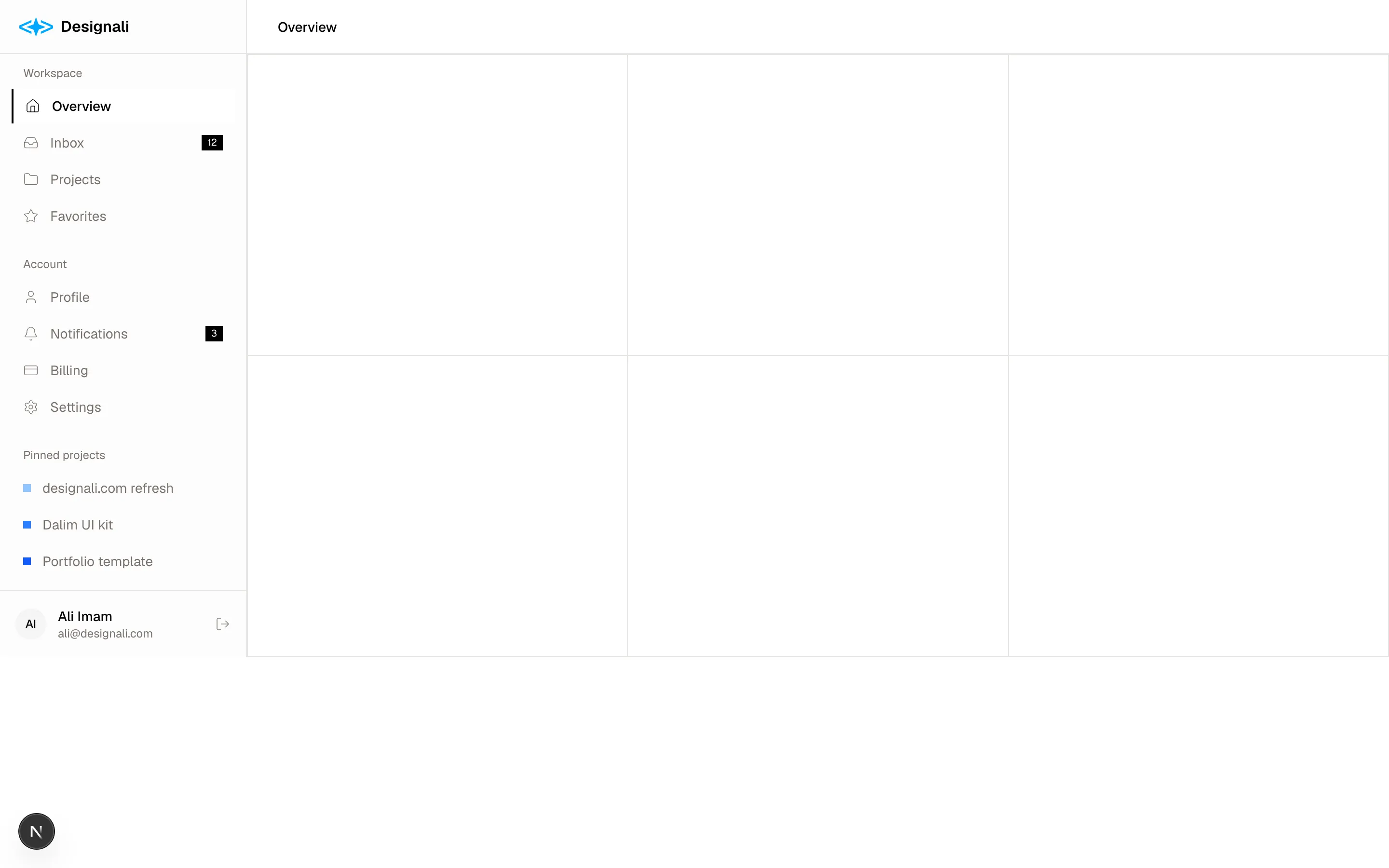
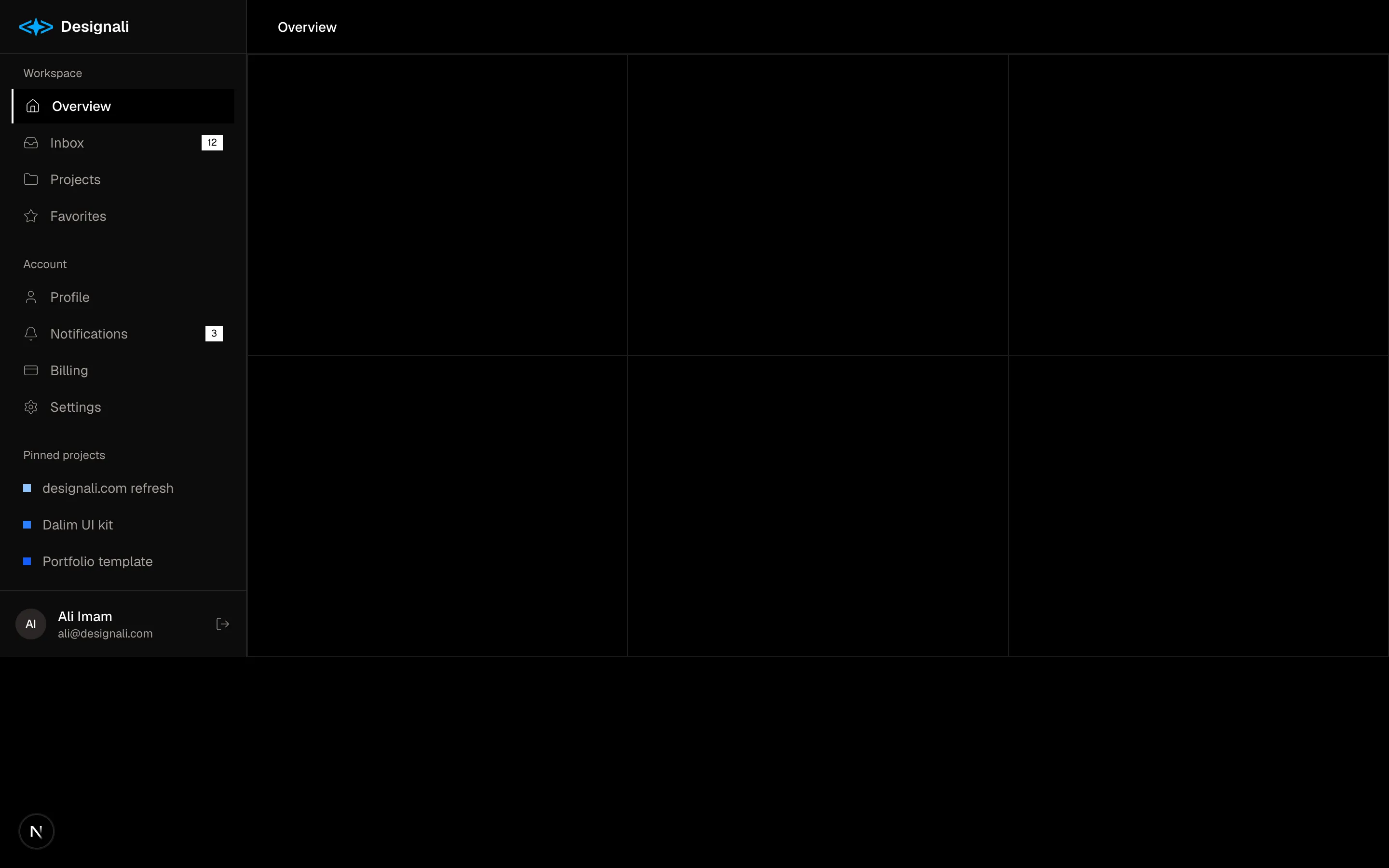
An application sidebar with pinned projects and a user profile.
navigation-02
Files
"use client"

import { useState } from "react"
import {
  ChevronRight,
} from "@designali/icons"

import { Button } from "@/components/ui/button"
import { cn } from "@/lib/utils"

const crumbs = ["Designali", "Projects", "designali.com"]

const tabs = [
  { label: "Overview" },
  { label: "Deployments", count: 128 },
  { label: "Analytics" },
  { label: "Logs" },
  { label: "Domains", count: 3 },
  { label: "Settings" },
]

export function Navigation03() {
  const [active, setActive] = useState("Deployments")

  return (
    <section className="w-full border-b bg-background">
      <div className="mx-auto max-w-7xl px-6">
        <div className="flex flex-col gap-4 py-6 md:flex-row md:items-center md:justify-between">
          <div className="space-y-2">
            <nav aria-label="Breadcrumb">
              <ol className="flex flex-wrap items-center gap-1.5 text-sm text-muted-foreground">
                {crumbs.map((crumb, index) => (
                  <li key={crumb} className="flex items-center gap-1.5">
                    {index > 0 && <ChevronRight className="size-3.5" />}
                    {index === crumbs.length - 1 ? (
                      <span className="text-foreground">{crumb}</span>
                    ) : (
                      <a href="#" className="hover:text-foreground">
                        {crumb}
                      </a>
                    )}
                  </li>
                ))}
              </ol>
            </nav>
            <h2 className="flex items-center gap-3 text-2xl font-semibold tracking-tight">
              designali.com
              <span className="flex items-center gap-1.5 border px-2 py-0.5 text-xs font-normal text-muted-foreground">
                <span className="size-1.5 rounded-full bg-primary" />
                Production
              </span>
            </h2>
          </div>
          <div className="flex gap-2">
            <Button variant="outline">Visit site</Button>
            <Button>Redeploy</Button>
          </div>
        </div>

        <nav className="-mb-px flex gap-6 overflow-x-auto">
          {tabs.map((tab) => (
            <button
              key={tab.label}
              type="button"
              onClick={() => setActive(tab.label)}
              className={cn(
                "flex shrink-0 items-center gap-2 border-b-2 pb-3 text-sm transition-colors",
                active === tab.label
                  ? "border-foreground text-foreground"
                  : "border-transparent text-muted-foreground hover:text-foreground"
              )}
            >
              {tab.label}
              {tab.count !== undefined && (
                <span className="bg-muted px-1.5 text-xs tabular-nums text-muted-foreground">
                  {tab.count}
                </span>
              )}
            </button>
          ))}
        </nav>
      </div>
    </section>
  )
}
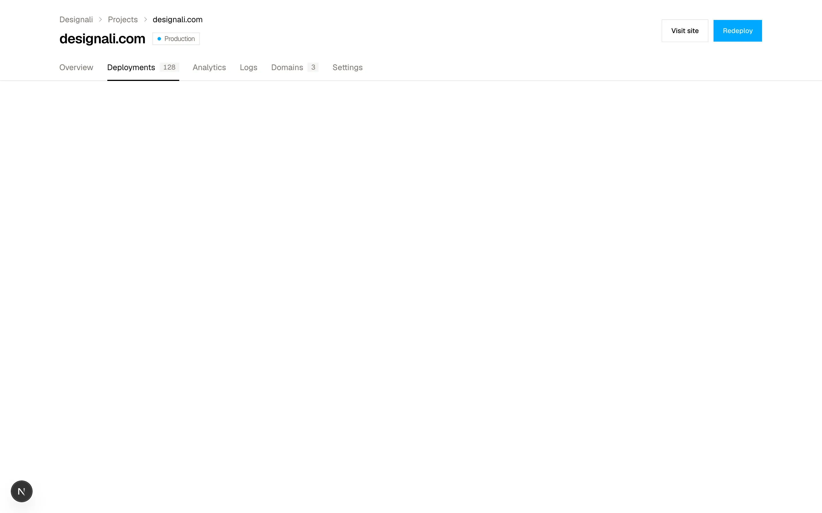
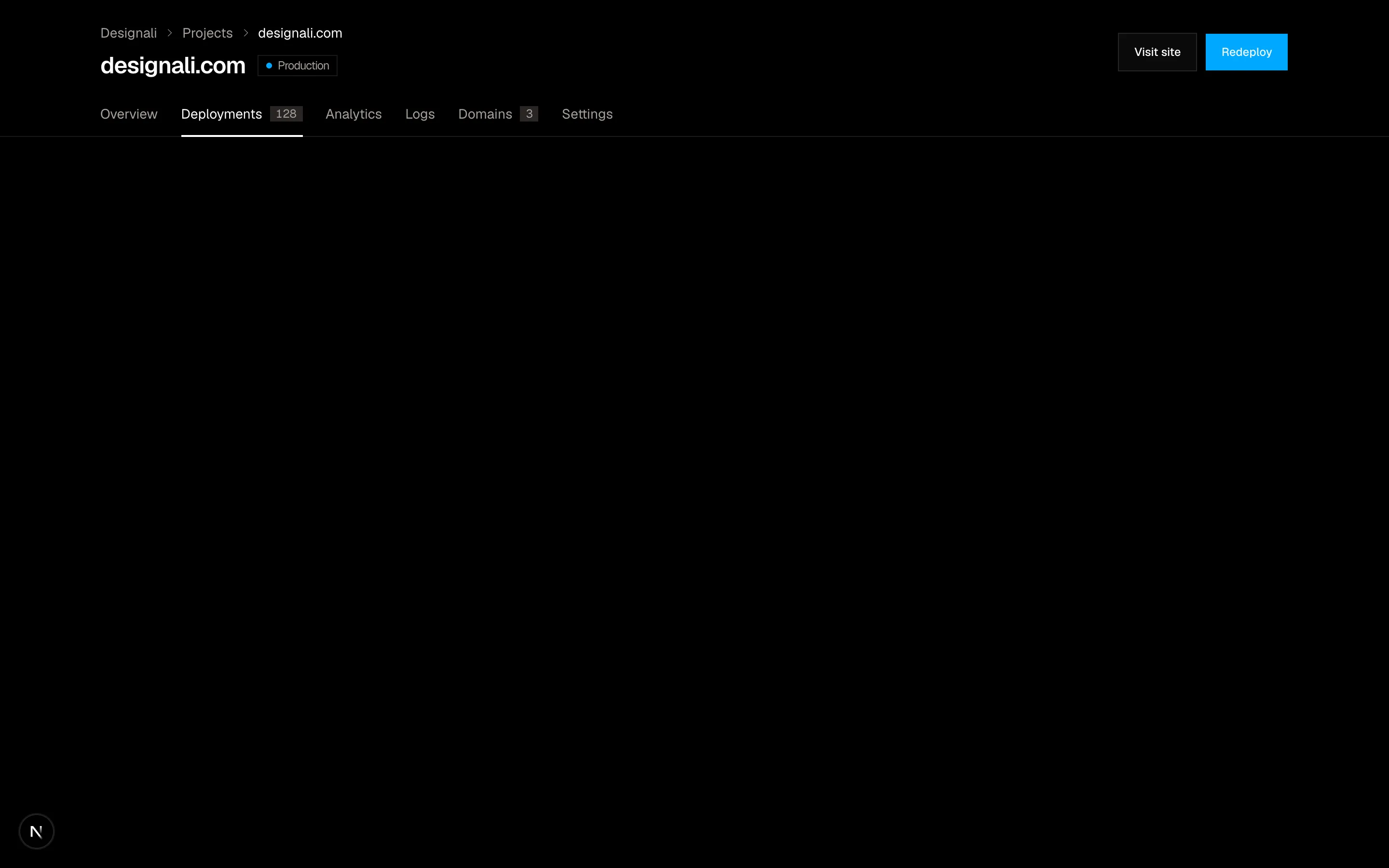
A breadcrumb and tab navigation bar for nested pages.
navigation-03
Files
"use client"
import { useState } from "react"
import {
ArrowRight,
Command,
FileText,
Search,
Settings,
Users,
} from "@designali/icons"
import { cn } from "@/lib/utils"
const results = [
{
group: "Pages",
items: [
{ icon: FileText, label: "Getting started with Designali", hint: "Docs" },
{ icon: FileText, label: "@designali/icons", hint: "Docs" },
{ icon: FileText, label: "Pricing", hint: "designali.com" },
],
},
{
group: "Actions",
items: [
{ icon: Users, label: "Invite teammates", hint: "⌘ I" },
{ icon: Settings, label: "Open settings", hint: "⌘ ," },
],
},
]
export function Navigation04() {
const [query, setQuery] = useState("")
const [highlight, setHighlight] = useState(0)
const flat = results.flatMap((group) =>
group.items
.filter((item) => item.label.toLowerCase().includes(query.toLowerCase()))
.map((item) => ({ ...item, group: group.group }))
)
return (
<section className="w-full bg-muted/40 py-20 md:py-28">
<div className="mx-auto max-w-xl px-6">
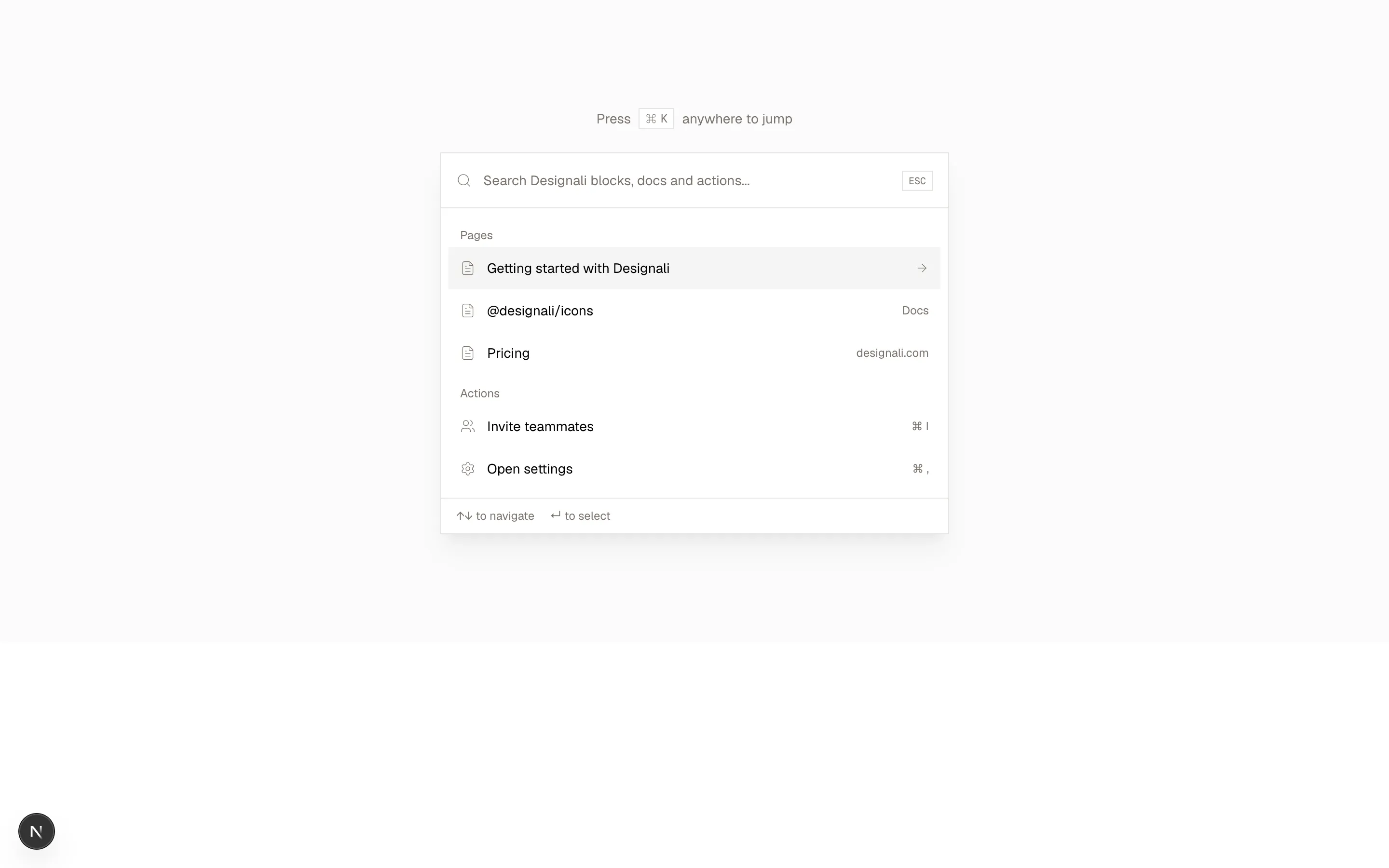
<p className="mb-6 flex items-center justify-center gap-2 text-sm text-muted-foreground">
Press
<kbd className="inline-flex items-center gap-1 border bg-background px-1.5 py-0.5 font-mono text-xs">
<Command className="size-3" />K
</kbd>
anywhere to jump
</p>
<div className="border bg-background shadow-xl/5">
<div className="flex items-center gap-3 border-b px-4">
<Search className="size-4 text-muted-foreground" />
<input
value={query}
onChange={(event) => {
setQuery(event.target.value)
setHighlight(0)
}}
placeholder="Search Designali blocks, docs and actions..."
className="h-14 flex-1 bg-transparent text-sm outline-none placeholder:text-muted-foreground"
/>
<kbd className="border px-1.5 py-0.5 font-mono text-[10px] text-muted-foreground">
ESC
</kbd>
</div>
<ul className="max-h-80 overflow-y-auto p-2">
{flat.map((item, index) => (
<li key={item.label}>
{(index === 0 || flat[index - 1]?.group !== item.group) && (
<p className="px-3 pt-3 pb-1 text-xs text-muted-foreground">
{item.group}
</p>
)}
<a
href="#"
onMouseEnter={() => setHighlight(index)}
className={cn(
"flex h-11 items-center gap-3 px-3 text-sm",
highlight === index && "bg-muted"
)}
>
<item.icon className="size-4 text-muted-foreground" />
{item.label}
<span className="ms-auto text-xs text-muted-foreground">
{highlight === index ? <ArrowRight className="size-3.5" /> : item.hint}
</span>
</a>
</li>
))}
{flat.length === 0 && (
<li className="px-3 py-10 text-center text-sm text-muted-foreground">
No results for “{query}”
</li>
)}
</ul>
<div className="flex items-center gap-4 border-t px-4 py-2.5 text-xs text-muted-foreground">
<span>↑↓ to navigate</span>
<span>↵ to select</span>
</div>
</div>
</div>
</section>
)
}
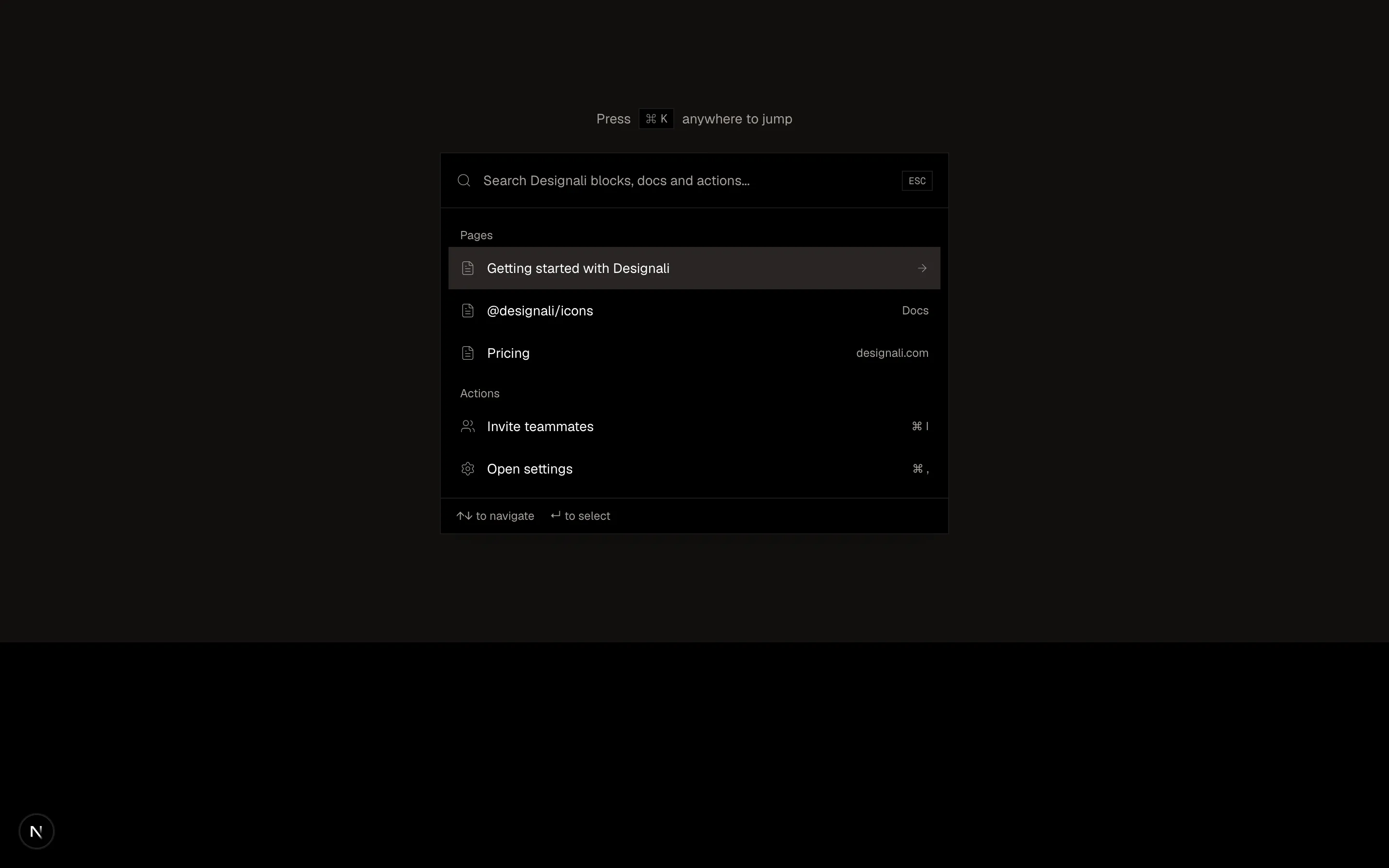
A command palette style navigation with search and grouped actions.
navigation-04
Files
"use client"
import { useState } from "react"
import {
Bell,
Compass,
House,
Plus,
User,
} from "@designali/icons"
import { cn } from "@/lib/utils"
import { IPhone } from "@/components/ui/apple/iphone"
const items = [
{ icon: House, label: "Home" },
{ icon: Compass, label: "Explore" },
{ icon: Plus, label: "Create", primary: true },
{ icon: Bell, label: "Activity" },
{ icon: User, label: "Profile" },
]
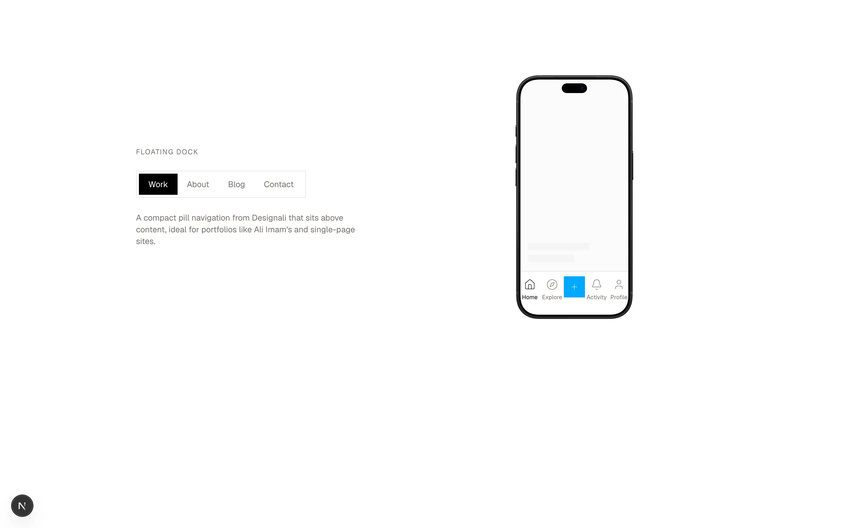
const dock = ["Work", "About", "Blog", "Contact"]
export function Navigation05() {
const [active, setActive] = useState("Home")
const [section, setSection] = useState("Work")
return (
<section className="w-full bg-background py-20 md:py-28">
<div className="mx-auto grid max-w-5xl items-center gap-16 px-6 md:grid-cols-2">
<div className="space-y-6">
<p className="text-xs tracking-widest text-muted-foreground uppercase">
Floating dock
</p>
<nav className="inline-flex border bg-background/80 p-1 backdrop-blur">
{dock.map((link) => (
<button
key={link}
type="button"
onClick={() => setSection(link)}
className={cn(
"h-9 px-4 text-sm transition-colors",
section === link
? "bg-foreground text-background"
: "text-muted-foreground hover:text-foreground"
)}
>
{link}
</button>
))}
</nav>
<p className="max-w-sm text-sm text-muted-foreground">
A compact pill navigation from Designali that sits above content,
ideal for portfolios like Ali Imam's and single-page sites.
</p>
</div>
<div className="flex justify-center">
<IPhone variant="18-pro" color="black" size="md">
<div className="flex h-full flex-col justify-end bg-muted/40">
<div className="m-4 space-y-2">
<div className="h-3 w-2/3 bg-muted" />
<div className="h-3 w-1/2 bg-muted" />
</div>
<nav className="grid grid-cols-5 border-t bg-background pb-4">
{items.map((item) => (
<button
key={item.label}
type="button"
onClick={() => setActive(item.label)}
className={cn(
"flex flex-col items-center gap-1 py-3 text-[10px] transition-colors",
active === item.label ? "text-foreground" : "text-muted-foreground"
)}
>
{item.primary ? (
<span className="flex size-9 -translate-y-1 items-center justify-center bg-primary text-primary-foreground">
<item.icon className="size-4" />
</span>
) : (
<>
<item.icon className="size-5" />
{item.label}
</>
)}
</button>
))}
</nav>
</div>
</IPhone>
</div>
</div>
</section>
)
}
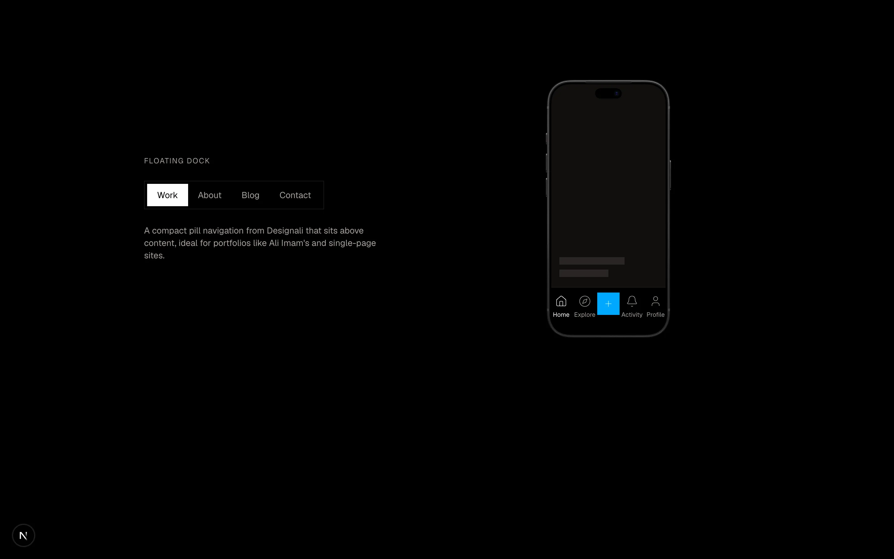
A floating dock navigation beside a mobile bottom tab bar.
navigation-05
Files
"use client"

import { useState } from "react"
import {
  Menu,
  Search,
  ShoppingBag,
  X,
} from "@designali/icons"

import { cn } from "@/lib/utils"

const left = ["Templates", "Blocks", "Blog"]
const right = ["Pricing", "About"]

export function Navigation06() {
  const [open, setOpen] = useState(false)

  return (
    <section className="w-full bg-background">
      <nav className="relative border-b">
        <div className="mx-auto grid h-20 max-w-7xl grid-cols-[1fr_auto_1fr] items-center px-6">
          <div className="flex items-center gap-1">
            <button
              type="button"
              aria-label={open ? "Close menu" : "Open menu"}
              onClick={() => setOpen(!open)}
              className="-ms-2 flex size-10 items-center justify-center md:hidden"
            >
              {open ? <X className="size-5" /> : <Menu className="size-5" />}
            </button>
            <ul className="hidden items-center gap-8 md:flex">
              {left.map((link) => (
                <li key={link}>
                  <a
                    href="#"
                    className="text-sm tracking-wide text-muted-foreground transition-colors hover:text-foreground"
                  >
                    {link}
                  </a>
                </li>
              ))}
            </ul>
          </div>

          <a href="#" className="flex flex-col items-center leading-none">
            <span className="font-sans text-2xl tracking-[0.3em] uppercase">Designali</span>
            <span className="mt-1 text-[10px] tracking-[0.4em] text-muted-foreground uppercase">
              Design se code tak
            </span>
          </a>

          <div className="flex items-center justify-end gap-8">
            <ul className="hidden items-center gap-8 md:flex">
              {right.map((link) => (
                <li key={link}>
                  <a
                    href="#"
                    className="text-sm tracking-wide text-muted-foreground transition-colors hover:text-foreground"
                  >
                    {link}
                  </a>
                </li>
              ))}
            </ul>
            <div className="flex items-center gap-1">
              <button
                type="button"
                aria-label="Search"
                className="hidden size-10 items-center justify-center sm:flex"
              >
                <Search className="size-4" />
              </button>
              <button
                type="button"
                aria-label="Cart, 2 templates"
                className="relative -me-2 flex size-10 items-center justify-center"
              >
                <ShoppingBag className="size-4" />
                <span className="absolute top-1.5 right-1.5 flex size-4 items-center justify-center bg-foreground text-[10px] text-background">
                  2
                </span>
              </button>
            </div>
          </div>
        </div>

        <div
          className={cn(
            "grid overflow-hidden border-t transition-[grid-template-rows] duration-300 md:hidden",
            open ? "grid-rows-[1fr]" : "grid-rows-[0fr] border-transparent"
          )}
        >
          <ul className="min-h-0 divide-y px-6">
            {[...left, ...right].map((link) => (
              <li key={link}>
                <a href="#" className="flex py-4 font-sans text-xl">
                  {link}
                </a>
              </li>
            ))}
          </ul>
        </div>
      </nav>

      <div className="mx-auto max-w-7xl px-6 py-16 text-center">
        <p className="text-xs tracking-[0.3em] text-muted-foreground uppercase">
          New template collection
        </p>
        <p className="mx-auto mt-4 max-w-xl font-sans text-3xl leading-snug md:text-4xl">
          Production-ready templates, designed and coded by Ali Imam.
        </p>
      </div>
    </section>
  )
}
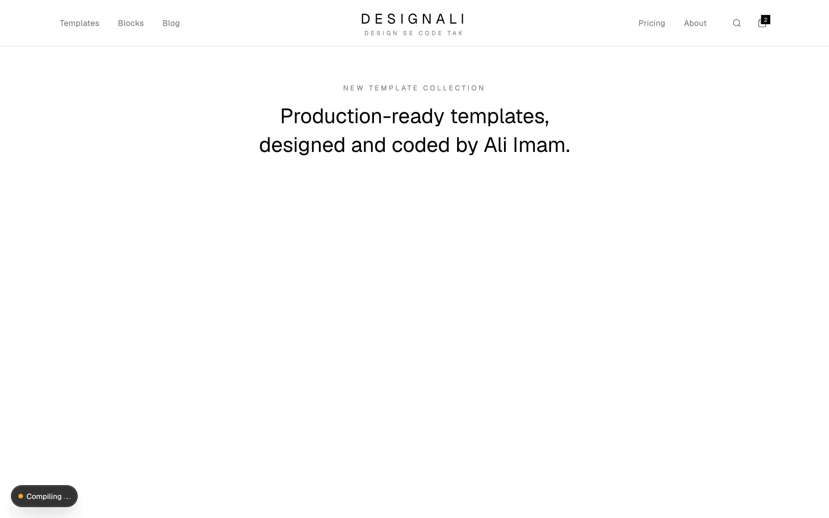
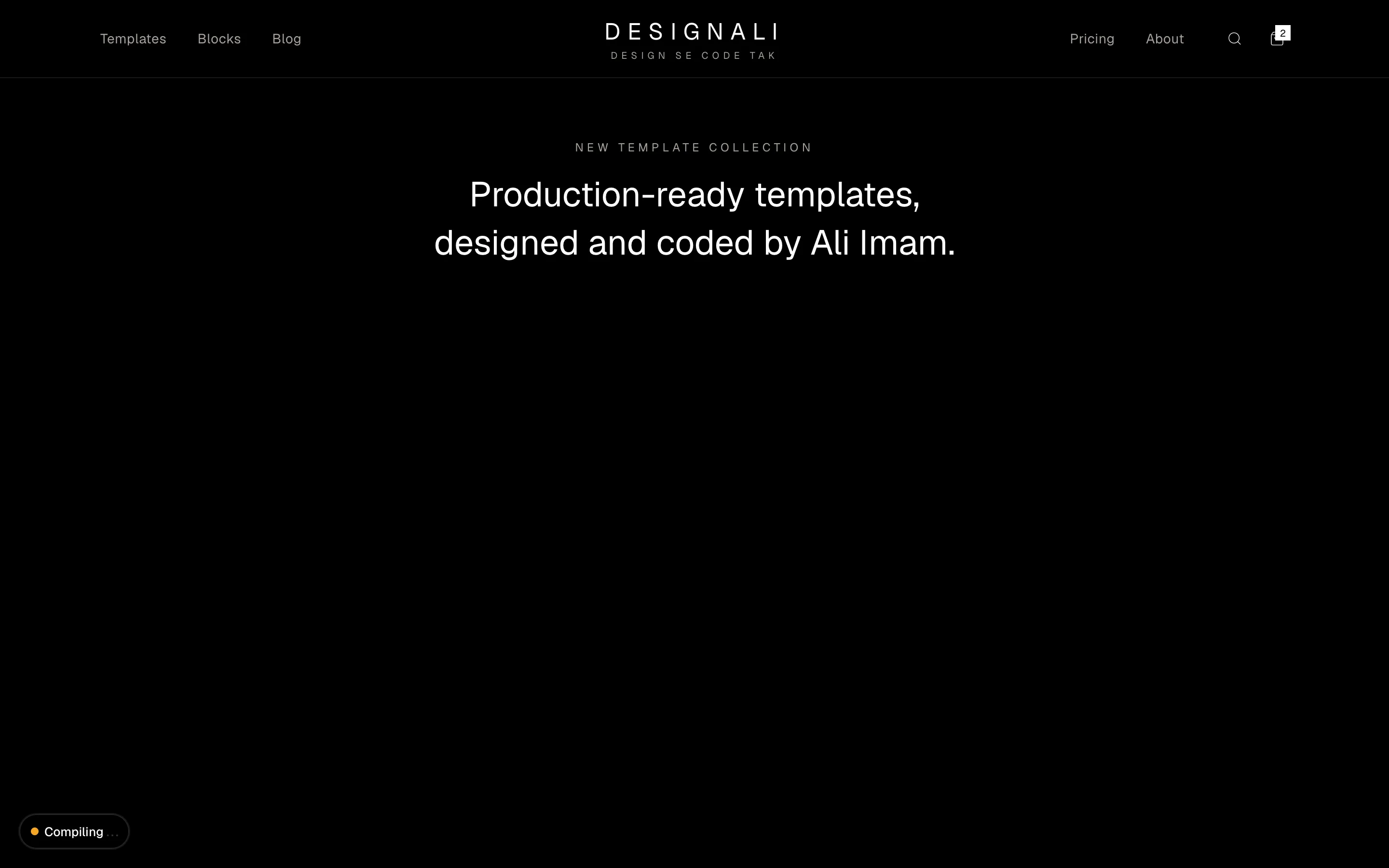
Boutique storefront header with split links around a centred serif wordmark, search, bag count and a slide-down mobile menu.
navigation-06
Files
"use client"

import { useState } from "react"
import {
  ArrowRight,
  ChevronDown,
  Globe,
  X,
} from "@designali/icons"

import { Button } from "@/components/ui/button"

import { Logo } from "@/components/logo"

const links = ["Templates", "Blocks", "Icons", "Pricing", "Work"]

export function Navigation07() {
  const [banner, setBanner] = useState(true)

  return (
    <section className="w-full bg-background">
      {banner && (
        <div className="bg-foreground text-background">
          <div className="mx-auto flex max-w-7xl items-center gap-4 px-6 py-2.5">
            <p className="flex-1 text-center text-xs sm:text-sm">
              <span className="me-2 border border-background/30 px-1.5 py-0.5 text-[10px] tracking-widest uppercase">
                Live
              </span>
              Designali Live with Ali Imam starts Thursday.{" "}
              <a
                href="#"
                className="inline-flex items-center gap-1 font-medium underline underline-offset-4"
              >
                Save your seat
                <ArrowRight className="size-3" />
              </a>
            </p>
            <button
              type="button"
              aria-label="Dismiss announcement"
              onClick={() => setBanner(false)}
              className="flex size-6 shrink-0 items-center justify-center text-background/70 hover:text-background"
            >
              <X className="size-4" />
            </button>
          </div>
        </div>
      )}

      <div className="hidden border-b bg-muted/40 md:block">
        <div className="mx-auto flex h-9 max-w-7xl items-center justify-end gap-6 px-6 text-xs text-muted-foreground">
          <a href="#" className="hover:text-foreground">designali.com: all systems normal</a>
          <a href="#" className="hover:text-foreground">Support</a>
          <a href="#" className="hover:text-foreground">hello@designali.com</a>
          <button type="button" className="flex items-center gap-1 hover:text-foreground">
            <Globe className="size-3.5" />
            English
            <ChevronDown className="size-3" />
          </button>
        </div>
      </div>

      <nav className="border-b">
        <div className="mx-auto flex h-16 max-w-7xl items-center gap-10 px-6">
          <a href="#" className="flex items-center gap-2 font-semibold tracking-tight">
            <Logo className="h-5 w-auto" />
            designali
          </a>
          <ul className="hidden flex-1 items-center gap-6 lg:flex">
            {links.map((link) => (
              <li key={link}>
                <a
                  href="#"
                  className="text-sm text-muted-foreground transition-colors hover:text-foreground"
                >
                  {link}
                </a>
              </li>
            ))}
          </ul>
          <div className="ms-auto flex items-center gap-2">
            <Button variant="ghost" className="hidden sm:inline-flex" nativeButton={false} render={<a href="#" />}>
              Log in
            </Button>
            <Button nativeButton={false} render={<a href="#" />}>
              Get Designali Pro
            </Button>
          </div>
        </div>
      </nav>
    </section>
  )
}
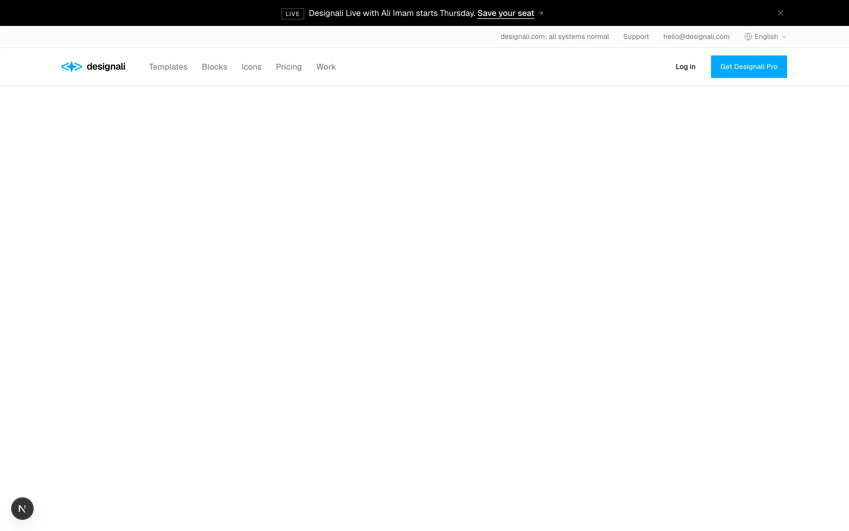
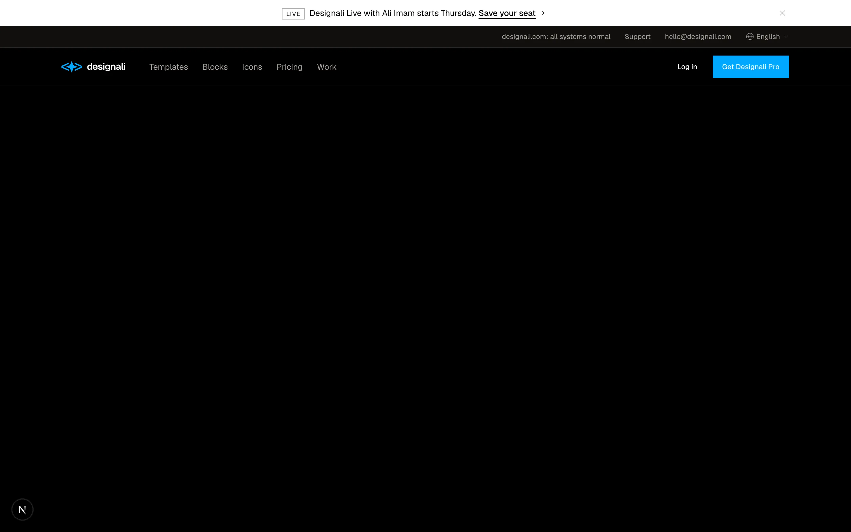
Dismissible live event announcement bar above a nav with dropdown links, language picker, log in and CTA.
navigation-07
Files
"use client"

import { useState } from "react"
import {
  ChartColumn as BarChart3,
  Calendar,
  ChevronsLeft,
  ChevronsRight,
  House,
  MessageSquare,
  Settings,
  Users,
  Wallet,
} from "@designali/icons"

import { cn } from "@/lib/utils"

import { CounterNumber } from "@/components/ui/counter-number"
import { GridPattern } from "@/components/ui/grid-pattern"
import { Logo } from "@/components/logo"

const items = [
  { icon: House, label: "Home" },
  { icon: BarChart3, label: "Analytics", badge: "New" },
  { icon: Calendar, label: "Schedule" },
  { icon: MessageSquare, label: "Messages", count: 4 },
  { icon: Users, label: "Clients" },
  { icon: Wallet, label: "Invoices" },
]

export function Navigation08() {
  const [expanded, setExpanded] = useState(false)
  const [active, setActive] = useState("Home")

  return (
    <section className="w-full bg-muted/40">
      <div className="mx-auto flex h-[560px] max-w-7xl border-x bg-background">
        <aside
          className={cn(
            "flex shrink-0 flex-col border-e transition-[width] duration-300",
            expanded ? "w-56" : "w-16"
          )}
        >
          <div className="flex h-16 items-center gap-3 border-b px-4">
            <Logo className="h-6 w-8 shrink-0" />
            {expanded && <span className="truncate font-semibold">Designali Studio</span>}
          </div>
          <nav className="flex-1 space-y-1 p-3">
            {items.map((item) => (
              <button
                key={item.label}
                type="button"
                onClick={() => setActive(item.label)}
                className={cn(
                  "group relative flex h-10 w-full items-center gap-3 px-2.5 text-sm transition-colors",
                  active === item.label
                    ? "bg-muted text-foreground"
                    : "text-muted-foreground hover:bg-muted/60 hover:text-foreground"
                )}
              >
                <item.icon className="size-5 shrink-0" />
                {expanded ? (
                  <>
                    <span className="flex-1 truncate text-start">{item.label}</span>
                    {item.count && (
                      <span className="bg-foreground px-1.5 text-xs text-background tabular-nums">
                        {item.count}
                      </span>
                    )}
                    {item.badge && (
                      <span className="border px-1.5 text-[10px] uppercase">{item.badge}</span>
                    )}
                  </>
                ) : (
                  <>
                    {item.count && (
                      <span className="absolute top-2 right-2 size-1.5 rounded-full bg-foreground" />
                    )}
                    <span className="pointer-events-none absolute start-full z-10 ms-3 hidden border bg-popover px-2 py-1 text-xs whitespace-nowrap text-popover-foreground group-hover:block">
                      {item.label}
                    </span>
                  </>
                )}
              </button>
            ))}
          </nav>
          <div className="space-y-1 border-t p-3">
            <button
              type="button"
              className="flex h-10 w-full items-center gap-3 px-2.5 text-sm text-muted-foreground hover:text-foreground"
            >
              <Settings className="size-5 shrink-0" />
              {expanded && "Settings"}
            </button>
            <button
              type="button"
              onClick={() => setExpanded(!expanded)}
              aria-label={expanded ? "Collapse sidebar" : "Expand sidebar"}
              className="flex h-10 w-full items-center gap-3 px-2.5 text-sm text-muted-foreground hover:text-foreground"
            >
              {expanded ? (
                <ChevronsLeft className="size-5 shrink-0" />
              ) : (
                <ChevronsRight className="size-5 shrink-0" />
              )}
              {expanded && "Collapse"}
            </button>
          </div>
        </aside>

        <div className="min-w-0 flex-1 p-6 md:p-10">
          <p className="text-xs tracking-widest text-muted-foreground uppercase">{active}</p>
          <h2 className="mt-2 text-2xl font-semibold tracking-tight">Good morning, Ali</h2>
          <div className="mt-8 grid gap-4 sm:grid-cols-3">
            {["Projects this week", "Unpaid invoices", "New clients"].map((label, index) => (
              <div key={label} className="border p-5">
                <p className="text-xs text-muted-foreground">{label}</p>
                <CounterNumber
                  value={[38, 6, 12][index] ?? 0}
                  size="lg"
                  className="mt-2 block text-2xl font-semibold"
                />
              </div>
            ))}
          </div>
          <div className="relative mt-4 h-40 overflow-hidden border">
            <GridPattern width={48} height={48} className="stroke-muted" />
          </div>
        </div>
      </div>
    </section>
  )
}
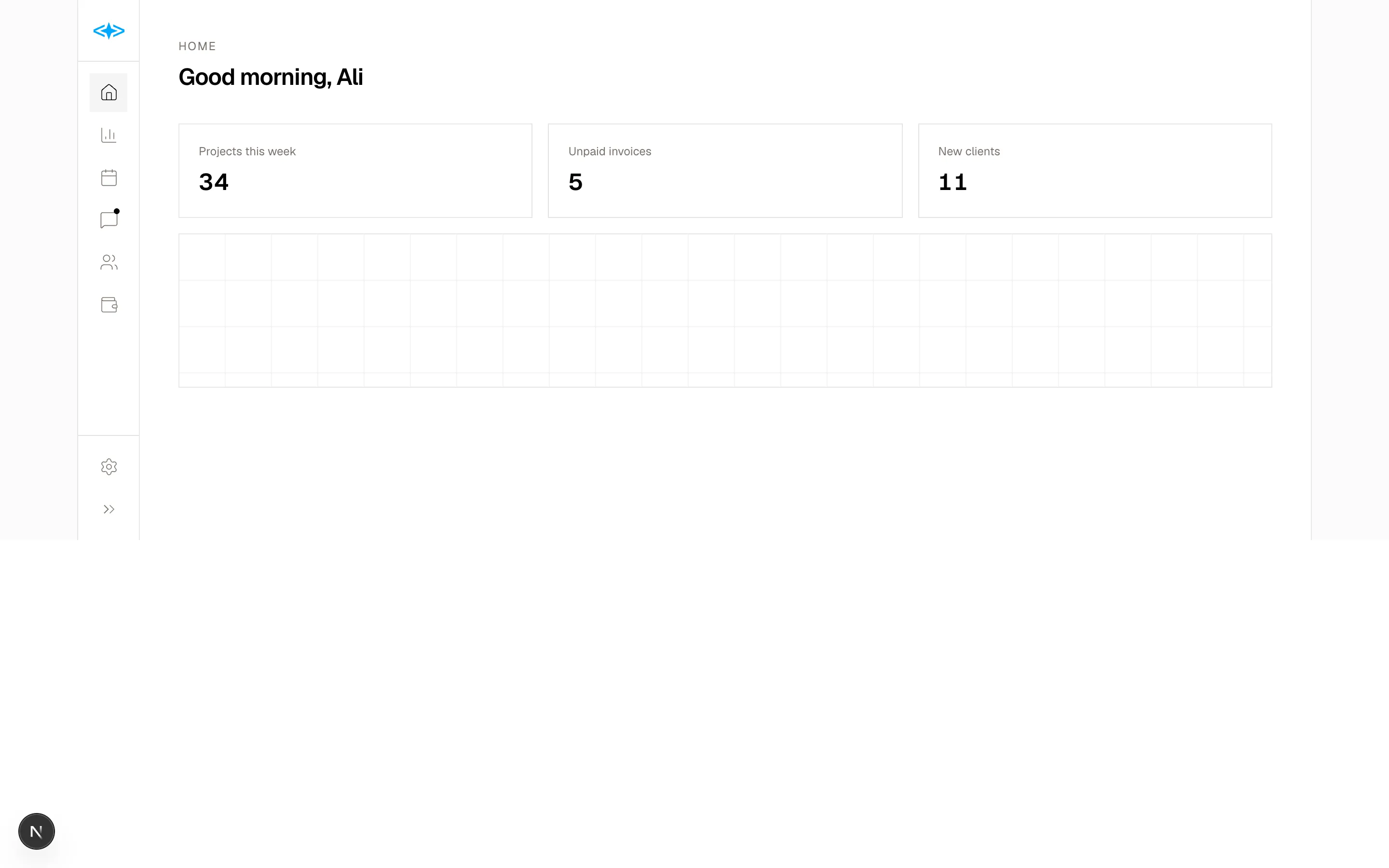
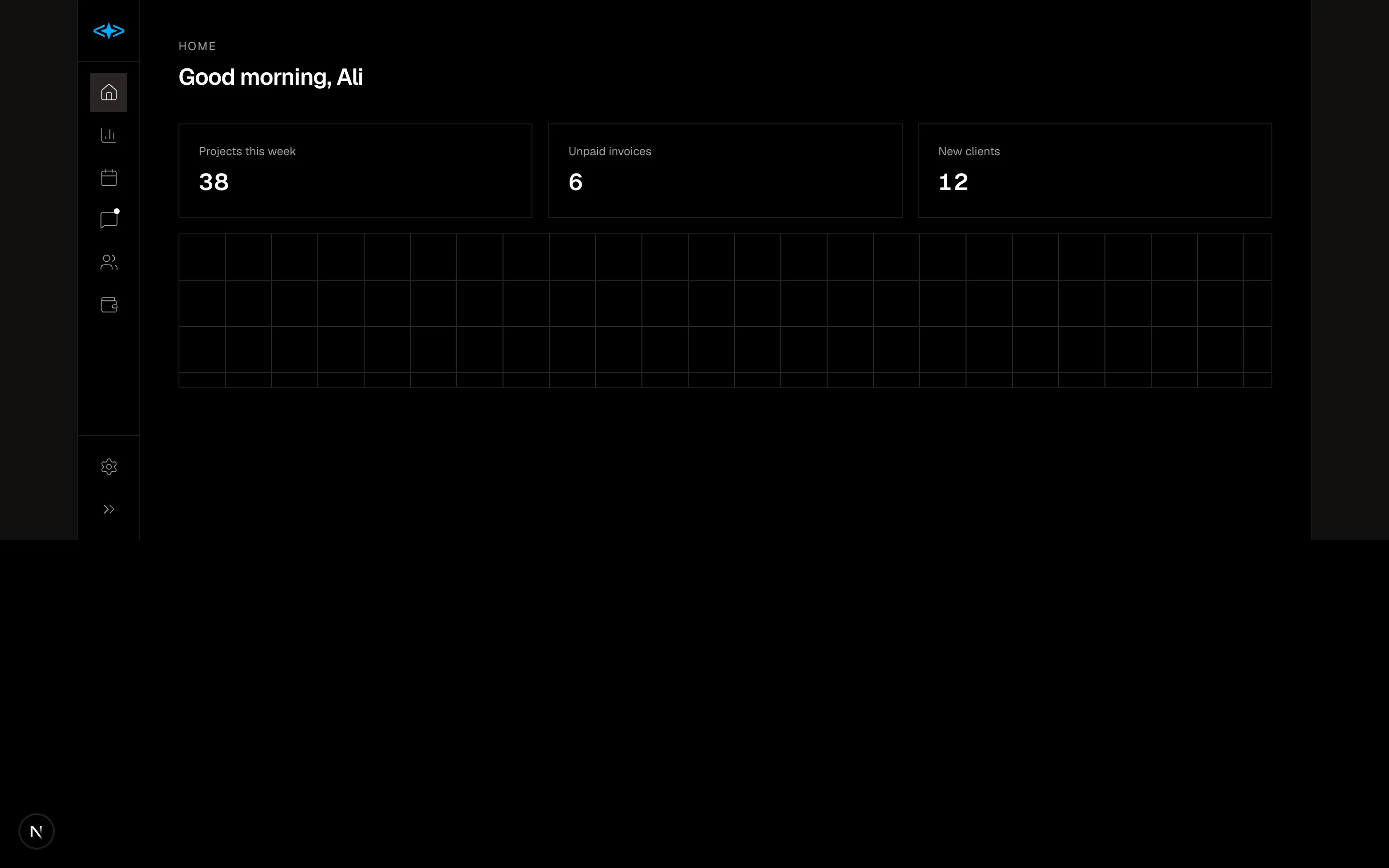
Collapsible app sidebar that toggles between icon rail and labelled view with badges, counts and active state.
navigation-08
Files
"use client"

import { useState } from "react"
import {
  ChevronRight,
  Search,
} from "@designali/icons"

import { cn } from "@/lib/utils"

const tree = [
  {
    title: "Getting started",
    pages: ["Introduction", "Installation", "Quickstart", "Project structure"],
  },
  {
    title: "Core concepts",
    pages: ["Blocks", "Theming", "Icons", "Logos"],
  },
  {
    title: "Guides",
    pages: ["Deploy to Vercel", "Dark mode", "Using with Figma"],
  },
  {
    title: "Packages",
    pages: ["@designali/icons", "@designali/logos", "@designali/vectors"],
  },
]

const toc = ["Semantic tokens", "Brand colour", "Dark mode", "Next steps"]

export function Navigation09() {
  const [openGroups, setOpenGroups] = useState<string[]>(["Getting started", "Core concepts"])
  const [page, setPage] = useState("Theming")

  function toggle(title: string) {
    setOpenGroups((current) =>
      current.includes(title) ? current.filter((item) => item !== title) : [...current, title]
    )
  }

  return (
    <section className="w-full border-y bg-background">
      <div className="mx-auto grid max-w-7xl md:grid-cols-[240px_1fr] xl:grid-cols-[240px_1fr_200px]">
        <aside className="border-b p-6 md:border-e md:border-b-0">
          <label className="flex h-9 items-center gap-2 border px-3 text-sm text-muted-foreground">
            <Search className="size-4" />
            <input
              placeholder="Search docs"
              className="w-full bg-transparent text-foreground outline-none placeholder:text-muted-foreground"
            />
          </label>
          <nav className="mt-6 space-y-1 text-sm">
            {tree.map((group) => {
              const isOpen = openGroups.includes(group.title)
              return (
                <div key={group.title}>
                  <button
                    type="button"
                    onClick={() => toggle(group.title)}
                    aria-expanded={isOpen}
                    className="flex w-full items-center gap-1.5 py-1.5 font-medium"
                  >
                    <ChevronRight
                      className={cn("size-3.5 transition-transform", isOpen && "rotate-90")}
                    />
                    {group.title}
                  </button>
                  {isOpen && (
                    <ul className="ms-[7px] mb-2 border-s">
                      {group.pages.map((item) => (
                        <li key={item}>
                          <button
                            type="button"
                            onClick={() => setPage(item)}
                            className={cn(
                              "-ms-px block w-full border-s py-1.5 ps-4 text-start transition-colors",
                              page === item
                                ? "border-foreground text-foreground"
                                : "border-transparent text-muted-foreground hover:text-foreground"
                            )}
                          >
                            {item}
                          </button>
                        </li>
                      ))}
                    </ul>
                  )}
                </div>
              )
            })}
          </nav>
        </aside>

        <article className="min-w-0 p-6 md:p-10">
          <p className="text-sm text-muted-foreground">Designali docs</p>
          <h2 className="mt-2 text-3xl font-semibold tracking-tight">{page}</h2>
          <p className="mt-4 max-w-2xl text-muted-foreground">
            Every Designali block uses semantic design tokens like bg-background
            and text-primary, so you can rebrand a whole site by changing a few
            CSS variables. Light and dark mode come for free.
          </p>
          <pre className="mt-6 overflow-x-auto border bg-muted/50 p-4 font-mono text-xs leading-relaxed">
            {`import { ArrowRight } from "@designali/icons"
import { Button } from "@/components/ui/button"

export function Cta() {
  return <Button>Start a project <ArrowRight /></Button>
}`}
          </pre>
          <div className="mt-10 flex flex-col gap-3 border-t pt-6 sm:flex-row sm:justify-between">
            <a href="#" className="border p-4 text-sm hover:bg-muted/50 sm:w-64">
              <span className="block text-xs text-muted-foreground">Previous</span>
              Blocks
            </a>
            <a href="#" className="border p-4 text-end text-sm hover:bg-muted/50 sm:w-64">
              <span className="block text-xs text-muted-foreground">Next</span>
              Icons
            </a>
          </div>
        </article>

        <aside className="hidden border-s p-6 xl:block">
          <p className="text-xs font-medium tracking-widest text-muted-foreground uppercase">
            On this page
          </p>
          <ul className="mt-4 space-y-2.5 text-sm">
            {toc.map((item, index) => (
              <li key={item}>
                <a
                  href="#"
                  className={cn(
                    "hover:text-foreground",
                    index === 0 ? "text-foreground" : "text-muted-foreground"
                  )}
                >
                  {item}
                </a>
              </li>
            ))}
          </ul>
        </aside>
      </div>
    </section>
  )
}
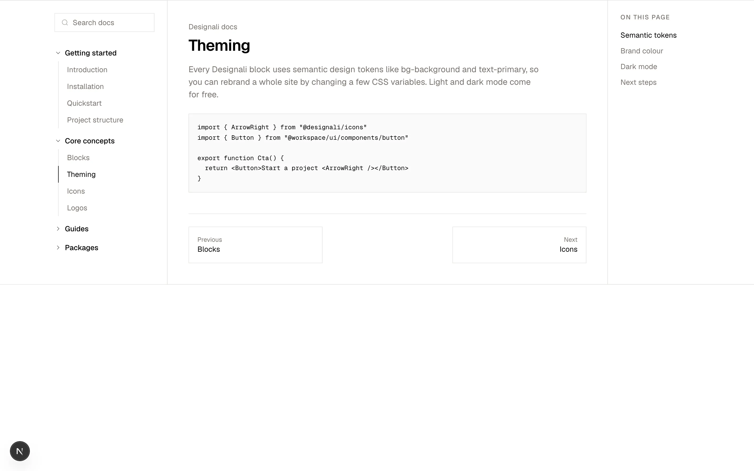
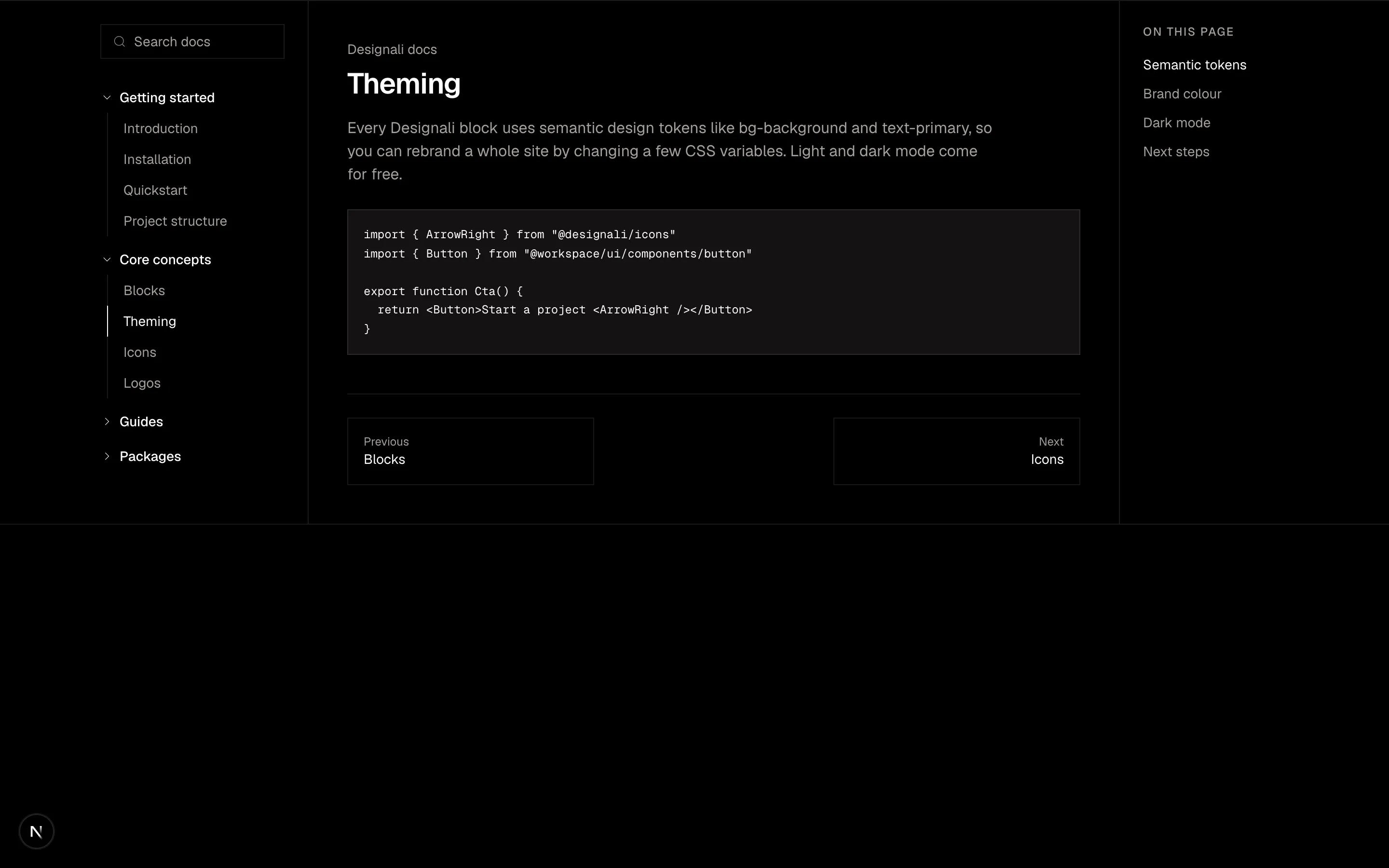
Docs layout with a searchable sidebar of collapsible sections, active page marker and article content.
navigation-09
Files
"use client"

import { useState } from "react"
import {
  ArrowUpRight,
  Menu,
  X,
} from "@designali/icons"

import { cn } from "@/lib/utils"

const links = [
  { label: "Work", count: "24" },
  { label: "Studio", count: "" },
  { label: "Services", count: "06" },
  { label: "Blog", count: "41" },
  { label: "Contact", count: "" },
]

const socials = ["Instagram", "X", "LinkedIn"]

export function Navigation10() {
  const [open, setOpen] = useState(false)

  return (
    <section className="relative w-full overflow-hidden bg-background">
      <div className="relative h-[640px]">
        <header className="relative z-20 mx-auto flex h-20 max-w-7xl items-center justify-between px-6">
          <a
            href="#"
            className={cn(
              "text-lg font-semibold tracking-tight transition-colors",
              open && "text-background"
            )}
          >
            designali
          </a>
          <button
            type="button"
            onClick={() => setOpen(!open)}
            aria-expanded={open}
            className={cn(
              "flex h-10 items-center gap-2 border px-4 text-sm transition-colors",
              open && "border-background/30 text-background"
            )}
          >
            {open ? <X className="size-4" /> : <Menu className="size-4" />}
            {open ? "Close" : "Menu"}
          </button>
        </header>

        <div className="mx-auto max-w-7xl px-6 pt-16">
          <h2 className="max-w-3xl text-4xl leading-tight font-semibold tracking-tight md:text-6xl">
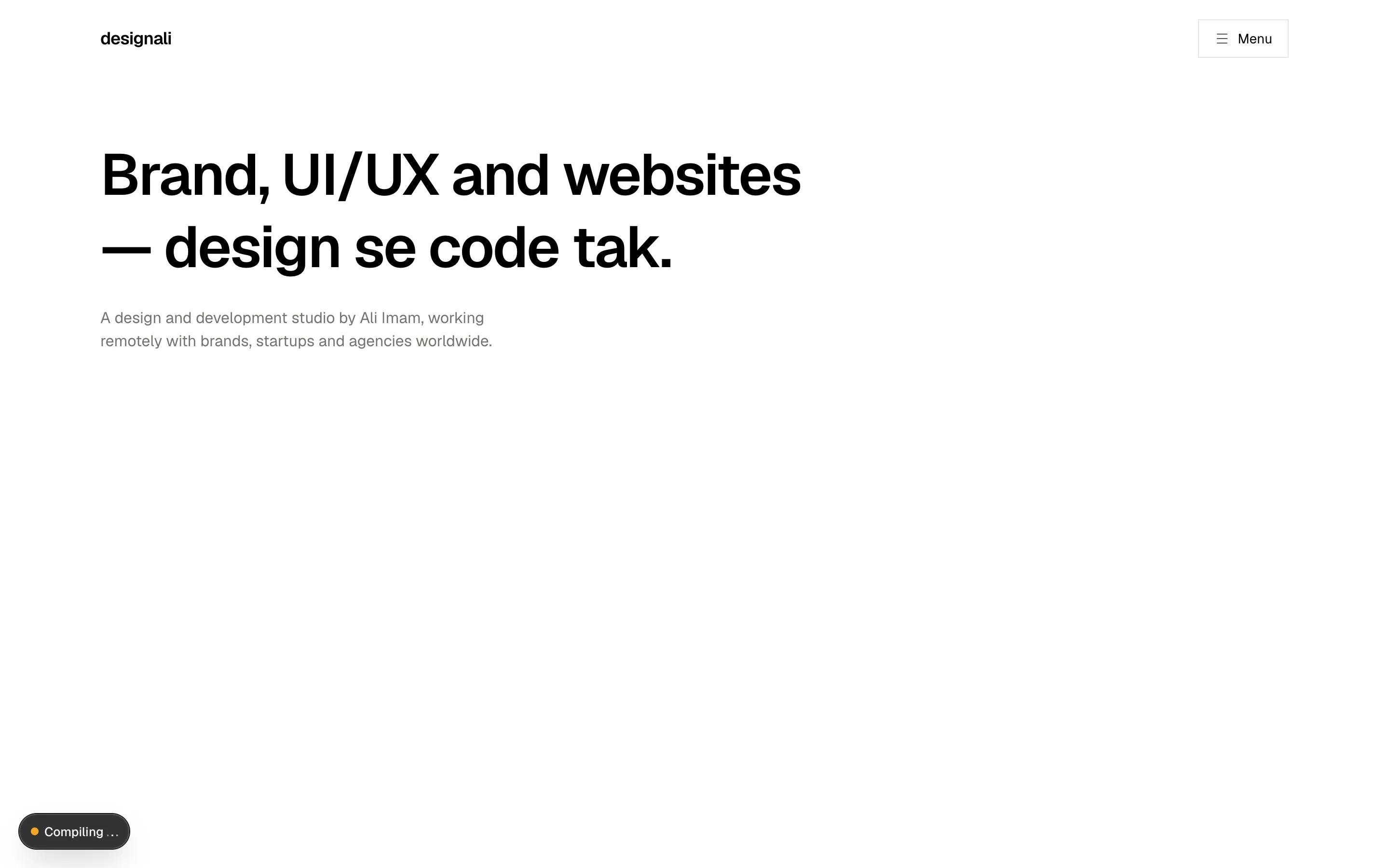
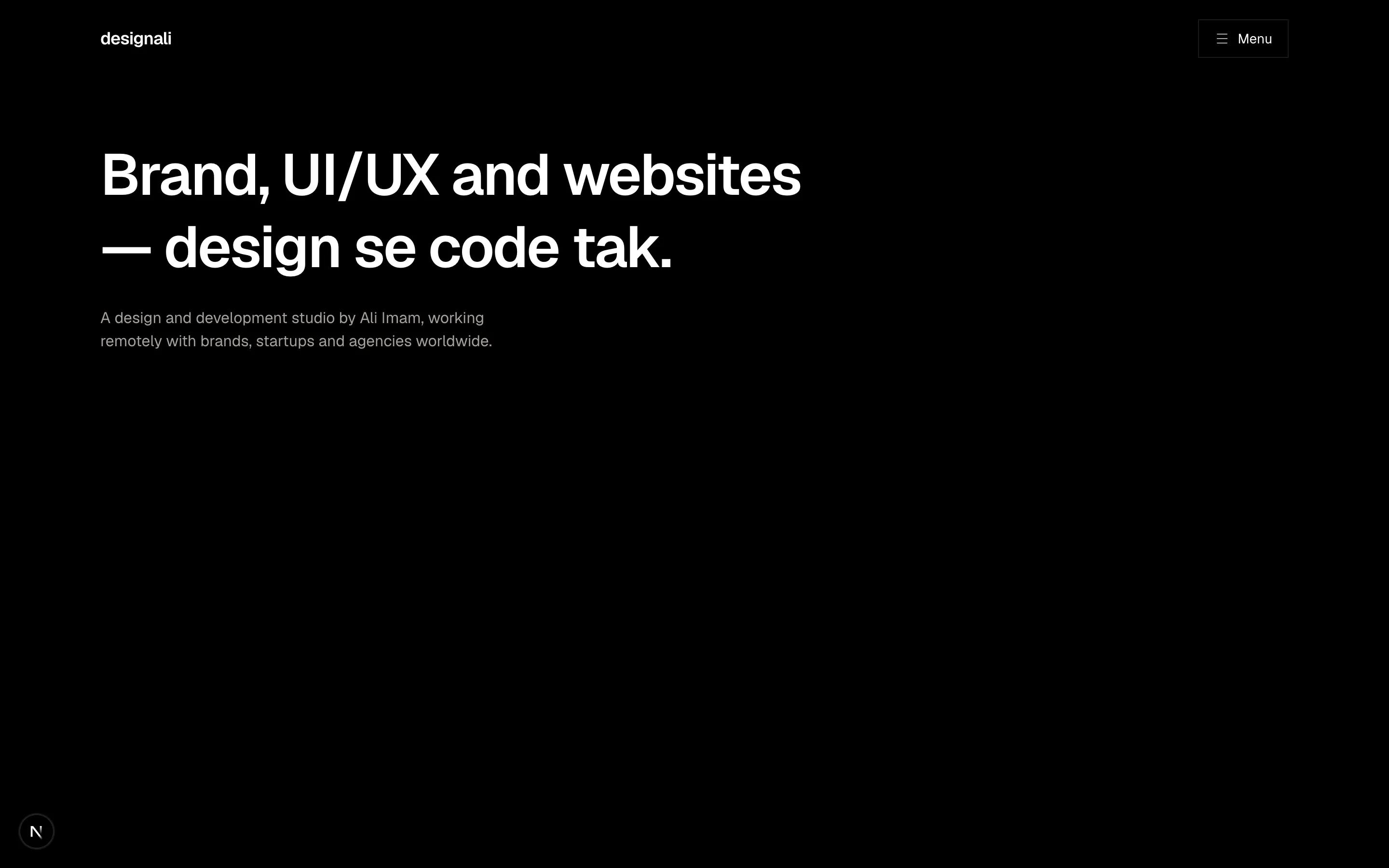
            Brand, UI/UX and websites — design se code tak.
          </h2>
          <p className="mt-6 max-w-md text-muted-foreground">
            A design and development studio by Ali Imam, working remotely with
            brands, startups and agencies worldwide.
          </p>
        </div>

        <div
          className={cn(
            "absolute inset-0 z-10 bg-foreground text-background transition-[clip-path] duration-500 ease-out",
            open ? "[clip-path:inset(0_0_0_0)]" : "pointer-events-none [clip-path:inset(0_0_100%_0)]"
          )}
          aria-hidden={!open}
        >
          <div className="mx-auto grid h-full max-w-7xl gap-10 px-6 pt-28 pb-10 md:grid-cols-[1fr_240px]">
            <nav>
              <ul className="divide-y divide-background/15 border-y border-background/15">
                {links.map((link, index) => (
                  <li key={link.label}>
                    <a
                      href="#"
                      tabIndex={open ? 0 : -1}
                      className="group flex items-baseline gap-4 py-3 md:py-4"
                    >
                      <span className="font-sans text-xs text-background/50">0{index + 1}</span>
                      <span className="text-3xl font-semibold tracking-tight transition-transform group-hover:translate-x-2 md:text-5xl">
                        {link.label}
                      </span>
                      {link.count && (
                        <sup className="font-sans text-xs text-background/50">{link.count}</sup>
                      )}
                      <ArrowUpRight className="ms-auto size-6 self-center opacity-0 transition-opacity group-hover:opacity-100" />
                    </a>
                  </li>
                ))}
              </ul>
            </nav>
            <div className="hidden flex-col justify-end gap-8 text-sm md:flex">
              <div>
                <p className="text-background/50">New business</p>
                <a href="#" tabIndex={open ? 0 : -1} className="mt-1 block">
                  hello@designali.com
                </a>
              </div>
              <ul className="space-y-1">
                {socials.map((social) => (
                  <li key={social}>
                    <a href="#" tabIndex={open ? 0 : -1} className="text-background/70 hover:text-background">
                      {social}
                    </a>
                  </li>
                ))}
              </ul>
            </div>
          </div>
        </div>
      </div>
    </section>
  )
}
Studio header whose menu button opens a full-screen inverted overlay with large links and contact details.
navigation-10
Files
"use client"

import { useLayoutEffect, useRef, useState } from "react"

import { cn } from "@/lib/utils"

import { Logo } from "@/components/logo"

const links = ["Overview", "Blocks", "Changelog", "Pricing", "Docs"]

type Box = { left: number; width: number }

export function Navigation11() {
  const [active, setActive] = useState(0)
  const [hovered, setHovered] = useState<number | null>(null)
  const [boxes, setBoxes] = useState<Box[]>([])
  const refs = useRef<(HTMLButtonElement | null)[]>([])

  useLayoutEffect(() => {
    function measure() {
      setBoxes(
        refs.current.map((element) => ({
          left: element?.offsetLeft ?? 0,
          width: element?.offsetWidth ?? 0,
        }))
      )
    }
    measure()
    window.addEventListener("resize", measure)
    return () => window.removeEventListener("resize", measure)
  }, [])

  const hoverBox = hovered !== null ? boxes[hovered] : undefined
  const activeBox = boxes[active]

  return (
    <section className="w-full bg-background py-16">
      <div className="mx-auto flex max-w-7xl flex-col items-center gap-10 px-6">
        <header className="flex w-full max-w-3xl items-center justify-between gap-4 border bg-background p-2">
          <a href="#" className="flex shrink-0 items-center gap-2 ps-2 text-sm font-semibold">
            <Logo className="h-4 w-auto" />
            <span className="hidden sm:inline">designali</span>
          </a>
          <nav
            className="relative flex min-w-0 overflow-x-auto"
            onMouseLeave={() => setHovered(null)}
          >
            {hoverBox && (
              <span
                aria-hidden
                className="absolute inset-y-0 bg-muted transition-all duration-200"
                style={{ left: hoverBox.left, width: hoverBox.width }}
              />
            )}
            {activeBox && (
              <span
                aria-hidden
                className="absolute bottom-0 h-0.5 bg-foreground transition-all duration-300"
                style={{ left: activeBox.left, width: activeBox.width }}
              />
            )}
            {links.map((link, index) => (
              <button
                key={link}
                ref={(element) => {
                  refs.current[index] = element
                }}
                type="button"
                onMouseEnter={() => setHovered(index)}
                onClick={() => setActive(index)}
                className={cn(
                  "relative h-9 shrink-0 px-3 text-sm transition-colors",
                  active === index ? "text-foreground" : "text-muted-foreground"
                )}
              >
                {link}
              </button>
            ))}
          </nav>
          <a
            href="#"
            className="hidden h-9 shrink-0 items-center bg-primary px-4 text-sm text-primary-foreground md:flex"
          >
            Get started
          </a>
        </header>

        <div className="w-full max-w-3xl border bg-muted/30 p-8 text-center md:p-12">
          <p className="text-xs tracking-widest text-muted-foreground uppercase">
            {links[active]}
          </p>
          <p className="mt-3 text-2xl font-semibold tracking-tight">
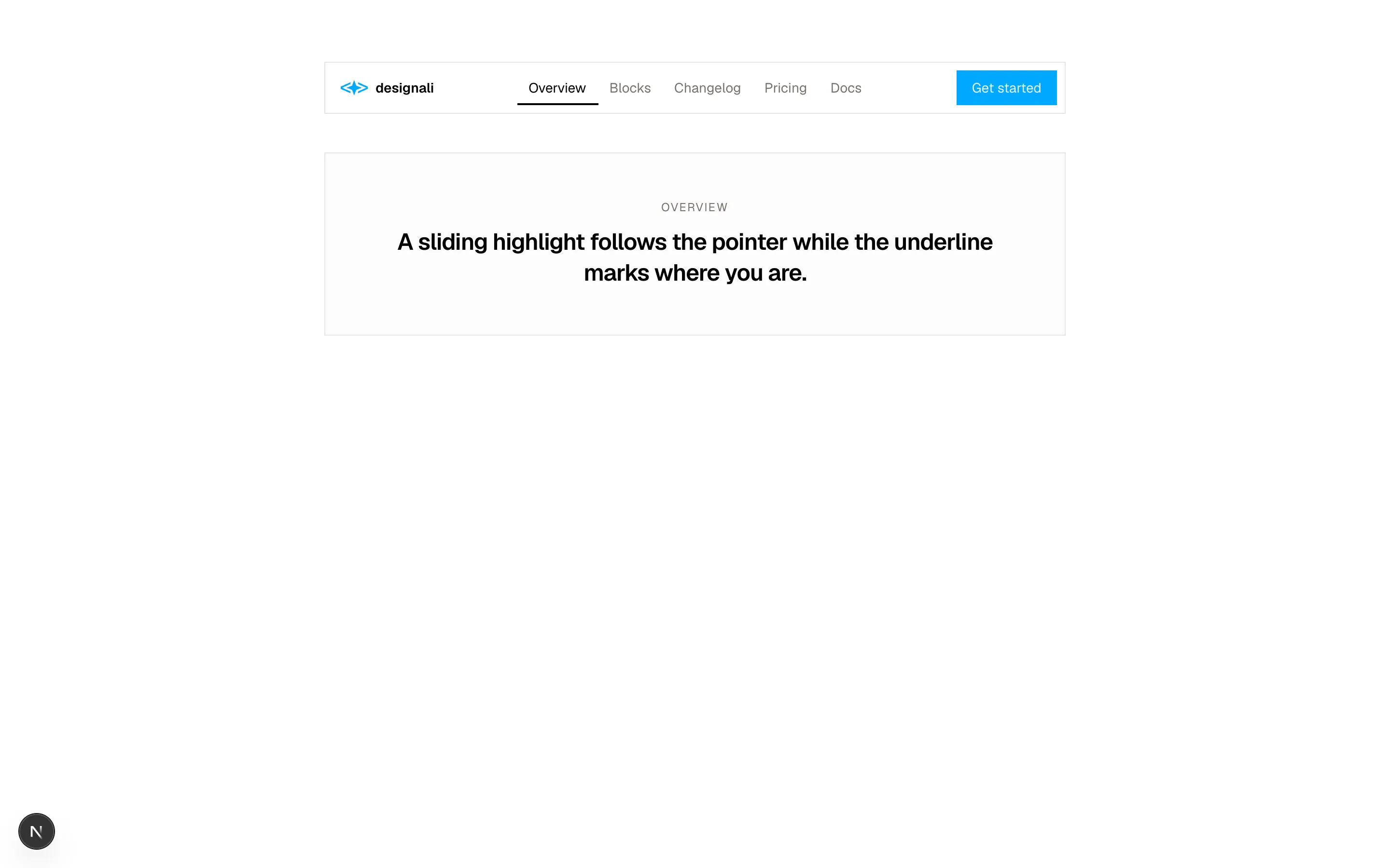
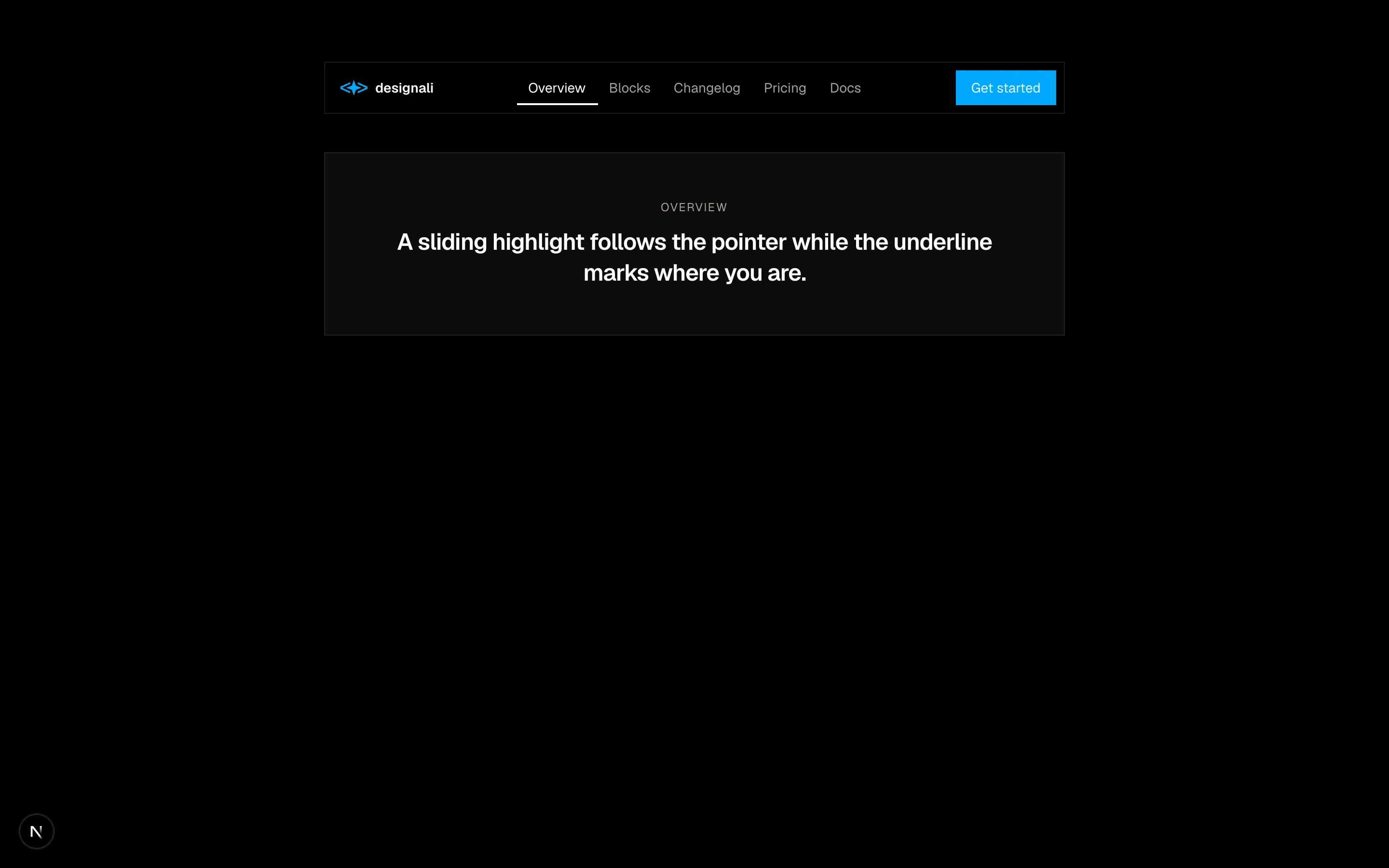
            A sliding highlight follows the pointer while the underline marks where you are.
          </p>
        </div>
      </div>
    </section>
  )
}
Floating pill nav where a sliding highlight follows the pointer and an underline marks the active link.
navigation-11
Files
"use client"

import { useState } from "react"
import {
  ArrowLeft,
  ArrowRight,
  Check,
  Lock,
} from "@designali/icons"

import { Button } from "@/components/ui/button"
import { cn } from "@/lib/utils"

const steps = [
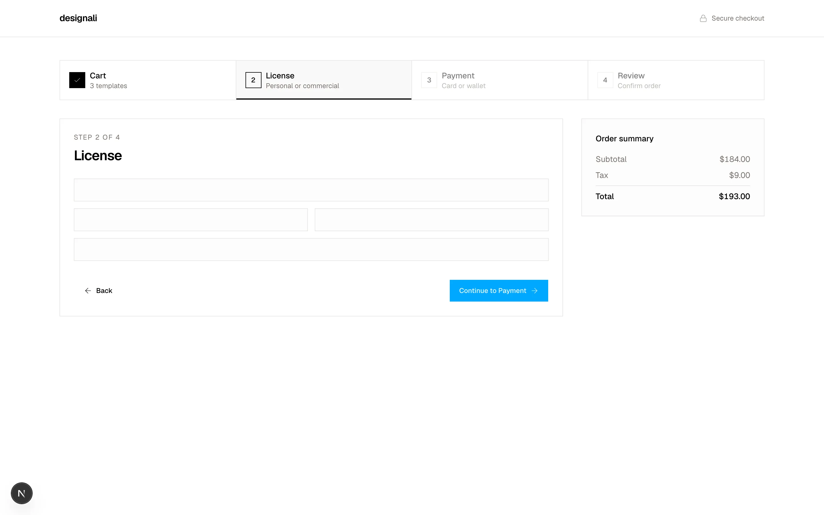
  { title: "Cart", detail: "3 templates" },
  { title: "License", detail: "Personal or commercial" },
  { title: "Payment", detail: "Card or wallet" },
  { title: "Review", detail: "Confirm order" },
]

export function Navigation12() {
  const [current, setCurrent] = useState(1)

  return (
    <section className="w-full bg-background">
      <header className="border-b">
        <div className="mx-auto flex h-16 max-w-7xl items-center justify-between px-6">
          <a href="#" className="font-semibold tracking-tight">
            designali
          </a>
          <span className="flex items-center gap-2 text-xs text-muted-foreground">
            <Lock className="size-3.5" />
            Secure checkout
          </span>
        </div>
      </header>

      <div className="mx-auto max-w-7xl px-6 py-10">
        <nav aria-label="Checkout progress">
          <ol className="grid grid-cols-4 border">
            {steps.map((step, index) => {
              const done = index < current
              const active = index === current
              return (
                <li key={step.title} className="border-e last:border-e-0">
                  <button
                    type="button"
                    disabled={index > current}
                    onClick={() => setCurrent(index)}
                    aria-current={active ? "step" : undefined}
                    className={cn(
                      "relative flex h-full w-full flex-col items-center gap-2 p-3 text-center transition-colors md:flex-row md:p-4 md:text-start",
                      active && "bg-muted/60",
                      index > current && "cursor-not-allowed opacity-50",
                      done && "hover:bg-muted/40"
                    )}
                  >
                    <span
                      className={cn(
                        "flex size-7 shrink-0 items-center justify-center border text-xs font-medium tabular-nums",
                        done && "border-foreground bg-foreground text-background",
                        active && "border-foreground"
                      )}
                    >
                      {done ? <Check className="size-3.5" /> : index + 1}
                    </span>
                    <span className="min-w-0">
                      <span className="block text-xs font-medium md:text-sm">{step.title}</span>
                      <span className="hidden truncate text-xs text-muted-foreground md:block">
                        {step.detail}
                      </span>
                    </span>
                    {active && (
                      <span className="absolute inset-x-0 bottom-0 h-0.5 bg-foreground" />
                    )}
                  </button>
                </li>
              )
            })}
          </ol>
        </nav>

        <div className="mt-8 grid gap-8 md:grid-cols-[1fr_320px]">
          <div className="border p-6">
            <p className="text-xs tracking-widest text-muted-foreground uppercase">
              Step {current + 1} of {steps.length}
            </p>
            <h2 className="mt-2 text-2xl font-semibold tracking-tight">{steps[current]!.title}</h2>
            <div className="mt-6 space-y-3">
              <div className="h-10 border bg-muted/30" />
              <div className="grid grid-cols-2 gap-3">
                <div className="h-10 border bg-muted/30" />
                <div className="h-10 border bg-muted/30" />
              </div>
              <div className="h-10 border bg-muted/30" />
            </div>
            <div className="mt-8 flex items-center justify-between">
              <Button
                variant="ghost"
                disabled={current === 0}
                onClick={() => setCurrent((value) => Math.max(0, value - 1))}
              >
                <ArrowLeft />
                Back
              </Button>
              <Button
                onClick={() => setCurrent((value) => Math.min(steps.length - 1, value + 1))}
              >
                {current === steps.length - 1 ? "Place order" : `Continue to ${steps[current + 1]!.title}`}
                <ArrowRight />
              </Button>
            </div>
          </div>
          <aside className="h-fit border bg-muted/30 p-6 text-sm">
            <p className="font-medium">Order summary</p>
            <dl className="mt-4 space-y-2 text-muted-foreground">
              <div className="flex justify-between"><dt>Subtotal</dt><dd className="tabular-nums">$184.00</dd></div>
              <div className="flex justify-between"><dt>Tax</dt><dd className="tabular-nums">$9.00</dd></div>
              <div className="flex justify-between border-t pt-2 font-medium text-foreground"><dt>Total</dt><dd className="tabular-nums">$193.00</dd></div>
            </dl>
          </aside>
        </div>
      </div>
    </section>
  )
}
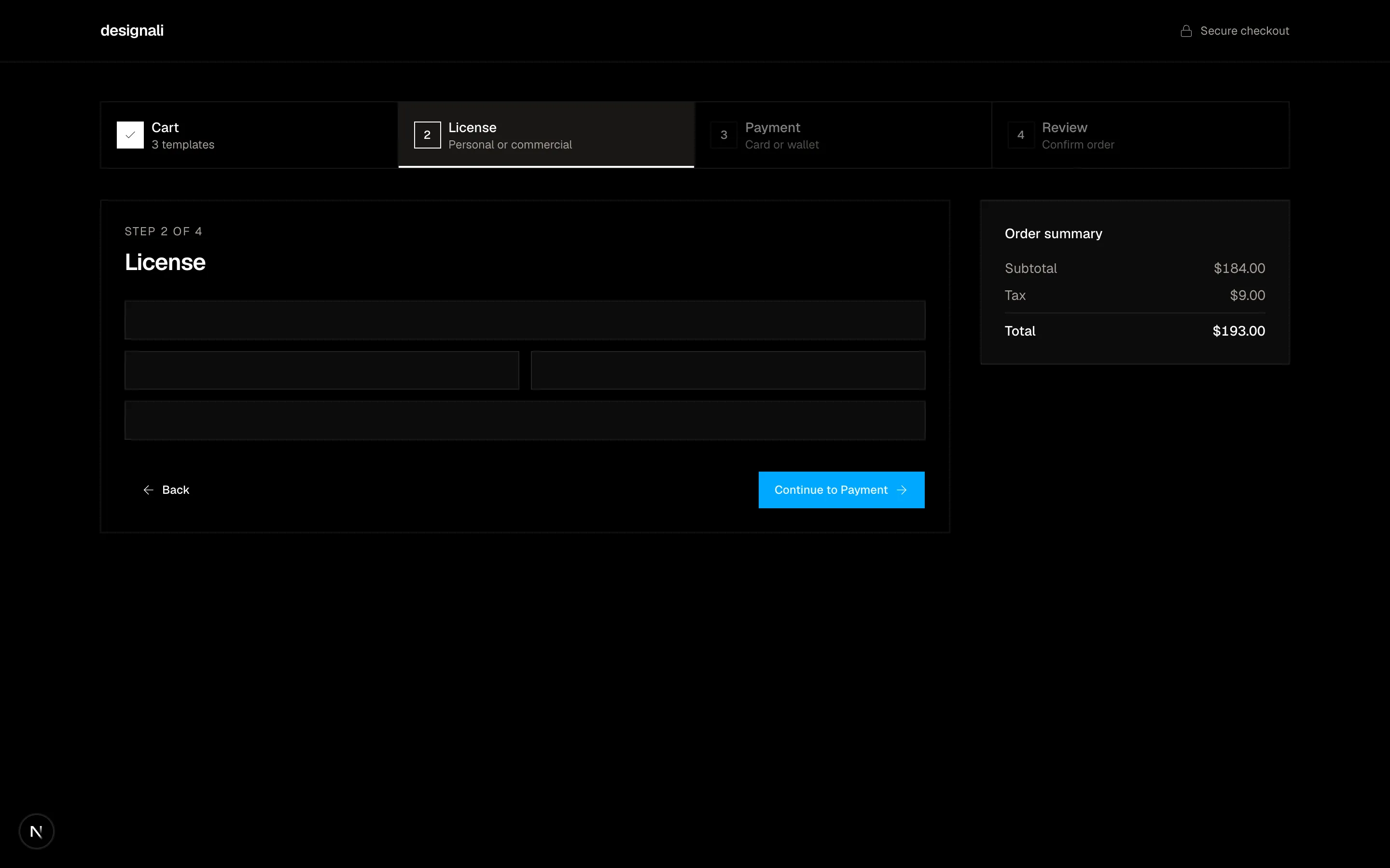
Checkout header with a numbered step progress bar, completed checkmarks and back/continue controls.
navigation-12
Files
"use client"
import { useState } from "react"
import {
ArrowLeft,
ArrowRight,
ChevronLeft,
ChevronRight,
} from "@designali/icons"
import { cn } from "@/lib/utils"
function pageList(current: number, total: number): (number | "gap")[] {
if (total <= 7) return Array.from({ length: total }, (_, index) => index + 1)
if (current <= 4) return [1, 2, 3, 4, 5, "gap", total]
if (current >= total - 3) return [1, "gap", total - 4, total - 3, total - 2, total - 1, total]
return [1, "gap", current - 1, current, current + 1, "gap", total]
}
export function Navigation13() {
const [page, setPage] = useState(6)
const [perPage, setPerPage] = useState(20)
const TOTAL = Math.ceil(468 / perPage)
const start = (page - 1) * perPage + 1
const end = Math.min(page * perPage, 468)
return (
<section className="w-full bg-background py-16">
<div className="mx-auto max-w-5xl space-y-12 px-6">
<div className="space-y-4">
<p className="text-xs tracking-widest text-muted-foreground uppercase">Table pagination</p>
<div className="flex flex-col gap-4 border p-4 sm:flex-row sm:items-center sm:justify-between">
<p className="text-sm text-muted-foreground">
Showing <span className="text-foreground tabular-nums">{start}-{end}</span> of{" "}
<span className="text-foreground tabular-nums">468</span> Designali blocks
</p>
<div className="flex items-center gap-4">
<label className="hidden items-center gap-2 text-sm text-muted-foreground md:flex">
Rows
<select
value={perPage}
onChange={(event) => {
setPerPage(Number(event.target.value))
setPage(1)
}}
className="h-8 border bg-background px-2 text-foreground"
>
{[10, 20, 50].map((value) => (
<option key={value} value={value}>{value}</option>
))}
</select>
</label>
<nav aria-label="Pagination" className="flex items-center">
<button
type="button"
aria-label="Previous page"
disabled={page === 1}
onClick={() => setPage(page - 1)}
className="flex size-8 items-center justify-center border disabled:opacity-40"
>
<ChevronLeft className="size-4" />
</button>
{pageList(page, TOTAL).map((item, index) =>
item === "gap" ? (
<span key={`gap-${index}`} className="flex size-8 items-center justify-center text-sm text-muted-foreground">
…
</span>
) : (
<button
key={item}
type="button"
onClick={() => setPage(item)}
aria-current={page === item ? "page" : undefined}
className={cn(
"hidden size-8 items-center justify-center text-sm tabular-nums transition-colors sm:flex",
page === item
? "flex bg-foreground text-background"
: "text-muted-foreground hover:bg-muted hover:text-foreground"
)}
>
{item}
</button>
)
)}
<button
type="button"
aria-label="Next page"
disabled={page === TOTAL}
onClick={() => setPage(page + 1)}
className="flex size-8 items-center justify-center border disabled:opacity-40"
>
<ChevronRight className="size-4" />
</button>
</nav>
</div>
</div>
</div>
<div className="space-y-4">
<p className="text-xs tracking-widest text-muted-foreground uppercase">Article navigation</p>
<nav aria-label="Chapters" className="grid border sm:grid-cols-2">
<a href="#" className="group flex flex-col gap-3 border-b p-6 transition-colors hover:bg-muted/50 sm:border-e sm:border-b-0">
<span className="flex items-center gap-2 text-xs text-muted-foreground">
<ArrowLeft className="size-3.5 transition-transform group-hover:-translate-x-1" />
Chapter 3
</span>
<span className="text-lg font-medium">Designing the block in Figma</span>
</a>
<a href="#" className="group flex flex-col items-end gap-3 p-6 text-end transition-colors hover:bg-muted/50">
<span className="flex items-center gap-2 text-xs text-muted-foreground">
Chapter 5
<ArrowRight className="size-3.5 transition-transform group-hover:translate-x-1" />
</span>
<span className="text-lg font-medium">Shipping it with Next.js</span>
</a>
</nav>
<div className="flex items-center gap-3">
<span className="text-xs text-muted-foreground tabular-nums">4 / 12</span>
<div className="h-1 flex-1 bg-muted">
<div className="h-full w-1/3 bg-foreground" />
</div>
</div>
</div>
</div>
</section>
)
}
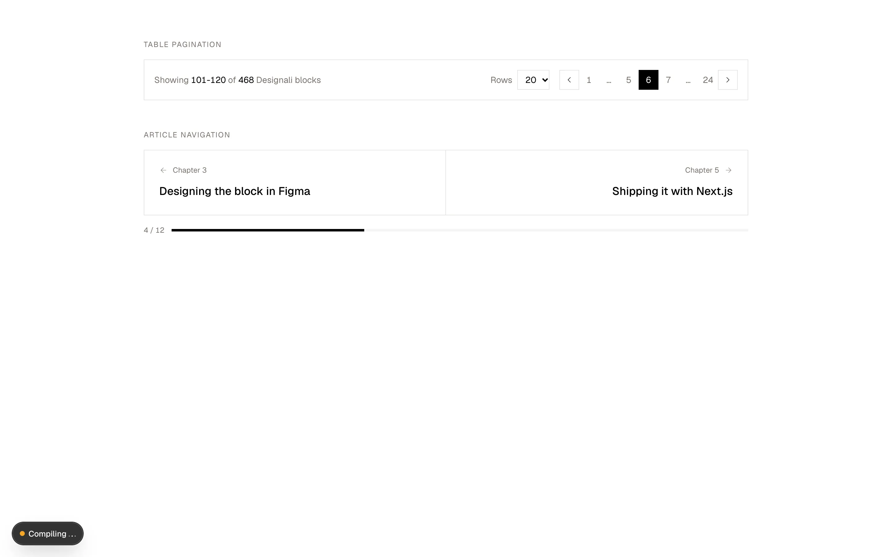
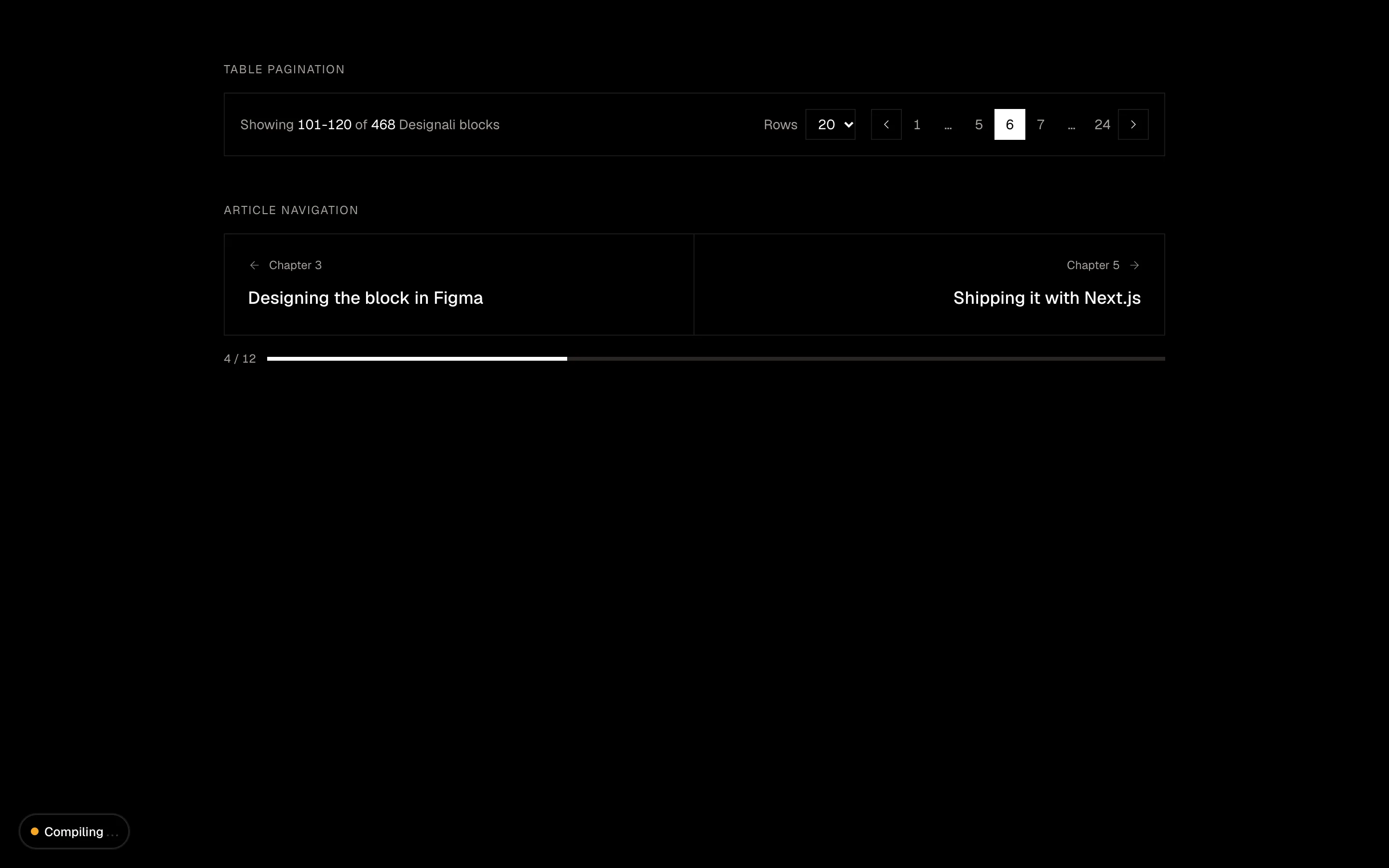
Table pagination with rows-per-page select and page numbers, plus previous/next chapter article navigation cards.
navigation-13
Files
"use client"

import { useState } from "react"
import {
  Heart,
  Globe,
  Search,
  ShoppingCart,
  Sparkles,
  User,
} from "@designali/icons"

import { cn } from "@/lib/utils"

const categories = [
  "New in",
  "Templates",
  "Blocks",
  "Landing pages",
  "UI designs",
  "Icons",
  "Logos",
  "Illustrations",
  "Sale",
]

const suggestions = ["portfolio template", "pricing block", "dashboard ui", "icon pack"]

export function Navigation14() {
  const [query, setQuery] = useState("")
  const [focused, setFocused] = useState(false)
  const [category, setCategory] = useState("New in")

  const matches = suggestions.filter((item) => item.includes(query.toLowerCase()))

  return (
    <section className="w-full bg-background">
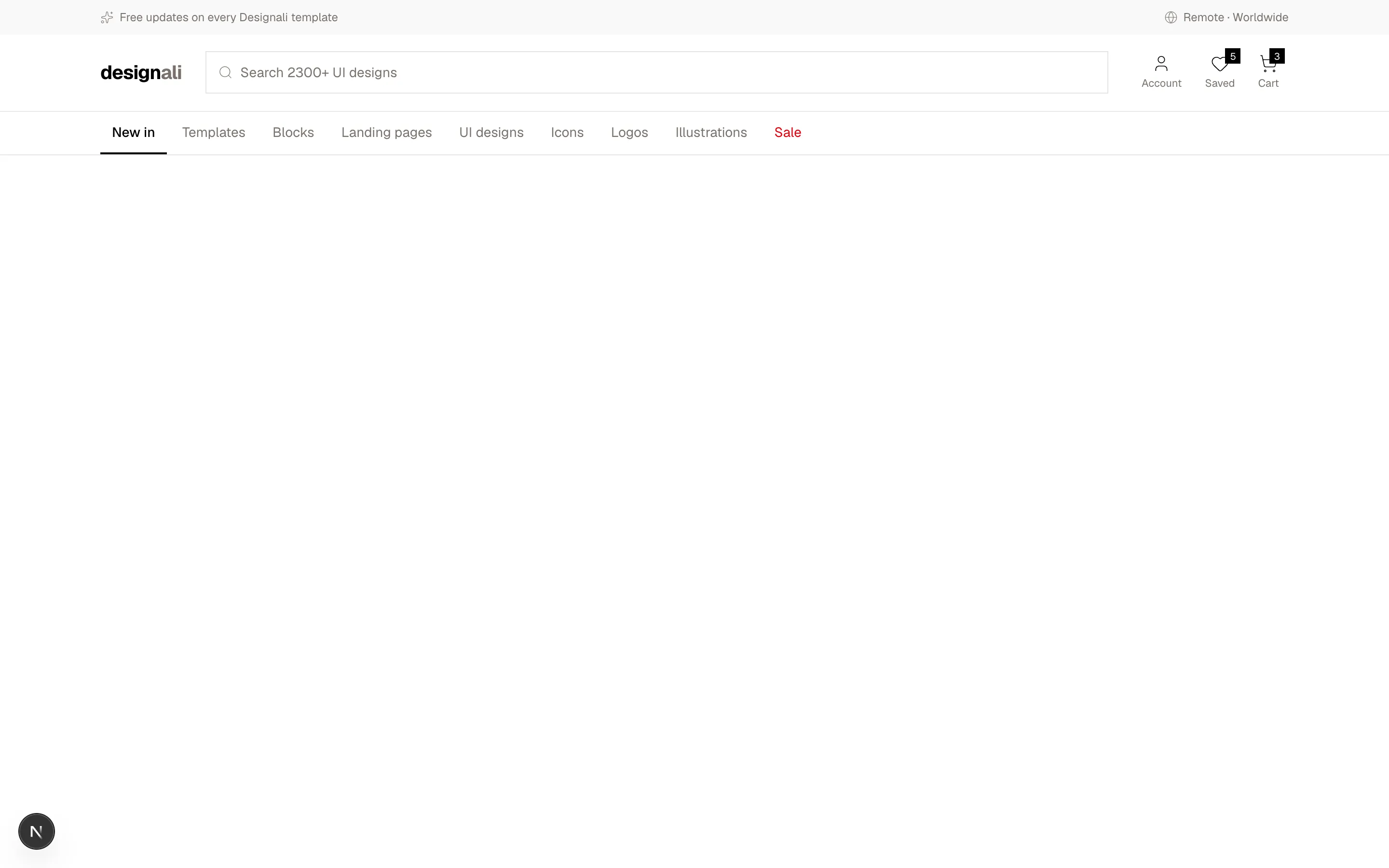
      <div className="bg-muted/60 text-xs text-muted-foreground">
        <div className="mx-auto flex h-9 max-w-7xl items-center justify-between gap-4 px-6">
          <span className="flex items-center gap-1.5 truncate">
            <Sparkles className="size-3.5 shrink-0" />
            Free updates on every Designali template
          </span>
          <a href="#" className="hidden items-center gap-1.5 hover:text-foreground sm:flex">
            <Globe className="size-3.5" />
            Remote · Worldwide
          </a>
        </div>
      </div>

      <div className="border-b">
        <div className="mx-auto grid max-w-7xl grid-cols-[auto_1fr] items-center gap-x-6 gap-y-3 px-6 py-4 md:grid-cols-[auto_1fr_auto]">
          <a href="#" className="text-xl font-bold tracking-tight">
            design<span className="text-muted-foreground">ali</span>
          </a>

          <div className="relative col-span-2 row-start-2 md:col-span-1 md:row-start-auto">
            <label className="flex h-11 items-center gap-2 border bg-background px-3 focus-within:border-foreground">
              <Search className="size-4 text-muted-foreground" />
              <input
                value={query}
                onChange={(event) => setQuery(event.target.value)}
                onFocus={() => setFocused(true)}
                onBlur={() => setFocused(false)}
                placeholder="Search 2300+ UI designs"
                className="w-full bg-transparent text-sm outline-none placeholder:text-muted-foreground"
              />
            </label>
            {focused && matches.length > 0 && (
              <ul className="absolute inset-x-0 top-full z-20 mt-1 border bg-popover py-1 text-sm text-popover-foreground">
                <li className="px-3 py-1.5 text-xs text-muted-foreground">Popular searches</li>
                {matches.map((item) => (
                  <li key={item}>
                    <button
                      type="button"
                      onMouseDown={() => setQuery(item)}
                      className="flex w-full items-center gap-2 px-3 py-2 text-start hover:bg-muted"
                    >
                      <Search className="size-3.5 text-muted-foreground" />
                      {item}
                    </button>
                  </li>
                ))}
              </ul>
            )}
          </div>

          <div className="flex items-center justify-end gap-1">
            {[
              { icon: User, label: "Account" },
              { icon: Heart, label: "Saved", count: 5 },
              { icon: ShoppingCart, label: "Cart", count: 3 },
            ].map((item) => (
              <a
                key={item.label}
                href="#"
                className="relative flex flex-col items-center gap-0.5 px-2.5 py-1 text-[11px] text-muted-foreground hover:text-foreground"
              >
                <item.icon className="size-5 text-foreground" />
                <span className="hidden sm:block">{item.label}</span>
                {item.count && (
                  <span className="absolute -top-0.5 right-1 flex size-4 items-center justify-center bg-foreground text-[10px] text-background">
                    {item.count}
                  </span>
                )}
              </a>
            ))}
          </div>
        </div>
      </div>

      <nav className="border-b">
        <ul className="mx-auto flex max-w-7xl gap-1 overflow-x-auto px-6">
          {categories.map((item) => (
            <li key={item} className="shrink-0">
              <button
                type="button"
                onClick={() => setCategory(item)}
                className={cn(
                  "h-11 border-b-2 px-3 text-sm transition-colors",
                  category === item
                    ? "border-foreground font-medium text-foreground"
                    : "border-transparent text-muted-foreground hover:text-foreground",
                  item === "Sale" && "text-destructive dark:text-destructive"
                )}
              >
                {item}
              </button>
            </li>
          ))}
        </ul>
      </nav>
      <div className="h-56" aria-hidden />
    </section>
  )
}
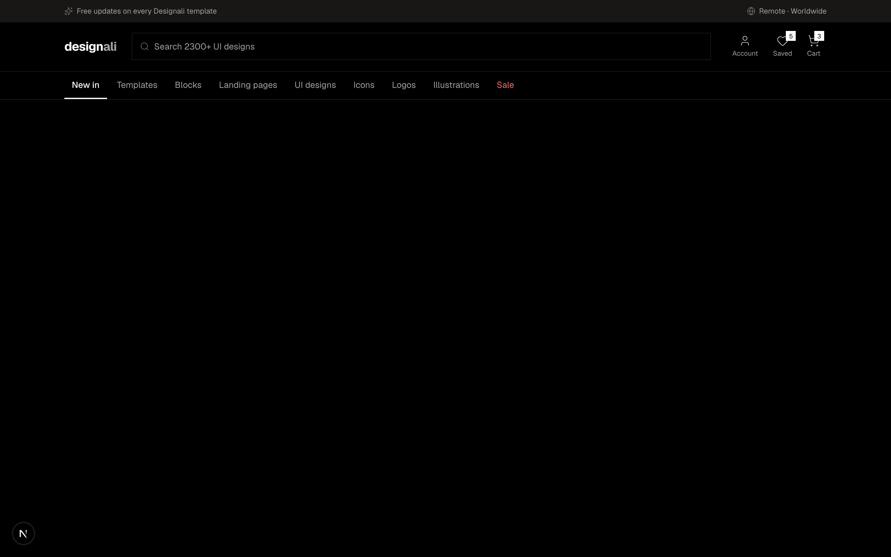
E-commerce header with delivery bar, location, search field, account, wishlist and cart icons above category tabs.
navigation-14
Files
"use client"

import { useState } from "react"
import {
  ArrowLeft,
  ChevronRight,
  Menu,
  Moon,
  X,
} from "@designali/icons"

import { Button } from "@/components/ui/button"
import { cn } from "@/lib/utils"

import { IPhone } from "@/components/ui/apple/iphone"

const menu = [
  {
    label: "Library",
    children: ["Templates", "Blocks", "Landing pages", "UI designs"],
  },
  {
    label: "Assets",
    children: ["Icons", "Logos", "Illustrations"],
  },
  { label: "Studio", children: ["Brand identity", "UI/UX design", "Web development"] },
  { label: "Blog" },
  { label: "Contact" },
]

export function Navigation15() {
  const [open, setOpen] = useState(true)
  const [panel, setPanel] = useState<string | null>(null)
  const sub = menu.find((item) => item.label === panel)

  return (
    <section className="w-full bg-muted/40 py-16">
      <div className="mx-auto grid max-w-5xl items-center gap-12 px-6 md:grid-cols-2">
        <div className="space-y-4">
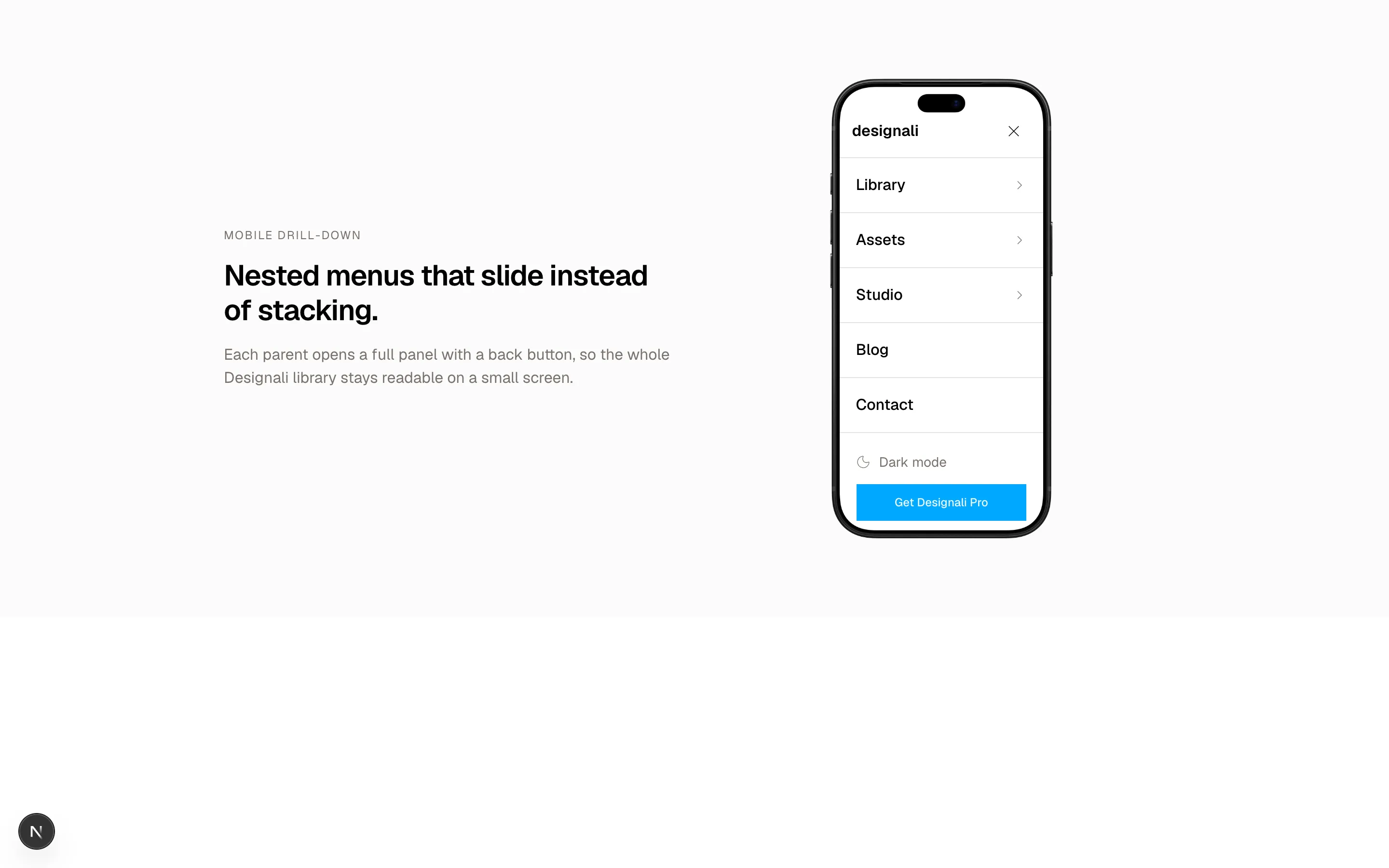
          <p className="text-xs tracking-widest text-muted-foreground uppercase">Mobile drill-down</p>
          <h2 className="text-3xl font-semibold tracking-tight">
            Nested menus that slide instead of stacking.
          </h2>
          <p className="text-muted-foreground">
            Each parent opens a full panel with a back button, so the whole
            Designali library stays readable on a small screen.
          </p>
        </div>

        <div className="flex justify-center">
          <IPhone variant="18-pro" color="black" size="lg">
          <div className="relative h-full overflow-hidden bg-background pt-6">
            <header className="flex h-14 items-center justify-between border-b px-4">
              <span className="font-semibold">designali</span>
              <button
                type="button"
                aria-label={open ? "Close menu" : "Open menu"}
                onClick={() => {
                  setOpen(!open)
                  setPanel(null)
                }}
                className="flex size-9 items-center justify-center"
              >
                {open ? <X className="size-5" /> : <Menu className="size-5" />}
              </button>
            </header>

            <div className="space-y-3 p-4">
              <img
                src="/img/hero-1.jpg"
                alt="Designali template preview"
                className="h-28 w-full object-cover"
              />
              <div className="h-3 w-3/4 bg-muted" />
              <div className="h-3 w-1/2 bg-muted" />
            </div>

            <div
              className={cn(
                "absolute inset-x-0 top-20 bottom-0 bg-background transition-transform duration-300",
                open ? "translate-x-0" : "translate-x-full"
              )}
            >
              <div
                className={cn(
                  "absolute inset-0 flex flex-col transition-transform duration-300",
                  sub && "-translate-x-full"
                )}
              >
                <ul className="flex-1 divide-y">
                  {menu.map((item) => (
                    <li key={item.label}>
                      <button
                        type="button"
                        onClick={() => item.children && setPanel(item.label)}
                        className="flex w-full items-center justify-between px-5 py-4 text-start font-medium"
                      >
                        {item.label}
                        {item.children && <ChevronRight className="size-4 text-muted-foreground" />}
                      </button>
                    </li>
                  ))}
                </ul>
                <div className="space-y-3 border-t p-5">
                  <button type="button" className="flex items-center gap-2 text-sm text-muted-foreground">
                    <Moon className="size-4" />
                    Dark mode
                  </button>
                  <Button className="w-full">Get Designali Pro</Button>
                  <Button variant="outline" className="w-full">Log in</Button>
                </div>
              </div>

              <div
                className={cn(
                  "absolute inset-0 transition-transform duration-300",
                  sub ? "translate-x-0" : "translate-x-full"
                )}
              >
                <button
                  type="button"
                  onClick={() => setPanel(null)}
                  className="flex w-full items-center gap-2 border-b px-5 py-4 text-sm text-muted-foreground"
                >
                  <ArrowLeft className="size-4" />
                  Back
                </button>
                <p className="px-5 pt-5 text-xs tracking-widest text-muted-foreground uppercase">
                  {sub?.label}
                </p>
                <ul className="py-2">
                  {sub?.children?.map((child) => (
                    <li key={child}>
                      <a href="#" className="block px-5 py-3 hover:bg-muted">
                        {child}
                      </a>
                    </li>
                  ))}
                </ul>
              </div>
            </div>
          </div>
          </IPhone>
        </div>
      </div>
    </section>
  )
}
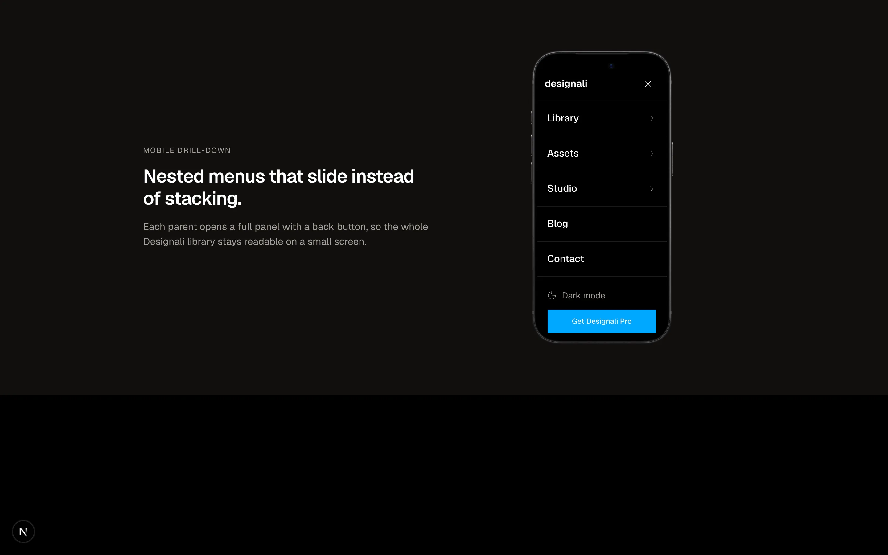
Mobile menu demo in a phone frame where nested sections slide in as full panels with back buttons.
navigation-15
Files
"use client"

import { useRef, useState } from "react"

import { cn } from "@/lib/utils"

const sections = [
  {
    id: "summary",
    title: "Summary",
    body: "designali.com serves 460+ blocks, 240+ landing pages and 4000+ icons to designers and developers worldwide. This report covers reliability, speed and cost for Q3.",
  },
  {
    id: "reliability",
    title: "Reliability",
    body: "Uptime held at 99.98% across the quarter. Two incidents in August accounted for most failed downloads, both traced to a misconfigured cache rule.",
  },
  {
    id: "latency",
    title: "Latency",
    body: "Median page load dropped from 410ms to 260ms after moving block previews onto the edge. The 99th percentile is now under 1.2 seconds.",
  },
  {
    id: "cost",
    title: "Cost",
    body: "Hosting spend fell 18% quarter over quarter. Storage grew 9% as we added new templates, UI designs and Figma source files.",
  },
  {
    id: "next",
    title: "Next quarter",
    body: "Priorities are a public status page, faster icon search, and a new mobile UI kit for the Designali library.",
  },
]

export function Navigation16() {
  const [active, setActive] = useState(sections[0]!.id)
  const container = useRef<HTMLDivElement>(null)

  function onScroll() {
    const element = container.current
    if (!element) return
    const top = element.scrollTop + 40
    let current = sections[0]!.id
    for (const section of sections) {
      const target = element.querySelector<HTMLElement>(`[data-section="${section.id}"]`)
      if (target && target.offsetTop <= top) current = section.id
    }
    setActive(current)
  }

  function jump(id: string) {
    const target = container.current?.querySelector<HTMLElement>(`[data-section="${id}"]`)
    if (target && container.current) {
      container.current.scrollTo({ top: target.offsetTop - 8, behavior: "smooth" })
    }
  }

  const index = sections.findIndex((section) => section.id === active)

  return (
    <section className="w-full bg-background py-16">
      <div className="mx-auto grid max-w-5xl gap-8 px-6 md:grid-cols-[200px_1fr]">
        <nav aria-label="Report sections" className="md:sticky md:top-6 md:h-fit">
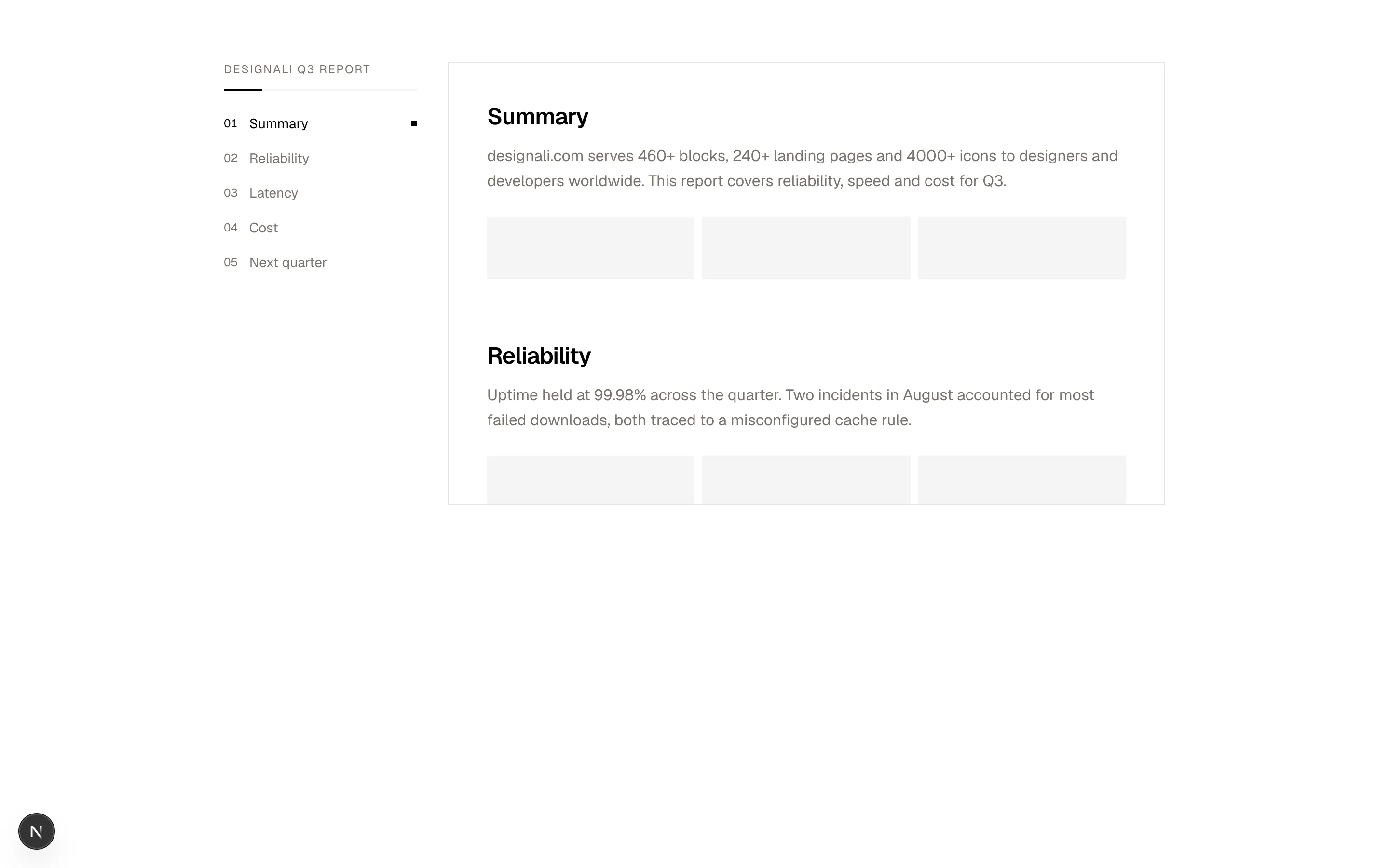
          <p className="text-xs tracking-widest text-muted-foreground uppercase">Designali Q3 report</p>
          <div className="mt-3 h-0.5 bg-muted">
            <div
              className="h-full bg-foreground transition-all duration-300"
              style={{ width: `${((index + 1) / sections.length) * 100}%` }}
            />
          </div>
          <ol className="mt-4 flex gap-1 overflow-x-auto md:flex-col md:gap-0">
            {sections.map((section, position) => (
              <li key={section.id} className="shrink-0">
                <button
                  type="button"
                  onClick={() => jump(section.id)}
                  className={cn(
                    "flex w-full items-center gap-3 py-2 pe-3 text-start text-sm transition-colors md:pe-0",
                    active === section.id ? "text-foreground" : "text-muted-foreground hover:text-foreground"
                  )}
                >
                  <span className="font-sans text-xs tabular-nums">0{position + 1}</span>
                  {section.title}
                  {active === section.id && (
                    <span className="ms-auto hidden size-1.5 bg-foreground md:block" />
                  )}
                </button>
              </li>
            ))}
          </ol>
        </nav>

        <div
          ref={container}
          onScroll={onScroll}
          className="relative h-[460px] overflow-y-auto border p-6 md:p-10"
        >
          {sections.map((section) => (
            <article key={section.id} data-section={section.id} className="pb-16 last:pb-64">
              <h3 className="text-2xl font-semibold tracking-tight">{section.title}</h3>
              <p className="mt-3 max-w-prose leading-relaxed text-muted-foreground">{section.body}</p>
              <div className="mt-6 grid grid-cols-3 gap-2">
                {[0, 1, 2].map((bar) => (
                  <div key={bar} className="h-16 bg-muted" />
                ))}
              </div>
            </article>
          ))}
        </div>
      </div>
    </section>
  )
}
Report reader with a sticky section index that tracks scroll position and smooth-scrolls to sections.
navigation-16
Files
"use client"

import { useState } from "react"
import {
  Bell,
  Check,
  ChevronsUpDown,
  CreditCard,
  LogOut,
  Plus,
  Search,
  Settings,
  User,
} from "@designali/icons"

import { cn } from "@/lib/utils"

import { Logo } from "@/components/logo"

const workspaces = [
  { name: "Designali Studio", plan: "Team", initials: "DS" },
  { name: "Side project", plan: "Free", initials: "SP" },
  { name: "Dalim Agency", plan: "Pro", initials: "DA" },
]

const notifications = [
  { who: "Sara", what: "commented on Dalim UI landing page", when: "2m" },
  { who: "Build bot", what: "deployed designali.com@4f2a1c to production", when: "18m" },
  { who: "Omar", what: "invited you to Portfolio template", when: "1h" },
]

type Panel = "workspace" | "notifications" | "account" | null

export function Navigation17() {
  const [panel, setPanel] = useState<Panel>(null)
  const [workspace, setWorkspace] = useState(workspaces[0]!)

  function toggle(next: Panel) {
    setPanel((current) => (current === next ? null : next))
  }

  return (
    <section className="w-full bg-muted/40 pb-72">
      <header className="relative border-b bg-background">
        <div className="mx-auto flex h-14 max-w-7xl items-center gap-3 px-4 sm:px-6">
          <Logo className="h-5 w-auto shrink-0" />
          <span className="text-muted-foreground/50">/</span>

          <div className="relative min-w-0">
            <button
              type="button"
              onClick={() => toggle("workspace")}
              aria-expanded={panel === "workspace"}
              className="flex h-9 min-w-0 items-center gap-2 px-2 text-sm hover:bg-muted"
            >
              <span className="flex size-6 shrink-0 items-center justify-center bg-muted text-[10px] font-semibold">
                {workspace.initials}
              </span>
              <span className="truncate font-medium">{workspace.name}</span>
              <span className="hidden border px-1.5 text-[10px] text-muted-foreground sm:inline">
                {workspace.plan}
              </span>
              <ChevronsUpDown className="size-3.5 shrink-0 text-muted-foreground" />
            </button>
            {panel === "workspace" && (
              <div className="absolute start-0 top-full z-20 mt-1 w-64 border bg-popover p-1 text-sm text-popover-foreground">
                <p className="px-2 py-1.5 text-xs text-muted-foreground">Workspaces</p>
                {workspaces.map((item) => (
                  <button
                    key={item.name}
                    type="button"
                    onClick={() => {
                      setWorkspace(item)
                      setPanel(null)
                    }}
                    className="flex w-full items-center gap-2 px-2 py-2 hover:bg-muted"
                  >
                    <span className="flex size-6 items-center justify-center bg-muted text-[10px] font-semibold">
                      {item.initials}
                    </span>
                    <span className="flex-1 text-start">{item.name}</span>
                    {item.name === workspace.name && <Check className="size-4" />}
                  </button>
                ))}
                <div className="my-1 h-px bg-border" />
                <button type="button" className="flex w-full items-center gap-2 px-2 py-2 text-muted-foreground hover:bg-muted hover:text-foreground">
                  <Plus className="size-4" />
                  New workspace
                </button>
              </div>
            )}
          </div>

          <button
            type="button"
            className="ms-auto hidden h-9 w-64 items-center gap-2 border px-3 text-sm text-muted-foreground hover:bg-muted md:flex"
          >
            <Search className="size-4" />
            Search projects
            <kbd className="ms-auto border bg-muted px-1.5 font-mono text-[10px]">/</kbd>
          </button>

          <div className="relative ms-auto md:ms-0">
            <button
              type="button"
              aria-label="Notifications"
              onClick={() => toggle("notifications")}
              className="relative flex size-9 items-center justify-center hover:bg-muted"
            >
              <Bell className="size-4" />
              <span className="absolute top-2 right-2 size-2 rounded-full bg-destructive ring-2 ring-background" />
            </button>
            {panel === "notifications" && (
              <div className="absolute end-0 top-full z-20 mt-1 w-[min(20rem,calc(100vw-2rem))] border bg-popover text-sm text-popover-foreground">
                <div className="flex items-center justify-between border-b px-4 py-3">
                  <span className="font-medium">Notifications</span>
                  <button type="button" className="text-xs text-muted-foreground hover:text-foreground">
                    Mark all read
                  </button>
                </div>
                <ul className="divide-y">
                  {notifications.map((item) => (
                    <li key={item.what} className="flex gap-3 px-4 py-3">
                      <span className="flex size-8 shrink-0 items-center justify-center bg-muted text-xs font-medium">
                        {item.who.slice(0, 1)}
                      </span>
                      <p className="flex-1 text-muted-foreground">
                        <span className="font-medium text-foreground">{item.who}</span> {item.what}
                      </p>
                      <span className="text-xs text-muted-foreground">{item.when}</span>
                    </li>
                  ))}
                </ul>
              </div>
            )}
          </div>

          <div className="relative">
            <button
              type="button"
              aria-label="Account menu"
              onClick={() => toggle("account")}
              className={cn(
                "flex size-9 items-center justify-center bg-gradient-to-br from-primary to-primary text-xs font-semibold text-white",
                panel === "account" && "ring-2 ring-foreground ring-offset-2 ring-offset-background"
              )}
            >
              AI
            </button>
            {panel === "account" && (
              <div className="absolute end-0 top-full z-20 mt-1 w-56 border bg-popover p-1 text-sm text-popover-foreground">
                <div className="px-2 py-2">
                  <p className="font-medium">Ali Imam</p>
                  <p className="text-xs text-muted-foreground">ali@designali.com</p>
                </div>
                <div className="my-1 h-px bg-border" />
                {[
                  { icon: User, label: "Profile" },
                  { icon: CreditCard, label: "Billing" },
                  { icon: Settings, label: "Settings" },
                  { icon: LogOut, label: "Sign out" },
                ].map((item) => (
                  <button key={item.label} type="button" className="flex w-full items-center gap-2 px-2 py-2 hover:bg-muted">
                    <item.icon className="size-4 text-muted-foreground" />
                    {item.label}
                  </button>
                ))}
              </div>
            )}
          </div>
        </div>
      </header>
    </section>
  )
}
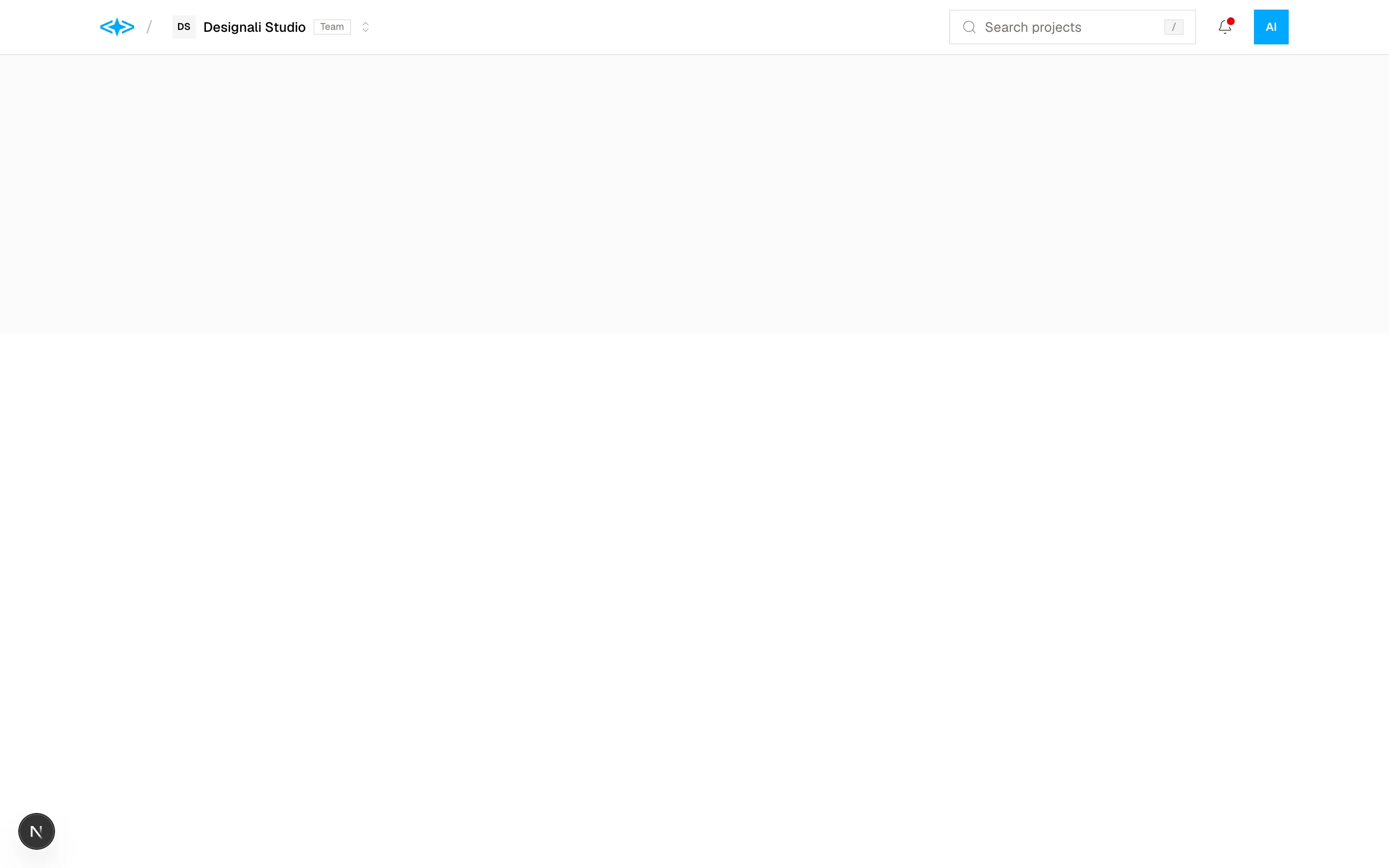
App top bar with a workspace switcher, project search and notifications popover panels.
navigation-17
Files
"use client"

import { useState } from "react"
import {
  ArrowRight,
  Boxes,
  ChevronDown,
  Code,
  Palette,
  PenTool,
  Sparkles,
} from "@designali/icons"

import { Button } from "@/components/ui/button"
import { cn } from "@/lib/utils"

const industries = [
  {
    icon: Palette,
    label: "Brand identity",
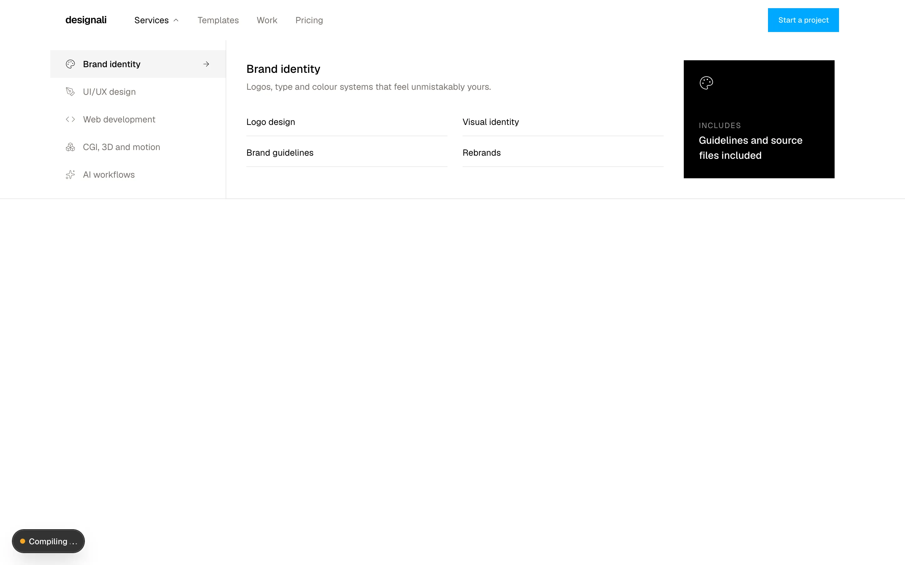
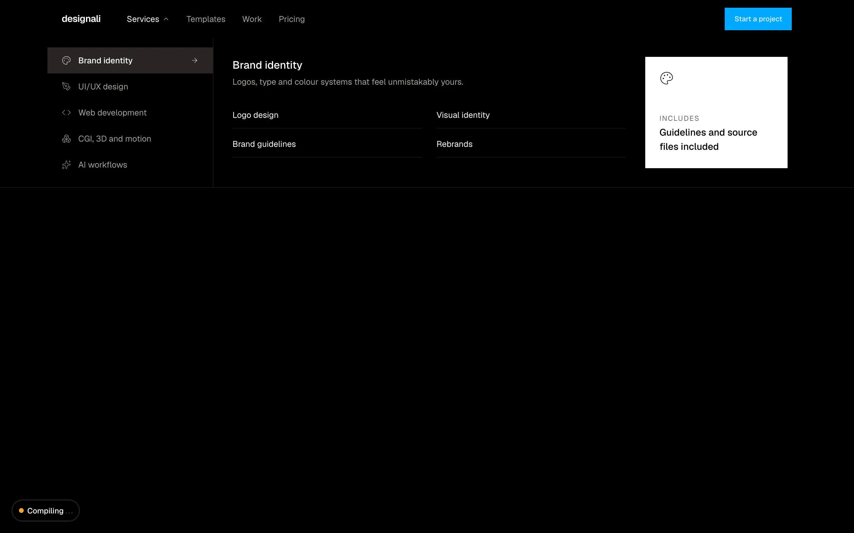
    blurb: "Logos, type and colour systems that feel unmistakably yours.",
    links: ["Logo design", "Visual identity", "Brand guidelines", "Rebrands"],
    stat: "Guidelines and source files included",
  },
  {
    icon: PenTool,
    label: "UI/UX design",
    blurb: "Interfaces that look great and feel intuitive.",
    links: ["Product design", "Design systems", "Prototypes", "UX audits"],
    stat: "Figma files that match the code",
  },
  {
    icon: Code,
    label: "Web development",
    blurb: "Production-ready websites with Next.js and Tailwind CSS.",
    links: ["Marketing sites", "Landing pages", "Web apps", "CMS setup"],
    stat: "Built on 460+ Designali blocks",
  },
  {
    icon: Boxes,
    label: "CGI, 3D and motion",
    blurb: "Renders, motion design and visuals for launches.",
    links: ["Product renders", "Motion design", "Showreels", "3D illustrations"],
    stat: "Art direction from concept to final frame",
  },
  {
    icon: Sparkles,
    label: "AI workflows",
    blurb: "AI-assisted research, design and development.",
    links: ["Design automation", "Content pipelines", "Prototyping with AI", "Workflow audits"],
    stat: "Faster from idea to launch",
  },
]

export function Navigation18() {
  const [open, setOpen] = useState(true)
  const [active, setActive] = useState(0)
  const current = industries[active]!

  return (
    <section className="relative w-full bg-background">
      <nav className="relative border-b">
        <div className="mx-auto flex h-16 max-w-7xl items-center gap-8 px-6">
          <a href="#" className="font-semibold tracking-tight">designali</a>
          <ul className="hidden items-center gap-1 text-sm md:flex">
            <li>
              <button
                type="button"
                onClick={() => setOpen(!open)}
                aria-expanded={open}
                className={cn(
                  "flex h-9 items-center gap-1 px-3 text-muted-foreground hover:text-foreground",
                  open && "text-foreground"
                )}
              >
                Services
                <ChevronDown className={cn("size-3.5 transition-transform", open && "rotate-180")} />
              </button>
            </li>
            {["Templates", "Work", "Pricing"].map((link) => (
              <li key={link}>
                <a href="#" className="flex h-9 items-center px-3 text-muted-foreground hover:text-foreground">
                  {link}
                </a>
              </li>
            ))}
          </ul>
          <Button className="ms-auto">Start a project</Button>
        </div>

        {open && (
          <div className="absolute inset-x-0 top-full z-20 border-b bg-background">
            <div className="mx-auto grid max-w-7xl md:grid-cols-[280px_1fr]">
              <ul className="flex overflow-x-auto border-b py-2 md:block md:border-e md:border-b-0 md:py-4">
                {industries.map((industry, index) => (
                  <li key={industry.label} className="shrink-0">
                    <button
                      type="button"
                      onMouseEnter={() => setActive(index)}
                      onFocus={() => setActive(index)}
                      onClick={() => setActive(index)}
                      className={cn(
                        "flex w-full items-center gap-3 px-6 py-3 text-start text-sm transition-colors",
                        active === index ? "bg-muted font-medium" : "text-muted-foreground hover:text-foreground"
                      )}
                    >
                      <industry.icon className="size-4 shrink-0" />
                      <span className="whitespace-nowrap">{industry.label}</span>
                      <ArrowRight
                        className={cn("ms-auto hidden size-3.5 md:block", active !== index && "invisible")}
                      />
                    </button>
                  </li>
                ))}
              </ul>
              <div className="grid gap-8 p-6 md:grid-cols-[1fr_240px] md:p-8">
                <div>
                  <p className="text-lg font-medium">{current.label}</p>
                  <p className="mt-1 text-sm text-muted-foreground">{current.blurb}</p>
                  <ul className="mt-6 grid gap-x-6 gap-y-1 sm:grid-cols-2">
                    {current.links.map((link) => (
                      <li key={link}>
                        <a href="#" className="group flex items-center justify-between border-b py-3 text-sm">
                          {link}
                          <ArrowRight className="size-3.5 -translate-x-1 opacity-0 transition-all group-hover:translate-x-0 group-hover:opacity-100" />
                        </a>
                      </li>
                    ))}
                  </ul>
                </div>
                <a href="#" className="flex flex-col justify-between gap-6 bg-foreground p-6 text-background">
                  <current.icon className="size-6" />
                  <span>
                    <span className="block text-xs tracking-widest text-background/60 uppercase">Includes</span>
                    <span className="mt-1 block font-medium">{current.stat}</span>
                  </span>
                </a>
              </div>
            </div>
          </div>
        )}
      </nav>
      <div className="h-[420px] md:h-80" aria-hidden />
    </section>
  )
}
Nav with an industries mega menu showing a list of sectors beside detail links and a proof card.
navigation-18
Files
"use client"

import { useState } from "react"
import {
  ChevronRight,
  Folder,
  FolderOpen,
  HardDrive,
  Ellipsis as MoreHorizontal,
} from "@designali/icons"

import { cn } from "@/lib/utils"

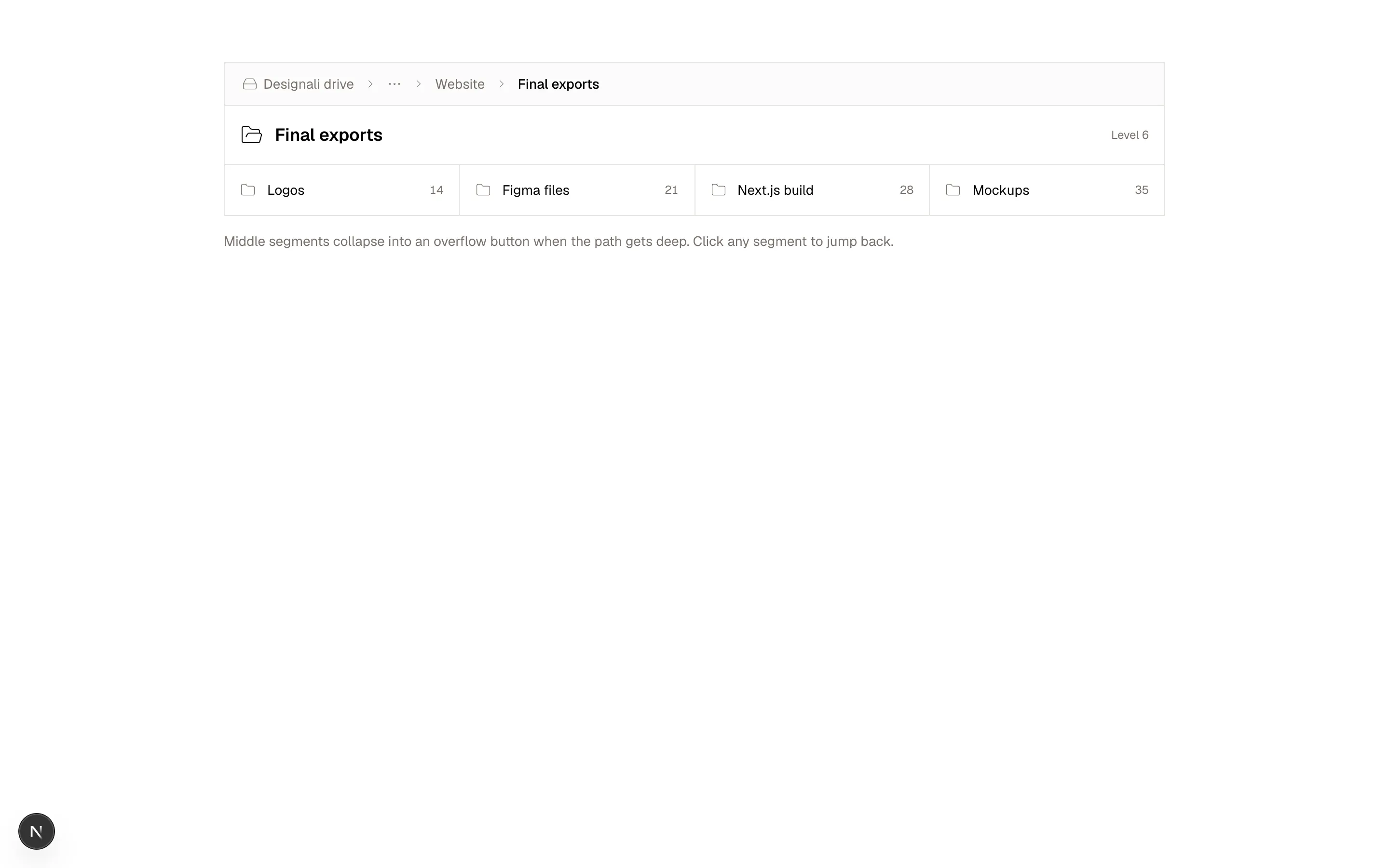
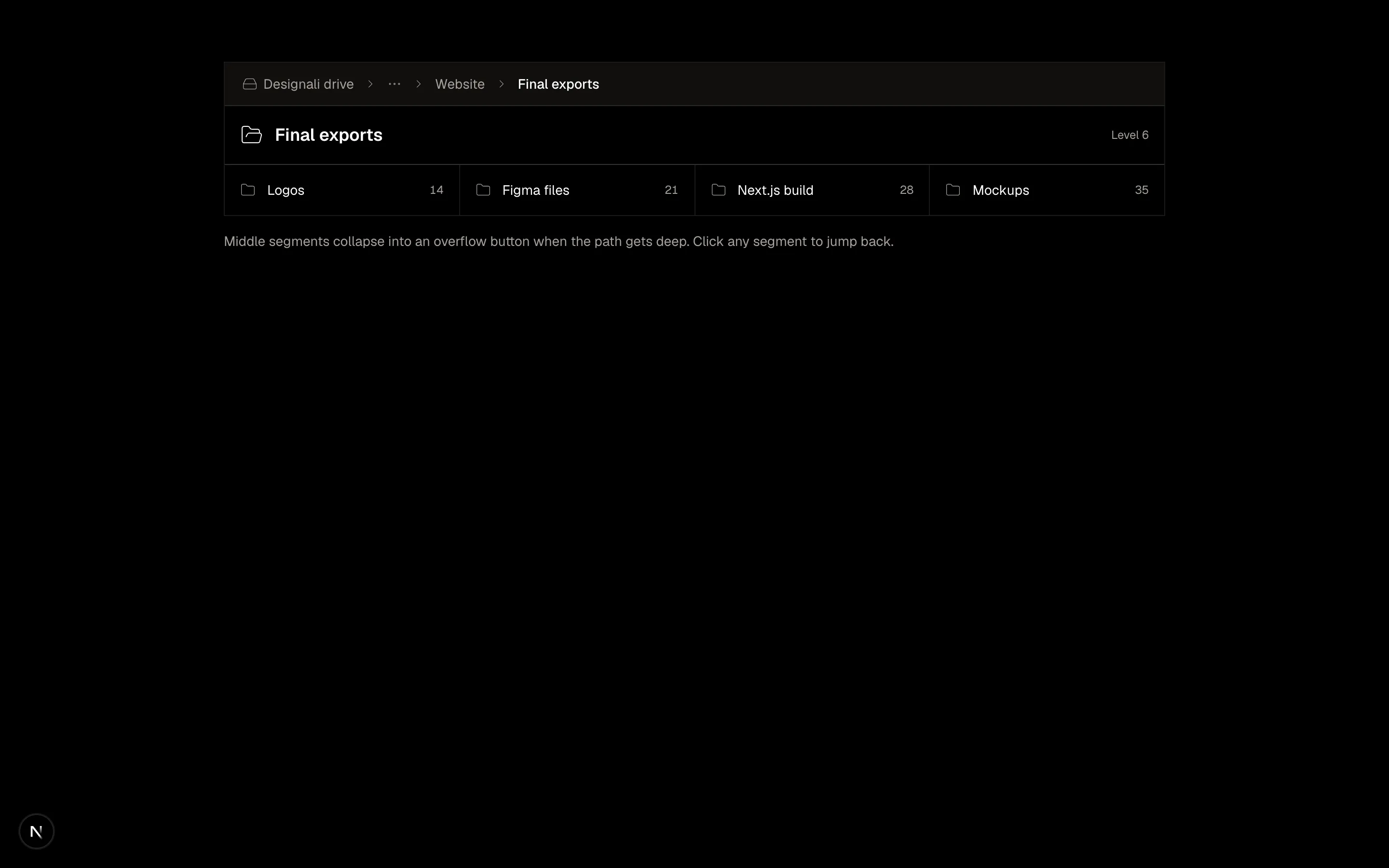
const path = ["Designali drive", "Clients", "Dalim Agency", "Brand refresh", "Website", "Final exports"]

const folders = ["Logos", "Figma files", "Next.js build", "Mockups"]

export function Navigation19() {
  const [depth, setDepth] = useState(path.length - 1)
  const [expanded, setExpanded] = useState(false)

  const visible = path.slice(0, depth + 1)
  const collapse = !expanded && visible.length > 3
  const hidden = collapse ? visible.slice(1, -2) : []

  return (
    <section className="w-full bg-background py-16">
      <div className="mx-auto max-w-5xl px-6">
        <div className="border">
          <nav aria-label="Folder path" className="flex items-center gap-1 border-b bg-muted/40 px-3 py-2 text-sm">
            <ol className="flex min-w-0 flex-1 items-center gap-1">
              {visible.map((segment, index) => {
                if (collapse && index > 0 && index < visible.length - 2) {
                  if (index !== 1) return null
                  return (
                    <li key="collapsed" className="relative flex items-center gap-1">
                      <button
                        type="button"
                        aria-label={`Show ${hidden.length} hidden folders`}
                        onClick={() => setExpanded(true)}
                        className="flex h-7 items-center px-1.5 text-muted-foreground hover:bg-muted hover:text-foreground"
                      >
                        <MoreHorizontal className="size-4" />
                      </button>
                      <ChevronRight className="size-3.5 shrink-0 text-muted-foreground" />
                    </li>
                  )
                }
                const last = index === visible.length - 1
                return (
                  <li key={segment} className="flex min-w-0 items-center gap-1">
                    <button
                      type="button"
                      onClick={() => {
                        setDepth(index)
                        setExpanded(false)
                      }}
                      aria-current={last ? "page" : undefined}
                      className={cn(
                        "flex h-7 min-w-0 items-center gap-1.5 px-1.5 hover:bg-muted",
                        last ? "font-medium" : "text-muted-foreground hover:text-foreground"
                      )}
                    >
                      {index === 0 && <HardDrive className="size-4 shrink-0" />}
                      <span className="truncate">{segment}</span>
                    </button>
                    {!last && <ChevronRight className="size-3.5 shrink-0 text-muted-foreground" />}
                  </li>
                )
              })}
            </ol>
            {expanded && (
              <button
                type="button"
                onClick={() => setExpanded(false)}
                className="shrink-0 text-xs text-muted-foreground hover:text-foreground"
              >
                Collapse
              </button>
            )}
          </nav>

          <div className="flex items-center justify-between gap-4 px-4 py-4">
            <div className="flex min-w-0 items-center gap-3">
              <FolderOpen className="size-6 shrink-0" />
              <h2 className="truncate text-lg font-semibold">{visible[visible.length - 1]}</h2>
            </div>
            <span className="shrink-0 text-xs text-muted-foreground">Level {depth + 1}</span>
          </div>

          <ul className="grid gap-px border-t bg-border sm:grid-cols-2 lg:grid-cols-4">
            {(depth < path.length - 1 ? [path[depth + 1], ...folders.slice(1)] : folders).map((folder, index) => (
              <li key={folder} className="bg-background">
                <button
                  type="button"
                  onClick={() => {
                    if (index === 0 && depth < path.length - 1) setDepth(depth + 1)
                  }}
                  className="flex w-full items-center gap-3 p-4 text-start text-sm hover:bg-muted/50"
                >
                  <Folder className="size-4 shrink-0 text-muted-foreground" />
                  <span className="min-w-0 flex-1 truncate">{folder}</span>
                  <span className="text-xs text-muted-foreground tabular-nums">{(index + 2) * 7}</span>
                </button>
              </li>
            ))}
          </ul>
        </div>
        <p className="mt-4 text-sm text-muted-foreground">
          Middle segments collapse into an overflow button when the path gets deep. Click any segment to jump back.
        </p>
      </div>
    </section>
  )
}
File browser breadcrumb that collapses middle folders into an overflow button and jumps to any level.
navigation-19
Files
"use client"

import { useState } from "react"
import {
  ArrowUpRight,
} from "@designali/icons"

import { cn } from "@/lib/utils"

const entries = [
  {
    title: "Dalim Agency",
    kind: "Agency identity",
    year: "Brand",
    image: "/images/templates/dalim-agency-old.jpg",
  },
  {
    title: "Dalim Fonts",
    kind: "Type platform",
    year: "Web",
    image: "/images/templates/dalim-fonts-old.jpg",
  },
  {
    title: "Dalim UI",
    kind: "Component library",
    year: "Code",
    image: "/images/templates/dalim-ui-old.jpg",
  },
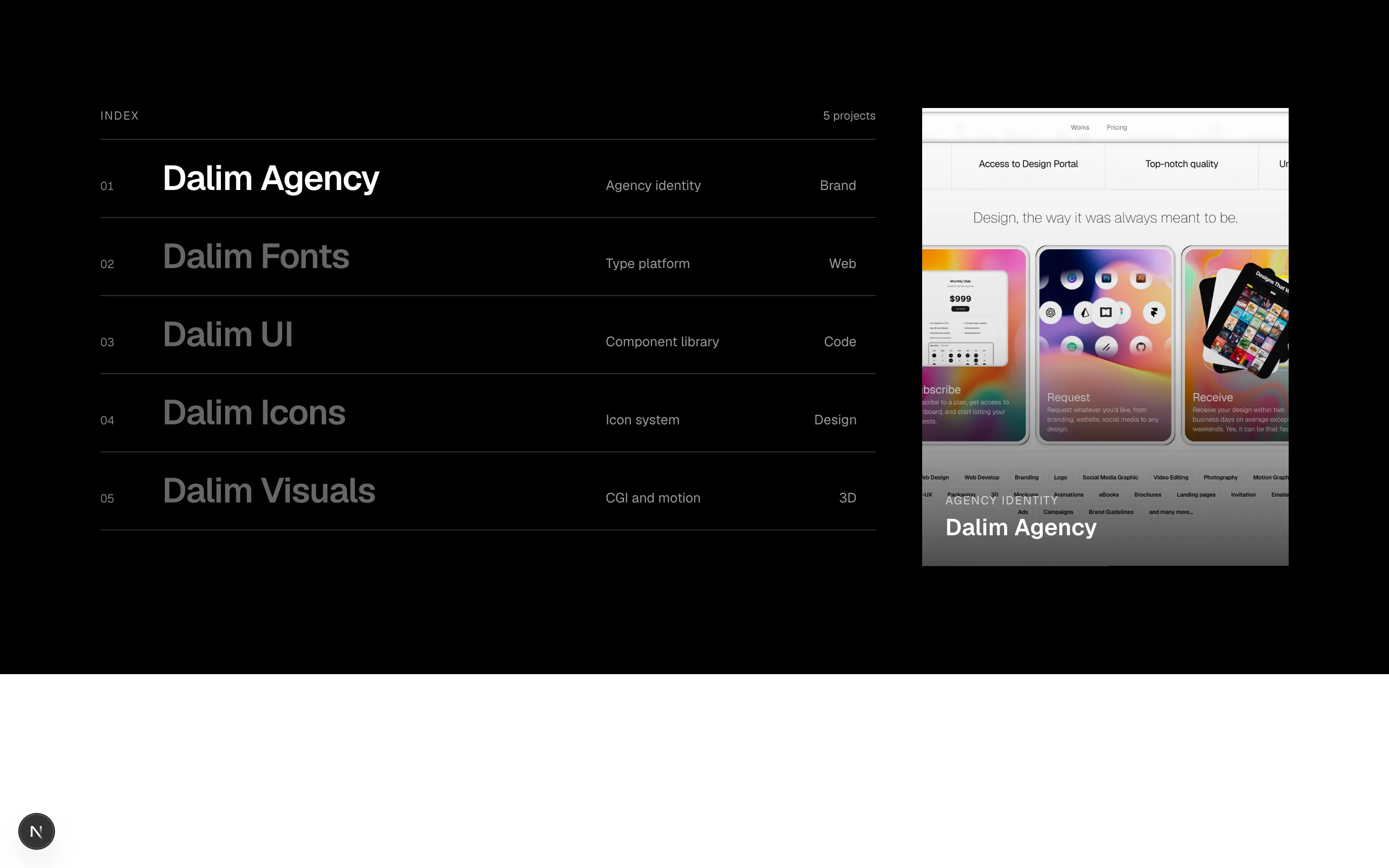
  {
    title: "Dalim Icons",
    kind: "Icon system",
    year: "Design",
    image: "/images/templates/dalim-icons-old.jpg",
  },
  {
    title: "Dalim Visuals",
    kind: "CGI and motion",
    year: "3D",
    image: "/images/templates/dalim-visuals-old.jpg",
  },
]

export function Navigation20() {
  const [hovered, setHovered] = useState(0)

  return (
    <section className="w-full bg-foreground py-20 text-background md:py-28">
      <div className="mx-auto grid max-w-7xl gap-12 px-6 lg:grid-cols-[1fr_380px]">
        <nav aria-label="Selected work">
          <div className="flex items-end justify-between border-b border-background/20 pb-4">
            <p className="text-xs tracking-widest text-background/60 uppercase">Index</p>
            <p className="text-xs text-background/60 tabular-nums">{entries.length} projects</p>
          </div>
          <ul>
            {entries.map((entry, index) => (
              <li key={entry.title} className="border-b border-background/20">
                <a
                  href="#"
                  onMouseEnter={() => setHovered(index)}
                  onFocus={() => setHovered(index)}
                  className="group grid grid-cols-[2rem_1fr_auto] items-baseline gap-4 py-5 md:grid-cols-[3rem_1fr_200px_4rem]"
                >
                  <span className="font-sans text-xs text-background/50 tabular-nums">
                    {String(index + 1).padStart(2, "0")}
                  </span>
                  <span
                    className={cn(
                      "text-2xl font-semibold tracking-tight transition-colors md:text-4xl",
                      hovered === index ? "text-background" : "text-background/40"
                    )}
                  >
                    {entry.title}
                  </span>
                  <span className="hidden text-sm text-background/60 md:block">{entry.kind}</span>
                  <span className="flex items-center justify-end gap-1 text-sm text-background/60 tabular-nums">
                    <span className="hidden sm:inline">{entry.year}</span>
                    <ArrowUpRight className="size-4 opacity-0 transition-opacity group-hover:opacity-100" />
                  </span>
                </a>
              </li>
            ))}
          </ul>
        </nav>

        <div className="relative hidden aspect-[4/5] overflow-hidden lg:block">
          {entries.map((entry, index) => (
            <div
              key={entry.title}
              className={cn(
                "absolute inset-0 flex flex-col justify-end bg-muted p-6 text-white transition-all duration-500",
                hovered === index ? "scale-100 opacity-100" : "scale-105 opacity-0"
              )}
            >
              <img
                src={entry.image}
                alt={`${entry.title} — Designali case study`}
                className="absolute inset-0 size-full object-cover"
              />
              <span className="absolute inset-0 bg-gradient-to-t from-black/70 via-black/10 to-transparent" />
              <p className="relative text-xs tracking-widest uppercase opacity-70">{entry.kind}</p>
              <p className="relative mt-1 text-2xl font-semibold">{entry.title}</p>
            </div>
          ))}
        </div>
      </div>
    </section>
  )
}
Inverted selected work index list whose hovered entry reveals a gradient preview card beside it.
navigation-20