Files
import {
  Blocks,
  Gauge,
  GitBranch,
  Globe,
  KeyRound,
  Layers,
} from "@designali/icons"

import type * as React from "react"

import { BentoGrid, BentoGridItem } from "@/components/ui/bento"
import { CounterNumber } from "@/components/ui/counter-number"

type IconComponent = React.ComponentType<React.SVGProps<SVGSVGElement> & { size?: number | string; strokeWidth?: number }>

const cells: {
  icon: IconComponent
  title: string
  description: string
  colSpan?: 1 | 2
  rowSpan?: 1 | 2
}[] = [
  {
    icon: Gauge,
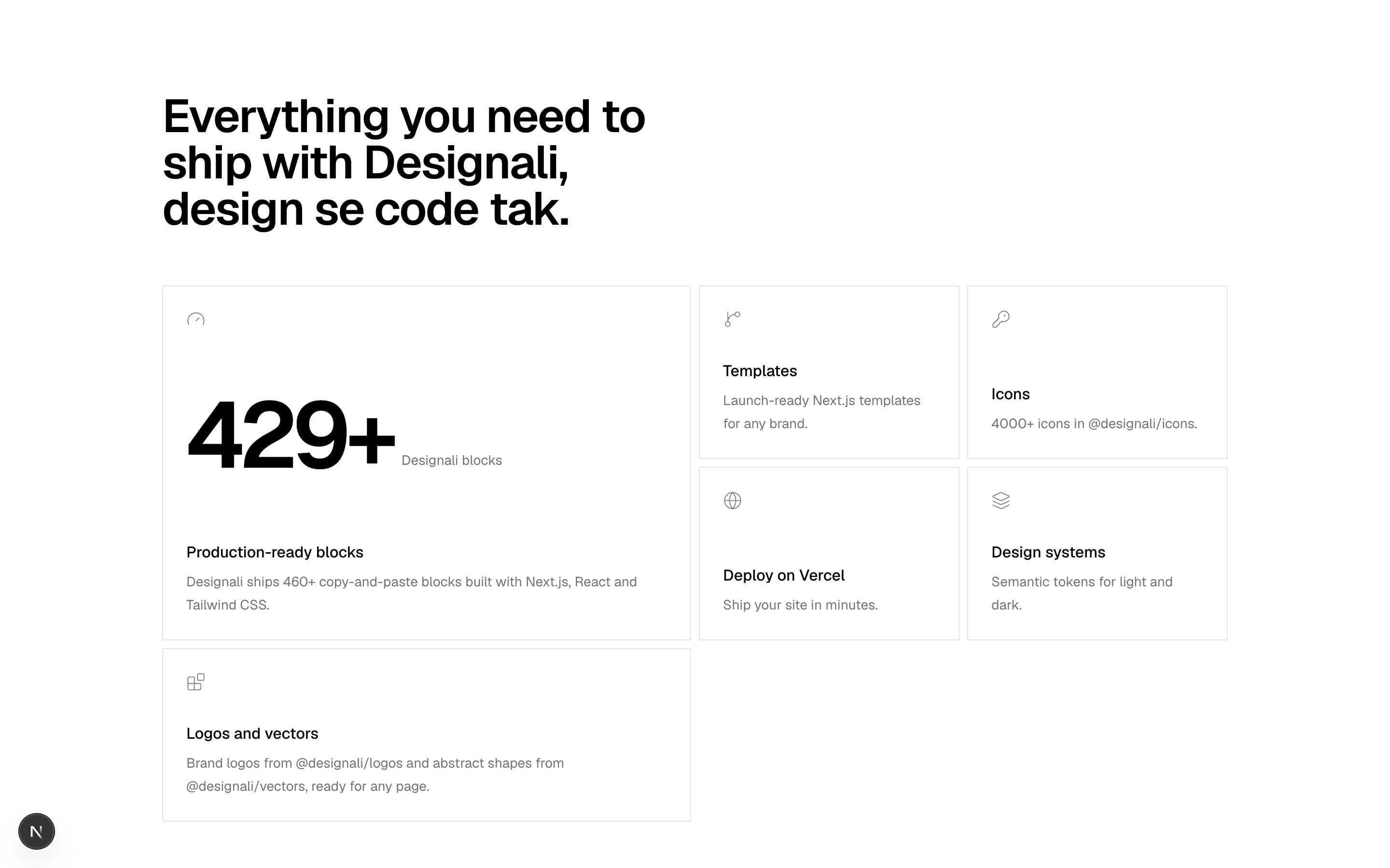
    title: "Production-ready blocks",
    description:
      "Designali ships 460+ copy-and-paste blocks built with Next.js, React and Tailwind CSS.",
    colSpan: 2,
    rowSpan: 2,
  },
  {
    icon: GitBranch,
    title: "Templates",
    description: "Launch-ready Next.js templates for any brand.",
  },
  {
    icon: KeyRound,
    title: "Icons",
    description: "4000+ icons in @designali/icons.",
  },
  {
    icon: Globe,
    title: "Deploy on Vercel",
    description: "Ship your site in minutes.",
  },
  {
    icon: Layers,
    title: "Design systems",
    description: "Semantic tokens for light and dark.",
  },
  {
    icon: Blocks,
    title: "Logos and vectors",
    description:
      "Brand logos from @designali/logos and abstract shapes from @designali/vectors, ready for any page.",
    colSpan: 2,
  },
]

export function Grid01() {
  return (
    <section className="w-full bg-background py-24">
      <div className="mx-auto max-w-6xl px-6">
        <h2 className="max-w-xl text-4xl font-semibold tracking-tight md:text-5xl">
          Everything you need to ship with Designali, design se code tak.
        </h2>

        <BentoGrid
          cols={{ base: 1, md: 4 }}
          gap={2}
          rowHeight="minmax(180px,auto)"
          className="mt-14 h-auto"
        >
          {cells.map((cell, index) => (
            <BentoGridItem
              key={cell.title}
              colSpan={{ base: 1, md: cell.colSpan ?? 1 }}
              rowSpan={{ base: 1, md: cell.rowSpan ?? 1 }}
              className="flex flex-col justify-between p-6"
            >
              <cell.icon className="size-5 text-muted-foreground" />
              {index === 0 && (
                <div className="my-8 flex items-end gap-2">
                  <CounterNumber
                    value={460}
                    suffix="+"
                    size="2xl"
                    className="font-semibold tracking-tighter md:text-8xl"
                  />
                  <span className="mb-3 text-sm text-muted-foreground">Designali blocks</span>
                </div>
              )}
              <div>
                <h3 className="text-base font-medium">{cell.title}</h3>
                <p className="mt-1.5 text-sm leading-6 text-muted-foreground">
                  {cell.description}
                </p>
              </div>
            </BentoGridItem>
          ))}
        </BentoGrid>
      </div>
    </section>
  )
}
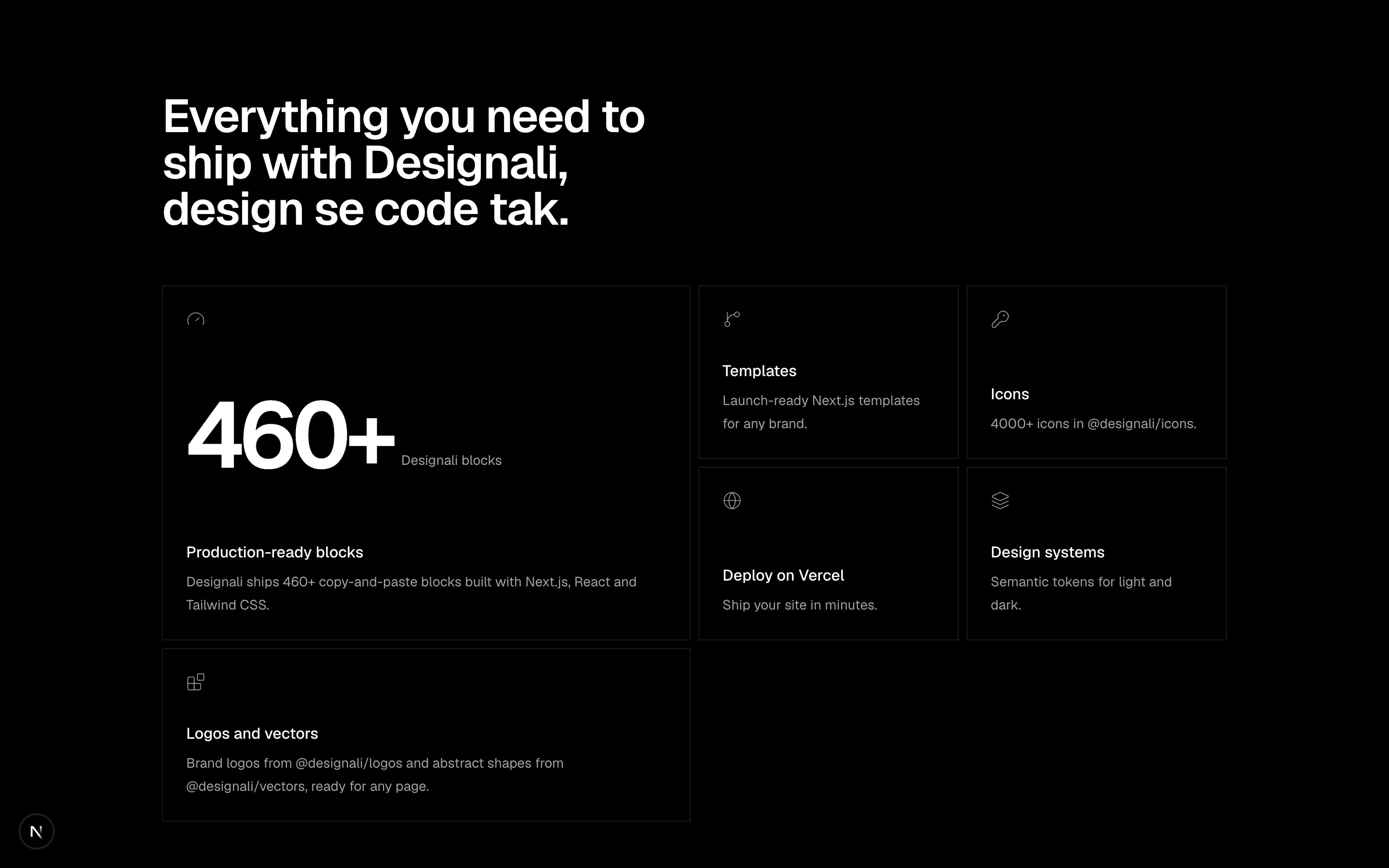
A four-column bordered feature grid with icon cells.
grid-01
Files
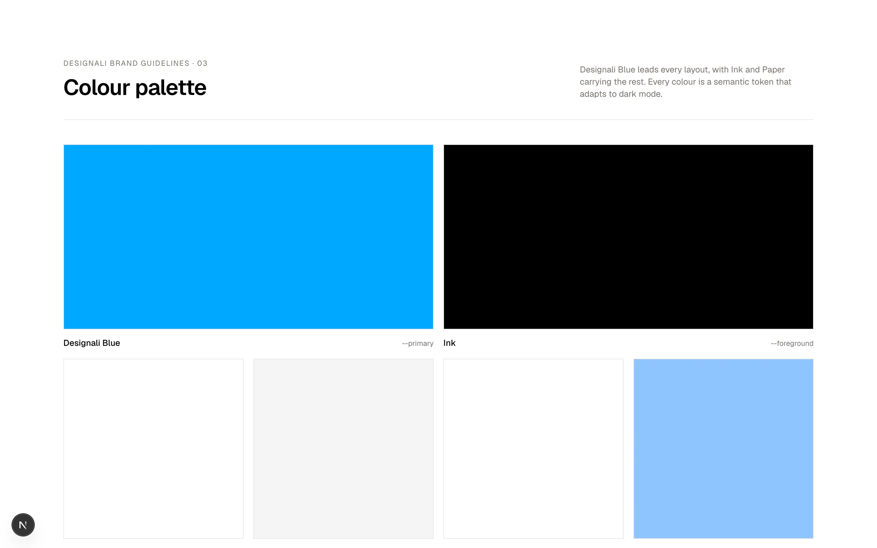
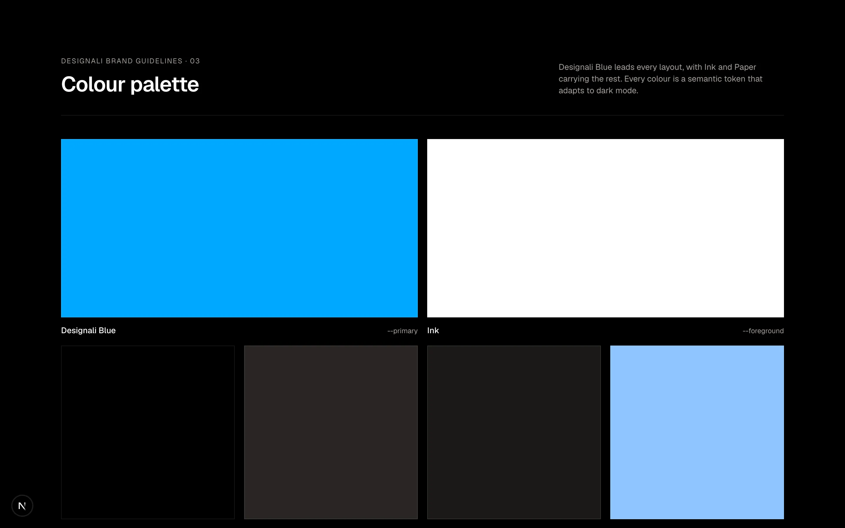
const swatches = [
  { name: "Designali Blue", hex: "--primary", tone: "bg-primary" },
  { name: "Ink", hex: "--foreground", tone: "bg-foreground" },
  { name: "Paper", hex: "--background", tone: "bg-background" },
  { name: "Muted", hex: "--muted", tone: "bg-muted" },
  { name: "Card", hex: "--card", tone: "bg-card" },
  { name: "Chart 1", hex: "--chart-1", tone: "bg-chart-1" },
  { name: "Chart 2", hex: "--chart-2", tone: "bg-chart-2" },
  { name: "Chart 3", hex: "--chart-3", tone: "bg-chart-3" },
]

export function Grid02() {
  return (
    <section className="w-full bg-background py-24">
      <div className="mx-auto max-w-7xl px-6">
        <div className="flex flex-col justify-between gap-4 border-b border-border pb-8 md:flex-row md:items-end">
          <div>
            <p className="text-xs tracking-widest text-muted-foreground uppercase">
              Designali brand guidelines · 03
            </p>
            <h2 className="mt-3 text-4xl font-semibold tracking-tight">Colour palette</h2>
          </div>
          <p className="max-w-sm text-sm text-muted-foreground">
            Designali Blue leads every layout, with Ink and Paper carrying the
            rest. Every colour is a semantic token that adapts to dark mode.
          </p>
        </div>

        <ul className="mt-10 grid grid-cols-2 gap-4 sm:grid-cols-4">
          {swatches.map((swatch, index) => (
            <li
              key={swatch.name}
              className={index < 2 ? "col-span-2 sm:col-span-2" : ""}
            >
              <div
                className={`${swatch.tone} border border-border ${
                  index < 2 ? "aspect-[2/1]" : "aspect-square"
                }`}
              />
              <div className="mt-3 flex items-baseline justify-between">
                <span className="text-sm font-medium">{swatch.name}</span>
                <span className="font-sans text-xs text-muted-foreground">
                  {swatch.hex}
                </span>
              </div>
            </li>
          ))}
        </ul>
      </div>
    </section>
  )
}
A colour palette grid of swatches with token names and values.
grid-02
Files
import {
  ArrowUpRight,
} from "@designali/icons"

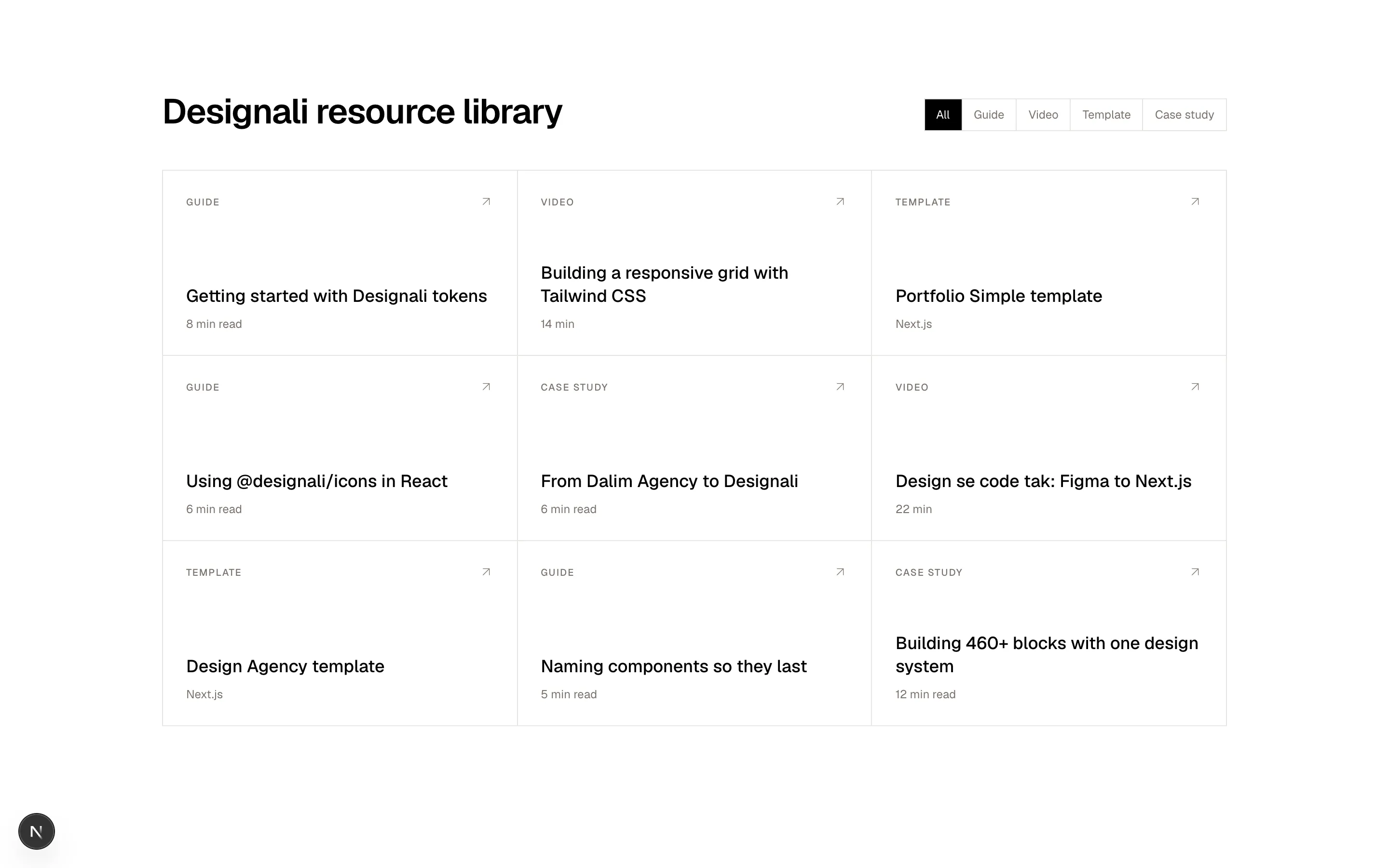
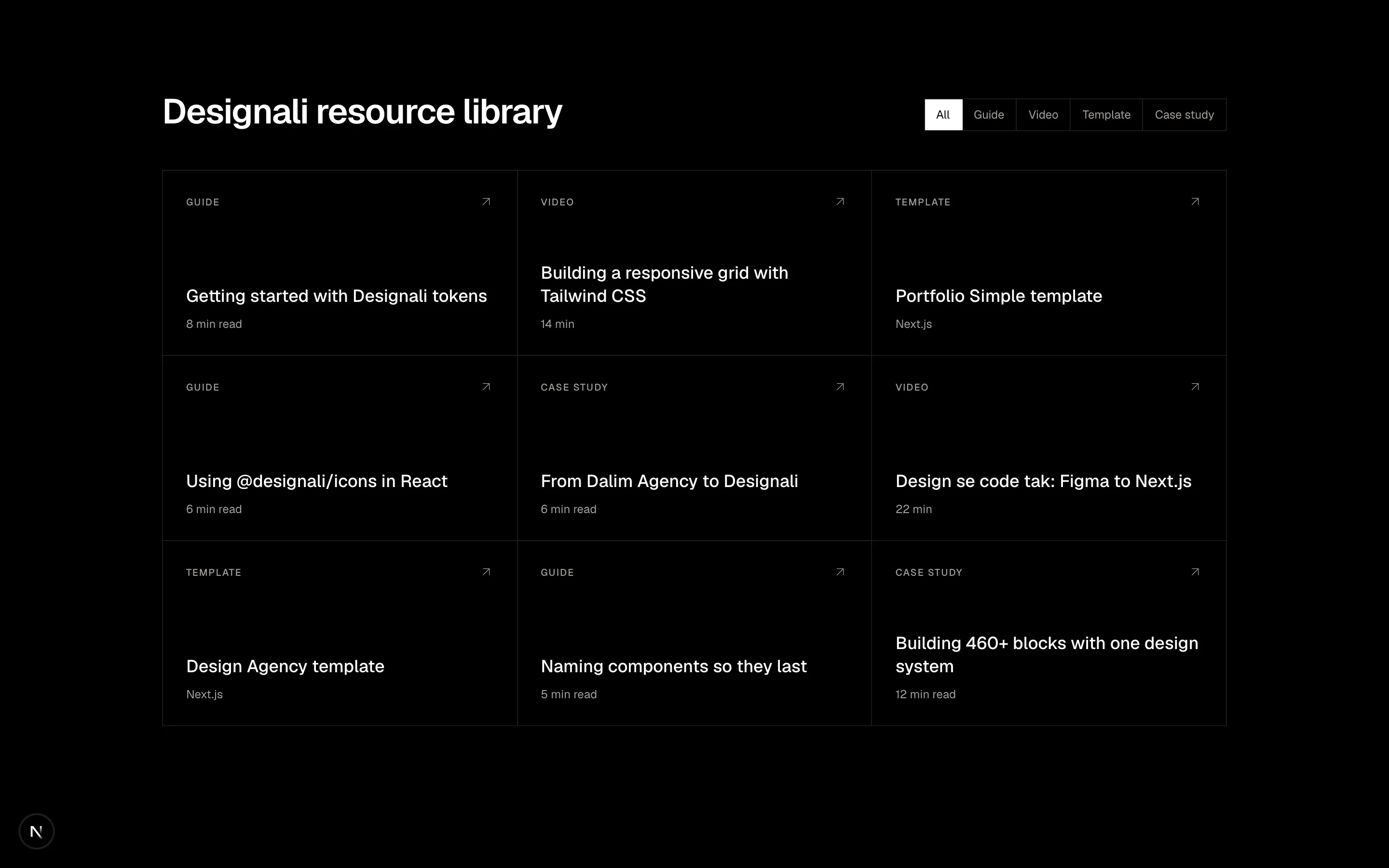
const resources = [
  { type: "Guide", title: "Getting started with Designali tokens", time: "8 min read" },
  { type: "Video", title: "Building a responsive grid with Tailwind CSS", time: "14 min" },
  { type: "Template", title: "Portfolio Simple template", time: "Next.js" },
  { type: "Guide", title: "Using @designali/icons in React", time: "6 min read" },
  { type: "Case study", title: "From Dalim Agency to Designali", time: "6 min read" },
  { type: "Video", title: "Design se code tak: Figma to Next.js", time: "22 min" },
  { type: "Template", title: "Design Agency template", time: "Next.js" },
  { type: "Guide", title: "Naming components so they last", time: "5 min read" },
  { type: "Case study", title: "Building 460+ blocks with one design system", time: "12 min read" },
]

const filters = ["All", "Guide", "Video", "Template", "Case study"]

export function Grid03() {
  return (
    <section className="w-full bg-background py-24">
      <div className="mx-auto max-w-6xl px-6">
        <div className="flex flex-col gap-6 md:flex-row md:items-end md:justify-between">
          <h2 className="text-4xl font-semibold tracking-tight">Designali resource library</h2>
          <nav className="flex flex-wrap border border-border">
            {filters.map((filter, index) => (
              <a
                key={filter}
                href="#"
                className={`border-border px-3 py-2 text-xs not-last:border-r ${
                  index === 0
                    ? "bg-foreground text-background"
                    : "text-muted-foreground hover:bg-muted hover:text-foreground"
                }`}
              >
                {filter}
              </a>
            ))}
          </nav>
        </div>

        <div className="mt-10 grid border-t border-l border-border sm:grid-cols-2 lg:grid-cols-3">
          {resources.map((resource) => (
            <a
              key={resource.title}
              href="#"
              className="group flex min-h-48 flex-col justify-between border-r border-b border-border p-6 transition-colors hover:bg-muted/50"
            >
              <div className="flex items-center justify-between">
                <span className="text-[10px] font-medium tracking-widest text-muted-foreground uppercase">
                  {resource.type}
                </span>
                <ArrowUpRight className="size-4 text-muted-foreground transition-transform group-hover:translate-x-0.5 group-hover:-translate-y-0.5 group-hover:text-foreground" />
              </div>
              <div>
                <h3 className="text-lg leading-snug font-medium">{resource.title}</h3>
                <p className="mt-2 text-xs text-muted-foreground">{resource.time}</p>
              </div>
            </a>
          ))}
        </div>
      </div>
    </section>
  )
}
A filterable resource library grid of cards.
grid-03
Files
import { BentoGrid, BentoGridItem } from "@/components/ui/bento"

const tiles: {
  label: string
  value: string
  colSpan?: 1 | 2
  rowSpan?: 1 | 2
  tone: string
}[] = [
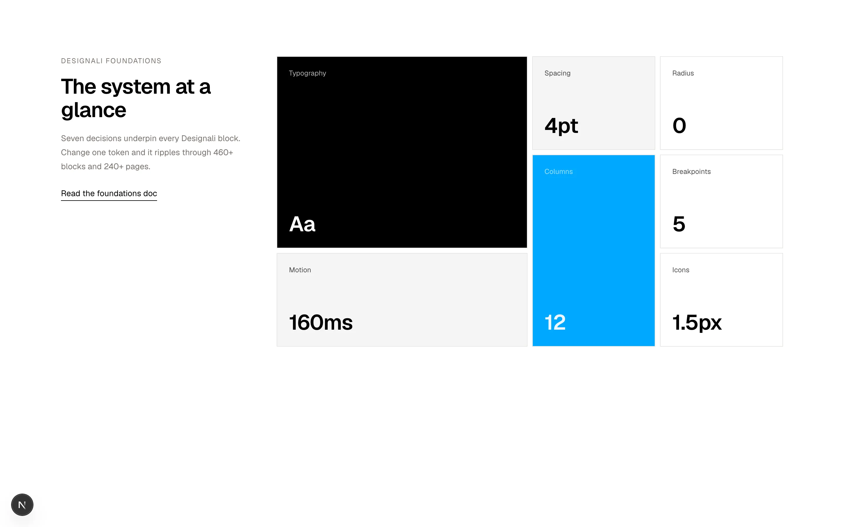
  { label: "Typography", value: "Aa", colSpan: 2, rowSpan: 2, tone: "bg-foreground text-background" },
  { label: "Spacing", value: "4pt", tone: "bg-muted" },
  { label: "Radius", value: "0", tone: "bg-background" },
  { label: "Columns", value: "12", rowSpan: 2, tone: "bg-primary text-primary-foreground" },
  { label: "Breakpoints", value: "5", tone: "bg-background" },
  { label: "Motion", value: "160ms", colSpan: 2, tone: "bg-muted" },
  { label: "Icons", value: "1.5px", tone: "bg-background" },
]

export function Grid04() {
  return (
    <section className="w-full bg-background py-24">
      <div className="mx-auto grid max-w-7xl gap-12 px-6 lg:grid-cols-[320px_1fr]">
        <div className="lg:sticky lg:top-24 lg:self-start">
          <p className="text-xs tracking-widest text-muted-foreground uppercase">
            Designali foundations
          </p>
          <h2 className="mt-4 text-4xl font-semibold tracking-tight">
            The system at a glance
          </h2>
          <p className="mt-4 text-sm leading-6 text-muted-foreground">
            Seven decisions underpin every Designali block. Change one token and
            it ripples through 460+ blocks and 240+ pages.
          </p>
          <a
            href="/docs"
            className="mt-6 inline-block border-b border-foreground pb-0.5 text-sm"
          >
            Read the foundations doc
          </a>
        </div>

        <BentoGrid
          cols={{ base: 2, md: 4 }}
          gap={2}
          rowHeight={{ base: "140px", md: "160px" }}
          className="h-auto"
        >
          {tiles.map((tile) => (
            <BentoGridItem
              key={tile.label}
              colSpan={tile.colSpan ?? 1}
              rowSpan={tile.rowSpan ?? 1}
              className={`flex flex-col justify-between p-5 ${tile.tone}`}
            >
              <span className="text-xs opacity-70">{tile.label}</span>
              <span className="text-3xl font-semibold tracking-tight md:text-4xl">
                {tile.value}
              </span>
            </BentoGridItem>
          ))}
        </BentoGrid>
      </div>
    </section>
  )
}
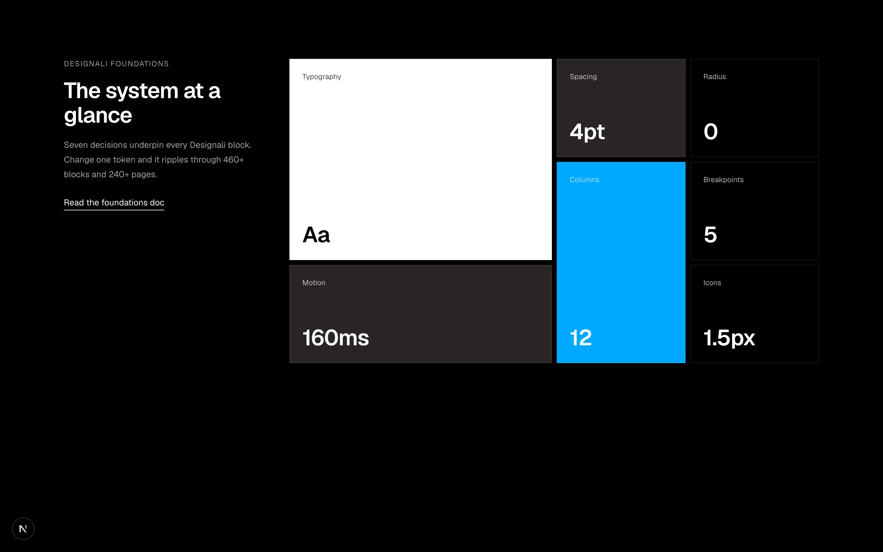
A sticky heading beside a grid of design system statistics.
grid-04
Files
import {
  ClaudeAI,
  Cursor,
  Figma,
  Github,
  Nextjs,
  Notion,
  OpenAI,
  ReactLib,
  Stripe,
  TailwindCSS,
  TypeScript,
  Vercel,
} from "@designali/logos"

const integrations = [
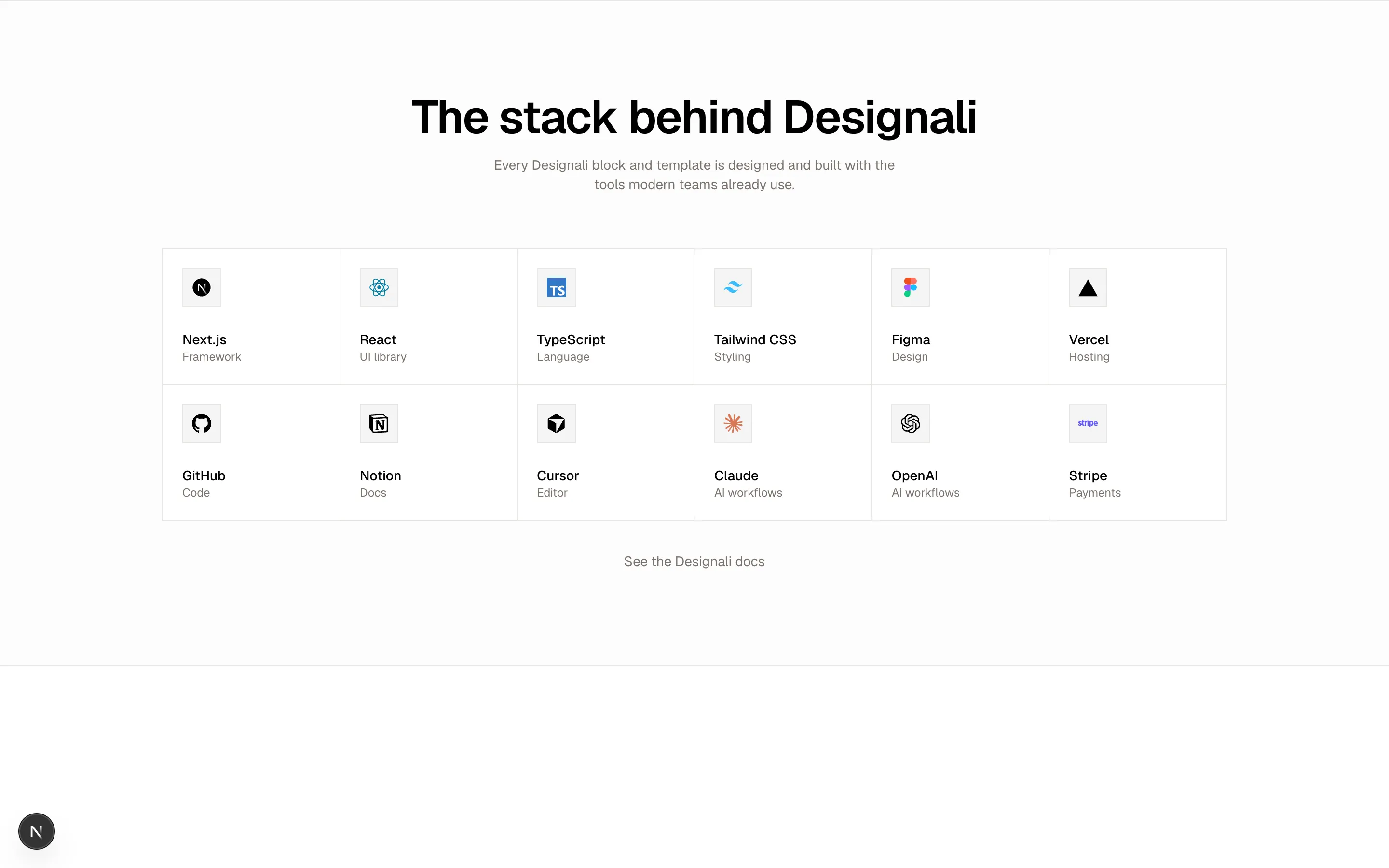
  { name: "Next.js", category: "Framework", logo: Nextjs },
  { name: "React", category: "UI library", logo: ReactLib },
  { name: "TypeScript", category: "Language", logo: TypeScript },
  { name: "Tailwind CSS", category: "Styling", logo: TailwindCSS },
  { name: "Figma", category: "Design", logo: Figma },
  { name: "Vercel", category: "Hosting", logo: Vercel },
  { name: "GitHub", category: "Code", logo: Github },
  { name: "Notion", category: "Docs", logo: Notion },
  { name: "Cursor", category: "Editor", logo: Cursor },
  { name: "Claude", category: "AI workflows", logo: ClaudeAI },
  { name: "OpenAI", category: "AI workflows", logo: OpenAI },
  { name: "Stripe", category: "Payments", logo: Stripe },
]

export function Grid05() {
  return (
    <section className="w-full border-y border-border bg-muted/30 py-24">
      <div className="mx-auto max-w-6xl px-6 text-center">
        <h2 className="text-4xl font-semibold tracking-tight md:text-5xl">
          The stack behind Designali
        </h2>
        <p className="mx-auto mt-4 max-w-md text-sm text-muted-foreground">
          Every Designali block and template is designed and built with the
          tools modern teams already use.
        </p>

        <ul className="mt-14 grid grid-cols-2 gap-px border border-border bg-border text-left sm:grid-cols-3 lg:grid-cols-6">
          {integrations.map((item) => (
            <li
              key={item.name}
              className="group flex flex-col gap-6 bg-background p-5 transition-colors hover:bg-muted"
            >
              <span className="flex size-10 items-center justify-center border border-border bg-muted">
                <item.logo size={20} />
              </span>
              <div>
                <p className="text-sm font-medium">{item.name}</p>
                <p className="text-xs text-muted-foreground">{item.category}</p>
              </div>
            </li>
          ))}
        </ul>

        <a
          href="/docs"
          className="mt-8 inline-block text-sm text-muted-foreground underline-offset-4 hover:text-foreground hover:underline"
        >
          See the Designali docs
        </a>
      </div>
    </section>
  )
}
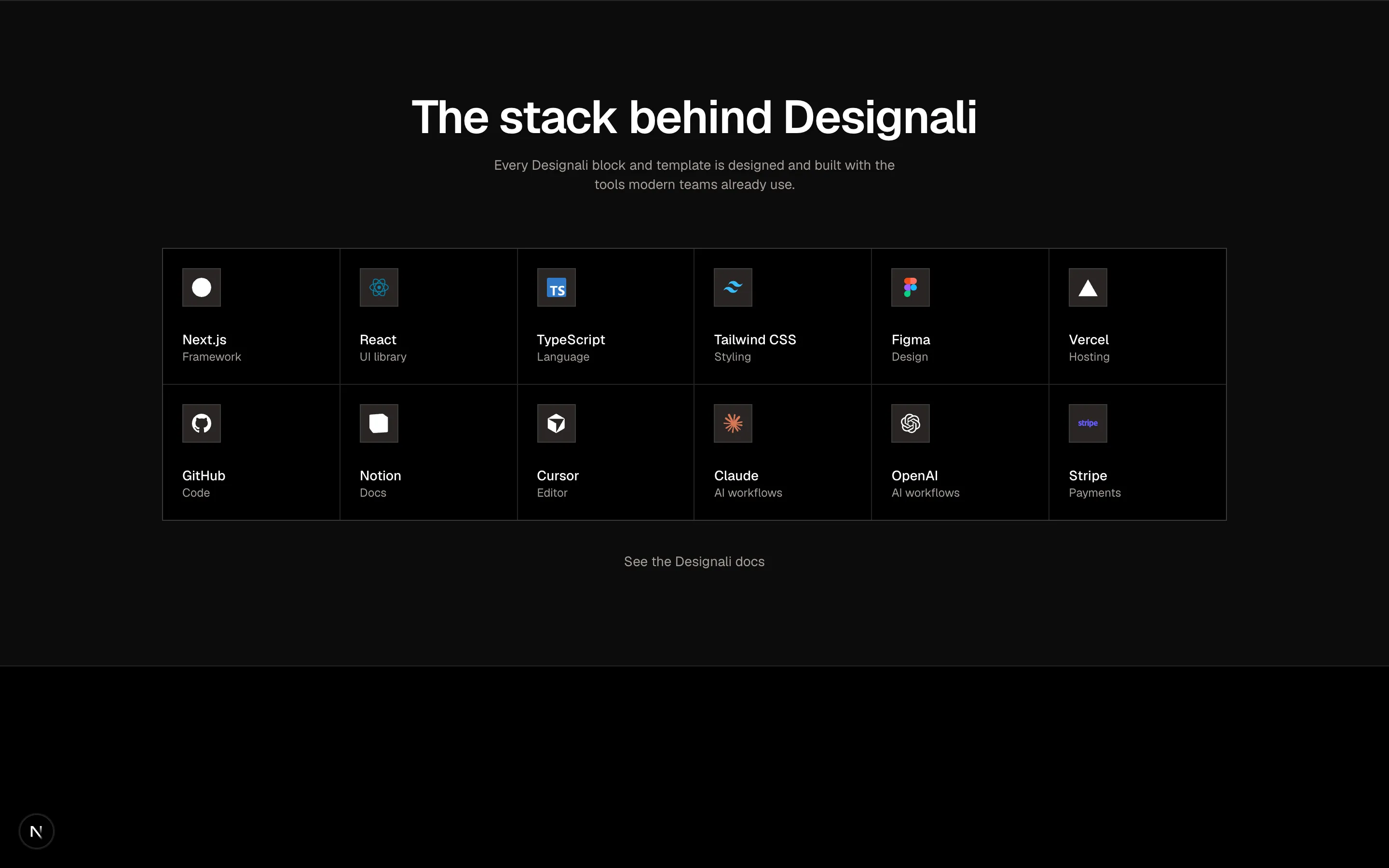
An integrations grid of tool tiles in six columns.
grid-05
Files
import { DotPattern } from "@/components/ui/dot-pattern"

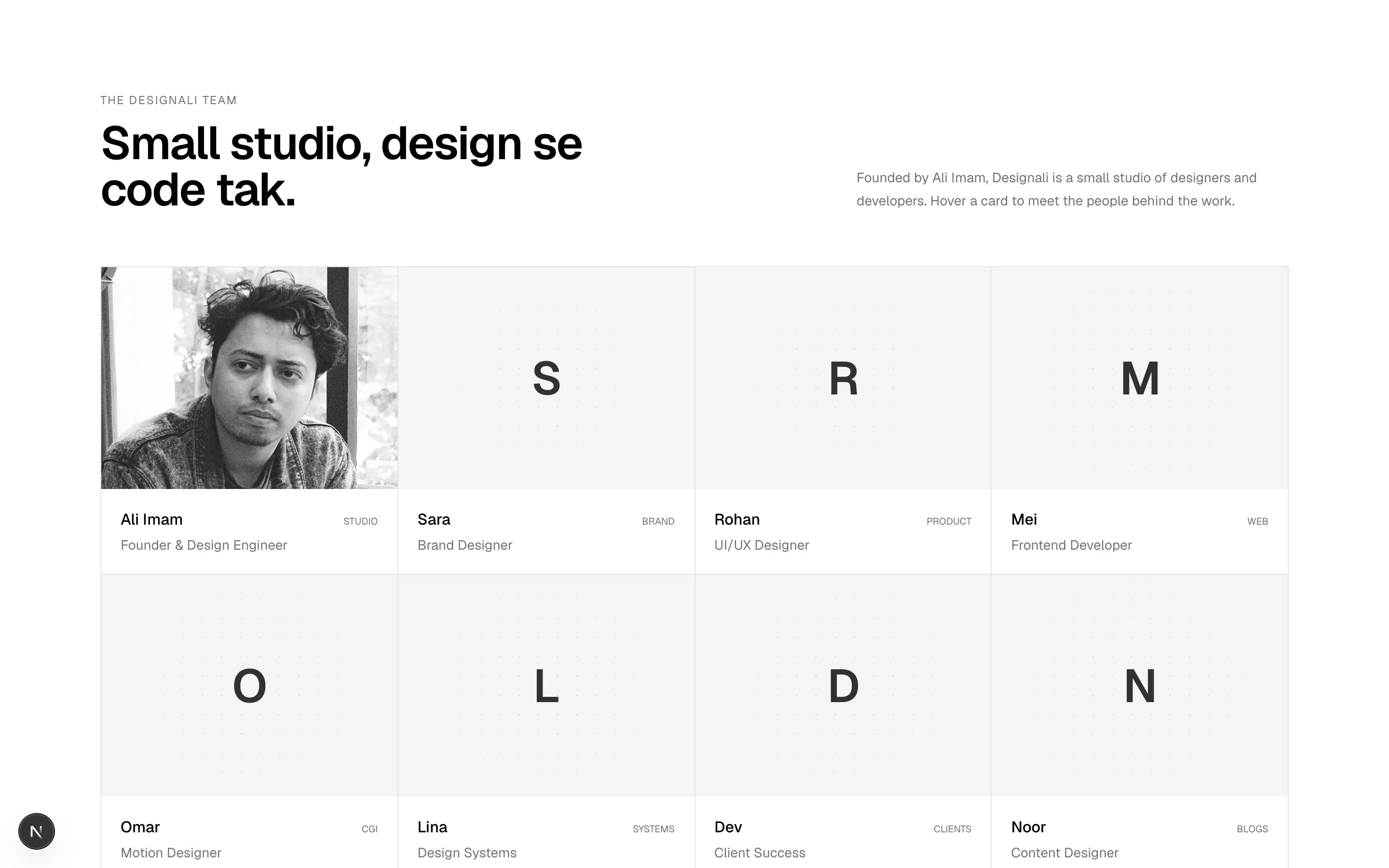
const team = [
  { name: "Ali Imam", role: "Founder & Design Engineer", city: "Studio", bio: "Designs and codes every Designali product. Design se code tak." },
  { name: "Sara", role: "Brand Designer", city: "Brand", bio: "Logos, type and colour systems for Designali client projects." },
  { name: "Rohan", role: "UI/UX Designer", city: "Product", bio: "Turns briefs into intuitive interfaces and clickable prototypes in Figma." },
  { name: "Mei", role: "Frontend Developer", city: "Web", bio: "Ships Next.js and Tailwind CSS builds with clean, typed components." },
  { name: "Omar", role: "Motion Designer", city: "CGI", bio: "CGI, 3D and motion for brand launches and landing page heroes." },
  { name: "Lina", role: "Design Systems", city: "Systems", bio: "Keeps tokens, components and Figma libraries in sync across 460+ blocks." },
  { name: "Dev", role: "Client Success", city: "Clients", bio: "First point of contact for Designali clients at hello@designali.com." },
  { name: "Noor", role: "Content Designer", city: "Blogs", bio: "Writes the docs and the Designali blog, and answers support emails." },
]

function initials(name: string) {
  return name
    .split(" ")
    .map((part) => part[0])
    .join("")
}

export function Grid06() {
  return (
    <section className="w-full bg-background py-24">
      <div className="mx-auto max-w-7xl px-6">
        <div className="grid gap-6 md:grid-cols-2 md:items-end">
          <div>
            <p className="text-xs tracking-widest text-muted-foreground uppercase">The Designali team</p>
            <h2 className="mt-3 text-4xl font-semibold tracking-tight md:text-5xl">
              Small studio, design se code tak.
            </h2>
          </div>
          <p className="max-w-md text-sm leading-6 text-muted-foreground md:justify-self-end">
            Founded by Ali Imam, Designali is a small studio of designers and
            developers. Hover a card to meet the people behind the work.
          </p>
        </div>

        <ul className="mt-14 grid grid-cols-1 gap-px border border-border bg-border sm:grid-cols-2 lg:grid-cols-4">
          {team.map((person) => (
            <li key={person.name} className="group relative overflow-hidden bg-background">
              <div className="relative flex aspect-[4/3] items-center justify-center overflow-hidden bg-muted">
                {person.name === "Ali Imam" ? (
                  <img
                    src="/ali.jpg"
                    alt="Ali Imam"
                    className="absolute inset-0 size-full object-cover"
                  />
                ) : (
                  <>
                    <DotPattern className="text-muted-foreground/60 [mask-image:radial-gradient(circle_at_center,white,transparent_75%)]" />
                    <span className="relative text-5xl font-semibold tracking-tight text-foreground/80">
                      {initials(person.name)}
                    </span>
                  </>
                )}
              </div>
              <div className="p-5">
                <div className="flex items-baseline justify-between gap-3">
                  <h3 className="font-medium">{person.name}</h3>
                  <span className="font-sans text-[10px] text-muted-foreground uppercase">
                    {person.city}
                  </span>
                </div>
                <p className="mt-1 text-sm text-muted-foreground">{person.role}</p>
              </div>
              <div className="absolute inset-x-0 bottom-0 translate-y-full bg-foreground p-5 text-background transition-transform duration-300 group-hover:translate-y-0">
                <p className="text-xs tracking-widest uppercase opacity-60">{person.role}</p>
                <p className="mt-2 text-sm leading-6">{person.bio}</p>
              </div>
            </li>
          ))}
        </ul>
      </div>
    </section>
  )
}
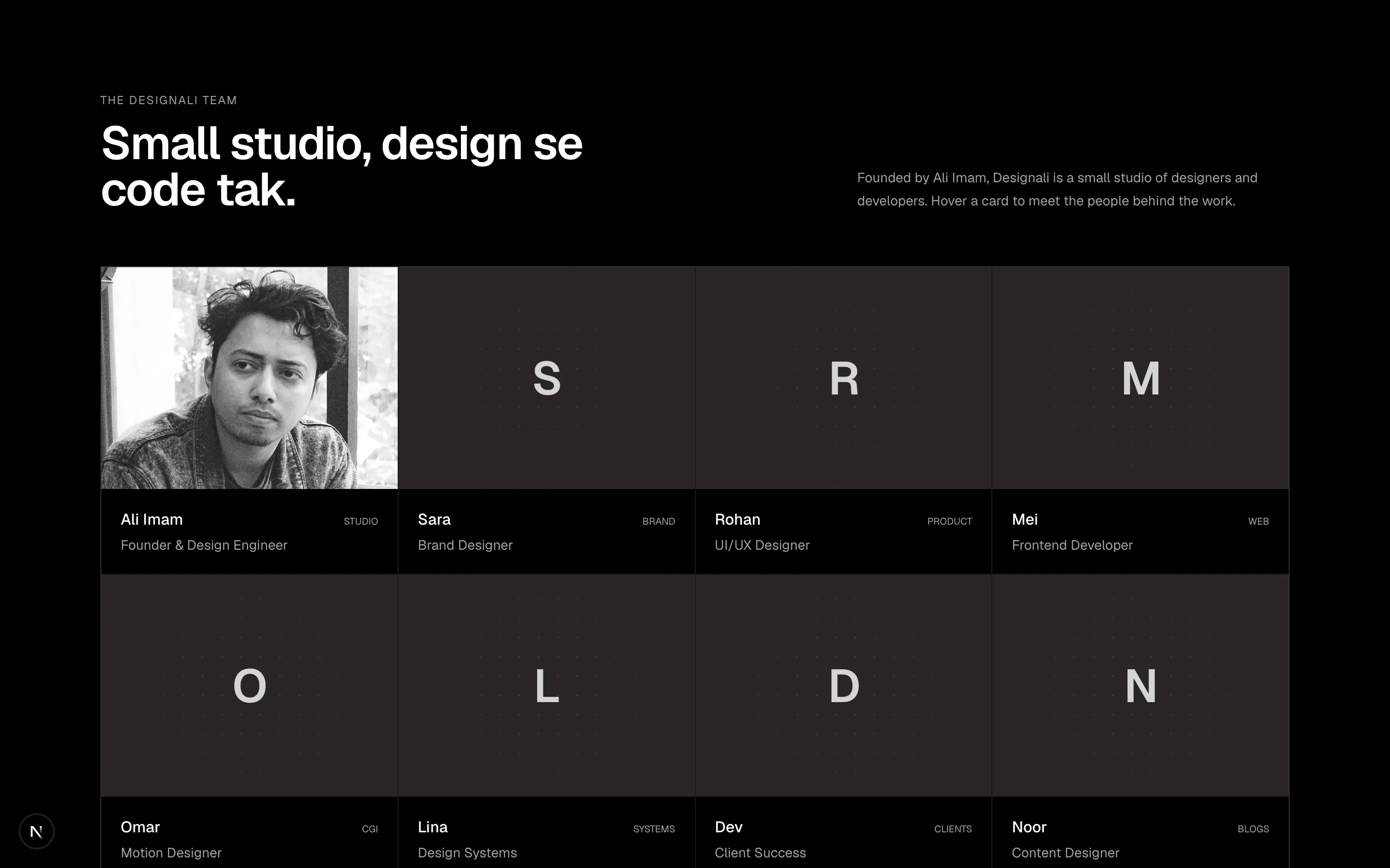
Team member grid with gradient initials portraits and a bio panel that slides up on hover.
grid-06
Files
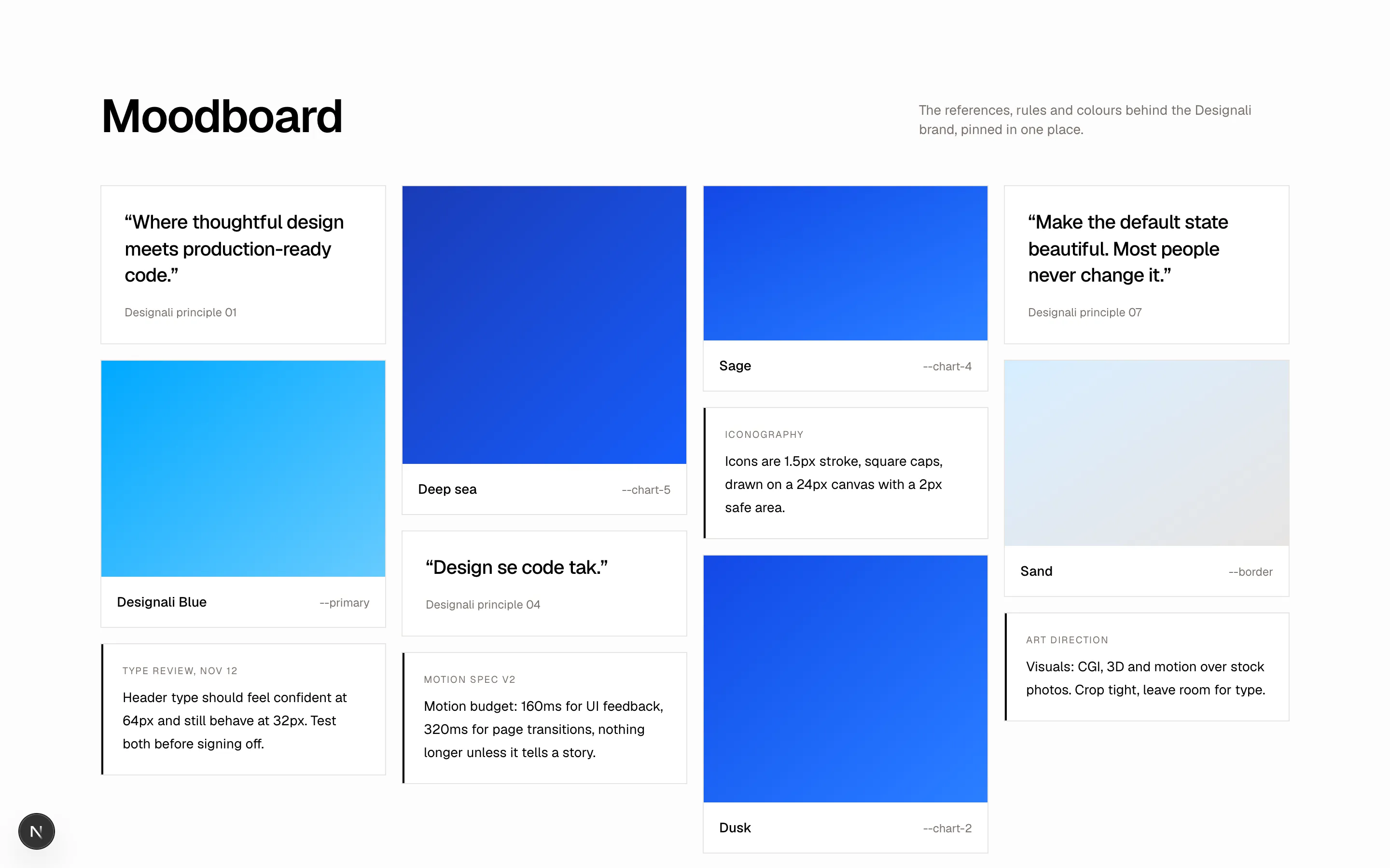
const notes = [
{ kind: "quote", text: "Where thoughtful design meets production-ready code.", meta: "Designali principle 01" },
{ kind: "swatch", text: "Designali Blue", meta: "--primary", tone: "from-primary to-primary/60", h: "h-56" },
{ kind: "note", text: "Header type should feel confident at 64px and still behave at 32px. Test both before signing off.", meta: "Type review, Nov 12" },
{ kind: "swatch", text: "Deep sea", meta: "--chart-5", tone: "from-chart-5 to-chart-3", h: "h-72" },
{ kind: "quote", text: "Design se code tak.", meta: "Designali principle 04" },
{ kind: "note", text: "Motion budget: 160ms for UI feedback, 320ms for page transitions, nothing longer unless it tells a story.", meta: "Motion spec v2" },
{ kind: "swatch", text: "Sage", meta: "--chart-4", tone: "from-chart-4 to-chart-2", h: "h-40" },
{ kind: "note", text: "Icons are 1.5px stroke, square caps, drawn on a 24px canvas with a 2px safe area.", meta: "Iconography" },
{ kind: "swatch", text: "Dusk", meta: "--chart-2", tone: "from-chart-4 to-chart-2", h: "h-64" },
{ kind: "quote", text: "Make the default state beautiful. Most people never change it.", meta: "Designali principle 07" },
{ kind: "swatch", text: "Sand", meta: "--border", tone: "from-primary/20 to-border", h: "h-48" },
{ kind: "note", text: "Visuals: CGI, 3D and motion over stock photos. Crop tight, leave room for type.", meta: "Art direction" },
]
export function Grid07() {
return (
<section className="w-full bg-muted/30 py-24">
<div className="mx-auto max-w-7xl px-6">
<div className="flex flex-col justify-between gap-4 md:flex-row md:items-end">
<h2 className="text-4xl font-semibold tracking-tight md:text-5xl">Moodboard</h2>
<p className="max-w-sm text-sm text-muted-foreground">
The references, rules and colours behind the Designali brand,
pinned in one place.
</p>
</div>
<div className="mt-12 columns-1 gap-4 sm:columns-2 lg:columns-4">
{notes.map((note) => (
<figure
key={note.text}
className="mb-4 break-inside-avoid border border-border bg-background"
>
{note.kind === "swatch" ? (
<>
<div className={`bg-gradient-to-br ${note.tone} ${note.h}`} />
<figcaption className="flex items-baseline justify-between p-4">
<span className="text-sm font-medium">{note.text}</span>
<span className="font-sans text-xs text-muted-foreground">{note.meta}</span>
</figcaption>
</>
) : note.kind === "quote" ? (
<blockquote className="p-6">
<p className="text-xl leading-snug font-medium tracking-tight">
“{note.text}”
</p>
<footer className="mt-4 text-xs text-muted-foreground">{note.meta}</footer>
</blockquote>
) : (
<div className="border-l-2 border-foreground p-5">
<p className="text-[10px] tracking-widest text-muted-foreground uppercase">
{note.meta}
</p>
<p className="mt-2 text-sm leading-6">{note.text}</p>
</div>
)}
</figure>
))}
</div>
</div>
</section>
)
}
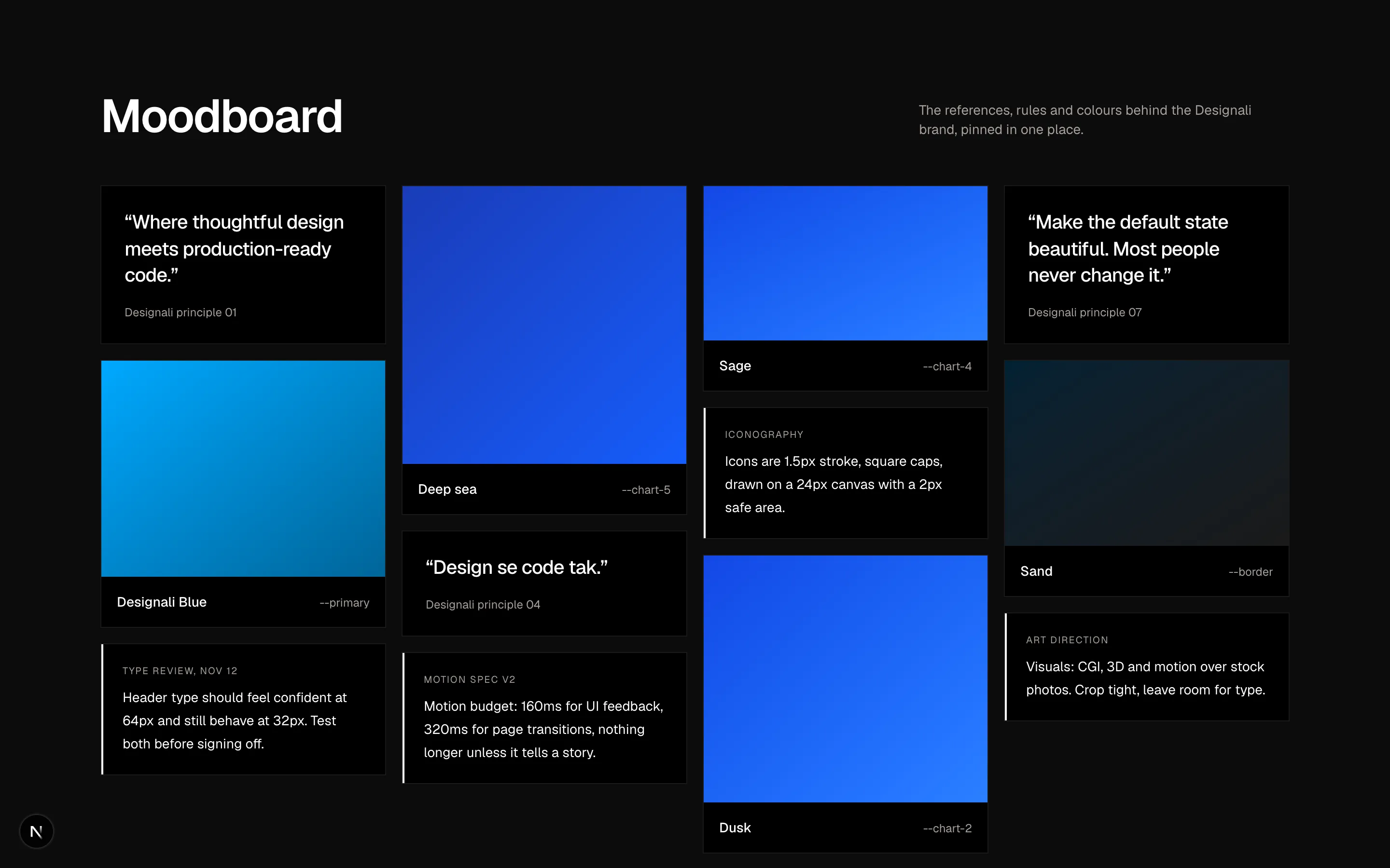
Masonry moodboard mixing colour swatches, pull quotes and design notes in CSS columns.
grid-07
Files
import {
  ArrowDownRight,
  ArrowUpRight,
} from "@designali/icons"

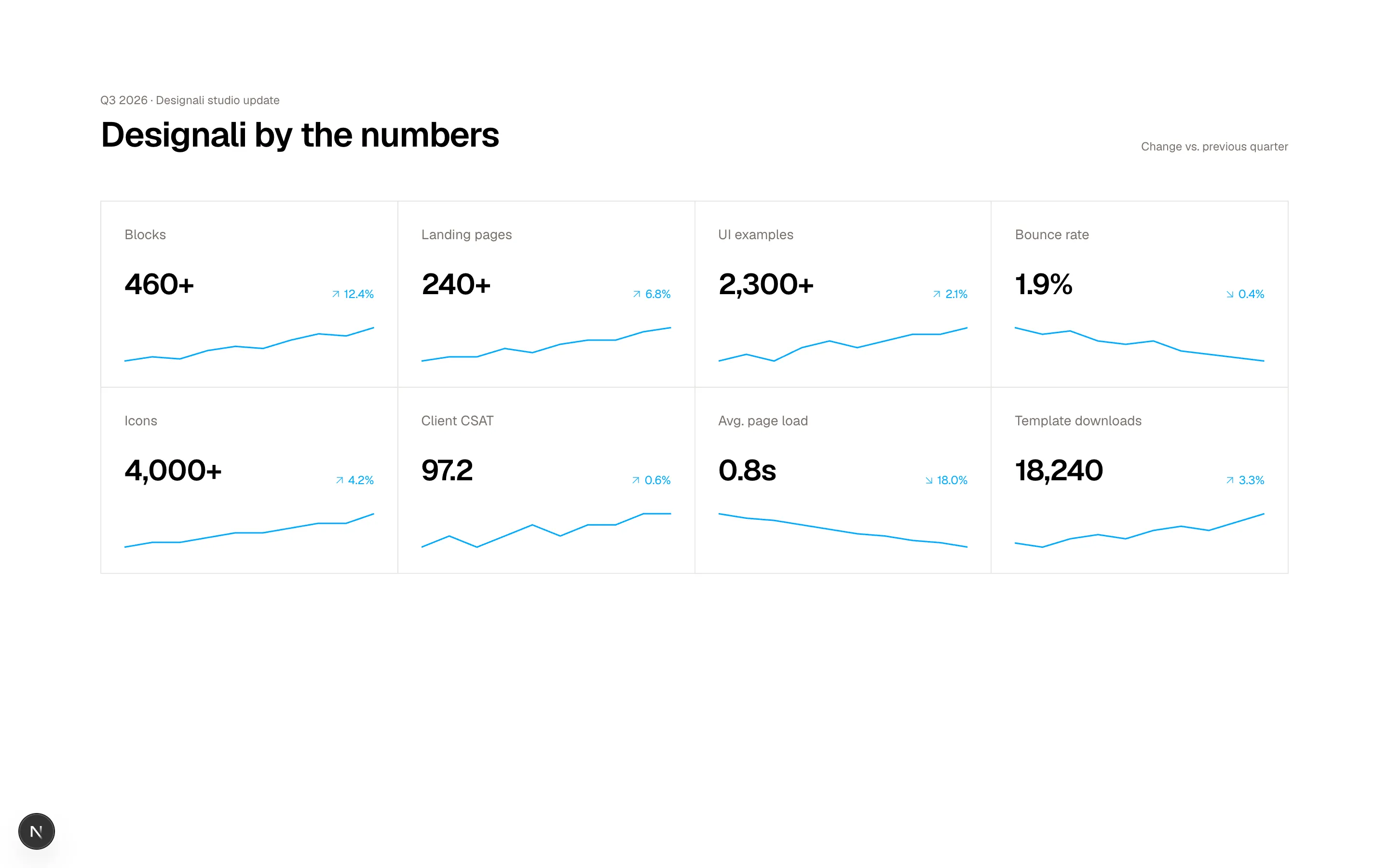
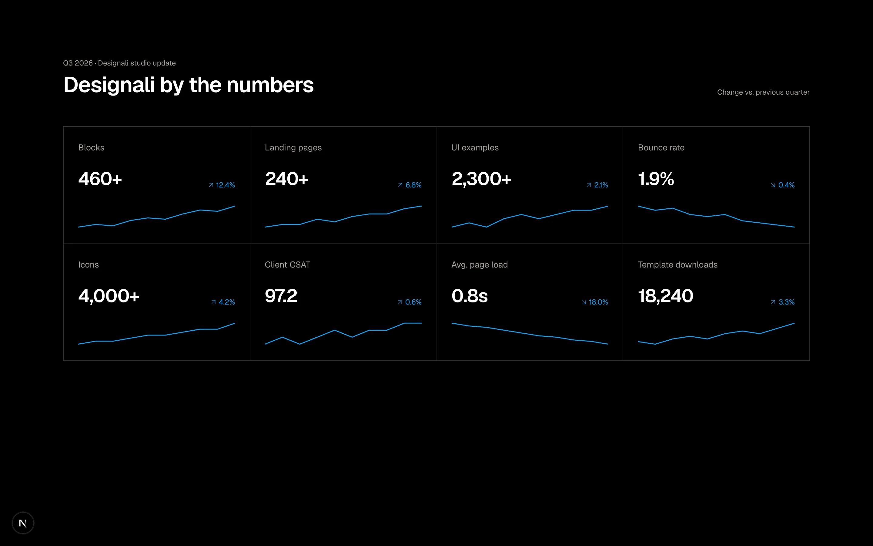
const metrics = [
  { label: "Blocks", value: "460+", change: 12.4, points: [12, 14, 13, 17, 19, 18, 22, 25, 24, 28] },
  { label: "Landing pages", value: "240+", change: 6.8, points: [20, 21, 21, 23, 22, 24, 25, 25, 27, 28] },
  { label: "UI examples", value: "2,300+", change: 2.1, points: [18, 19, 18, 20, 21, 20, 21, 22, 22, 23] },
  { label: "Bounce rate", value: "1.9%", change: -0.4, points: [26, 24, 25, 22, 21, 22, 19, 18, 17, 16] },
  { label: "Icons", value: "4,000+", change: 4.2, points: [14, 15, 15, 16, 17, 17, 18, 19, 19, 21] },
  { label: "Client CSAT", value: "97.2", change: 0.6, points: [22, 23, 22, 23, 24, 23, 24, 24, 25, 25] },
  { label: "Avg. page load", value: "0.8s", change: -18.0, points: [28, 26, 25, 23, 21, 19, 18, 16, 15, 13] },
  { label: "Template downloads", value: "18,240", change: 3.3, points: [15, 14, 16, 17, 16, 18, 19, 18, 20, 22] },
]

function sparkline(points: number[]) {
  const max = Math.max(...points)
  const min = Math.min(...points)
  const range = max - min || 1
  return points
    .map((p, i) => `${(i / (points.length - 1)) * 100},${30 - ((p - min) / range) * 26 - 2}`)
    .join(" ")
}

export function Grid08() {
  return (
    <section className="w-full bg-background py-24">
      <div className="mx-auto max-w-7xl px-6">
        <div className="flex flex-wrap items-end justify-between gap-4">
          <div>
            <p className="font-sans text-xs text-muted-foreground">Q3 2026 · Designali studio update</p>
            <h2 className="mt-2 text-4xl font-semibold tracking-tight">Designali by the numbers</h2>
          </div>
          <p className="text-xs text-muted-foreground">Change vs. previous quarter</p>
        </div>

        <dl className="mt-12 grid grid-cols-1 gap-px border border-border bg-border sm:grid-cols-2 lg:grid-cols-4">
          {metrics.map((metric) => {
            const goodWhenDown = metric.label === "Bounce rate" || metric.label === "Avg. page load"
            const positive = goodWhenDown ? metric.change < 0 : metric.change > 0
            const Arrow = metric.change > 0 ? ArrowUpRight : ArrowDownRight
            return (
              <div key={metric.label} className="flex flex-col gap-6 bg-background p-6">
                <dt className="text-sm text-muted-foreground">{metric.label}</dt>
                <dd className="flex items-end justify-between gap-4">
                  <span className="text-3xl font-semibold tracking-tight">{metric.value}</span>
                  <span
                    className={`inline-flex items-center gap-0.5 font-sans text-xs ${
                      positive
                        ? "text-primary dark:text-primary"
                        : "text-primary dark:text-primary"
                    }`}
                  >
                    <Arrow className="size-3.5" />
                    {Math.abs(metric.change).toFixed(1)}%
                  </span>
                </dd>
                <svg viewBox="0 0 100 30" preserveAspectRatio="none" className="h-10 w-full" aria-hidden>
                  <polyline
                    points={sparkline(metric.points)}
                    fill="none"
                    stroke="currentColor"
                    strokeWidth="1.5"
                    vectorEffect="non-scaling-stroke"
                    className={positive ? "text-primary" : "text-primary"}
                  />
                </svg>
              </div>
            )
          })}
        </dl>
      </div>
    </section>
  )
}
Bordered KPI grid with big values, trend deltas and inline SVG sparklines.
grid-08
Files
import {
  ArrowRight,
} from "@designali/icons"

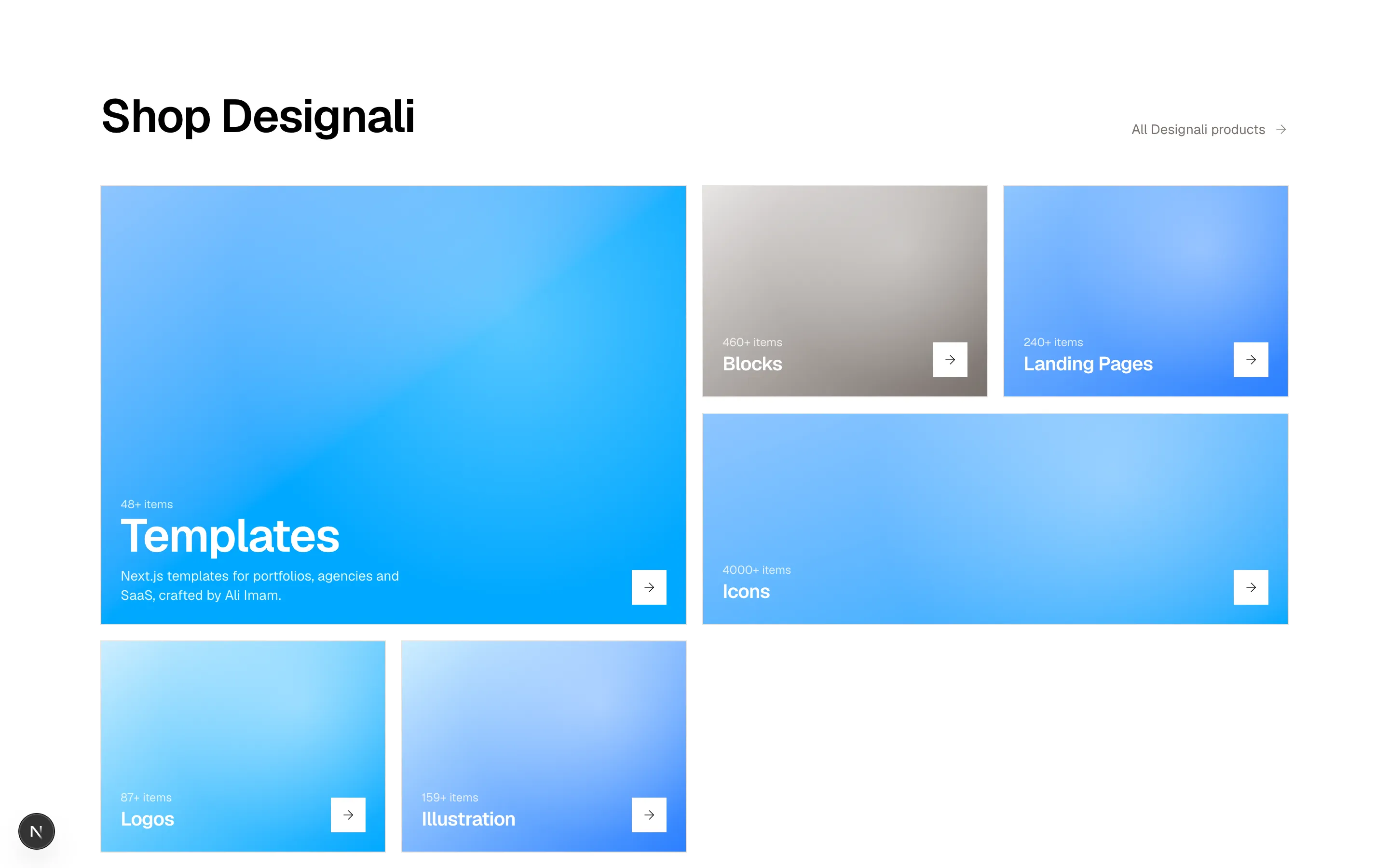
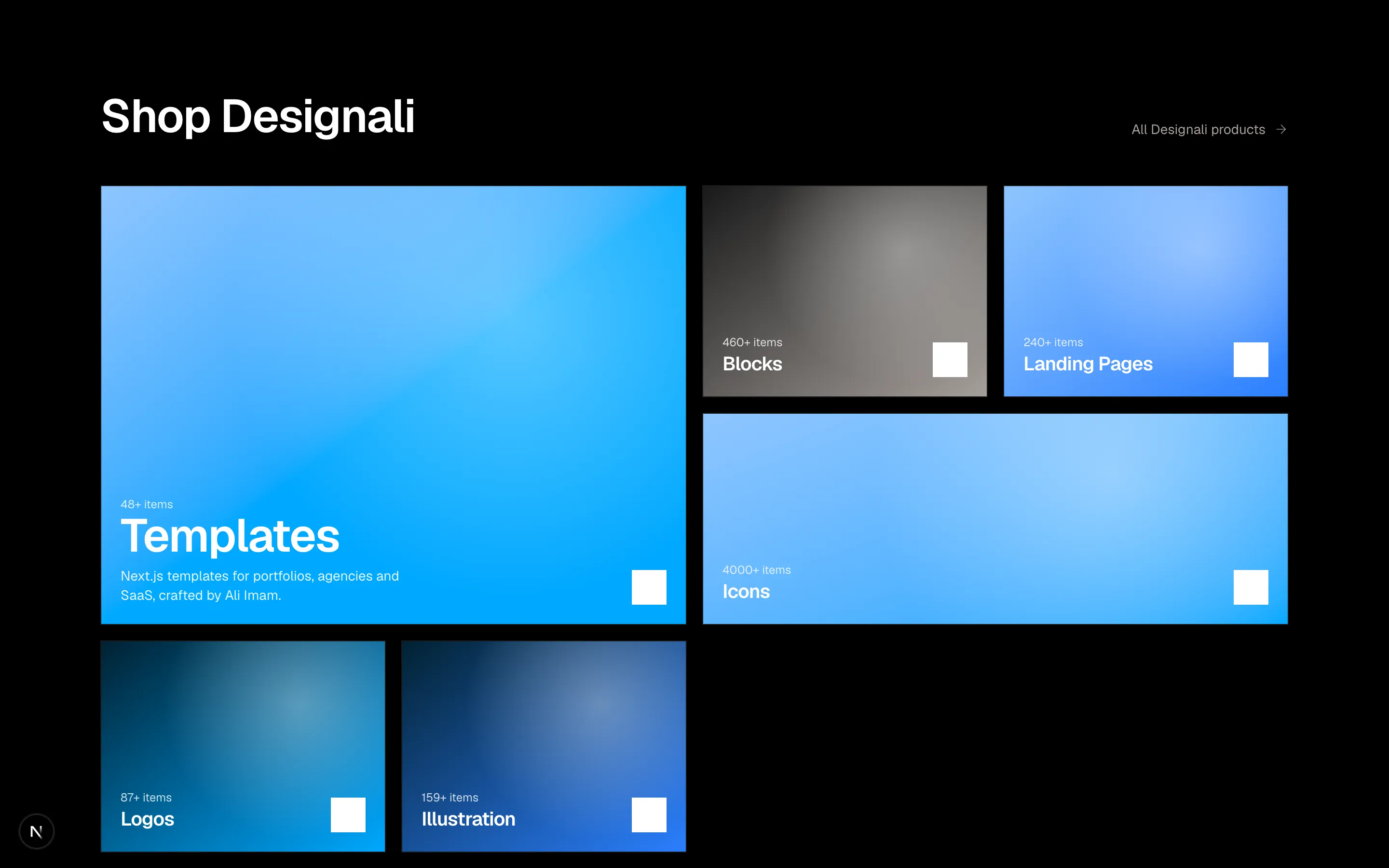
const categories = [
  { name: "Templates", count: 48, tone: "from-chart-1 via-primary to-primary", className: "sm:col-span-2 sm:row-span-2", feature: true },
  { name: "Blocks", count: 460, tone: "from-border to-muted-foreground", className: "" },
  { name: "Landing Pages", count: 240, tone: "from-chart-1 to-chart-2", className: "" },
  { name: "Icons", count: 4000, tone: "from-chart-1 to-primary", className: "sm:col-span-2" },
  { name: "Logos", count: 87, tone: "from-primary/20 to-primary", className: "" },
  { name: "Illustration", count: 159, tone: "from-primary/20 to-chart-2", className: "" },
]

export function Grid09() {
  return (
    <section className="w-full bg-background py-24">
      <div className="mx-auto max-w-7xl px-6">
        <div className="flex items-end justify-between gap-6">
          <h2 className="text-4xl font-semibold tracking-tight md:text-5xl">Shop Designali</h2>
          <a href="#" className="hidden items-center gap-2 text-sm text-muted-foreground hover:text-foreground sm:inline-flex">
            All Designali products <ArrowRight className="size-4" />
          </a>
        </div>

        <div className="mt-12 grid auto-rows-[200px] grid-cols-1 gap-4 sm:grid-cols-4 md:auto-rows-[220px]">
          {categories.map((category) => (
            <a
              key={category.name}
              href="#"
              className={`group relative flex overflow-hidden border border-border ${category.className}`}
            >
              <div
                className={`absolute inset-0 bg-gradient-to-br ${category.tone} transition-transform duration-500 group-hover:scale-105`}
              />
              <div className="absolute inset-0 bg-[radial-gradient(circle_at_70%_30%,rgba(255,255,255,0.35),transparent_55%)]" />
              <div className="relative mt-auto flex w-full items-end justify-between gap-4 p-5 text-white">
                <div>
                  <p className="text-xs opacity-80">{category.count}+ items</p>
                  <h3
                    className={`font-semibold tracking-tight ${
                      category.feature ? "text-4xl md:text-5xl" : "text-xl"
                    }`}
                  >
                    {category.name}
                  </h3>
                  {category.feature && (
                    <p className="mt-2 max-w-xs text-sm opacity-90">
                      Next.js templates for portfolios, agencies and SaaS, crafted by Ali Imam.
                    </p>
                  )}
                </div>
                <span className="flex size-9 shrink-0 items-center justify-center bg-white text-foreground transition-transform group-hover:translate-x-1">
                  <ArrowRight className="size-4" />
                </span>
              </div>
            </a>
          ))}
        </div>
      </div>
    </section>
  )
}
Asymmetric shop-by-category grid with one feature tile and gradient image tiles.
grid-09
Files
"use client"

import { useState } from "react"

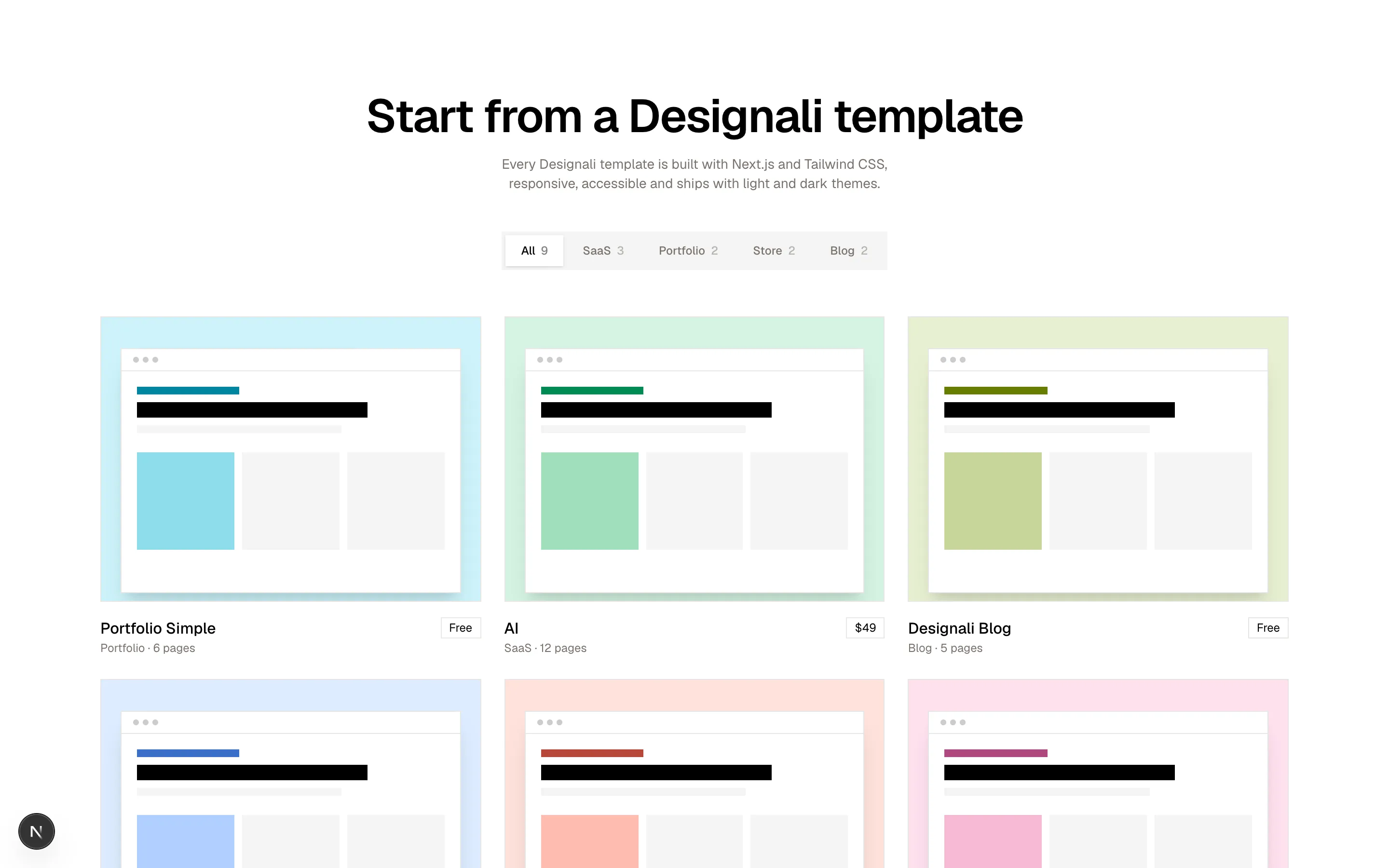
const templates = [
  { name: "Portfolio Simple", category: "Portfolio", pages: 6, price: "Free", hue: 210 },
  { name: "AI", category: "SaaS", pages: 12, price: "$49", hue: 160 },
  { name: "Designali Blog", category: "Blog", pages: 5, price: "Free", hue: 120 },
  { name: "Vercel Style", category: "SaaS", pages: 14, price: "$79", hue: 260 },
  { name: "Resort", category: "Store", pages: 9, price: "$59", hue: 30 },
  { name: "Design Notes", category: "Blog", pages: 7, price: "$29", hue: 350 },
  { name: "Design Agency", category: "Portfolio", pages: 4, price: "$19", hue: 290 },
  { name: "Icon Store", category: "Store", pages: 11, price: "$69", hue: 60 },
  { name: "Dashboard", category: "SaaS", pages: 10, price: "Free", hue: 190 },
]

const filters = ["All", "SaaS", "Portfolio", "Store", "Blog"]

export function Grid10() {
  const [active, setActive] = useState("All")
  const visible = active === "All" ? templates : templates.filter((t) => t.category === active)

  return (
    <section className="w-full bg-background py-24">
      <div className="mx-auto max-w-7xl px-6">
        <div className="text-center">
          <h2 className="text-4xl font-semibold tracking-tight md:text-5xl">Start from a Designali template</h2>
          <p className="mx-auto mt-4 max-w-md text-sm text-muted-foreground">
            Every Designali template is built with Next.js and Tailwind CSS, responsive, accessible and ships with light and dark themes.
          </p>
        </div>

        <div className="mt-10 flex justify-center">
          <div role="tablist" className="inline-flex flex-wrap justify-center gap-1 bg-muted p-1">
            {filters.map((filter) => (
              <button
                key={filter}
                type="button"
                role="tab"
                aria-selected={active === filter}
                onClick={() => setActive(filter)}
                className={`px-4 py-2 text-xs font-medium transition-colors ${
                  active === filter
                    ? "bg-background text-foreground shadow-sm"
                    : "text-muted-foreground hover:text-foreground"
                }`}
              >
                {filter}
                <span className="ml-1.5 font-sans opacity-50">
                  {filter === "All" ? templates.length : templates.filter((t) => t.category === filter).length}
                </span>
              </button>
            ))}
          </div>
        </div>

        <ul className="mt-12 grid grid-cols-1 gap-6 sm:grid-cols-2 lg:grid-cols-3">
          {visible.map((template) => (
            <li key={template.name}>
              <a href="#" className="group block">
                <div
                  className="relative aspect-[4/3] overflow-hidden border border-border p-5"
                  style={{ background: `oklch(0.94 0.04 ${template.hue})` }}
                >
                  <div className="h-full translate-y-3 border border-black/10 bg-white shadow-xl transition-transform duration-300 group-hover:translate-y-0">
                    <div className="flex items-center gap-1 border-b border-black/10 px-3 py-2">
                      <span className="size-1.5 rounded-full bg-black/20" />
                      <span className="size-1.5 rounded-full bg-black/20" />
                      <span className="size-1.5 rounded-full bg-black/20" />
                    </div>
                    <div className="space-y-2 p-4">
                      <div className="h-2 w-1/3" style={{ background: `oklch(0.55 0.15 ${template.hue})` }} />
                      <div className="h-4 w-3/4 bg-foreground" />
                      <div className="h-2 w-2/3 bg-muted" />
                      <div className="grid grid-cols-3 gap-2 pt-3">
                        <div className="aspect-square" style={{ background: `oklch(0.85 0.08 ${template.hue})` }} />
                        <div className="aspect-square bg-muted" />
                        <div className="aspect-square bg-muted" />
                      </div>
                    </div>
                  </div>
                </div>
                <div className="mt-4 flex items-start justify-between gap-4">
                  <div>
                    <h3 className="font-medium">{template.name}</h3>
                    <p className="text-xs text-muted-foreground">
                      {template.category} · {template.pages} pages
                    </p>
                  </div>
                  <span className="border border-border px-2 py-0.5 font-sans text-xs">{template.price}</span>
                </div>
              </a>
            </li>
          ))}
        </ul>
      </div>
    </section>
  )
}
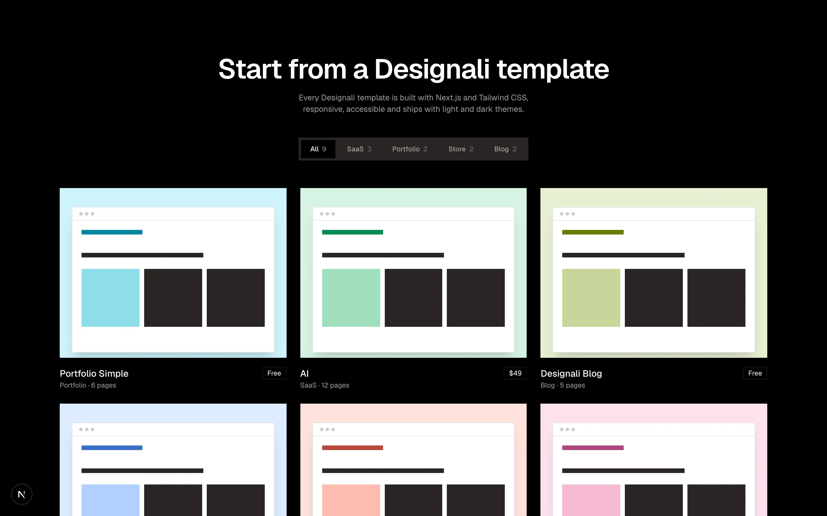
Filterable template gallery with segmented category tabs and browser-mockup previews.
grid-10
Files
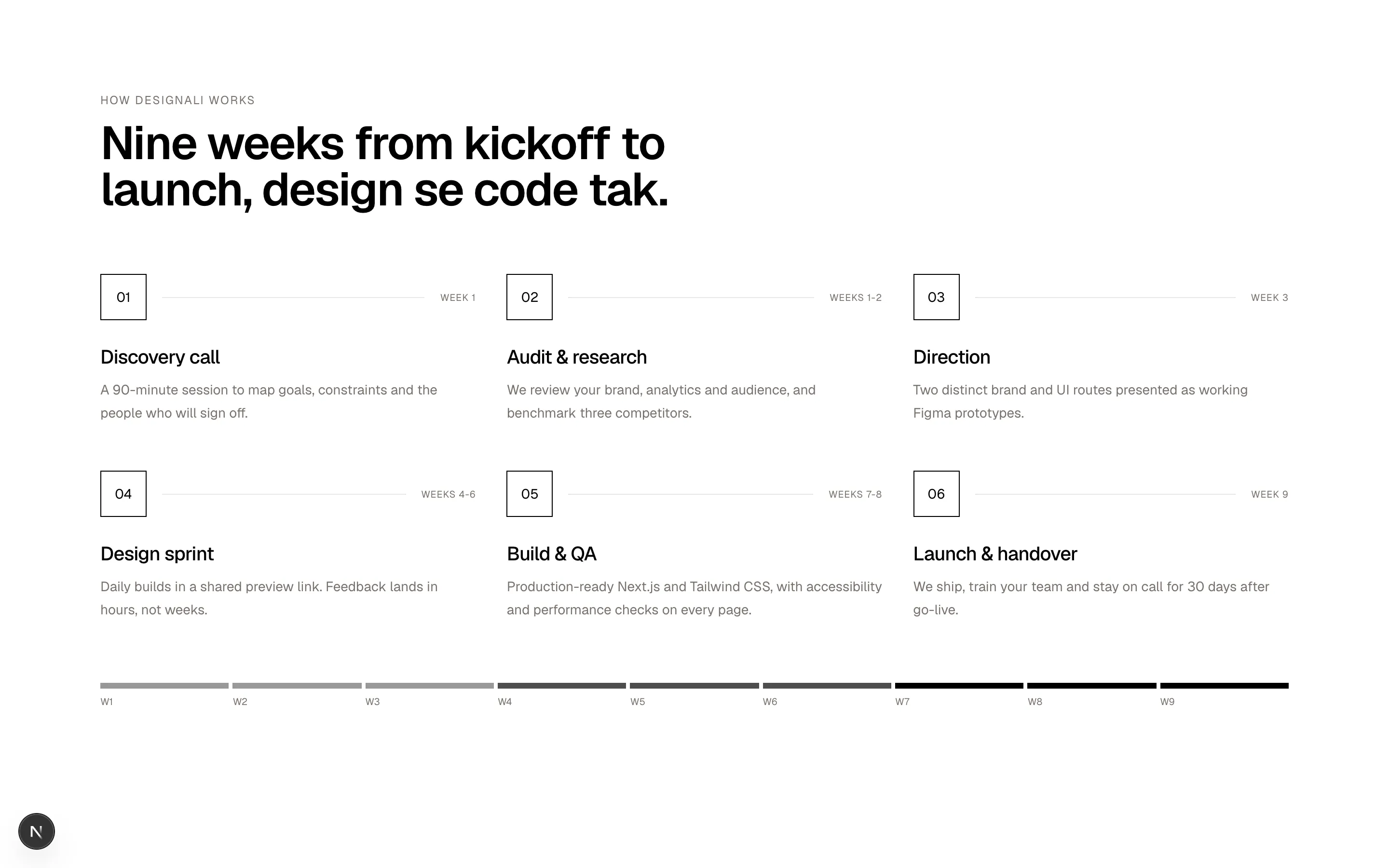
const steps = [
  { title: "Discovery call", duration: "Week 1", text: "A 90-minute session to map goals, constraints and the people who will sign off." },
  { title: "Audit & research", duration: "Weeks 1-2", text: "We review your brand, analytics and audience, and benchmark three competitors." },
  { title: "Direction", duration: "Week 3", text: "Two distinct brand and UI routes presented as working Figma prototypes." },
  { title: "Design sprint", duration: "Weeks 4-6", text: "Daily builds in a shared preview link. Feedback lands in hours, not weeks." },
  { title: "Build & QA", duration: "Weeks 7-8", text: "Production-ready Next.js and Tailwind CSS, with accessibility and performance checks on every page." },
  { title: "Launch & handover", duration: "Week 9", text: "We ship, train your team and stay on call for 30 days after go-live." },
]

export function Grid11() {
  return (
    <section className="w-full bg-background py-24">
      <div className="mx-auto max-w-7xl px-6">
        <div className="max-w-2xl">
          <p className="text-xs tracking-widest text-muted-foreground uppercase">How Designali works</p>
          <h2 className="mt-3 text-4xl font-semibold tracking-tight md:text-5xl">
            Nine weeks from kickoff to launch, design se code tak.
          </h2>
        </div>

        <ol className="mt-16 grid grid-cols-1 gap-x-8 gap-y-12 md:grid-cols-2 lg:grid-cols-3">
          {steps.map((step, index) => (
            <li key={step.title} className="relative">
              <div className="flex items-center gap-4">
                <span className="flex size-12 shrink-0 items-center justify-center border border-foreground font-sans text-sm">
                  {String(index + 1).padStart(2, "0")}
                </span>
                <span className="h-px flex-1 bg-border" />
                <span className="font-sans text-[10px] tracking-wider text-muted-foreground uppercase">
                  {step.duration}
                </span>
              </div>
              <h3 className="mt-6 text-xl font-medium tracking-tight">{step.title}</h3>
              <p className="mt-2 text-sm leading-6 text-muted-foreground">{step.text}</p>
            </li>
          ))}
        </ol>

        <div className="mt-16 grid grid-cols-9 gap-1" aria-hidden>
          {Array.from({ length: 9 }).map((_, week) => (
            <div key={week} className="space-y-1.5">
              <div className={`h-1.5 ${week < 3 ? "bg-foreground/40" : week < 6 ? "bg-foreground/70" : "bg-foreground"}`} />
              <p className="font-sans text-[10px] text-muted-foreground">W{week + 1}</p>
            </div>
          ))}
        </div>
      </div>
    </section>
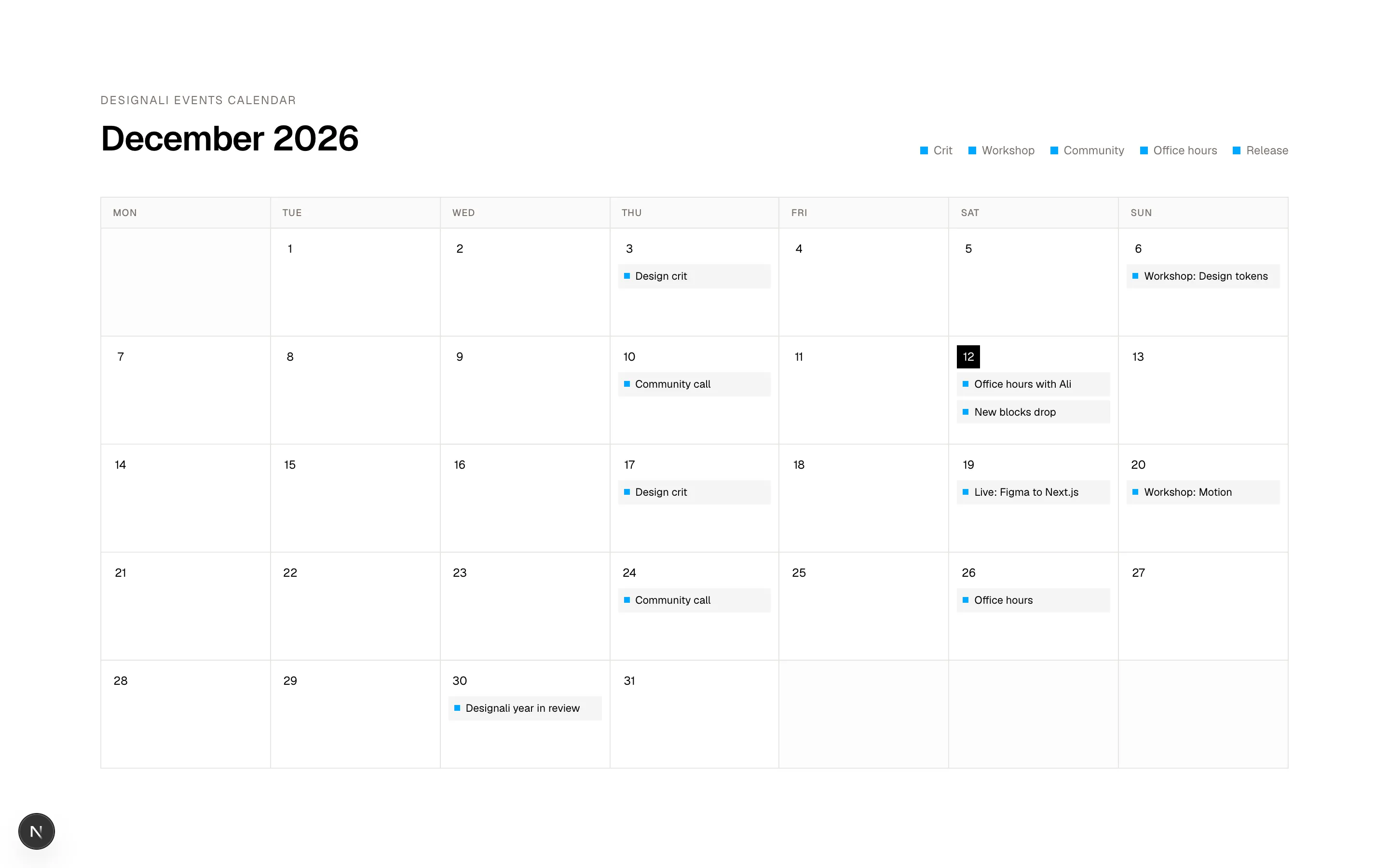
  )
}
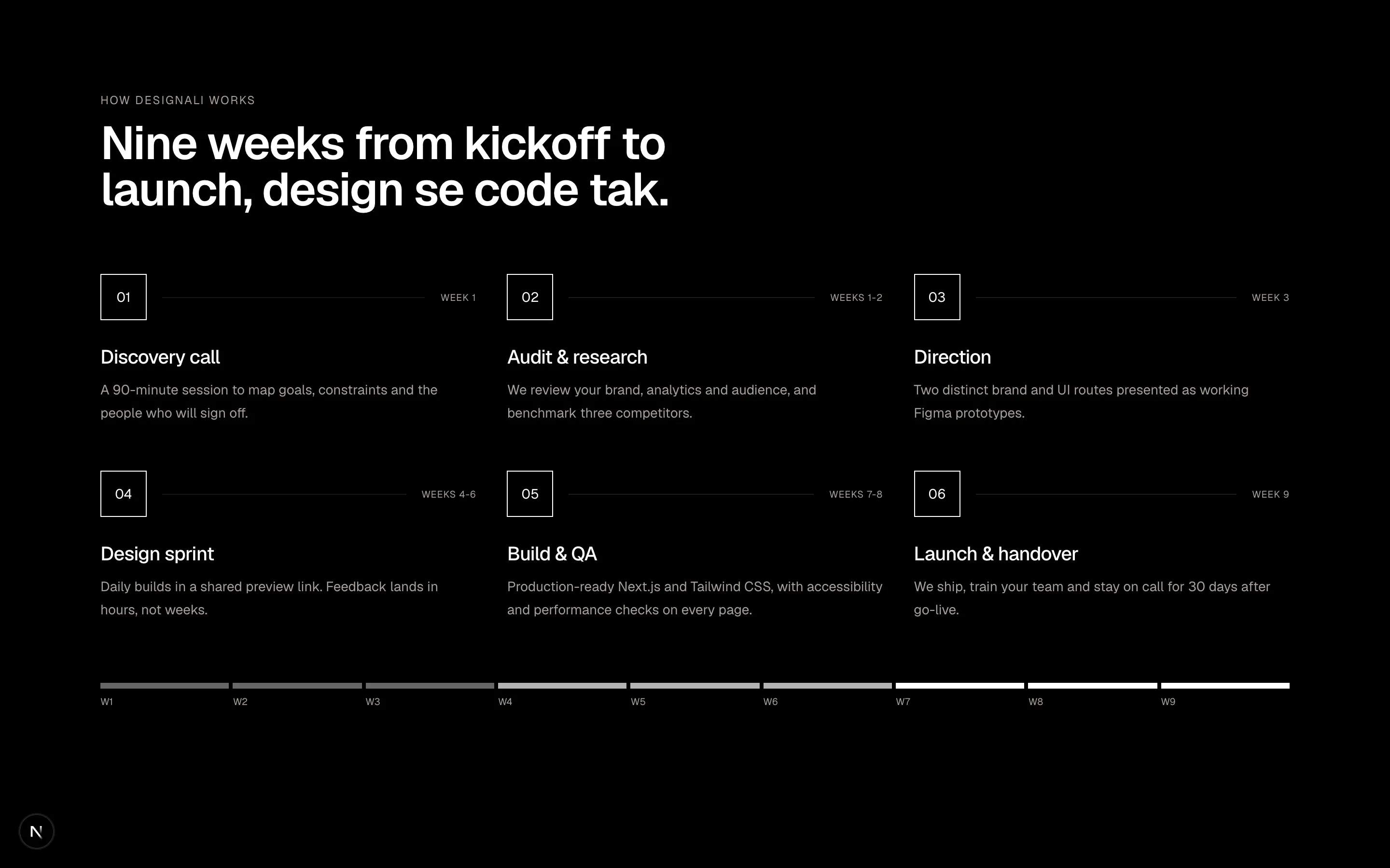
Numbered six-step process grid with durations and a nine-week progress strip.
grid-11
Files
const events: Record<number, { title: string; tone: string }[]> = {
  3: [{ title: "Design crit", tone: "bg-primary" }],
  6: [{ title: "Workshop: Design tokens", tone: "bg-primary" }],
  10: [{ title: "Community call", tone: "bg-primary" }],
  12: [{ title: "Office hours with Ali", tone: "bg-primary" }, { title: "New blocks drop", tone: "bg-primary" }],
  17: [{ title: "Design crit", tone: "bg-primary" }],
  19: [{ title: "Live: Figma to Next.js", tone: "bg-primary" }],
  20: [{ title: "Workshop: Motion", tone: "bg-primary" }],
  24: [{ title: "Community call", tone: "bg-primary" }],
  26: [{ title: "Office hours", tone: "bg-primary" }],
  30: [{ title: "Designali year in review", tone: "bg-primary" }],
}

const weekdays = ["Mon", "Tue", "Wed", "Thu", "Fri", "Sat", "Sun"]
// December 2026 starts on a Tuesday, so one leading empty cell on a Monday-first grid
const leading = 1
const daysInMonth = 31

const legend = [
  { label: "Crit", tone: "bg-primary" },
  { label: "Workshop", tone: "bg-primary" },
  { label: "Community", tone: "bg-primary" },
  { label: "Office hours", tone: "bg-primary" },
  { label: "Release", tone: "bg-primary" },
]

export function Grid12() {
  const cells = Array.from({ length: leading + daysInMonth }, (_, i) => (i < leading ? null : i - leading + 1))
  while (cells.length % 7 !== 0) cells.push(null)

  return (
    <section className="w-full bg-background py-24">
      <div className="mx-auto max-w-7xl px-6">
        <div className="flex flex-col gap-6 md:flex-row md:items-end md:justify-between">
          <div>
            <p className="text-xs tracking-widest text-muted-foreground uppercase">Designali events calendar</p>
            <h2 className="mt-3 text-4xl font-semibold tracking-tight">December 2026</h2>
          </div>
          <ul className="flex flex-wrap gap-x-4 gap-y-2">
            {legend.map((item) => (
              <li key={item.label} className="flex items-center gap-1.5 text-xs text-muted-foreground">
                <span className={`size-2 ${item.tone}`} />
                {item.label}
              </li>
            ))}
          </ul>
        </div>

        <div className="mt-10 border-t border-l border-border">
          <div className="grid grid-cols-7">
            {weekdays.map((day) => (
              <div key={day} className="border-r border-b border-border bg-muted/50 px-2 py-2 text-[10px] font-medium tracking-wider text-muted-foreground uppercase md:px-3">
                <span className="md:hidden">{day[0]}</span>
                <span className="hidden md:inline">{day}</span>
              </div>
            ))}
          </div>
          <div className="grid grid-cols-7">
            {cells.map((day, index) => {
              const dayEvents = day ? events[day] ?? [] : []
              return (
                <div
                  key={index}
                  className={`min-h-14 border-r border-b border-border p-1.5 md:min-h-28 md:p-2 ${
                    day ? "bg-background" : "bg-muted/30"
                  }`}
                >
                  {day && (
                    <>
                      <span
                        className={`inline-flex size-6 items-center justify-center font-sans text-xs ${
                          day === 12 ? "bg-foreground text-background" : ""
                        }`}
                      >
                        {day}
                      </span>
                      <div className="mt-1 flex gap-1 md:hidden">
                        {dayEvents.map((event) => (
                          <span key={event.title} className={`size-1.5 ${event.tone}`} />
                        ))}
                      </div>
                      <ul className="mt-1 hidden space-y-1 md:block">
                        {dayEvents.map((event) => (
                          <li key={event.title} className="flex items-center gap-1.5 truncate bg-muted px-1.5 py-1 text-[11px]">
                            <span className={`size-1.5 shrink-0 ${event.tone}`} />
                            <span className="truncate">{event.title}</span>
                          </li>
                        ))}
                      </ul>
                    </>
                  )}
                </div>
              )
            })}
          </div>
        </div>
      </div>
    </section>
  )
}
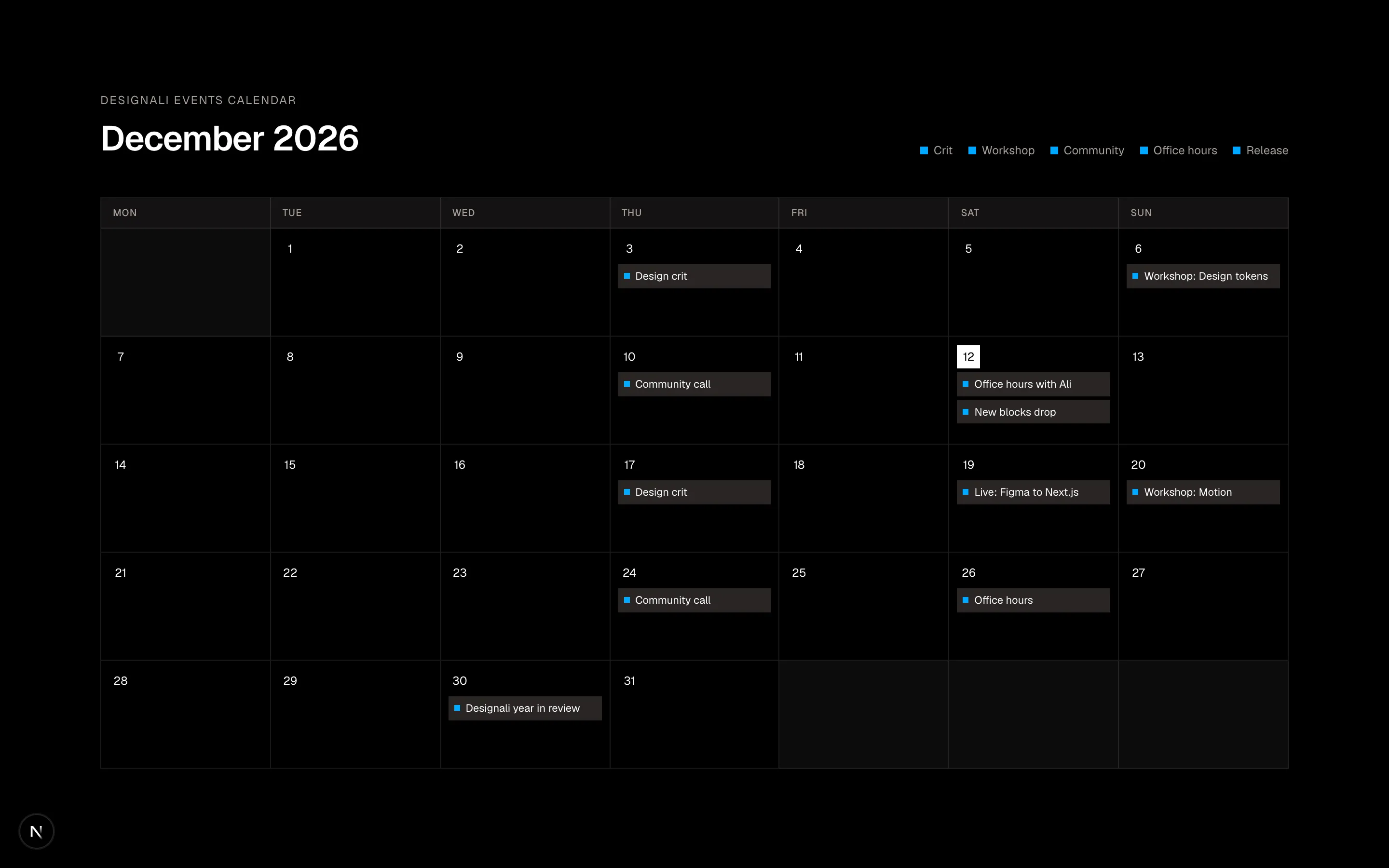
Month calendar grid with colour-coded events, a legend and dot markers on mobile.
grid-12
Files
import {
  Cpu,
  FingerprintPattern as Fingerprint,
  HardDrive,
  Network,
  RefreshCw,
  ScanEye,
  ShieldCheck,
  Timer,
} from "@designali/icons"

import type * as React from "react"

type IconComponent = React.ComponentType<React.SVGProps<SVGSVGElement> & { size?: number | string; strokeWidth?: number }>

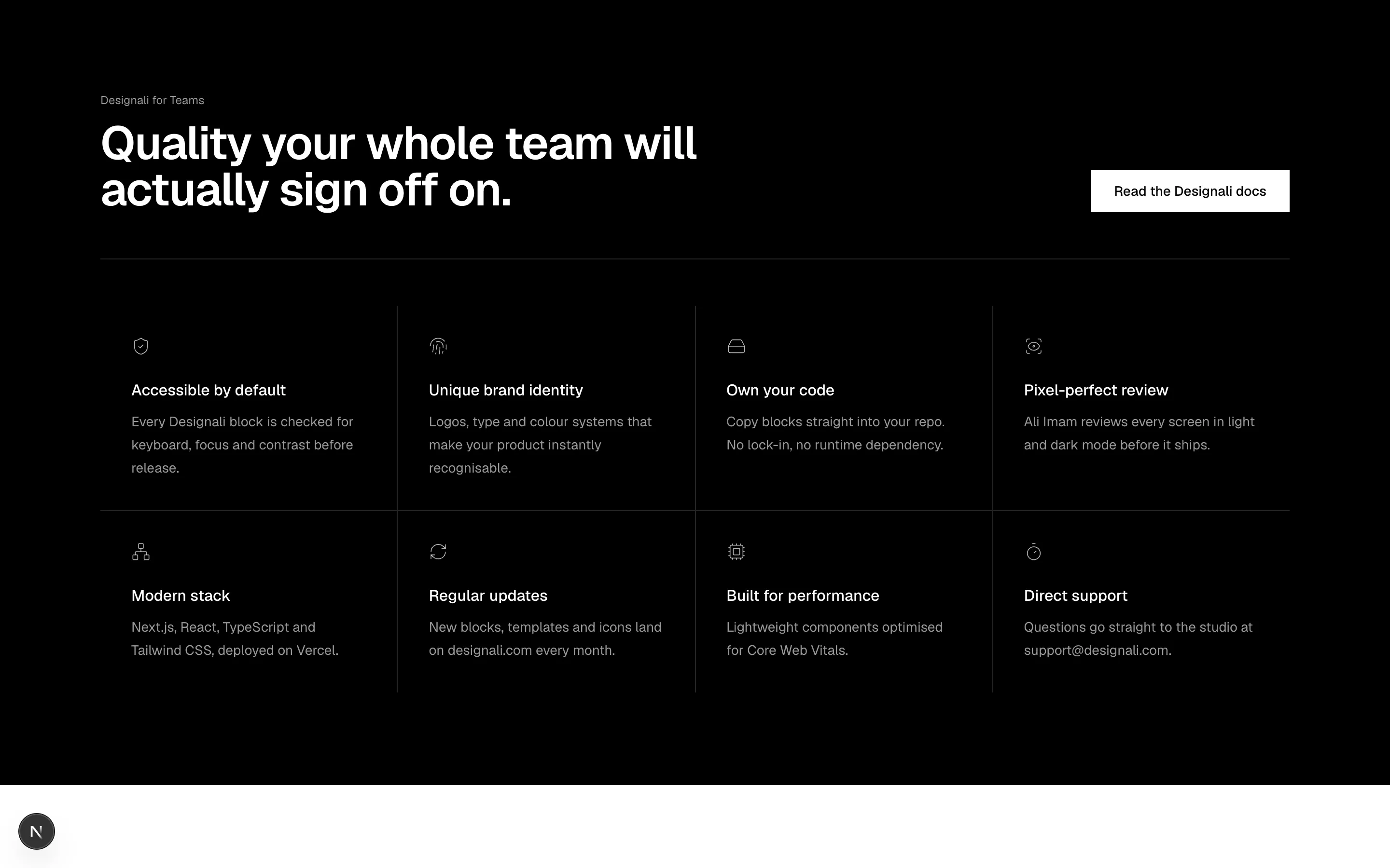
const features: { icon: IconComponent; title: string; text: string }[] = [
  { icon: ShieldCheck, title: "Accessible by default", text: "Every Designali block is checked for keyboard, focus and contrast before release." },
  { icon: Fingerprint, title: "Unique brand identity", text: "Logos, type and colour systems that make your product instantly recognisable." },
  { icon: HardDrive, title: "Own your code", text: "Copy blocks straight into your repo. No lock-in, no runtime dependency." },
  { icon: ScanEye, title: "Pixel-perfect review", text: "Ali Imam reviews every screen in light and dark mode before it ships." },
  { icon: Network, title: "Modern stack", text: "Next.js, React, TypeScript and Tailwind CSS, deployed on Vercel." },
  { icon: RefreshCw, title: "Regular updates", text: "New blocks, templates and icons land on designali.com every month." },
  { icon: Cpu, title: "Built for performance", text: "Lightweight components optimised for Core Web Vitals." },
  { icon: Timer, title: "Direct support", text: "Questions go straight to the studio at support@designali.com." },
]

export function Grid13() {
  return (
    <section className="w-full bg-foreground py-24 text-background">
      <div className="mx-auto max-w-7xl px-6">
        <div className="grid gap-8 border-b border-background/15 pb-12 lg:grid-cols-[1fr_auto] lg:items-end">
          <div>
            <p className="font-sans text-xs text-background/60">Designali for Teams</p>
            <h2 className="mt-3 max-w-2xl text-4xl font-semibold tracking-tight md:text-5xl">
              Quality your whole team will actually sign off on.
            </h2>
          </div>
          <a
            href="/docs"
            className="inline-flex h-11 items-center justify-center bg-background px-6 text-sm font-medium text-foreground transition-opacity hover:opacity-90"
          >
            Read the Designali docs
          </a>
        </div>

        <div className="mt-12 grid grid-cols-1 gap-px bg-background/15 sm:grid-cols-2 lg:grid-cols-4">
          {features.map((feature) => (
            <div key={feature.title} className="bg-foreground p-6 lg:p-8">
              <feature.icon className="size-5 text-background/70" />
              <h3 className="mt-6 font-medium">{feature.title}</h3>
              <p className="mt-2 text-sm leading-6 text-background/60">{feature.text}</p>
            </div>
          ))}
        </div>
      </div>
    </section>
  )
}
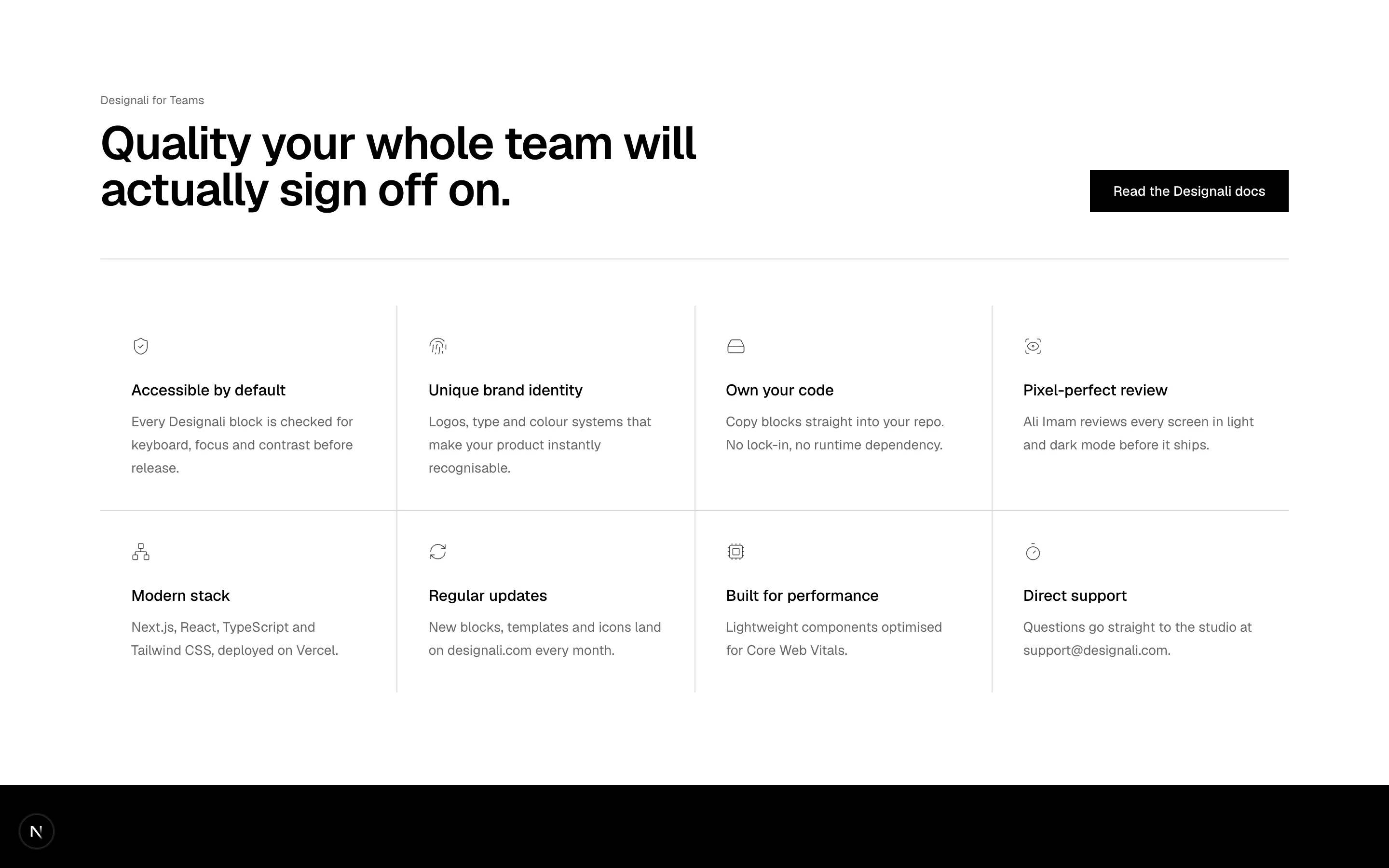
Inverted dark band with an enterprise security feature grid and a whitepaper CTA.
grid-13
Files
"use client"
import { useState } from "react"
import {
BookOpen,
Check,
SquareKanban as KanbanSquare,
Megaphone,
Palette,
Rocket,
Users,
} from "@designali/icons"
import { Button } from "@/components/ui/button"
import { cn } from "@/lib/utils"
import type * as React from "react"
type IconComponent = React.ComponentType<React.SVGProps<SVGSVGElement> & { size?: number | string; strokeWidth?: number }>
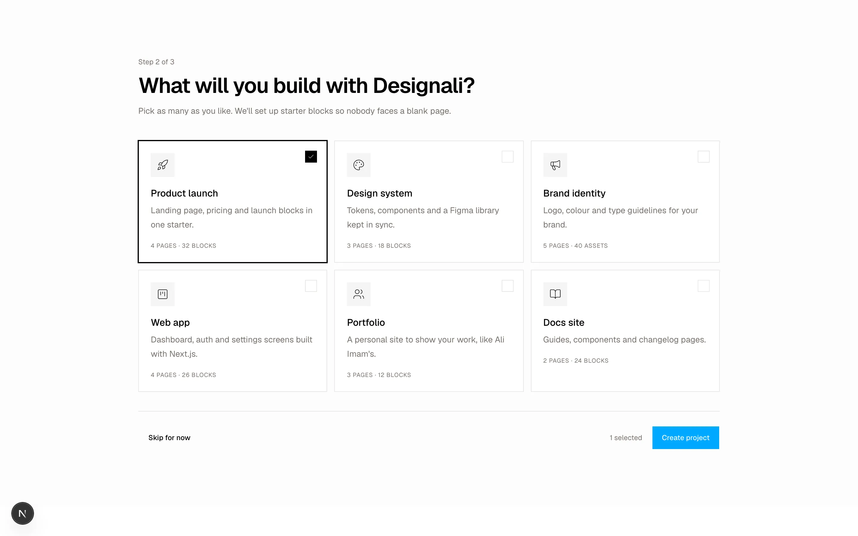
const options: { id: string; icon: IconComponent; title: string; text: string; includes: string }[] = [
{ id: "product", icon: Rocket, title: "Product launch", text: "Landing page, pricing and launch blocks in one starter.", includes: "4 pages · 32 blocks" },
{ id: "design", icon: Palette, title: "Design system", text: "Tokens, components and a Figma library kept in sync.", includes: "3 pages · 18 blocks" },
{ id: "marketing", icon: Megaphone, title: "Brand identity", text: "Logo, colour and type guidelines for your brand.", includes: "5 pages · 40 assets" },
{ id: "sprint", icon: KanbanSquare, title: "Web app", text: "Dashboard, auth and settings screens built with Next.js.", includes: "4 pages · 26 blocks" },
{ id: "hiring", icon: Users, title: "Portfolio", text: "A personal site to show your work, like Ali Imam's.", includes: "3 pages · 12 blocks" },
{ id: "wiki", icon: BookOpen, title: "Docs site", text: "Guides, components and changelog pages.", includes: "2 pages · 24 blocks" },
]
export function Grid14() {
const [selected, setSelected] = useState<string[]>(["product"])
const toggle = (id: string) =>
setSelected((current) =>
current.includes(id) ? current.filter((item) => item !== id) : [...current, id]
)
return (
<section className="w-full bg-muted/30 py-24">
<div className="mx-auto max-w-5xl px-6">
<p className="font-sans text-xs text-muted-foreground">Step 2 of 3</p>
<h2 className="mt-3 text-3xl font-semibold tracking-tight md:text-4xl">
What will you build with Designali?
</h2>
<p className="mt-3 text-sm text-muted-foreground">
Pick as many as you like. We'll set up starter blocks so nobody faces a blank page.
</p>
<div className="mt-10 grid grid-cols-1 gap-3 sm:grid-cols-2 lg:grid-cols-3">
{options.map((option) => {
const isSelected = selected.includes(option.id)
return (
<button
key={option.id}
type="button"
aria-pressed={isSelected}
onClick={() => toggle(option.id)}
className={cn(
"group relative flex flex-col items-start gap-4 border bg-background p-5 text-left transition-colors",
isSelected ? "border-foreground ring-1 ring-foreground" : "border-border hover:border-foreground/40"
)}
>
<span
className={cn(
"absolute top-4 right-4 flex size-5 items-center justify-center border transition-colors",
isSelected ? "border-foreground bg-foreground text-background" : "border-border"
)}
>
{isSelected && <Check className="size-3" />}
</span>
<span className="flex size-10 items-center justify-center bg-muted">
<option.icon className="size-5" />
</span>
<span>
<span className="block font-medium">{option.title}</span>
<span className="mt-1 block text-sm leading-6 text-muted-foreground">{option.text}</span>
</span>
<span className="font-sans text-[10px] tracking-wider text-muted-foreground uppercase">
{option.includes}
</span>
</button>
)
})}
</div>
<div className="mt-8 flex flex-col-reverse gap-3 border-t border-border pt-6 sm:flex-row sm:items-center sm:justify-between">
<Button variant="ghost">Skip for now</Button>
<div className="flex items-center justify-between gap-4 sm:justify-end">
<span className="text-xs text-muted-foreground">{selected.length} selected</span>
<Button disabled={selected.length === 0}>Create project</Button>
</div>
</div>
</div>
</section>
)
}
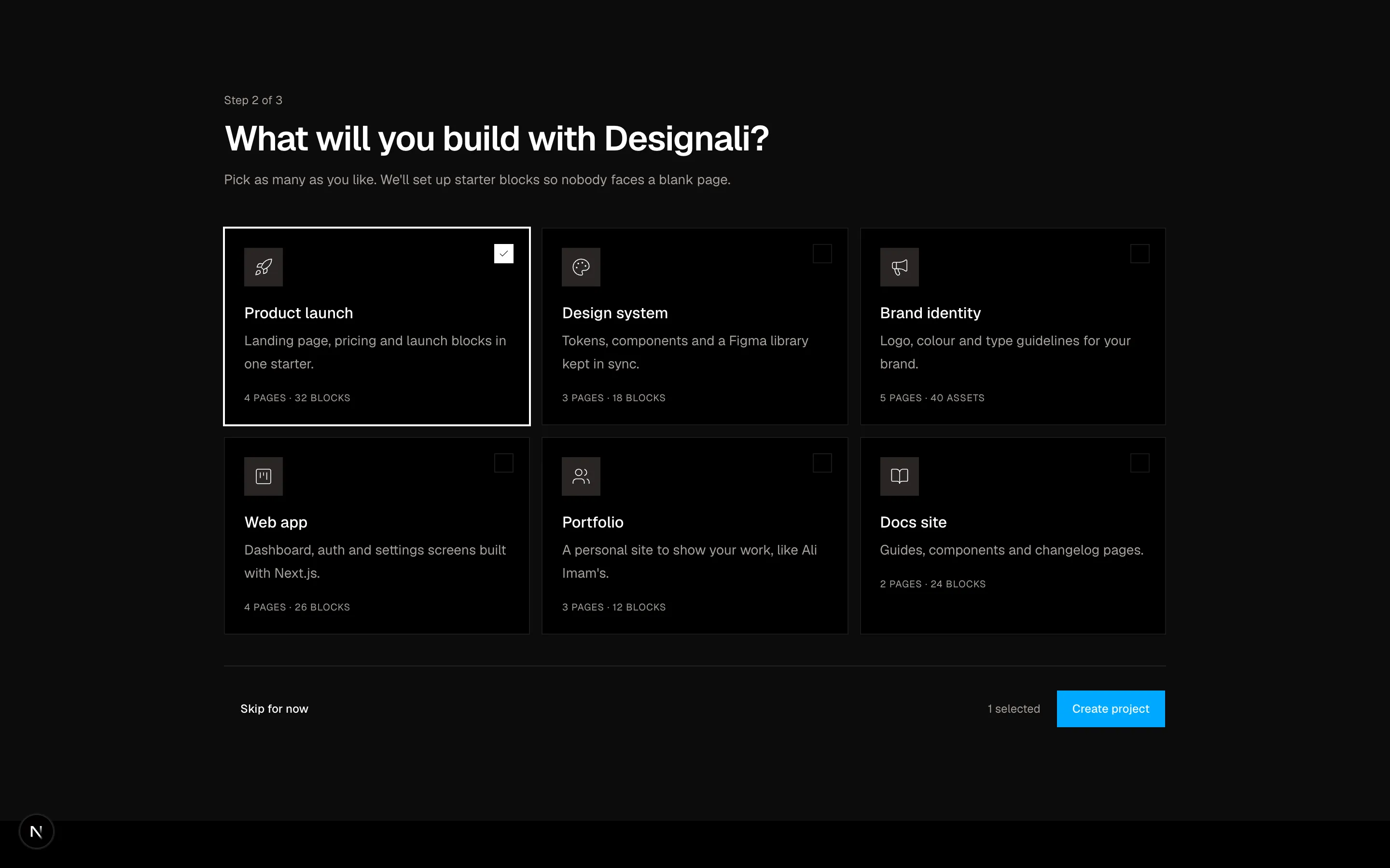
Multi-select onboarding card grid with check states and a create workspace footer.
grid-14
Files
import {
  ArrowUpRight,
} from "@designali/icons"

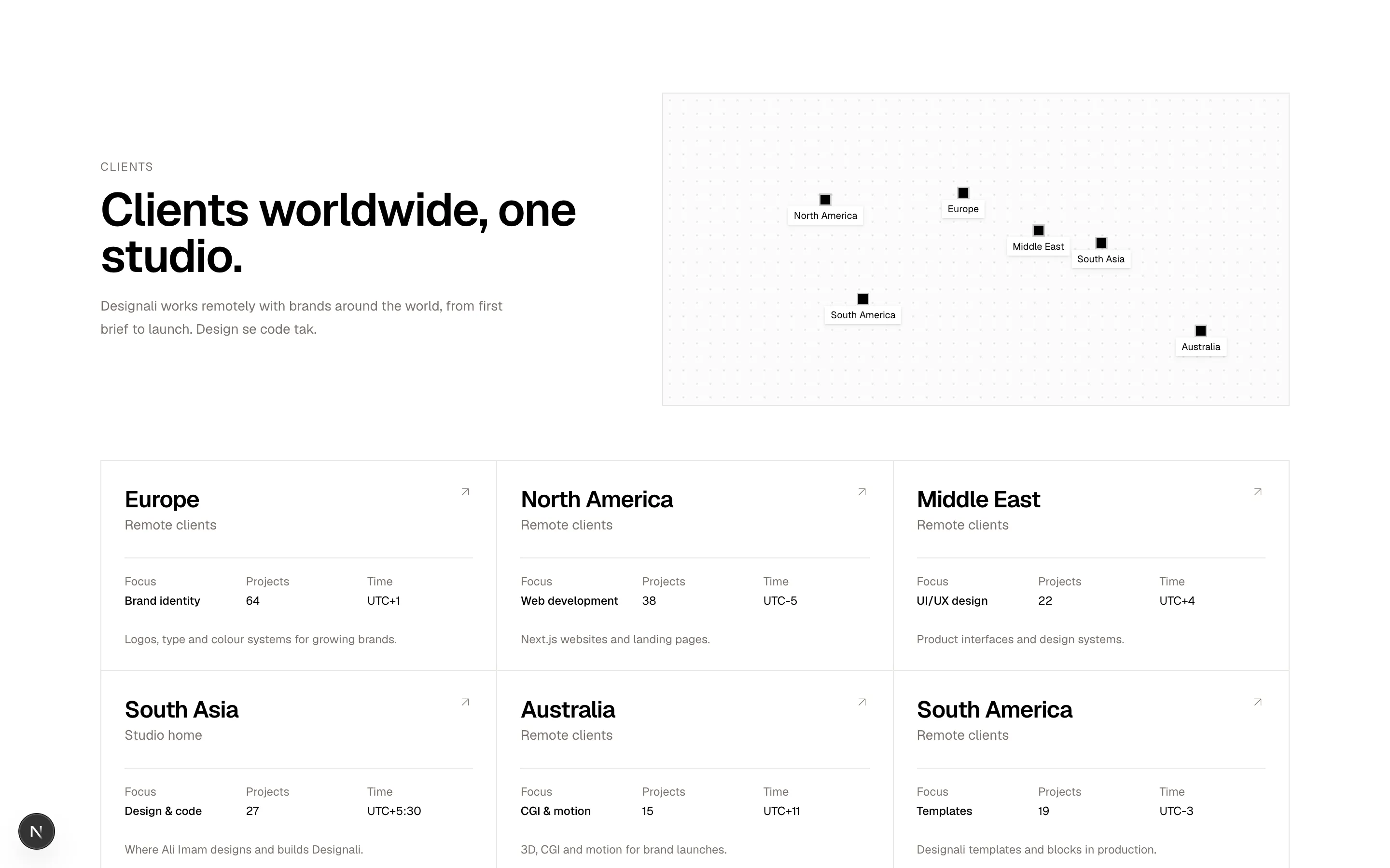
const offices = [
  { city: "Europe", country: "Remote clients", role: "Brand identity", address: "Logos, type and colour systems for growing brands.", people: 64, utc: "UTC+1", x: 48, y: 32 },
  { city: "North America", country: "Remote clients", role: "Web development", address: "Next.js websites and landing pages.", people: 38, utc: "UTC-5", x: 26, y: 34 },
  { city: "Middle East", country: "Remote clients", role: "UI/UX design", address: "Product interfaces and design systems.", people: 22, utc: "UTC+4", x: 60, y: 44 },
  { city: "South Asia", country: "Studio home", role: "Design & code", address: "Where Ali Imam designs and builds Designali.", people: 27, utc: "UTC+5:30", x: 70, y: 48 },
  { city: "Australia", country: "Remote clients", role: "CGI & motion", address: "3D, CGI and motion for brand launches.", people: 15, utc: "UTC+11", x: 86, y: 76 },
  { city: "South America", country: "Remote clients", role: "Templates", address: "Designali templates and blocks in production.", people: 19, utc: "UTC-3", x: 32, y: 66 },
]

export function Grid15() {
  return (
    <section className="w-full bg-background py-24">
      <div className="mx-auto max-w-7xl px-6">
        <div className="grid gap-10 lg:grid-cols-[1fr_1.2fr] lg:items-center">
          <div>
            <p className="text-xs tracking-widest text-muted-foreground uppercase">Clients</p>
            <h2 className="mt-3 text-4xl font-semibold tracking-tight md:text-5xl">
              Clients worldwide, one studio.
            </h2>
            <p className="mt-4 max-w-md text-sm leading-6 text-muted-foreground">
              Designali works remotely with brands around the world, from first
              brief to launch. Design se code tak.
            </p>
          </div>

          <div className="relative aspect-[2/1] overflow-hidden border border-border bg-muted/40">
            <div className="absolute inset-0 bg-[radial-gradient(circle,var(--border)_1px,transparent_1px)] [background-size:14px_14px]" />
            {offices.map((office) => (
              <span
                key={office.city}
                className="absolute -translate-x-1/2 -translate-y-1/2"
                style={{ left: `${office.x}%`, top: `${office.y}%` }}
              >
                <span className="absolute inset-0 animate-ping bg-foreground/30" />
                <span className="relative block size-2.5 bg-foreground" />
                <span className="absolute top-3 left-1/2 hidden -translate-x-1/2 bg-background px-1.5 py-0.5 text-[10px] whitespace-nowrap shadow-sm sm:block">
                  {office.city}
                </span>
              </span>
            ))}
          </div>
        </div>

        <ul className="mt-14 grid grid-cols-1 gap-px border border-border bg-border sm:grid-cols-2 lg:grid-cols-3">
          {offices.map((office) => (
            <li key={office.city}>
              <a href="#" className="group flex h-full flex-col gap-6 bg-background p-6 transition-colors hover:bg-muted/50">
                <div className="flex items-start justify-between">
                  <div>
                    <h3 className="text-2xl font-semibold tracking-tight">{office.city}</h3>
                    <p className="text-sm text-muted-foreground">{office.country}</p>
                  </div>
                  <ArrowUpRight className="size-4 text-muted-foreground transition-transform group-hover:translate-x-0.5 group-hover:-translate-y-0.5 group-hover:text-foreground" />
                </div>
                <dl className="grid grid-cols-3 gap-4 border-t border-border pt-4 text-xs">
                  <div>
                    <dt className="text-muted-foreground">Focus</dt>
                    <dd className="mt-1 font-medium">{office.role}</dd>
                  </div>
                  <div>
                    <dt className="text-muted-foreground">Projects</dt>
                    <dd className="mt-1 font-sans">{office.people}</dd>
                  </div>
                  <div>
                    <dt className="text-muted-foreground">Time</dt>
                    <dd className="mt-1 font-sans">{office.utc}</dd>
                  </div>
                </dl>
                <p className="text-xs text-muted-foreground">{office.address}</p>
              </a>
            </li>
          ))}
        </ul>
      </div>
    </section>
  )
}
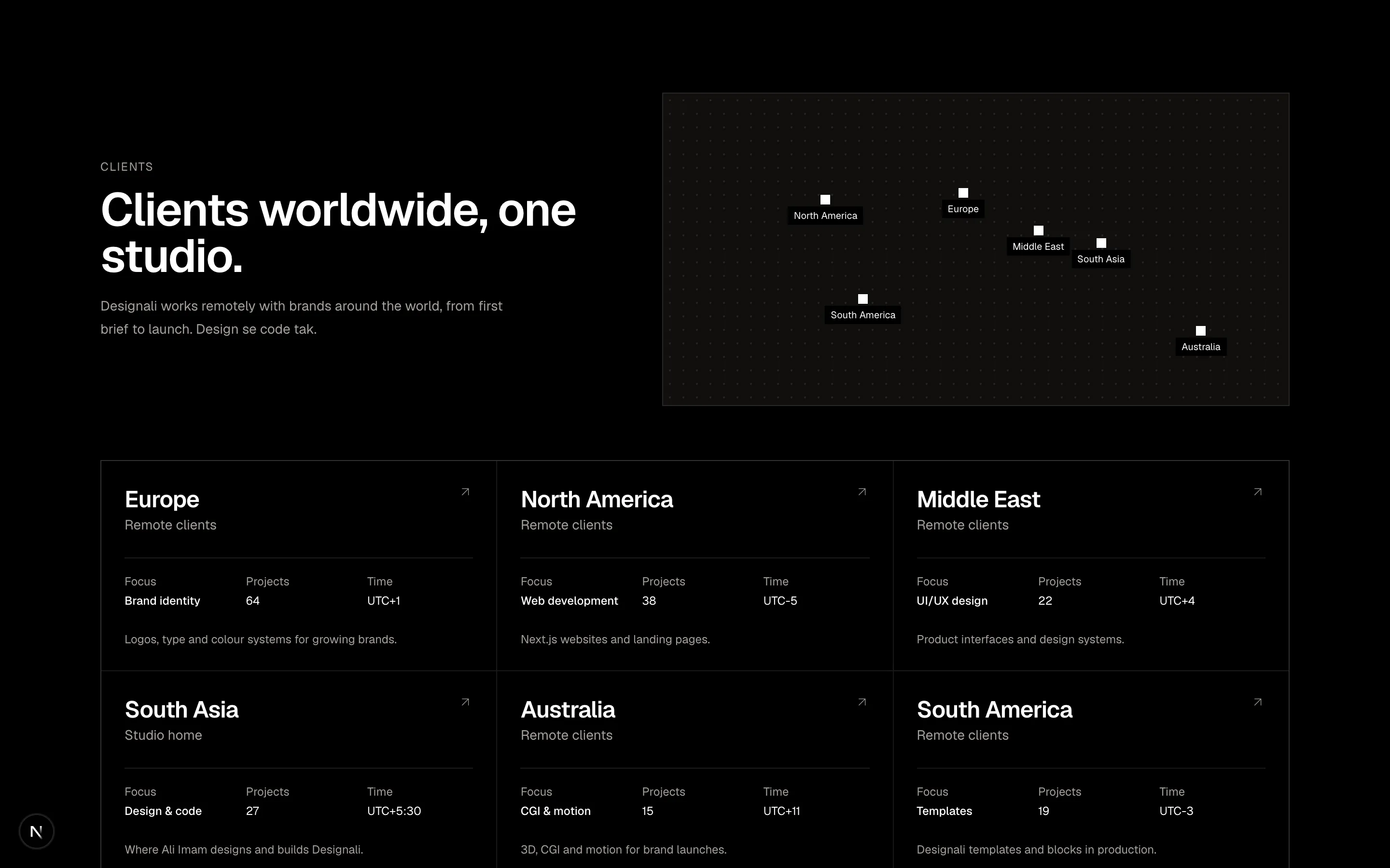
Office locations grid paired with a dotted world map showing pulsing hub markers.
grid-15
Files
"use client"

import { useState } from "react"
import {
  Minus,
  Plus,
} from "@designali/icons"

import { cn } from "@/lib/utils"

const projects = [
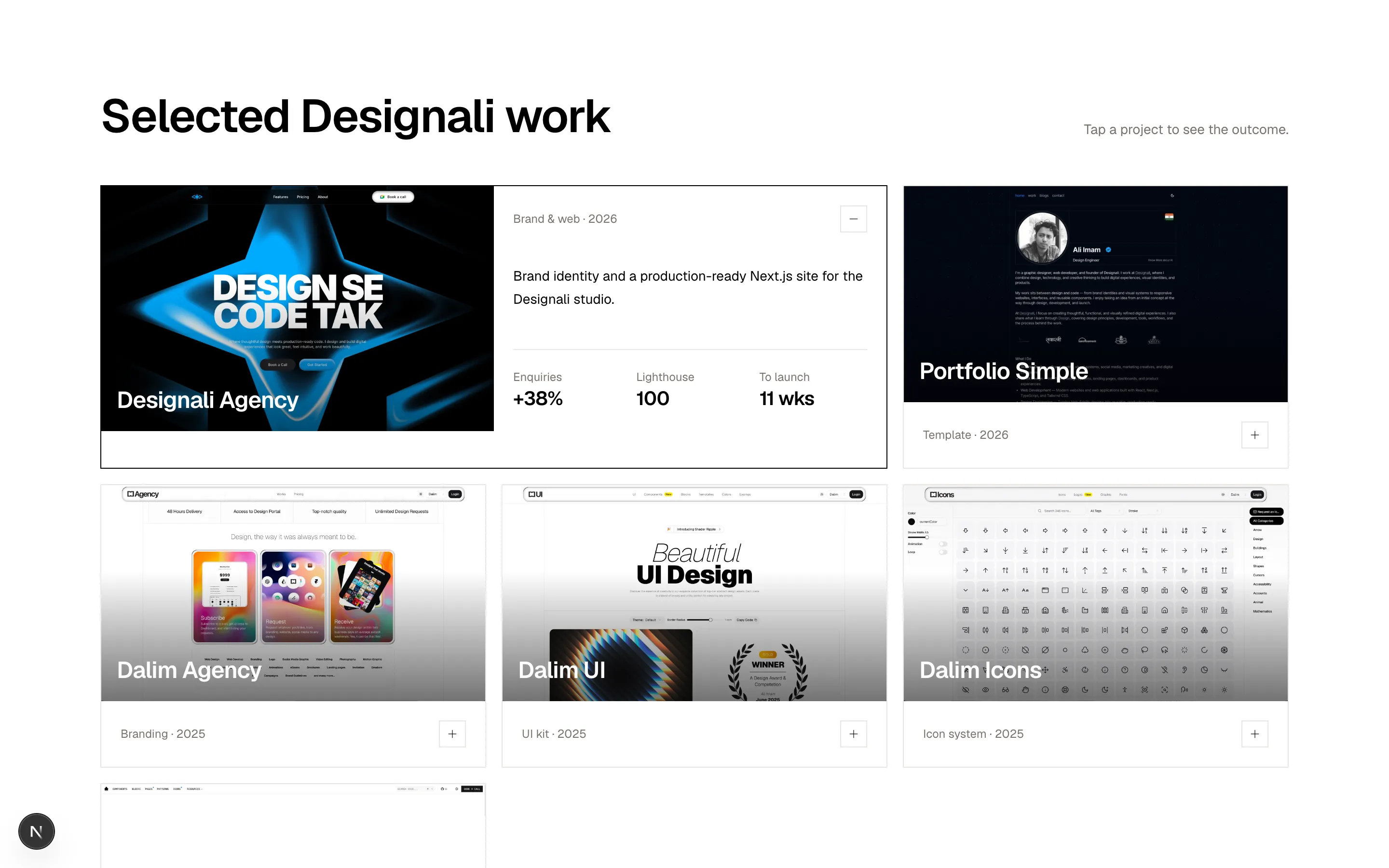
  { name: "Designali Agency", sector: "Brand & web", year: "2026", image: "/images/templates/design-agency.jpg", summary: "Brand identity and a production-ready Next.js site for the Designali studio.", results: [["+38%", "Enquiries"], ["100", "Lighthouse"], ["11 wks", "To launch"]] },
  { name: "Portfolio Simple", sector: "Template", year: "2026", image: "/images/templates/portfolio-simple.jpg", summary: "A clean Next.js portfolio template for designers and developers.", results: [["2.1x", "Downloads"], ["-26%", "Setup time"], ["9 wks", "To launch"]] },
  { name: "Dalim Agency", sector: "Branding", year: "2025", image: "/images/templates/dalim-agency-old.jpg", summary: "Brand identity and website for the first Dalim studio by Ali Imam.", results: [["+64%", "Leads"], ["-52%", "Bounce"], ["6 wks", "To launch"]] },
  { name: "Dalim UI", sector: "UI kit", year: "2025", image: "/images/templates/dalim-ui-old.jpg", summary: "A component kit that grew into the 460+ Designali blocks.", results: [["460+", "Blocks"], ["AA", "WCAG"], ["14 wks", "To launch"]] },
  { name: "Dalim Icons", sector: "Icon system", year: "2025", image: "/images/templates/dalim-icons-old.jpg", summary: "An icon set that evolved into 4000+ icons in @designali/icons.", results: [["4000+", "Icons"], ["+3x", "Usage"], ["8 wks", "To launch"]] },
  { name: "Ali Imam", sector: "Portfolio", year: "2024", image: "/images/templates/aliimam-comp.jpg", summary: "Personal portfolio for Ali Imam, designed in Figma and built with Next.js.", results: [["240+", "Pages"], ["-45%", "Load time"], ["10 wks", "To launch"]] },
]

export function Grid16() {
  const [open, setOpen] = useState<string | null>(projects[0]!.name)

  return (
    <section className="w-full bg-background py-24">
      <div className="mx-auto max-w-7xl px-6">
        <div className="flex flex-col justify-between gap-4 md:flex-row md:items-end">
          <h2 className="text-4xl font-semibold tracking-tight md:text-5xl">Selected Designali work</h2>
          <p className="text-sm text-muted-foreground">Tap a project to see the outcome.</p>
        </div>

        <div className="mt-12 grid grid-flow-dense grid-cols-1 gap-4 sm:grid-cols-2 lg:grid-cols-3">
          {projects.map((project) => {
            const isOpen = open === project.name
            return (
              <article
                key={project.name}
                className={cn(
                  "overflow-hidden border border-border bg-background transition-colors",
                  isOpen && "sm:col-span-2 border-foreground"
                )}
              >
                <button
                  type="button"
                  aria-expanded={isOpen}
                  onClick={() => setOpen(isOpen ? null : project.name)}
                  className={cn("grid w-full text-left", isOpen && "md:grid-cols-2")}
                >
                  <div
                    className={cn("relative", isOpen ? "aspect-[16/10]" : "aspect-[16/9]")}
                    style={{
                      background: `linear-gradient(to top, oklch(0 0 0 / 0.55), transparent 60%), url("${project.image}") center / cover`,
                    }}
                  >
                    <span className="absolute bottom-4 left-4 text-2xl font-semibold tracking-tight text-white">
                      {project.name}
                    </span>
                  </div>
                  <div className="flex flex-col justify-between p-5">
                    <div className="flex items-center justify-between gap-4">
                      <span className="text-xs text-muted-foreground">
                        {project.sector} · {project.year}
                      </span>
                      <span className="flex size-7 items-center justify-center border border-border">
                        {isOpen ? <Minus className="size-3.5" /> : <Plus className="size-3.5" />}
                      </span>
                    </div>
                    {isOpen && (
                      <>
                        <p className="mt-4 text-sm leading-6">{project.summary}</p>
                        <dl className="mt-6 grid grid-cols-3 gap-4 border-t border-border pt-5">
                          {project.results.map(([value, label]) => (
                            <div key={label}>
                              <dt className="text-xs text-muted-foreground">{label}</dt>
                              <dd className="text-xl font-semibold tracking-tight">{value}</dd>
                            </div>
                          ))}
                        </dl>
                      </>
                    )}
                  </div>
                </button>
              </article>
            )
          })}
        </div>
      </div>
    </section>
  )
}
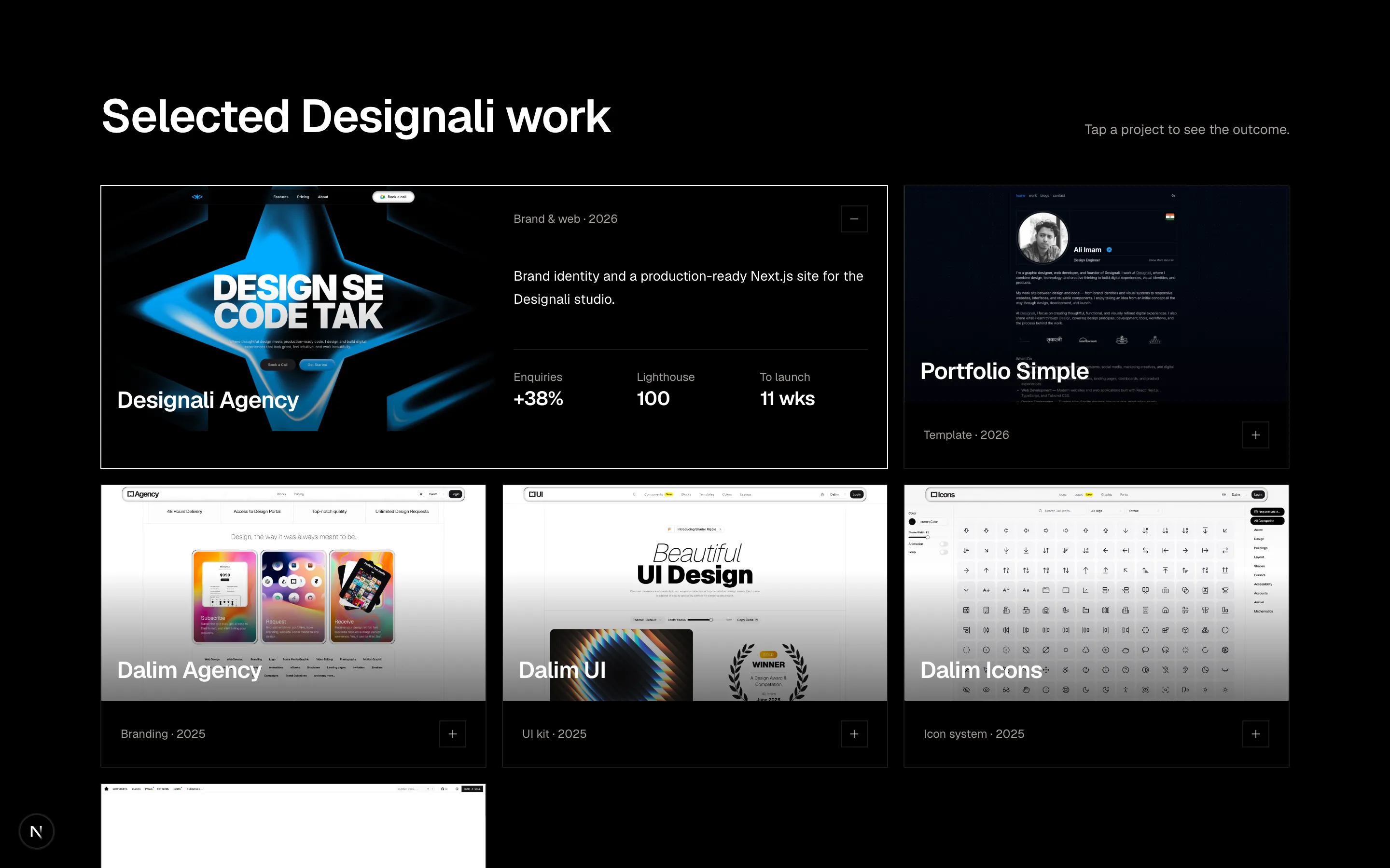
Project grid where a clicked card expands to two columns with summary and results.
grid-16
Files
import {
Check,
GitPullRequest,
Sparkles,
} from "@designali/icons"
const bars = [42, 58, 51, 66, 72, 64, 81, 77, 88, 94, 86, 98]
const reviewers = [
{ initials: "AI", tone: "bg-primary" },
{ initials: "SR", tone: "bg-chart-2" },
{ initials: "MK", tone: "bg-primary" },
{ initials: "OL", tone: "bg-chart-2" },
]
export function Grid17() {
return (
<section className="w-full bg-background py-24">
<div className="mx-auto max-w-7xl px-6">
<div className="mx-auto max-w-2xl text-center">
<h2 className="text-4xl font-semibold tracking-tight md:text-5xl">
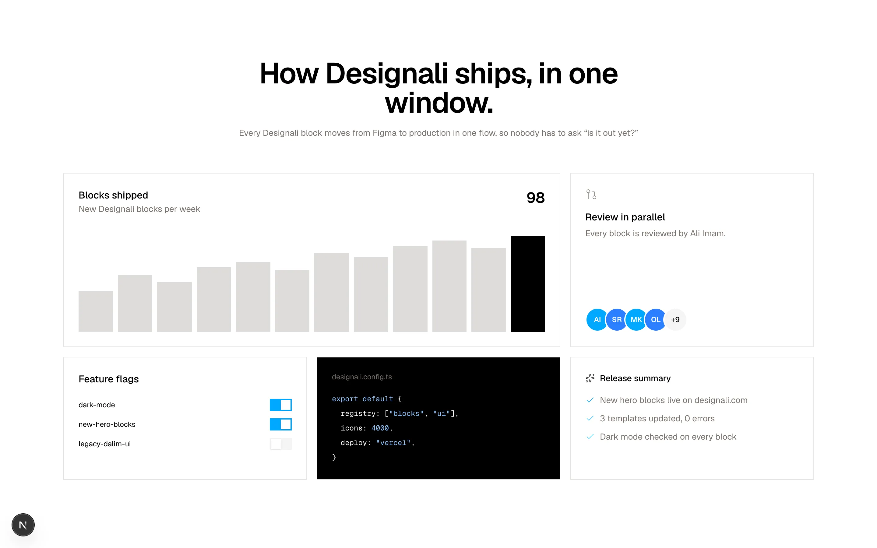
How Designali ships, in one window.
</h2>
<p className="mt-4 text-sm text-muted-foreground">
Every Designali block moves from Figma to production in one flow,
so nobody has to ask “is it out yet?”
</p>
</div>
<div className="mt-14 grid grid-cols-1 gap-4 md:grid-cols-6">
{/* Chart */}
<div className="flex flex-col border border-border bg-card p-6 md:col-span-4">
<div className="flex items-start justify-between gap-4">
<div>
<h3 className="font-medium">Blocks shipped</h3>
<p className="text-sm text-muted-foreground">New Designali blocks per week</p>
</div>
<span className="font-sans text-2xl font-semibold">98</span>
</div>
<div className="mt-8 flex h-40 items-end gap-1.5 md:gap-2">
{bars.map((value, index) => (
<div
key={index}
className={index === bars.length - 1 ? "flex-1 bg-foreground" : "flex-1 bg-muted-foreground/25"}
style={{ height: `${value}%` }}
/>
))}
</div>
</div>
{/* Reviewers */}
<div className="flex flex-col justify-between gap-8 border border-border bg-card p-6 md:col-span-2">
<div>
<GitPullRequest className="size-5 text-muted-foreground" />
<h3 className="mt-4 font-medium">Review in parallel</h3>
<p className="mt-1 text-sm text-muted-foreground">Every block is reviewed by Ali Imam.</p>
</div>
<div className="flex items-center">
{reviewers.map((reviewer) => (
<span
key={reviewer.initials}
className={`-ml-2 flex size-10 items-center justify-center rounded-full border-2 border-card text-xs font-semibold text-white first:ml-0 ${reviewer.tone}`}
>
{reviewer.initials}
</span>
))}
<span className="-ml-2 flex size-10 items-center justify-center rounded-full border-2 border-card bg-muted text-xs font-medium">
+9
</span>
</div>
</div>
{/* Flags */}
<div className="border border-border bg-card p-6 md:col-span-2">
<h3 className="font-medium">Feature flags</h3>
<ul className="mt-5 space-y-3">
{[
["dark-mode", true],
["new-hero-blocks", true],
["legacy-dalim-ui", false],
].map(([flag, on]) => (
<li key={String(flag)} className="flex items-center justify-between gap-4">
<span className="font-sans text-xs">{flag}</span>
<span
className={`flex h-5 w-9 items-center p-0.5 transition-colors ${
on ? "justify-end bg-primary" : "justify-start bg-muted"
}`}
>
<span className="size-4 bg-white shadow-sm" />
</span>
</li>
))}
</ul>
</div>
{/* Code */}
<div className="overflow-hidden border border-border bg-foreground p-6 text-background md:col-span-2">
<p className="text-xs text-muted-foreground">designali.config.ts</p>
<pre className="mt-4 overflow-x-auto font-mono text-xs leading-6">
<code>
<span className="text-chart-1">export</span> {"{"}
{"\n"} registry: [<span className="text-chart-1">"blocks"</span>, <span className="text-chart-1">"ui"</span>],
{"\n"} icons: <span className="text-chart-1">4000</span>,
{"\n"} deploy: <span className="text-chart-1">"vercel"</span>,
{"\n"}{"}"}
</code>
</pre>
</div>
{/* AI summary */}
<div className="flex flex-col gap-4 border border-border bg-card p-6 md:col-span-2">
<div className="flex items-center gap-2 text-sm font-medium">
<Sparkles className="size-4" /> Release summary
</div>
<ul className="space-y-2.5 text-sm text-muted-foreground">
{["New hero blocks live on designali.com", "3 templates updated, 0 errors", "Dark mode checked on every block"].map((line) => (
<li key={line} className="flex gap-2">
<Check className="mt-0.5 size-4 shrink-0 text-primary dark:text-primary" />
{line}
</li>
))}
</ul>
</div>
</div>
</div>
</section>
)
}
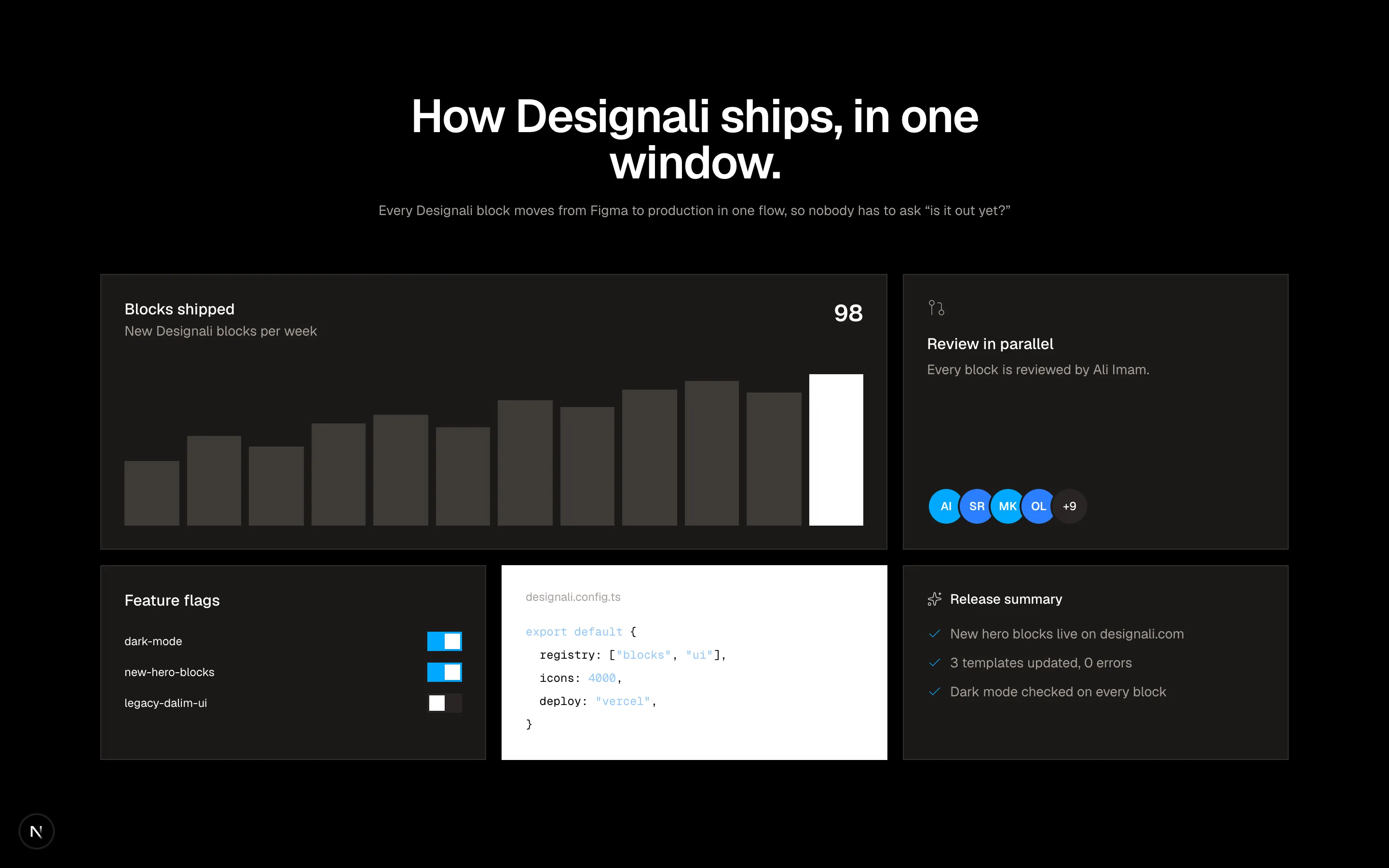
Product bento mixing a bar chart, reviewer avatars, feature flag toggles and a code card.
grid-17
Files
"use client"
import { useState } from "react"
import {
Anchor,
Archive,
Bell,
Bike,
Bookmark,
Camera,
Check,
Cloud,
Coffee,
Compass,
Feather,
Flag,
Flame,
Gift,
Headphones,
Heart,
Key,
Leaf,
Map as MapIcon,
Moon,
Music,
Package,
Search,
Star,
Sun,
Umbrella,
Zap,
} from "@designali/icons"
import type * as React from "react"
type IconComponent = React.ComponentType<React.SVGProps<SVGSVGElement> & { size?: number | string; strokeWidth?: number }>
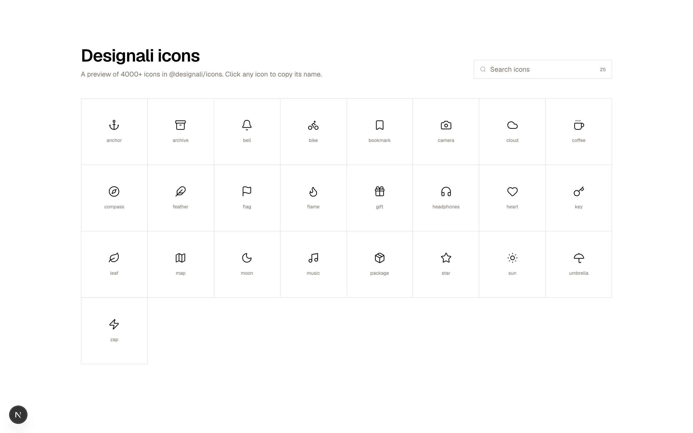
const icons: [string, IconComponent][] = [
["anchor", Anchor], ["archive", Archive], ["bell", Bell], ["bike", Bike],
["bookmark", Bookmark], ["camera", Camera], ["cloud", Cloud], ["coffee", Coffee],
["compass", Compass], ["feather", Feather], ["flag", Flag], ["flame", Flame],
["gift", Gift], ["headphones", Headphones], ["heart", Heart], ["key", Key],
["leaf", Leaf], ["map", MapIcon], ["moon", Moon], ["music", Music],
["package", Package], ["star", Star], ["sun", Sun], ["umbrella", Umbrella],
["zap", Zap],
]
export function Grid18() {
const [query, setQuery] = useState("")
const [copied, setCopied] = useState<string | null>(null)
const visible = icons.filter(([name]) => name.includes(query.trim().toLowerCase()))
const copy = (name: string) => {
navigator.clipboard?.writeText(name).catch(() => {})
setCopied(name)
window.setTimeout(() => setCopied((current) => (current === name ? null : current)), 1400)
}
return (
<section className="w-full bg-background py-24">
<div className="mx-auto max-w-6xl px-6">
<div className="flex flex-col gap-6 md:flex-row md:items-end md:justify-between">
<div>
<h2 className="text-4xl font-semibold tracking-tight">Designali icons</h2>
<p className="mt-2 text-sm text-muted-foreground">
A preview of 4000+ icons in @designali/icons. Click any icon to copy its name.
</p>
</div>
<label className="flex h-10 w-full items-center gap-2 border border-border bg-background px-3 focus-within:border-foreground md:w-72">
<Search className="size-4 text-muted-foreground" />
<input
value={query}
onChange={(event) => setQuery(event.target.value)}
placeholder="Search icons"
className="w-full bg-transparent text-sm outline-none placeholder:text-muted-foreground"
/>
<span className="font-sans text-[10px] text-muted-foreground">{visible.length}</span>
</label>
</div>
<div className="mt-10 grid grid-cols-3 border-t border-l border-border sm:grid-cols-5 lg:grid-cols-8">
{visible.map(([name, Icon]) => (
<button
key={name}
type="button"
onClick={() => copy(name)}
className="group flex aspect-square flex-col items-center justify-center gap-3 border-r border-b border-border transition-colors hover:bg-muted"
>
{copied === name ? (
<Check className="size-6 text-primary dark:text-primary" />
) : (
<Icon className="size-6" strokeWidth={1.5} />
)}
<span className="font-sans text-[10px] text-muted-foreground group-hover:text-foreground">
{copied === name ? "copied" : name}
</span>
</button>
))}
</div>
{visible.length === 0 && (
<p className="border border-t-0 border-border py-16 text-center text-sm text-muted-foreground">
No icons match “{query}”. Try “sun” or “map”.
</p>
)}
</div>
</section>
)
}
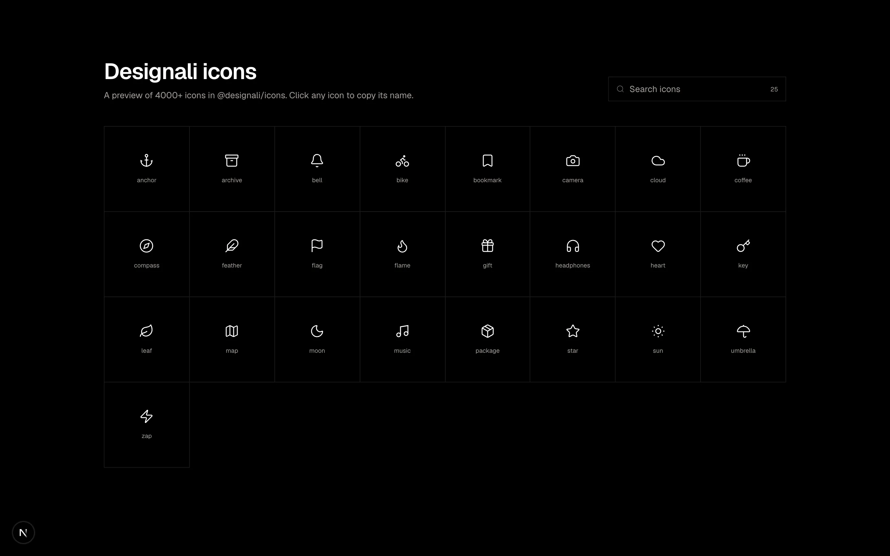
Searchable icon library grid with click-to-copy feedback and an empty state.
grid-18
Files
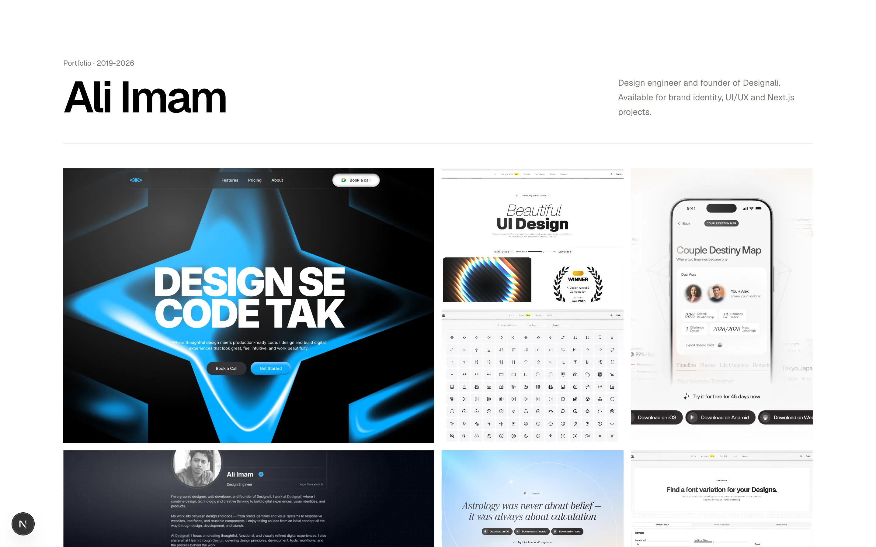
const shots = [
  { title: "Designali Agency", tag: "Brand & web", image: "/images/templates/design-agency.jpg", tone: "from-chart-5 via-chart-3 to-primary", className: "col-span-2 row-span-2" },
  { title: "Dalim UI", tag: "UI kit", image: "/images/templates/dalim-ui-old.jpg", tone: "from-muted-foreground to-border", className: "" },
  { title: "Glass spheres", tag: "CGI", image: "/img/ask/ask3.jpg", tone: "from-primary via-primary to-chart-2", className: "row-span-2" },
  { title: "Dalim Icons", tag: "Icons", image: "/images/templates/dalim-icons-old.jpg", tone: "from-chart-4 to-primary", className: "" },
  { title: "Portfolio Simple", tag: "Template", image: "/images/templates/portfolio-simple.jpg", tone: "from-chart-5 via-chart-4 to-primary", className: "col-span-2" },
  { title: "Liquid form", tag: "3D", image: "/img/ask/ask7.jpg", tone: "from-primary/10 via-muted to-primary/20", className: "" },
  { title: "Dalim Fonts", tag: "Typography", image: "/images/templates/dalim-fonts-old.jpg", tone: "from-foreground to-muted-foreground", className: "" },
  { title: "Resort", tag: "Template", image: "/images/templates/resort.jpg", tone: "from-border via-primary/10 to-white", className: "col-span-2" },
]

export function Grid19() {
  return (
    <section className="w-full bg-background py-24">
      <div className="mx-auto max-w-7xl px-6">
        <div className="grid gap-6 border-b border-border pb-10 md:grid-cols-[1fr_auto] md:items-end">
          <div>
            <p className="font-sans text-xs text-muted-foreground">Portfolio · 2019-2026</p>
            <h2 className="mt-3 text-5xl font-semibold tracking-tighter md:text-7xl">Ali Imam</h2>
          </div>
          <p className="max-w-xs text-sm leading-6 text-muted-foreground">
            Design engineer and founder of Designali. Available for brand identity,
            UI/UX and Next.js projects.
          </p>
        </div>

        <div className="mt-10 grid auto-rows-[140px] grid-cols-2 gap-2 sm:auto-rows-[180px] md:grid-cols-4 md:gap-3 lg:auto-rows-[220px]">
          {shots.map((shot, index) => (
            <a
              key={shot.title}
              href="#"
              className={`group relative overflow-hidden bg-gradient-to-br ${shot.tone} ${shot.className}`}
              style={{ background: `url("${shot.image}") center / cover` }}
            >
              <div className="absolute inset-0 bg-[radial-gradient(ellipse_at_30%_20%,rgba(255,255,255,0.3),transparent_60%)]" />
              <div className="absolute inset-0 flex flex-col justify-between bg-black/0 p-4 text-white opacity-0 transition-all duration-300 group-hover:bg-black/40 group-hover:opacity-100">
                <span className="font-sans text-[10px]">{String(index + 1).padStart(2, "0")}</span>
                <div>
                  <p className="text-[10px] tracking-widest uppercase opacity-80">{shot.tag}</p>
                  <p className="text-lg font-medium tracking-tight">{shot.title}</p>
                </div>
              </div>
            </a>
          ))}
        </div>

        <div className="mt-8 flex flex-wrap items-center justify-between gap-4 text-xs text-muted-foreground">
          <span>Showing 8 Designali projects</span>
          <a href="/work" className="border-b border-foreground pb-0.5 text-foreground">
            View all work
          </a>
        </div>
      </div>
    </section>
  )
}
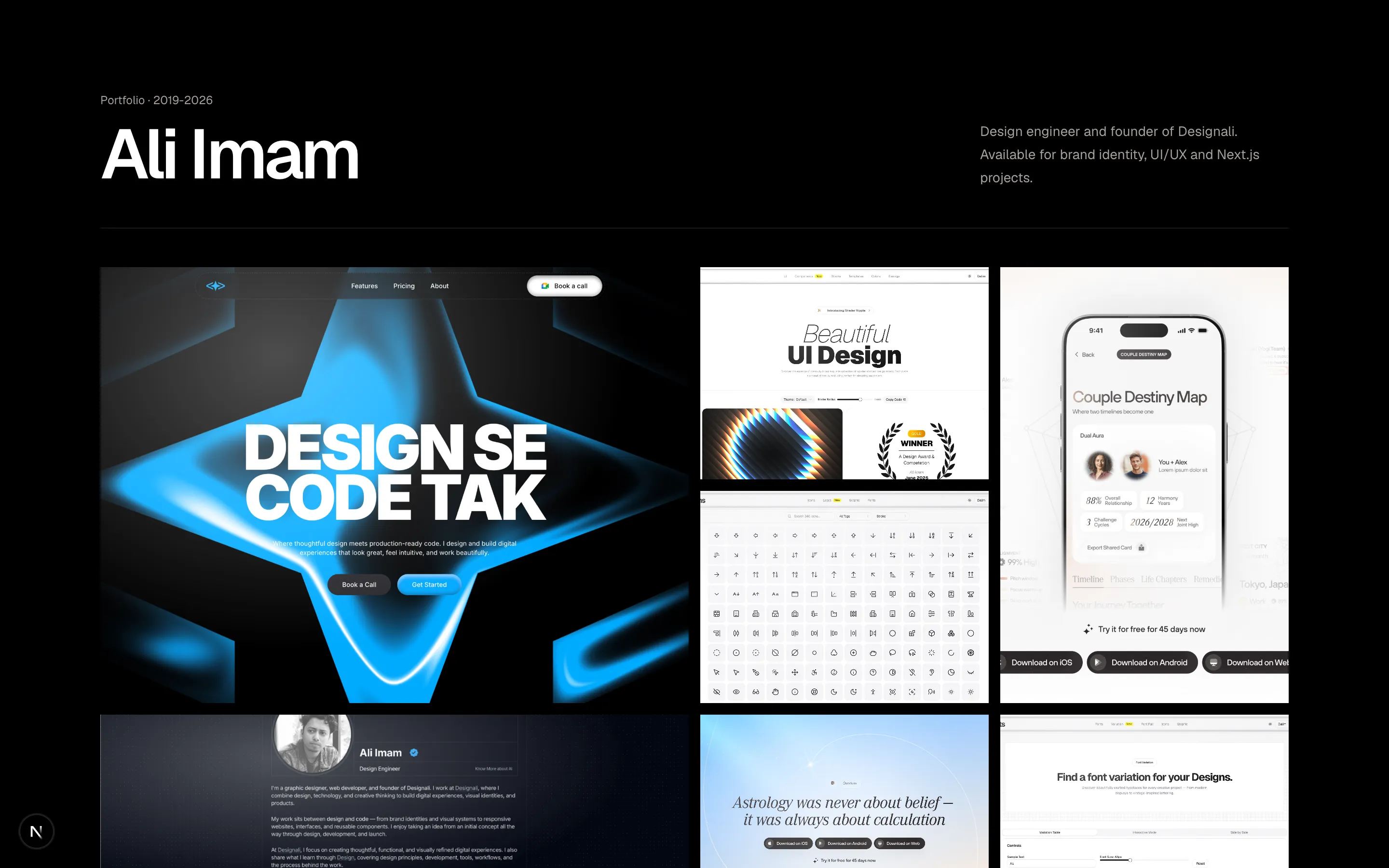
Photographer portfolio mosaic with spanning gradient frames and hover captions.
grid-19
Files
import { Kbd, KbdGroup } from "@/components/ui/kbd"

const groups = [
  {
    title: "General",
    shortcuts: [
      { action: "Command menu", keys: ["⌘", "K"] },
      { action: "Search everywhere", keys: ["/"] },
      { action: "Toggle sidebar", keys: ["⌘", "\\"] },
      { action: "Open settings", keys: ["⌘", ","] },
    ],
  },
  {
    title: "Editing",
    shortcuts: [
      { action: "Bold", keys: ["⌘", "B"] },
      { action: "Insert link", keys: ["⌘", "K", "L"] },
      { action: "Duplicate block", keys: ["⌘", "D"] },
      { action: "Move block up", keys: ["⌥", "↑"] },
      { action: "Move block down", keys: ["⌥", "↓"] },
    ],
  },
  {
    title: "Navigation",
    shortcuts: [
      { action: "Go to icons", keys: ["G", "I"] },
      { action: "Go to pricing", keys: ["G", "P"] },
      { action: "Next item", keys: ["J"] },
      { action: "Previous item", keys: ["K"] },
    ],
  },
  {
    title: "Blocks",
    shortcuts: [
      { action: "New block", keys: ["C"] },
      { action: "Copy code", keys: ["Y"] },
      { action: "Toggle theme", keys: ["T"] },
      { action: "Open preview", keys: ["P"] },
      { action: "Copy block link", keys: ["⌘", "⇧", "C"] },
    ],
  },
  {
    title: "View",
    shortcuts: [
      { action: "Zoom in", keys: ["⌘", "+"] },
      { action: "Zoom out", keys: ["⌘", "-"] },
      { action: "Full screen", keys: ["⌃", "⌘", "F"] },
    ],
  },
  {
    title: "Selection",
    shortcuts: [
      { action: "Select all", keys: ["⌘", "A"] },
      { action: "Extend selection", keys: ["⇧", "J"] },
      { action: "Clear selection", keys: ["Esc"] },
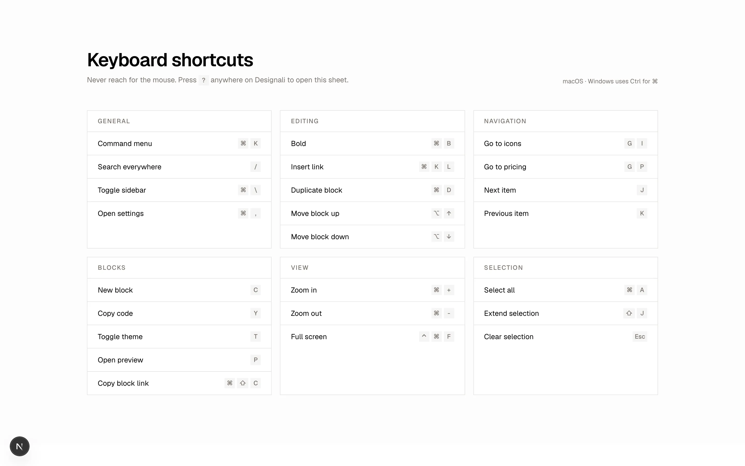
    ],
  },
]

export function Grid20() {
  return (
    <section className="w-full bg-muted/30 py-24">
      <div className="mx-auto max-w-6xl px-6">
        <div className="flex flex-col justify-between gap-4 md:flex-row md:items-end">
          <div>
            <h2 className="text-4xl font-semibold tracking-tight">Keyboard shortcuts</h2>
            <p className="mt-2 text-sm text-muted-foreground">
              Never reach for the mouse. Press <Kbd>?</Kbd> anywhere on Designali to open this sheet.
            </p>
          </div>
          <span className="text-xs text-muted-foreground">macOS · Windows uses Ctrl for ⌘</span>
        </div>

        <div className="mt-12 grid grid-cols-1 gap-4 md:grid-cols-2 lg:grid-cols-3">
          {groups.map((group) => (
            <div key={group.title} className="border border-border bg-background">
              <h3 className="border-b border-border px-5 py-3 text-xs font-medium tracking-widest text-muted-foreground uppercase">
                {group.title}
              </h3>
              <ul className="divide-y divide-border">
                {group.shortcuts.map((shortcut) => (
                  <li key={shortcut.action} className="flex items-center justify-between gap-4 px-5 py-3">
                    <span className="text-sm">{shortcut.action}</span>
                    <KbdGroup>
                      {shortcut.keys.map((key) => (
                        <Kbd key={key}>{key}</Kbd>
                      ))}
                    </KbdGroup>
                  </li>
                ))}
              </ul>
            </div>
          ))}
        </div>
      </div>
    </section>
  )
}
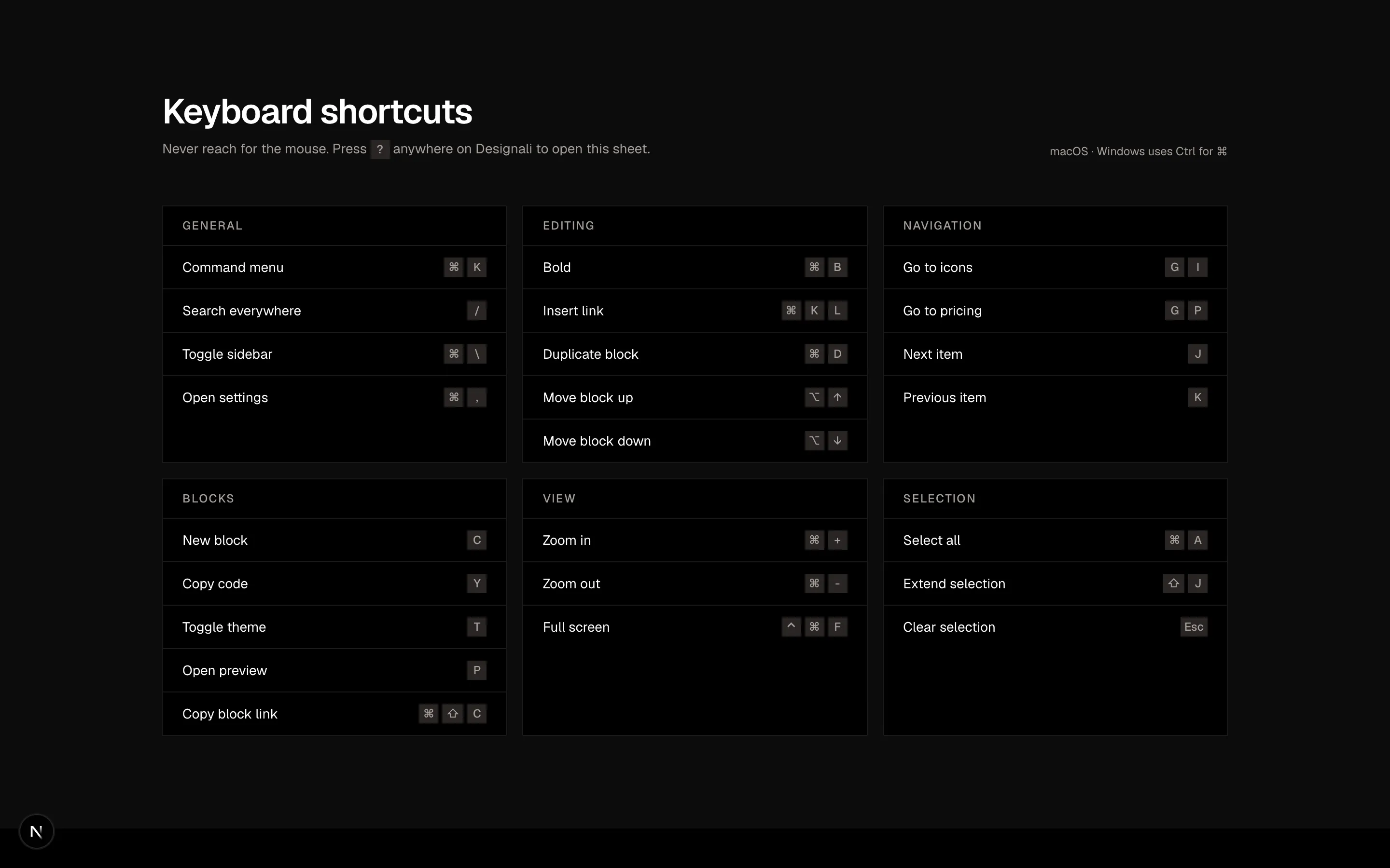
Keyboard shortcut cheat sheet grid of grouped cards with key caps.
grid-20