Files
"use client"

import { Dithering  } from "@paper-design/shaders-react"
import { Abstract12Shapes, Abstract131Shapes, Abstract36Shapes } from "@designali/vectors"

export function FeatureSection() {
  return (
    <div className="mx-auto flex min-h-screen w-full max-w-5xl flex-col justify-center px-4">
      <div className="flex flex-col items-center justify-center py-10">
        {/* Heading */}
        <div>
          <h1 className="mx-auto mb-10 max-w-xs px-6 text-center text-xl md:max-w-full md:text-3xl">
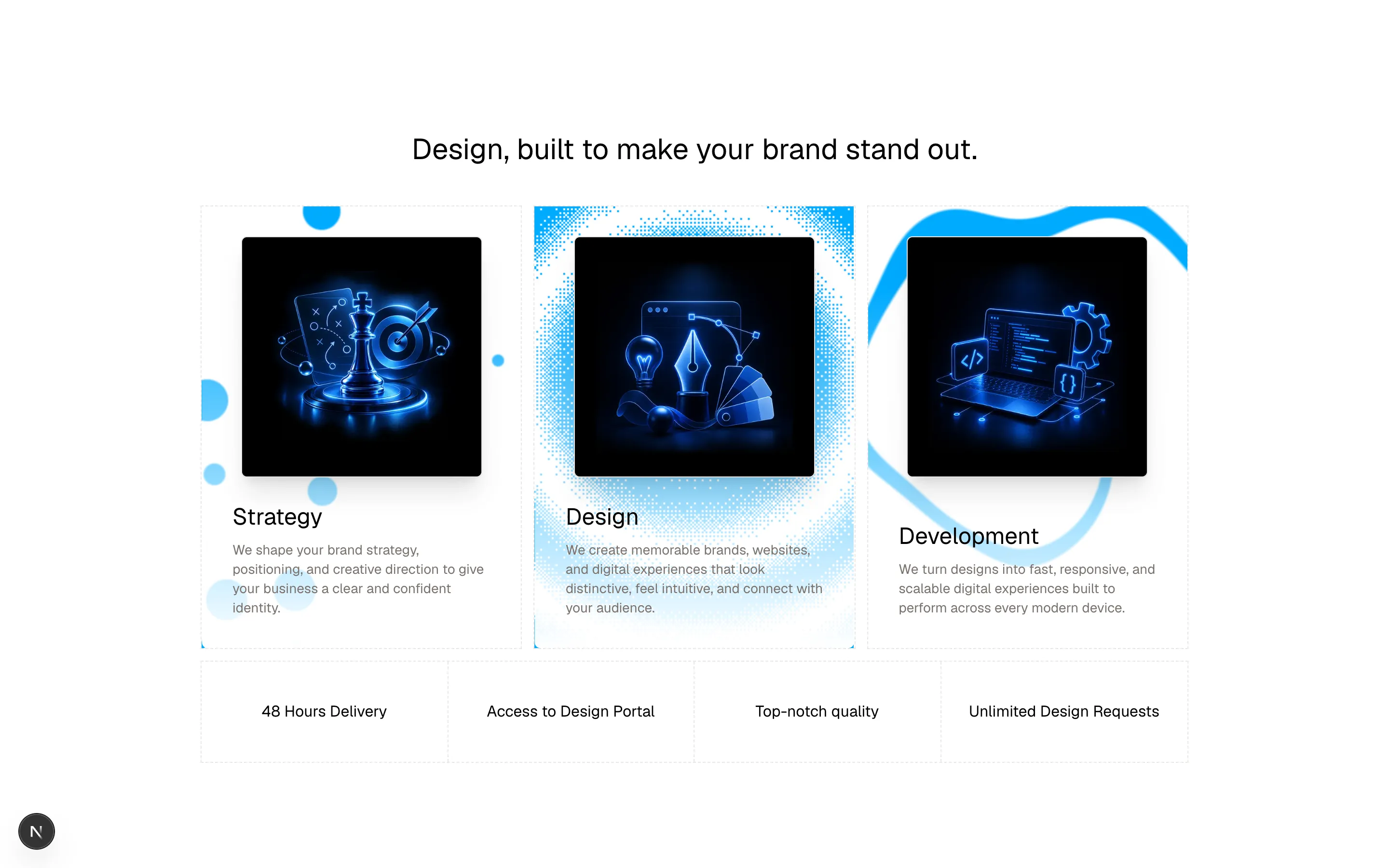
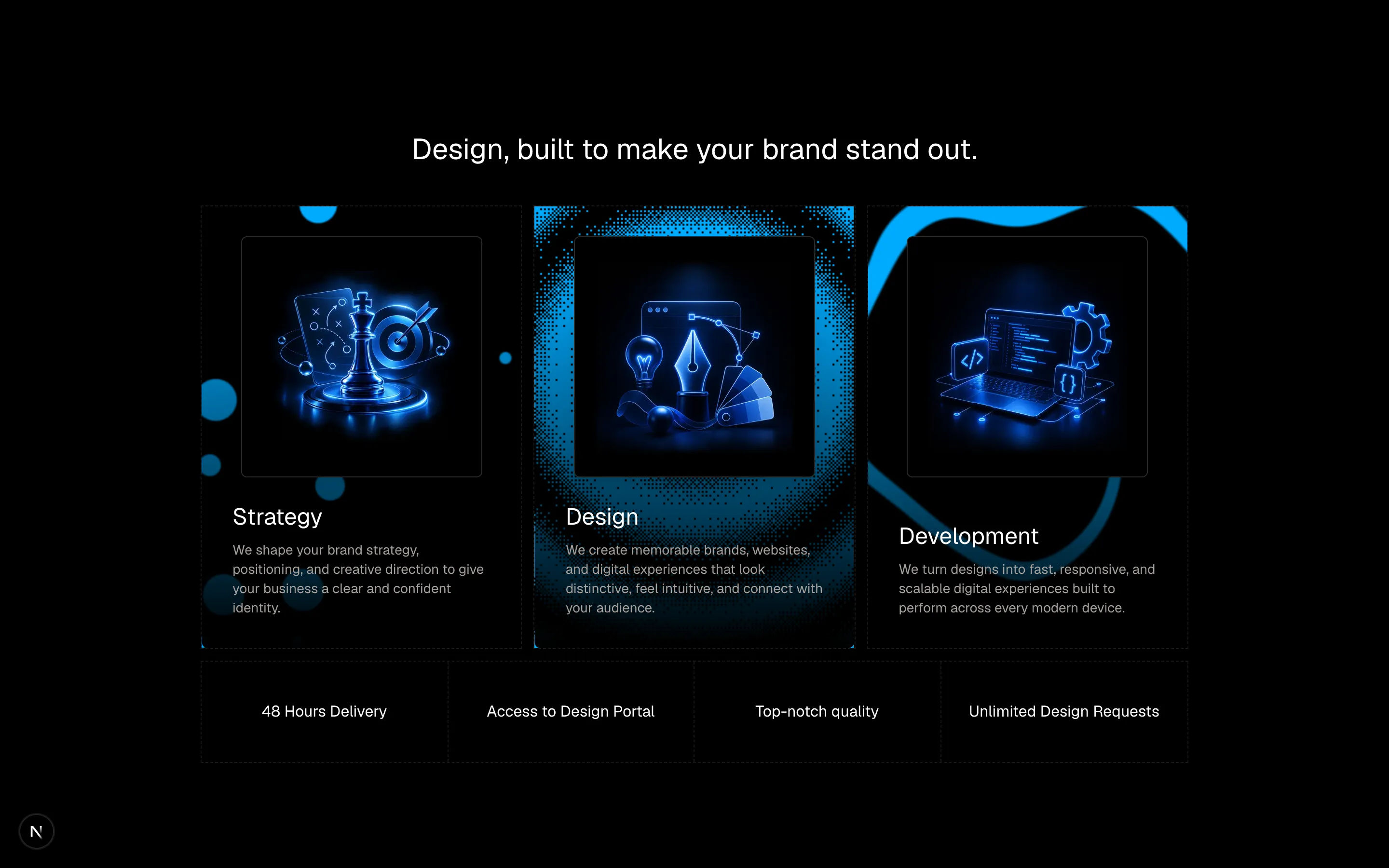
            designali — design se code tak, built to make your brand stand out.
          </h1>
        </div>

        {/* Cards */}
        <div className="grid w-full grid-cols-1 gap-3 md:grid-cols-3">
          {/* Strategy */}
          <div className="h-[430px] overflow-hidden border border-dashed md:h-[460px]">
            <div className="relative h-full">
              {/* Icon */}
              <div className="absolute left-1/2  top-40 z-10 flex size-60 -translate-x-1/2 -translate-y-1/2 items-center justify-center border bg-background/80 backdrop-blur-md">

                <Abstract12Shapes className="size-40 animate-[spin_30s_linear_infinite]" />
              </div>

              <div className="absolute bottom-0 left-1/2 w-full -translate-x-1/2 rounded-b-sm bg-gradient-to-t from-white to-transparent p-8 pt-60 dark:from-black dark:to-transparent">
                <h2 className="text-2xl">Strategy</h2>
                <p className="pt-2 text-sm text-muted-foreground">
                  We shape your brand strategy, positioning, and creative
                  direction to give your business a clear and confident
                  identity.
                </p>
              </div>
            </div>
          </div>

          {/* Design */}
          <div className="h-[430px] overflow-hidden border border-dashed md:h-[460px]">
            <div className="relative h-full">
              {/* Icon */}
              <div className="absolute left-1/2  top-40 z-10 flex size-60 -translate-x-1/2 -translate-y-1/2 items-center justify-center border bg-background/80 backdrop-blur-md">

              <Abstract131Shapes className="size-40 animate-[spin_30s_linear_infinite]" />
              </div>

              <Dithering
                className="absolute bottom-0 h-full w-full"
                colorBack="#00000000"
                colorFront="#00A8FF"
                shape="ripple"
                type="8x8"
                size={2}
                speed={1}
                offsetY={-0.15}
              />

              <div className="absolute bottom-0 left-1/2 w-full -translate-x-1/2 rounded-b-sm bg-gradient-to-t from-white to-transparent p-8 pt-60 dark:from-black dark:to-transparent">
                <h2 className="text-2xl">Design</h2>
                <p className="pt-2 text-sm text-muted-foreground">
                  We create memorable brands, websites, and digital
                  experiences that look distinctive, feel intuitive, and
                  connect with your audience.
                </p>
              </div>
            </div>
          </div>

          {/* Development */}
          <div className="h-[430px] overflow-hidden border border-dashed md:h-[460px]">
            <div className="relative h-full">
              {/* Icon */}
              <div className="absolute left-1/2  top-40 z-10 flex size-60 -translate-x-1/2 -translate-y-1/2 items-center justify-center border bg-background">
              <Abstract36Shapes className="size-40 animate-[spin_30s_linear_infinite]" />
              </div>


              <div className="absolute bottom-0 left-1/2 w-full -translate-x-1/2 rounded-b-sm bg-gradient-to-t from-white to-transparent p-8 pt-60 dark:from-black dark:to-transparent">
                <h2 className="text-2xl">Development</h2>
                <p className="pt-2 text-sm text-muted-foreground">
                  We turn designs into fast, responsive, and scalable digital
                  experiences built to perform across every modern device.
                </p>
              </div>
            </div>
          </div>
        </div>

        {/* Benefits */}
        <div className="relative mt-3 h-full w-full border border-dashed">
          <div className="grid w-full grid-cols-1 md:grid-cols-2 lg:grid-cols-4">
            <div className="border-b border-dashed py-10 md:border-r lg:border-b-0 lg:border-r">
              <p className="text-center text-sm">Brand identity</p>
            </div>

            <div className="border-b border-dashed py-10 lg:border-b-0 lg:border-r">
              <p className="text-center text-sm">UI/UX design</p>
            </div>

            <div className="border-b border-dashed py-10 md:border-r md:border-b-0 lg:border-r">
              <p className="text-center text-sm">Next.js development</p>
            </div>

            <div className="py-10">
              <p className="text-center text-sm">
                Design systems
              </p>
            </div>
          </div>
        </div>
      </div>
    </div>
  )
}
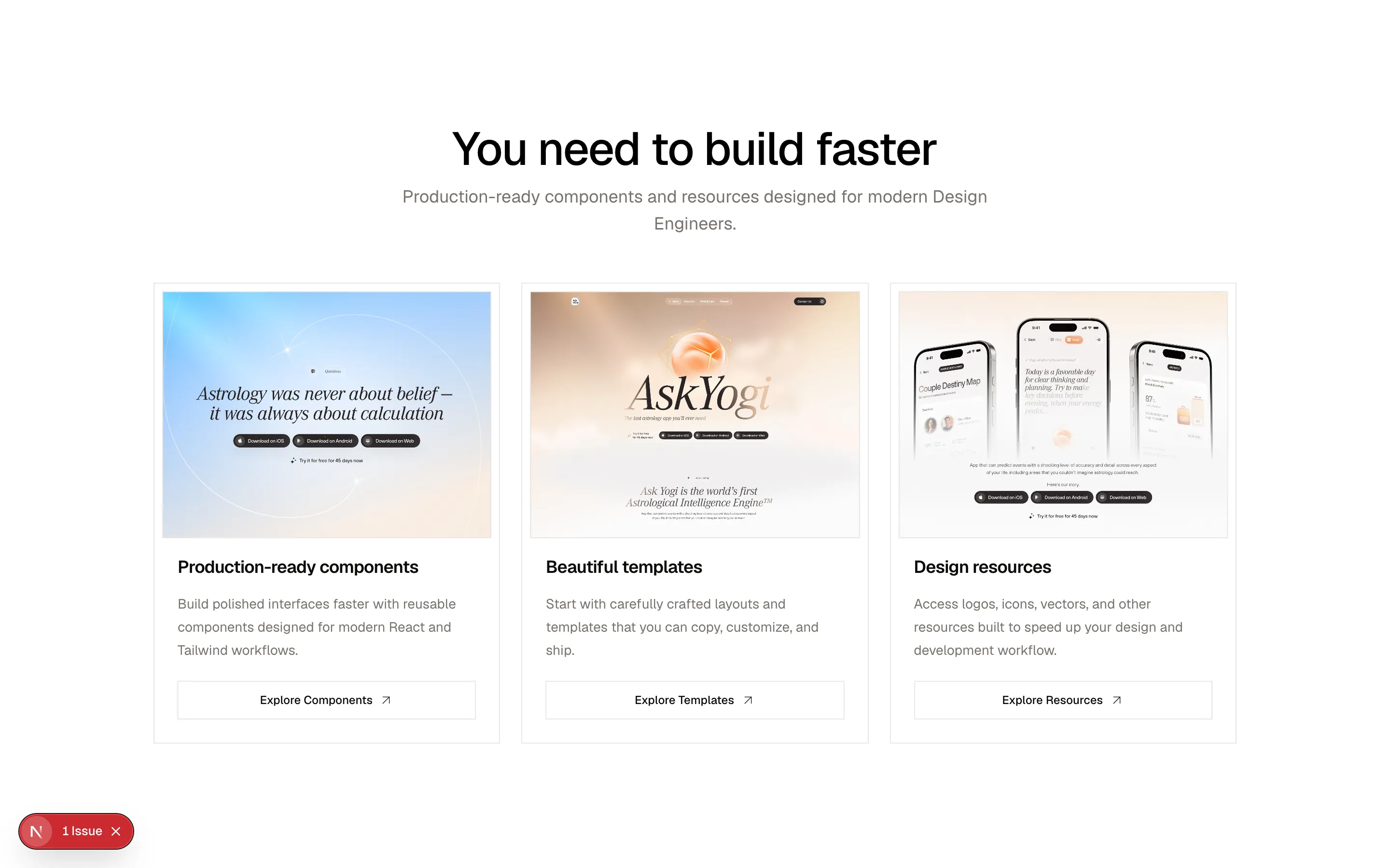
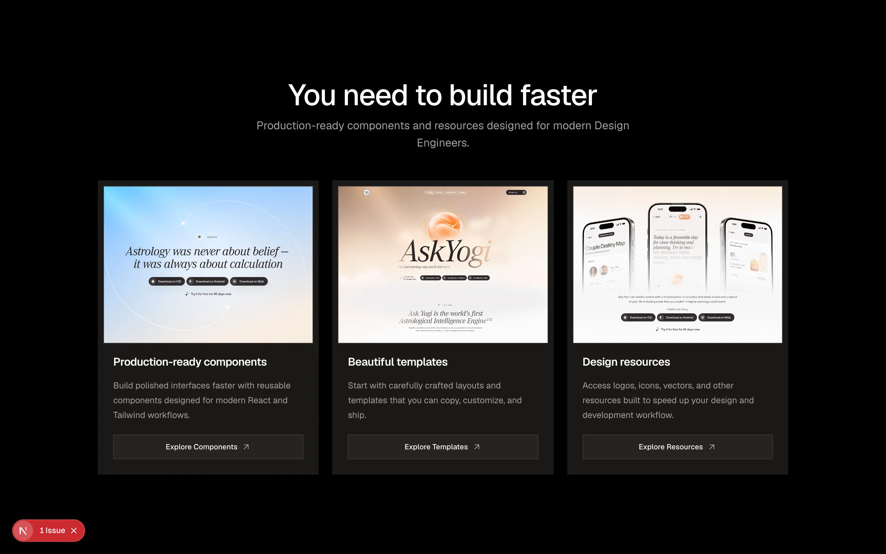
A simple feature section.
feature-01
Files
import {
  ArrowUpRight,
} from "@designali/icons"
import { cn } from "@/lib/utils"
import {
  Card,
  CardContent,
  CardHeader,
} from "@/components/ui/card"
import { Button } from "@/components/ui/button"

interface FeatureItem {
  img?: string
  title: string
  description: string
  link?: {
    text: string
    url: string
  }
}

interface Feature01Props {
  title?: string
  description?: string
  features?: FeatureItem[]
  className?: string
}

export const Feature02 = ({
  title = "Build faster with Designali",
  description = "460+ blocks, templates, and design resources by Ali Imam, made for modern design engineers.",
  features = [
    {
      img: "/img/ask/ask7.jpg",
      title: "Production-ready components",
      description:
        "Build polished interfaces faster with reusable components designed for modern React and Tailwind workflows.",
      link: {
        text: "Explore Components",
        url: "/blocks",
      },
    },
    {
      img: "/img/ask/ask14.jpg",
      title: "Beautiful templates",
      description:
        "Start with carefully crafted layouts and templates that you can copy, customize, and ship.",
      link: {
        text: "Explore Templates",
        url: "/templates",
      },
    },
    {
      img: "/img/ask/ask12.jpg",
      title: "Design resources",
      description:
        "Access logos, icons, vectors, and other resources built to speed up your design and development workflow.",
      link: {
        text: "Explore Resources",
        url: "/logos",
      },
    },
  ],
  className,
}: Feature01Props) => {
  return (
    <section
      className={cn(
        "max-w-6xl mx-auto h-screen flex flex-col justify-center px-4 py-10",
        className
      )}
    >
      {/* Header */}
      <div className="mx-auto flex max-w-2xl flex-col items-center gap-3 text-center">
        <h2 className="text-3xl font-medium tracking-tight md:text-4xl lg:text-5xl">
          {title}
        </h2>

        {description && (
          <p className="text-muted-foreground md:text-lg">
            {description}
          </p>
        )}
      </div>

      {/* Features */}
      <div className="mt-12 grid gap-6 sm:grid-cols-2 lg:grid-cols-3">
        {features.map((feature) => (
          <Card
            key={feature.title}
            className="group flex flex-col gap-0 overflow-hidden  p-2 shadow-none transition-colors"
          >
            <CardHeader className="gap-0 p-0">
              {feature.img && (
                <div className="overflow-hidden  border bg-muted">
                  <img
                    src={feature.img}
                    alt={feature.title}
                    className="aspect-[4/3] h-full w-full object-cover transition-transform duration-500 group-hover:scale-[1.02]"
                  />
                </div>
              )}
            </CardHeader>

            <CardContent className="flex flex-1 flex-col gap-3 p-4">
              <h3 className="text-lg font-semibold tracking-tight">
                {feature.title}
              </h3>

              <p className="flex-1 text-sm leading-6 text-muted-foreground">
                {feature.description}
              </p>

              {feature.link && (
                <Button
                  variant="outline"
                  render={ <a href={feature.link.url}/>}
                  className="mt-2 w-full" >
                   {feature.link.text}
                    <ArrowUpRight className="size-4" />

                </Button>
              )}
            </CardContent>
          </Card>
        ))}
      </div>
    </section>
  )
}
A simple feature section.
feature-02
Files
import { cn } from "@/lib/utils"
import { BentoGrid, BentoGridItem } from "@/components/ui/bento"
import {
  Copy,
  Sparkles,
  CodeXml as Code2,
  LayoutTemplate,
  Gauge,
} from "@designali/icons"

interface FeatureItem {
  icon: React.ReactNode
  title: string
  description: string
  featured?: boolean
}

interface Feature08Props {
  label?: string
  title?: string
  description?: string
  features?: FeatureItem[]
  className?: string
}

const FeatureCard = ({
  icon,
  title,
  description,
  featured,
}: FeatureItem) => (
  <BentoGridItem
    colSpan={featured ? { base: 1, md: 2, lg: 1 } : 1}
    rowSpan={featured ? { base: 1, lg: 2 } : 1}
    className={cn(
      "overflow-hidden p-0",
      featured ? "border-0 bg-foreground text-background" : "bg-muted/50",
    )}
  >
    <div
      className={cn(
        "flex flex-col p-6",
        featured ? "h-full min-h-[360px]" : "gap-5",
      )}
    >
      <div
        className={cn(
          "flex size-11 items-center justify-center border",
          featured
            ? "border-background/15 bg-background/10"
            : "border-border bg-background",
        )}
      >
        <span
          className={cn(
            "flex items-center justify-center",
            !featured && "text-foreground",
          )}
        >
          {icon}
        </span>
      </div>

      <div
        className={cn(
          "flex flex-col gap-2",
          featured && "mt-auto gap-3 pt-10",
        )}
      >
        <h3
          className={cn(
            "font-medium tracking-tight",
            featured && "text-xl",
          )}
        >
          {title}
        </h3>

        <p
          className={cn(
            "text-sm leading-6",
            !featured && "text-muted-foreground",
            featured && "text-background/70",
          )}
        >
          {description}
        </p>
      </div>
    </div>
  </BentoGridItem>
)

export const Feature08 = ({
  label = "Features",
  title = "Everything you need to ship with Designali",
  description = "A modern toolkit of blocks, templates, icons, and logos by Designali, built for design engineers.",
  features = [
    {
      icon: <Copy className="size-5" />,
      title: "Copy & paste ready",
      description:
        "Production-ready components you can copy directly into your project and customize to fit your needs.",
      featured: true,
    },
    {
      icon: <Sparkles className="size-5" />,
      title: "Fully customizable",
      description:
        "Built with Tailwind CSS so you can easily adapt every component to your product and brand.",
    },
    {
      icon: <Code2 className="size-5" />,
      title: "TypeScript first",
      description:
        "Written with TypeScript for type safety, better developer experience, and reliable code.",
    },
    {
      icon: <LayoutTemplate className="size-5" />,
      title: "Ready-made templates",
      description:
        "Start projects faster with polished templates and layouts designed for real-world products.",
    },
    {
      icon: <Gauge className="size-5" />,
      title: "Built for performance",
      description:
        "Lightweight components and clean code designed to keep your interfaces fast and responsive.",
    },
  ],
  className,
}: Feature08Props) => (
  <section
    className={cn(
      "w-full h-screen flex flex-col justify-center px-4 py-10",
      className,
    )}
  >
    {/* Header */}
    <div className="mx-auto flex max-w-3xl flex-col items-center gap-4 text-center">
      {label && (
        <p className="text-xs font-medium tracking-[0.2em] text-muted-foreground uppercase">
          {label}
        </p>
      )}

      <h2 className="text-3xl font-medium tracking-tight md:text-4xl lg:text-5xl">
        {title}
      </h2>

      {description && (
        <p className="max-w-2xl text-muted-foreground md:text-lg">
          {description}
        </p>
      )}
    </div>

    {/* Features */}
    <BentoGrid
      cols={{ base: 1, md: 2, lg: 3 }}
      gap={3}
      rowHeight="auto"
      className="mt-12 h-auto max-w-5xl"
    >
      {features.map((feature, index) => (
        <FeatureCard key={index} {...feature} />
      ))}
    </BentoGrid>
  </section>
)
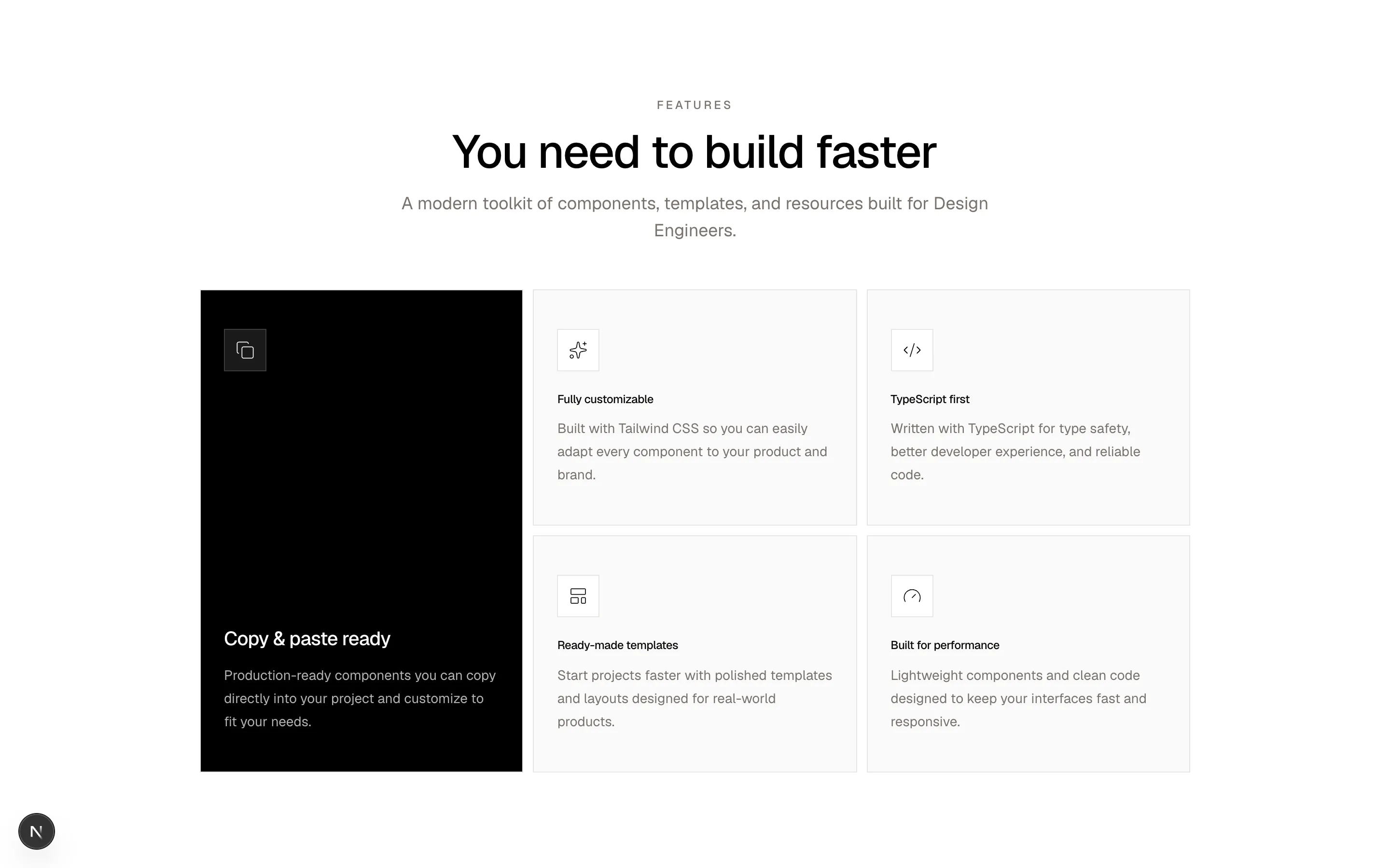
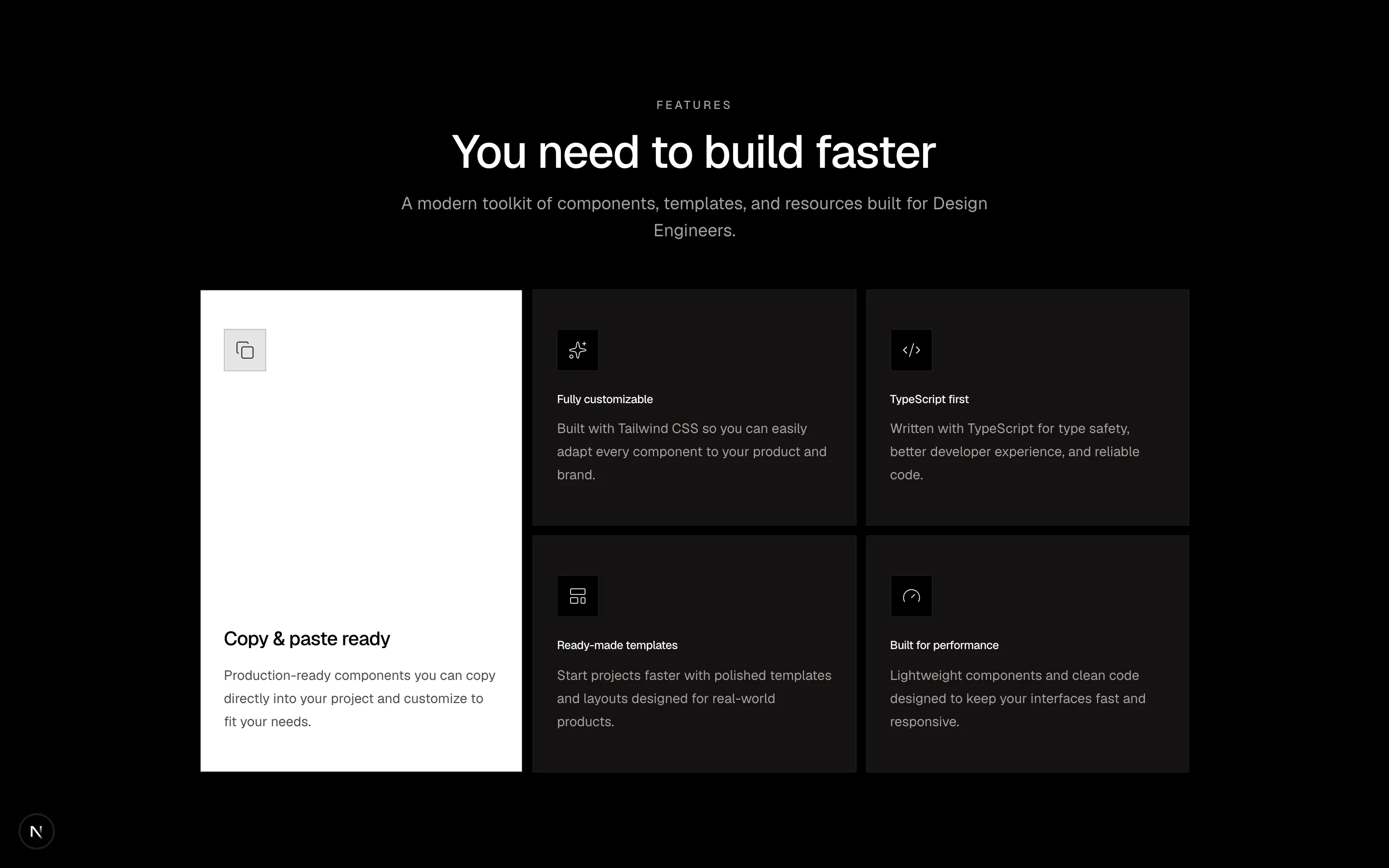
A simple feature section.
feature-03
Files
"use client"

import { cn } from "@/lib/utils"
import { motion } from "framer-motion"

import {
  ClaudeAI,
  Cursor,
  Github,
  Grok,
  OpenAI,
  Replicate,
  Vercel,
} from "@designali/logos"

interface IntegrationIcon {
  icon: React.ReactNode
  className?: string
}

interface Integration01Props {
  label?: string
  title?: string
  description?: string
  integrations?: IntegrationIcon[]
  className?: string
}

const IntegrationIconBubble = ({
  icon,
  className,
}: IntegrationIcon) => {
  return (
    <div
      className={cn(
        "flex h-20 w-20 items-center justify-center border bg-background",
        className
      )}
    >
      {icon}
    </div>
  )
}

export const Features = ({
  label = "Integrations",
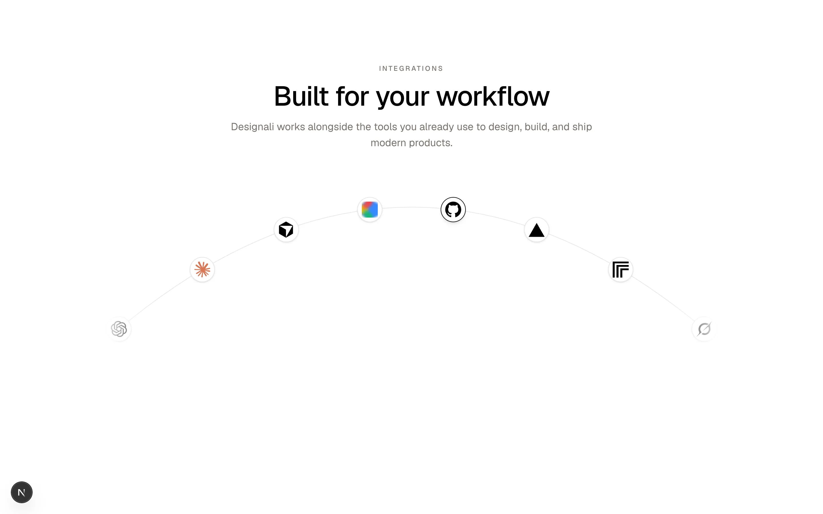
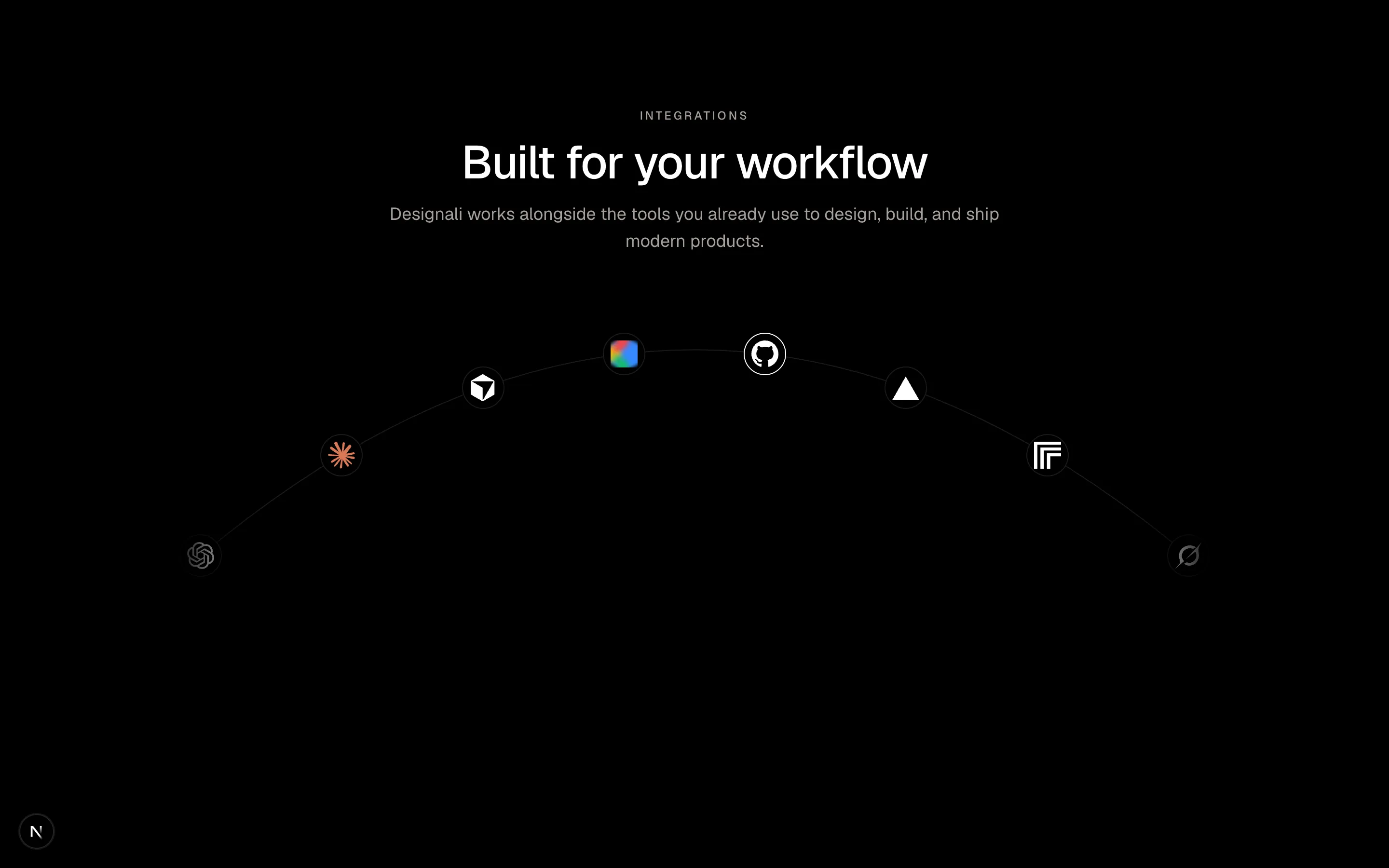
  title = "Built for your workflow",
  description = "Designali works alongside the tools you already use to design, build, and ship modern products.",
  integrations = [
    { icon: <OpenAI size={28} /> },
    { icon: <ClaudeAI size={28} /> },
    { icon: <Cursor size={28} /> },
    { icon: <Github size={28} /> },
    { icon: <Vercel size={28} /> },
    { icon: <Replicate size={28} /> },
    { icon: <Grok size={28} /> },
  ],
  className,
}: Integration01Props) => {
  /**
   * Get position on quadratic bezier curve
   */
  const getPositionOnCurve = (index: number, total: number) => {
    if (total <= 1) {
      return {
        x: 50,
        y: 20,
      }
    }

    const t = index / (total - 1)

    const p0 = {
      x: 0,
      y: 75,
    }

    const p1 = {
      x: 50,
      y: -50,
    }

    const p2 = {
      x: 100,
      y: 75,
    }

    const x =
      Math.pow(1 - t, 2) * p0.x +
      2 * (1 - t) * t * p1.x +
      Math.pow(t, 2) * p2.x

    const y =
      Math.pow(1 - t, 2) * p0.y +
      2 * (1 - t) * t * p1.y +
      Math.pow(t, 2) * p2.y

    return {
      x,
      y,
    }
  }

  const mobileIntegrations = integrations.slice(0, 5)

  /**
   * Arc marquee
   *
   * Logos move from left -> center -> right
   * and then loop back to the beginning.
   *
   * The logo itself never rotates.
   */
  const renderIntegrationArc = (
    icons: IntegrationIcon[],
    className?: string
  ) => {
    const count = icons.length

    return (
      <div
        className={cn(
          "relative aspect-[3/1]",
          className
        )}
      >
        {/* Arc */}
        <svg
          className="absolute inset-0 size-full overflow-visible"
          viewBox="0 0 100 100"
          preserveAspectRatio="none"
          fill="none"
        >
          <path
            d="M 0 75 Q 50 -50 100 75"
            stroke="currentColor"
            strokeWidth="1"
            className="text-border"
            vectorEffect="non-scaling-stroke"
          />
        </svg>

        {/* Logos */}
        {icons.map((integration, index) => {
          const start = getPositionOnCurve(index, count)

          return (
            <motion.div
              key={index}
              className="absolute -translate-x-1/2 -translate-y-1/2"
              initial={{
                left: `${start.x}%`,
                top: `${start.y}%`,
              }}
              animate={{
                left: [
                  `${start.x}%`,
                  `${start.x}%`,
                  `${start.x}%`,
                ],
                top: [
                  `${start.y}%`,
                  `${start.y}%`,
                  `${start.y}%`,
                ],
              }}
              transition={{
                duration: 20,
                repeat: Infinity,
                ease: "linear",
              }}
            >
              <motion.div
                animate={{
                  /**
                   * Move the bubble along the arc
                   * without rotating the logo.
                   */
                  x: [
                    "0%",
                    "0%",
                  ],
                }}
              >
                <IntegrationIconBubble
                  icon={integration.icon}
                  className={integration.className}
                />
              </motion.div>
            </motion.div>
          )
        })}

        {/* Left Gradient */}
        <div
          className="
            pointer-events-none
            absolute
            inset-y-0
            -left-8
            w-1/4
            bg-linear-to-r
            from-background
            to-transparent
            md:w-24
          "
        />

        {/* Right Gradient */}
        <div
          className="
            pointer-events-none
            absolute
            inset-y-0
            -right-8
            w-1/4
            bg-linear-to-l
            from-background
            to-transparent
            md:w-24
          "
        />
      </div>
    )
  }

  return (
    <section
      className={cn(
        "container mx-auto overflow-hidden px-4 py-20 md:py-28",
        className
      )}
    >
      {/* Header */}
      <div className="mx-auto flex max-w-2xl flex-col items-center gap-4 text-center">
        {label && (
          <p className="text-xs font-medium tracking-[0.2em] text-muted-foreground uppercase">
            {label}
          </p>
        )}

        <h2 className="text-4xl font-medium tracking-tight md:text-5xl">
          {title}
        </h2>

        {description && (
          <p className="text-muted-foreground md:text-lg">
            {description}
          </p>
        )}
      </div>

      {/* Integration Arc */}
      <div className="relative mx-auto mt-14 max-w-5xl">
        {/* Mobile */}
        {renderIntegrationArc(
          mobileIntegrations,
          "md:hidden"
        )}

        {/* Desktop */}
        {renderIntegrationArc(
          integrations,
          "hidden md:block"
        )}
      </div>
    </section>
  )
}
A simple feature section.
feature-04
Files
import {
  Gauge,
  GitBranch,
  Globe,
  Layers,
  Lock,
  Zap,
} from "@designali/icons"

const features = [
  {
    icon: Zap,
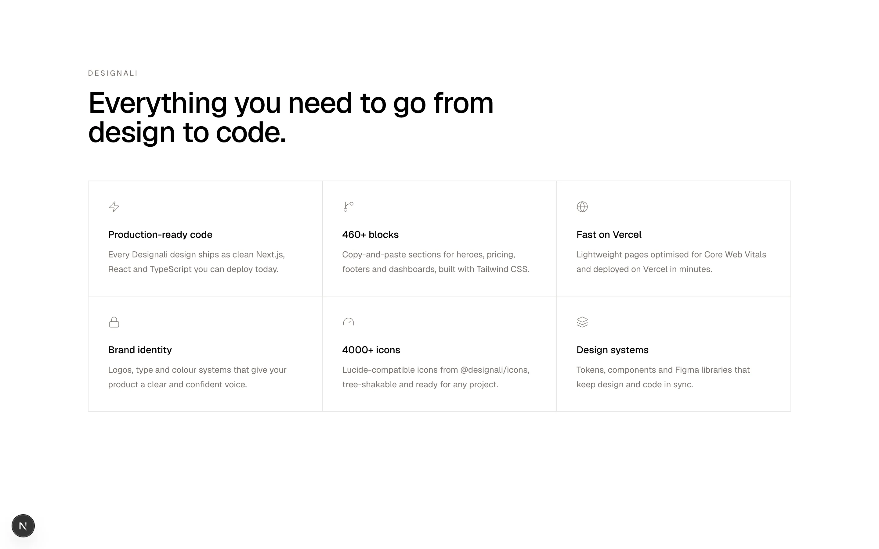
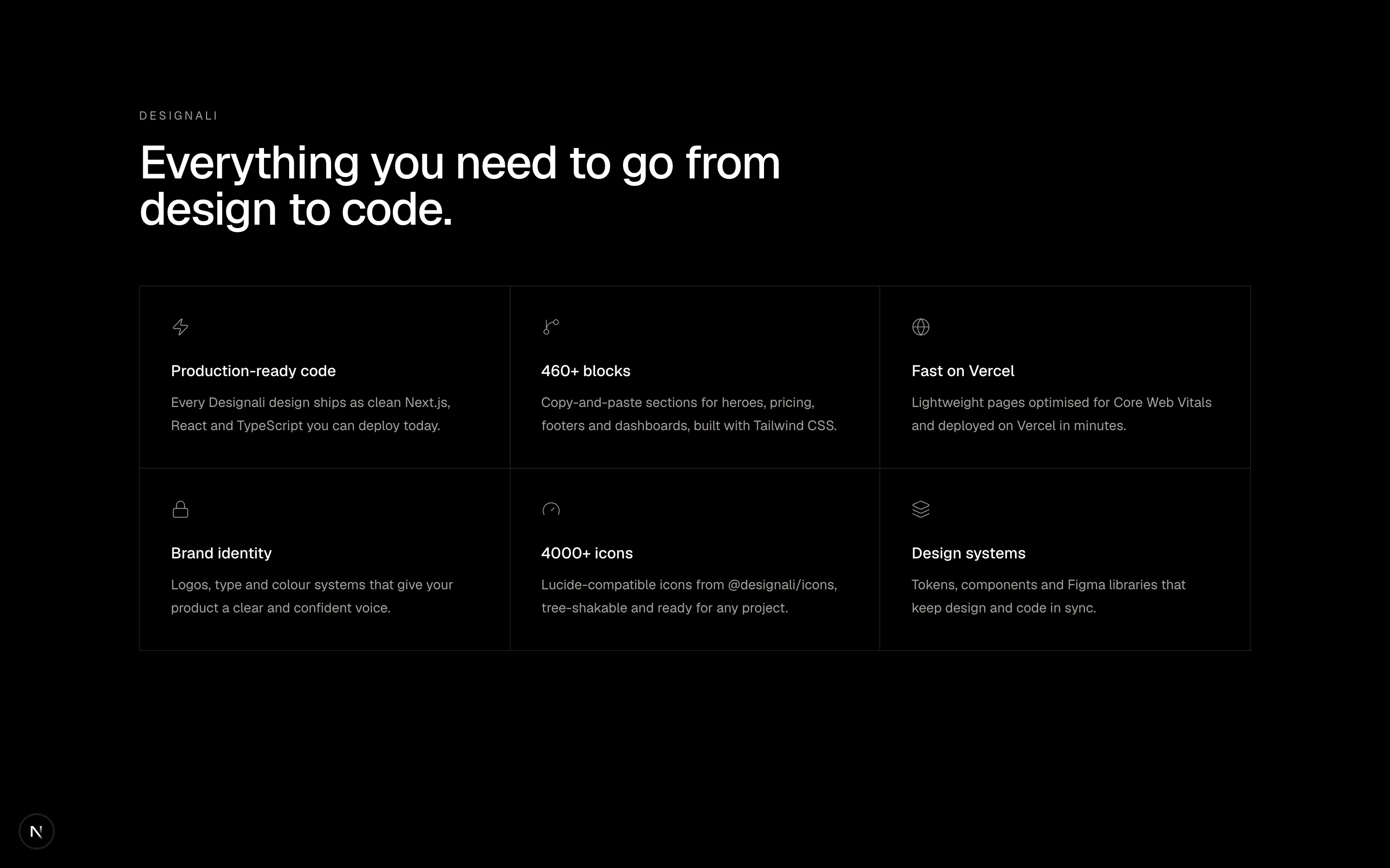
    title: "Production-ready code",
    body: "Every Designali design ships as clean Next.js, React and TypeScript you can deploy today.",
  },
  {
    icon: GitBranch,
    title: "460+ blocks",
    body: "Copy-and-paste sections for heroes, pricing, footers and dashboards, built with Tailwind CSS.",
  },
  {
    icon: Globe,
    title: "Fast on Vercel",
    body: "Lightweight pages optimised for Core Web Vitals and deployed on Vercel in minutes.",
  },
  {
    icon: Lock,
    title: "Brand identity",
    body: "Logos, type and colour systems that give your product a clear and confident voice.",
  },
  {
    icon: Gauge,
    title: "4000+ icons",
    body: "Lucide-compatible icons from @designali/icons, tree-shakable and ready for any project.",
  },
  {
    icon: Layers,
    title: "Design systems",
    body: "Tokens, components and Figma libraries that keep design and code in sync.",
  },
]

export function Features05() {
  return (
    <section className="w-full bg-background px-6 py-20 md:py-28">
      <div className="mx-auto max-w-6xl">
        <div className="max-w-2xl">
          <p className="text-xs tracking-[0.2em] text-muted-foreground uppercase">
            Designali
          </p>
          <h2 className="mt-4 text-3xl font-medium tracking-tight md:text-5xl">
            Everything you need to go from design to code.
          </h2>
        </div>
        <div className="mt-14 grid border-t border-l border-border sm:grid-cols-2 lg:grid-cols-3">
          {features.map(({ icon: Icon, title, body }) => (
            <div
              key={title}
              className="border-r border-b border-border p-8 transition-colors hover:bg-muted/50"
            >
              <Icon className="size-5 text-muted-foreground" />
              <h3 className="mt-6 text-base font-medium">{title}</h3>
              <p className="mt-2 text-sm leading-6 text-muted-foreground">
                {body}
              </p>
            </div>
          ))}
        </div>
      </div>
    </section>
  )
}
A six-item bordered feature grid with icons.
features-05
Files
import {
  Check,
} from "@designali/icons"

import { Macbook } from "@/components/ui/apple/macbook"

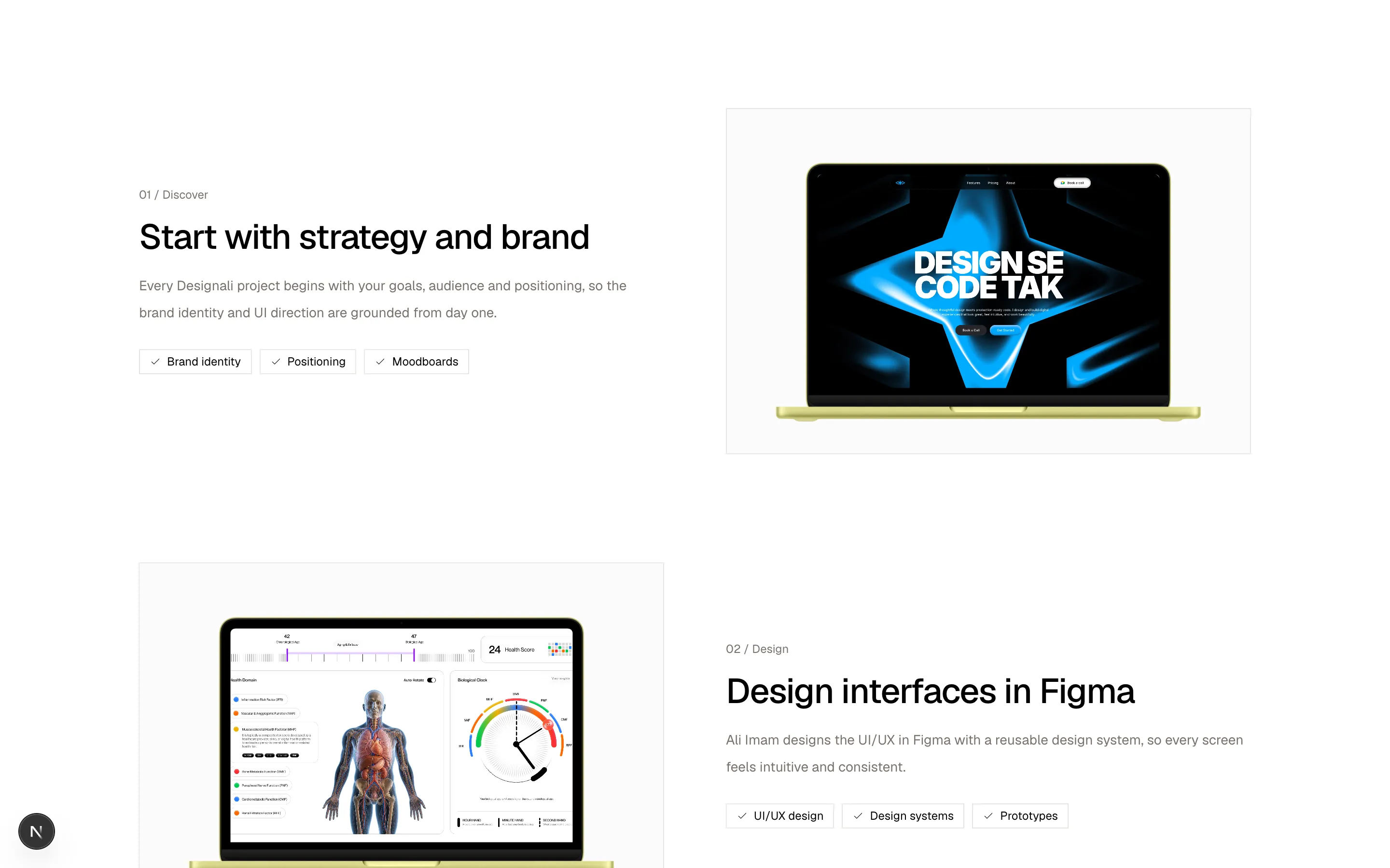
const rows = [
  {
    eyebrow: "01 / Discover",
    title: "Start with strategy and brand",
    body: "Every Designali project begins with your goals, audience and positioning, so the brand identity and UI direction are grounded from day one.",
    points: ["Brand identity", "Positioning", "Moodboards"],
  },
  {
    eyebrow: "02 / Design",
    title: "Design interfaces in Figma",
    body: "Ali Imam designs the UI/UX in Figma with a reusable design system, so every screen feels intuitive and consistent.",
    points: ["UI/UX design", "Design systems", "Prototypes"],
  },
  {
    eyebrow: "03 / Build",
    title: "Ship production-ready code",
    body: "Designs are turned into fast, responsive Next.js sites with Tailwind CSS and deployed on Vercel. Design se code tak.",
    points: ["Next.js", "Tailwind CSS", "Vercel"],
  },
]

const screens = [
  "/images/templates/design-agency.jpg",
  "/img/dashboard-1-light.jpg",
  "/images/templates/portfolio-simple.jpg",
]

function Visual({ index }: { index: number }) {
  return (
    <div className="flex w-full items-center justify-center border border-border bg-muted/40 p-6">
      <Macbook size="md" className="max-w-full">
        <img
          src={screens[index % screens.length]}
          alt="Designali project preview"
          className="size-full object-cover object-top"
        />
      </Macbook>
    </div>
  )
}

export function Features06() {
  return (
    <section className="w-full bg-background px-6 py-20 md:py-28">
      <div className="mx-auto max-w-6xl space-y-20 md:space-y-28">
        {rows.map((row, index) => (
          <div
            key={row.title}
            className="grid items-center gap-10 md:grid-cols-2 md:gap-16"
          >
            <div className={index % 2 === 1 ? "md:order-2" : undefined}>
              <p className="font-sans text-xs text-muted-foreground">
                {row.eyebrow}
              </p>
              <h3 className="mt-4 text-2xl font-medium tracking-tight md:text-4xl">
                {row.title}
              </h3>
              <p className="mt-4 text-sm leading-7 text-muted-foreground">
                {row.body}
              </p>
              <ul className="mt-6 flex flex-wrap gap-2">
                {row.points.map((point) => (
                  <li
                    key={point}
                    className="inline-flex items-center gap-1.5 border border-border px-2.5 py-1 text-xs"
                  >
                    <Check className="size-3" />
                    {point}
                  </li>
                ))}
              </ul>
            </div>
            <Visual index={index} />
          </div>
        ))}
      </div>
    </section>
  )
}
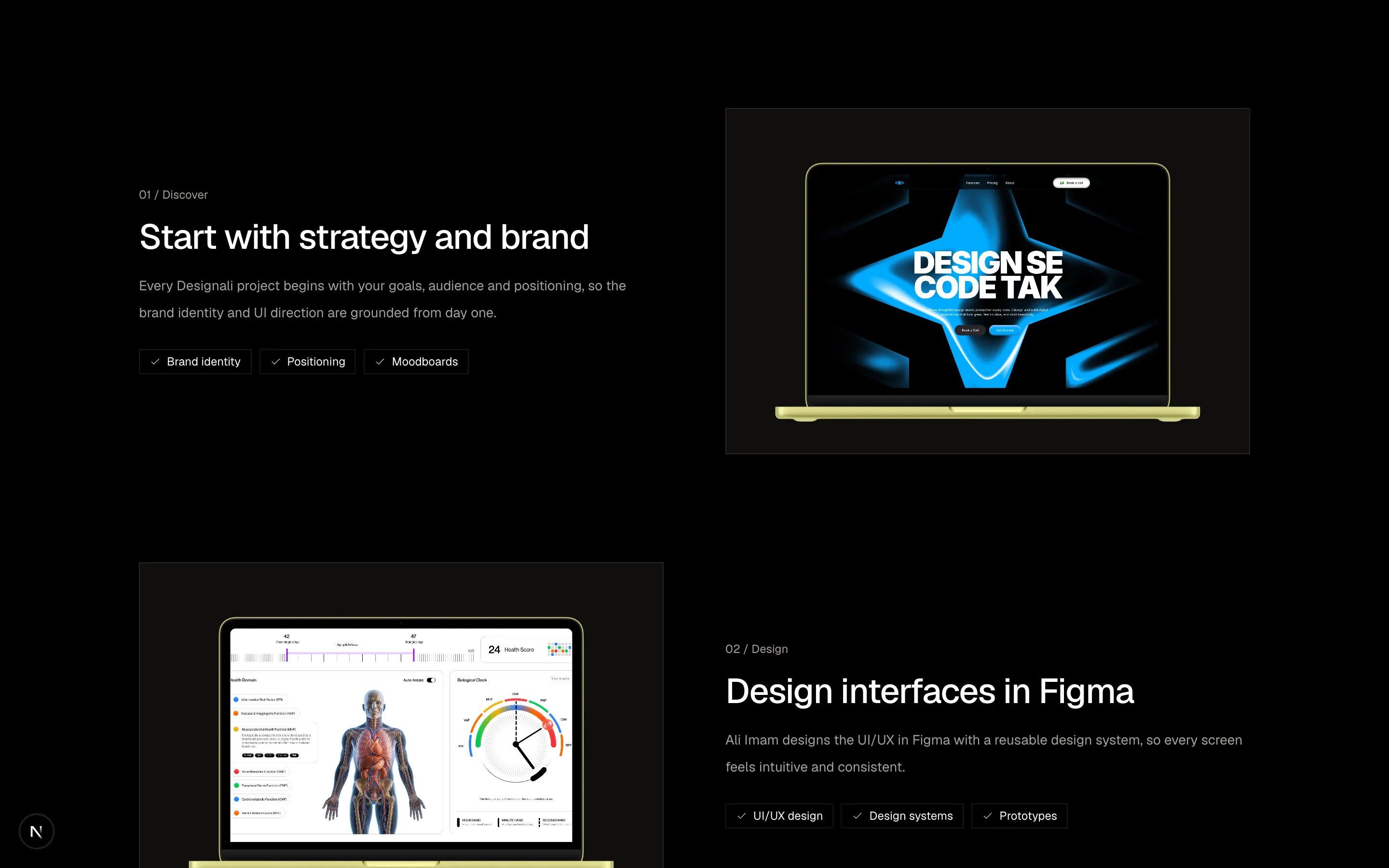
Alternating feature rows with numbered eyebrows, tags and mock UI visuals.
features-06
Files
import {
  Command,
  Database,
  Sparkles,
  Workflow,
} from "@designali/icons"

import { BentoGrid, BentoGridItem } from "@/components/ui/bento"

export function Features07() {
  return (
    <section className="w-full bg-muted/30 px-6 py-20 md:py-28">
      <div className="mx-auto max-w-6xl">
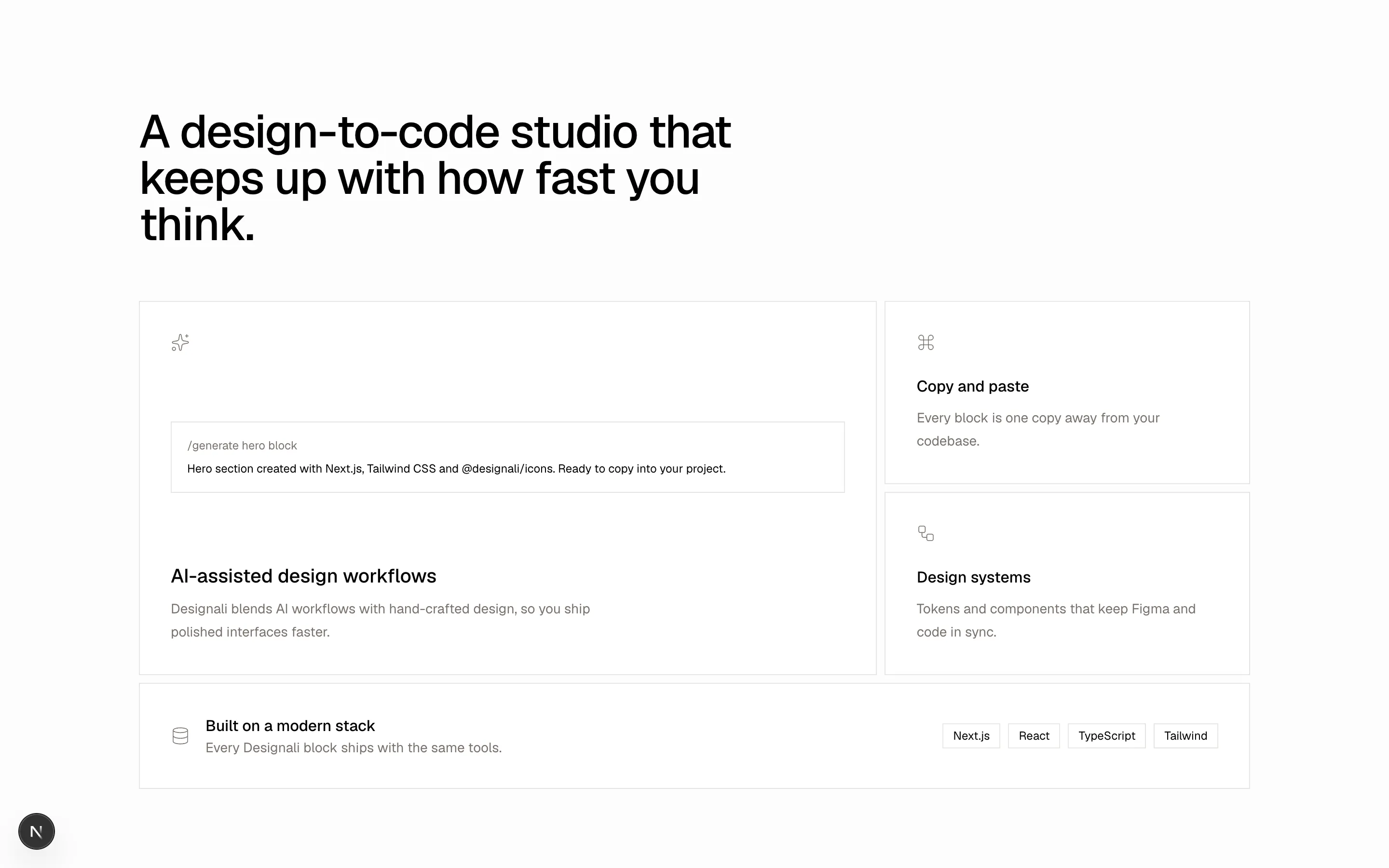
        <h2 className="max-w-2xl text-3xl font-medium tracking-tight md:text-5xl">
          A design-to-code studio that keeps up with how fast you think.
        </h2>
        <BentoGrid
          cols={{ base: 1, md: 6 }}
          gap={2}
          rowHeight="auto"
          className="mt-14 h-auto"
        >
          <BentoGridItem
            colSpan={{ base: 1, md: 4 }}
            rowSpan={{ base: 1, md: 2 }}
            className="flex flex-col justify-between p-8"
          >
            <Sparkles className="size-5 text-muted-foreground" />
            <div className="my-10 space-y-2 border border-border p-4 font-sans text-xs">
              <p className="text-muted-foreground">/generate hero block</p>
              <p>
                Hero section created with Next.js, Tailwind CSS and
                @designali/icons. Ready to copy into your project.
              </p>
            </div>
            <div>
              <h3 className="text-xl font-medium">AI-assisted design workflows</h3>
              <p className="mt-2 max-w-md text-sm leading-6 text-muted-foreground">
                Designali blends AI workflows with hand-crafted design, so
                you ship polished interfaces faster.
              </p>
            </div>
          </BentoGridItem>
          <BentoGridItem colSpan={{ base: 1, md: 2 }} className="p-8">
            <Command className="size-5 text-muted-foreground" />
            <h3 className="mt-6 font-medium">Copy and paste</h3>
            <p className="mt-2 text-sm leading-6 text-muted-foreground">
              Every block is one copy away from your codebase.
            </p>
          </BentoGridItem>
          <BentoGridItem colSpan={{ base: 1, md: 2 }} className="p-8">
            <Workflow className="size-5 text-muted-foreground" />
            <h3 className="mt-6 font-medium">Design systems</h3>
            <p className="mt-2 text-sm leading-6 text-muted-foreground">
              Tokens and components that keep Figma and code in sync.
            </p>
          </BentoGridItem>
          <BentoGridItem className="flex flex-col gap-6 p-8 md:col-span-6 md:flex-row md:items-center md:justify-between">
            <div className="flex items-center gap-4">
              <Database className="size-5 text-muted-foreground" />
              <div>
                <h3 className="font-medium">Built on a modern stack</h3>
                <p className="text-sm text-muted-foreground">
                  Every Designali block ships with the same tools.
                </p>
              </div>
            </div>
            <div className="flex gap-2 text-xs">
              {["Next.js", "React", "TypeScript", "Tailwind"].map((format) => (
                <span key={format} className="border border-border px-2.5 py-1">
                  {format}
                </span>
              ))}
            </div>
          </BentoGridItem>
        </BentoGrid>
      </div>
    </section>
  )
}
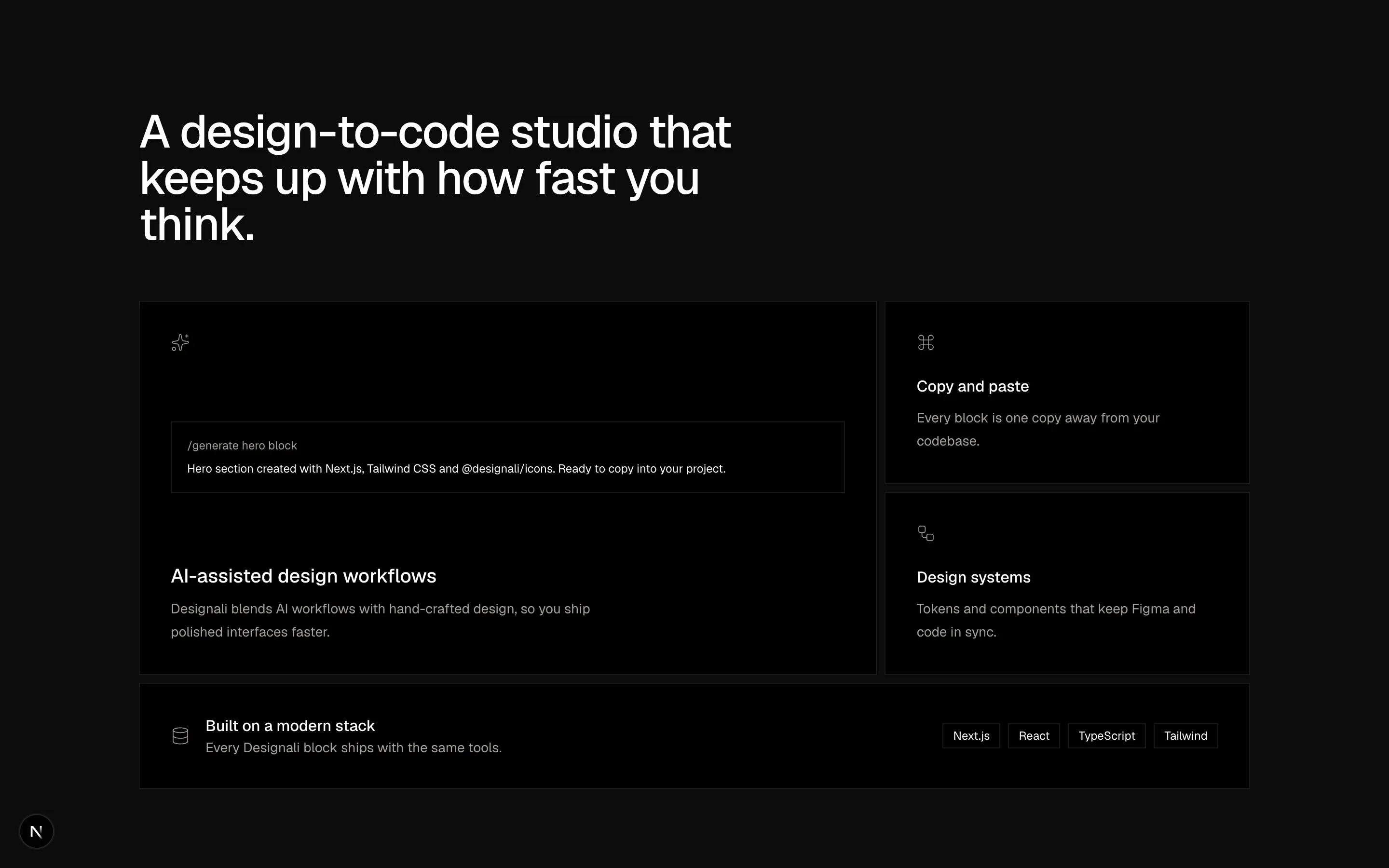
A bento feature layout with an assistant preview, small tiles and a wide export row.
features-07
Files
"use client"

import { useState } from "react"

import { cn } from "@/lib/utils"

import { CounterNumber } from "@/components/ui/counter-number"

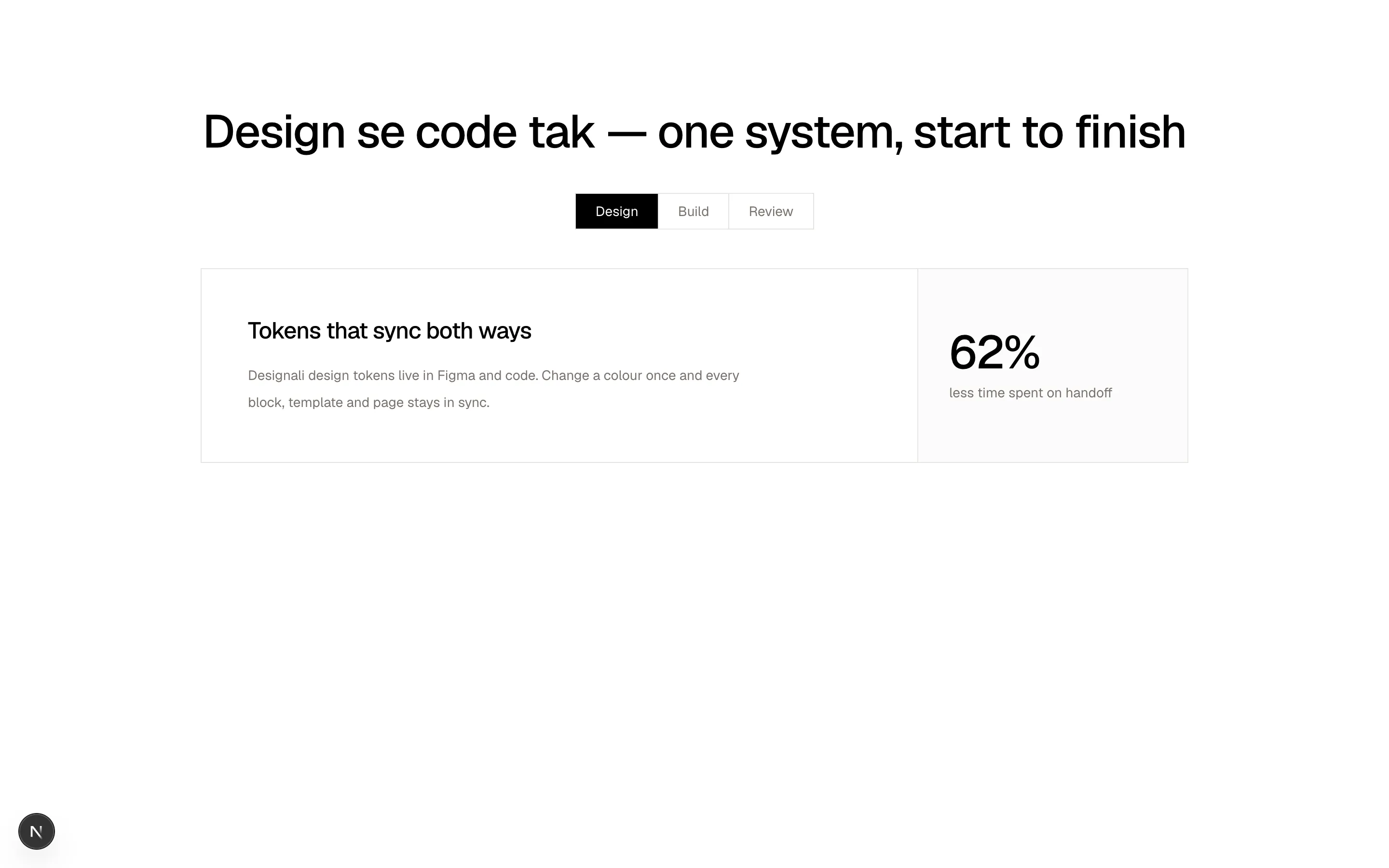
const tabs = [
  {
    id: "design",
    label: "Design",
    title: "Tokens that sync both ways",
    body: "Designali design tokens live in Figma and code. Change a colour once and every block, template and page stays in sync.",
    metric: 62,
    decimals: 0,
    suffix: "%",
    metricLabel: "less time spent on handoff",
  },
  {
    id: "build",
    label: "Build",
    title: "Components with guardrails",
    body: "Accessible components built with React, TypeScript and Tailwind CSS, so you compose new screens without reinventing behaviour.",
    metric: 3.4,
    decimals: 1,
    suffix: "x",
    metricLabel: "faster feature delivery",
  },
  {
    id: "review",
    label: "Review",
    title: "Shipped on Vercel",
    body: "Ali Imam reviews every page for polish and performance before it ships, so your site looks great and loads fast on every device.",
    metric: 91,
    decimals: 0,
    suffix: "%",
    metricLabel: "Lighthouse-ready pages",
  },
]

export function Features08() {
  const [active, setActive] = useState(tabs[0]!.id)
  const current = tabs.find((tab) => tab.id === active) ?? tabs[0]!

  return (
    <section className="w-full bg-background px-6 py-20 md:py-28">
      <div className="mx-auto max-w-5xl">
        <h2 className="text-center text-3xl font-medium tracking-tight md:text-5xl">
          Design se code tak — one system, start to finish
        </h2>
        <div className="mx-auto mt-10 flex w-fit border border-border">
          {tabs.map((tab) => (
            <button
              key={tab.id}
              type="button"
              onClick={() => setActive(tab.id)}
              className={cn(
                "px-5 py-2 text-sm transition-colors not-last:border-r not-last:border-border",
                active === tab.id
                  ? "bg-foreground text-background"
                  : "text-muted-foreground hover:text-foreground"
              )}
            >
              {tab.label}
            </button>
          ))}
        </div>
        <div className="mt-10 grid border border-border md:grid-cols-[1fr_280px]">
          <div className="p-8 md:p-12">
            <h3 className="text-2xl font-medium tracking-tight">
              {current.title}
            </h3>
            <p className="mt-4 max-w-lg text-sm leading-7 text-muted-foreground">
              {current.body}
            </p>
          </div>
          <div className="flex flex-col justify-center border-t border-border bg-muted/40 p-8 md:border-t-0 md:border-l">
            <CounterNumber
              key={current.id}
              value={current.metric}
              decimalPlaces={current.decimals}
              suffix={current.suffix}
              size="xl"
              className="font-medium tracking-tight"
            />
            <div className="mt-2 text-sm text-muted-foreground">
              {current.metricLabel}
            </div>
          </div>
        </div>
      </div>
    </section>
  )
}
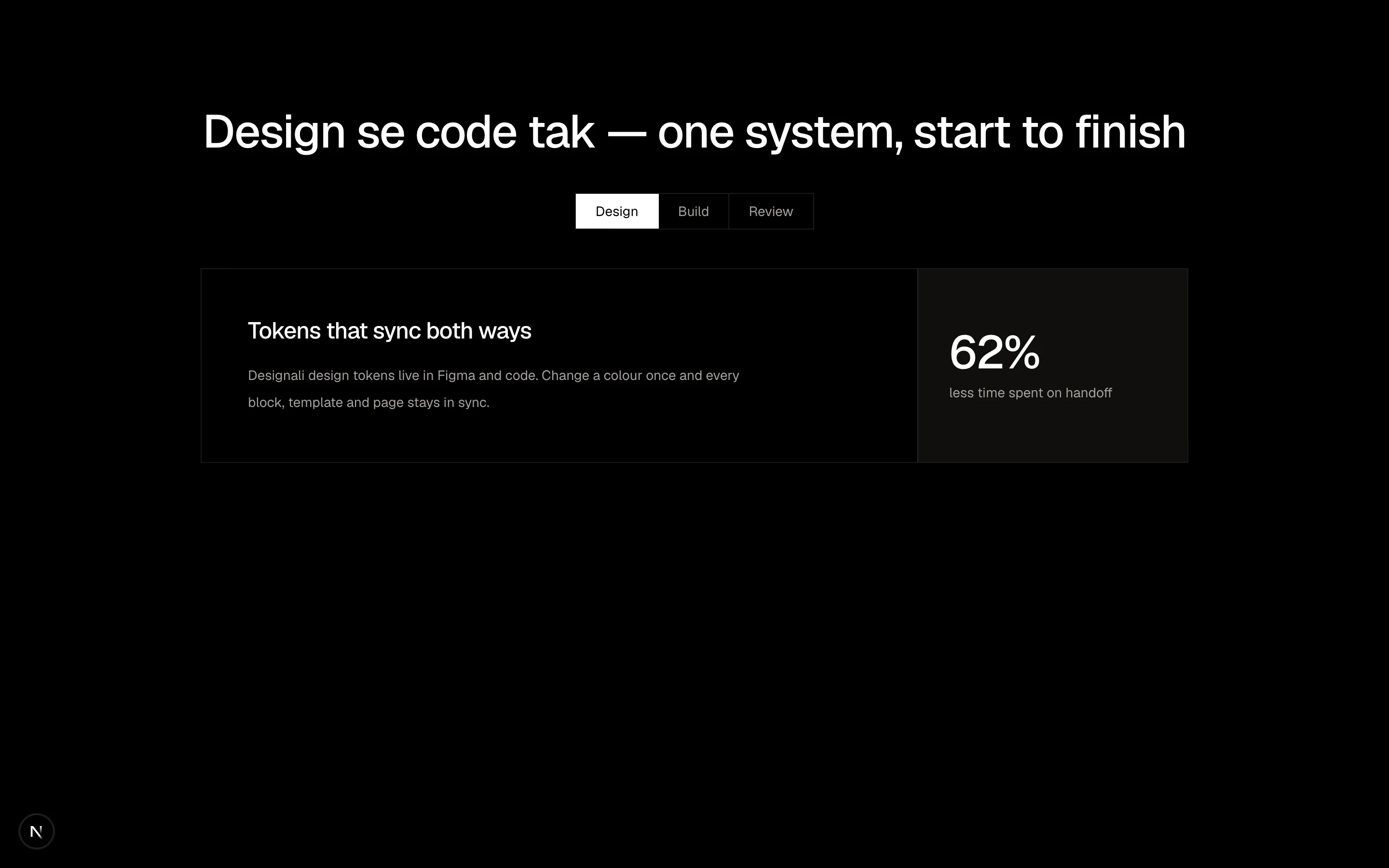
A tabbed feature showcase with a highlighted metric panel.
features-08
Files
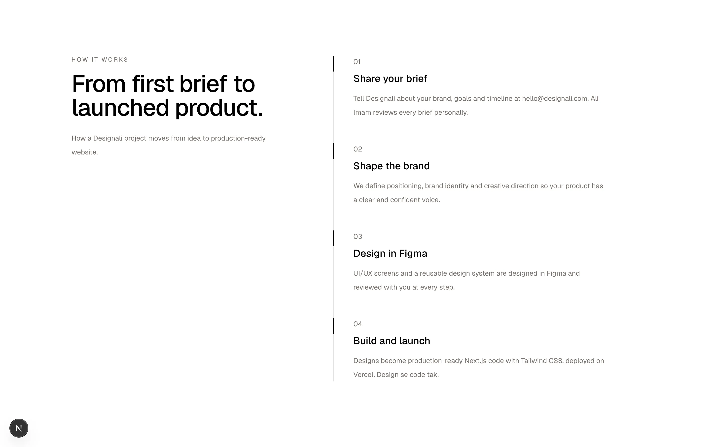
const steps = [
  {
    number: "01",
    title: "Share your brief",
    body: "Tell Designali about your brand, goals and timeline at hello@designali.com. Ali Imam reviews every brief personally.",
  },
  {
    number: "02",
    title: "Shape the brand",
    body: "We define positioning, brand identity and creative direction so your product has a clear and confident voice.",
  },
  {
    number: "03",
    title: "Design in Figma",
    body: "UI/UX screens and a reusable design system are designed in Figma and reviewed with you at every step.",
  },
  {
    number: "04",
    title: "Build and launch",
    body: "Designs become production-ready Next.js code with Tailwind CSS, deployed on Vercel. Design se code tak.",
  },
]

export function Features09() {
  return (
    <section className="w-full bg-background px-6 py-20 md:py-28">
      <div className="mx-auto grid max-w-6xl gap-12 lg:grid-cols-[1fr_1.4fr] lg:gap-20">
        <div className="lg:sticky lg:top-24 lg:self-start">
          <p className="text-xs tracking-[0.2em] text-muted-foreground uppercase">
            How it works
          </p>
          <h2 className="mt-4 text-3xl font-medium tracking-tight md:text-5xl">
            From first brief to launched product.
          </h2>
          <p className="mt-6 text-sm leading-7 text-muted-foreground">
            How a Designali project moves from idea to production-ready
            website.
          </p>
        </div>
        <ol className="border-l border-border">
          {steps.map((step) => (
            <li key={step.number} className="relative pb-12 pl-10 last:pb-0">
              <span className="absolute top-0 -left-px h-8 w-px bg-foreground" />
              <span className="font-sans text-sm text-muted-foreground">
                {step.number}
              </span>
              <h3 className="mt-2 text-xl font-medium">{step.title}</h3>
              <p className="mt-3 max-w-lg text-sm leading-7 text-muted-foreground">
                {step.body}
              </p>
            </li>
          ))}
        </ol>
      </div>
    </section>
  )
}
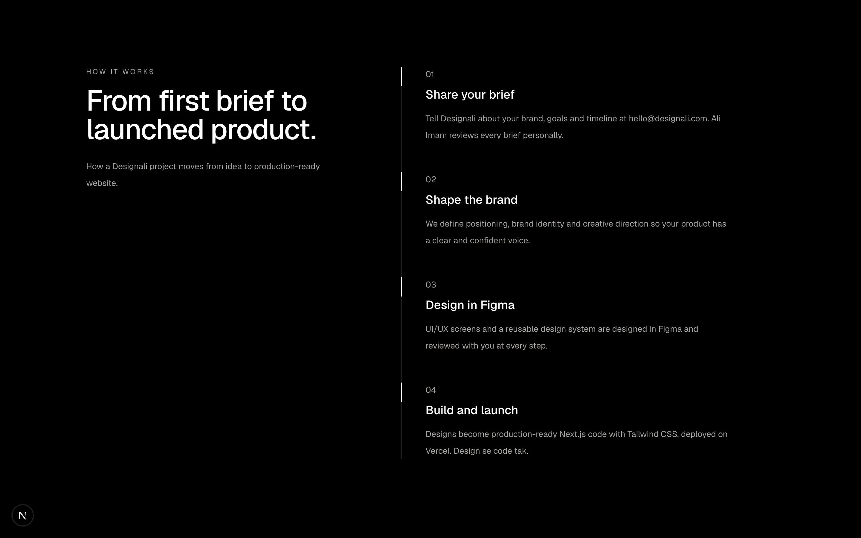
A sticky intro with a numbered vertical timeline of steps.
features-09
Files
import {
  Check,
  Minus,
} from "@designali/icons"

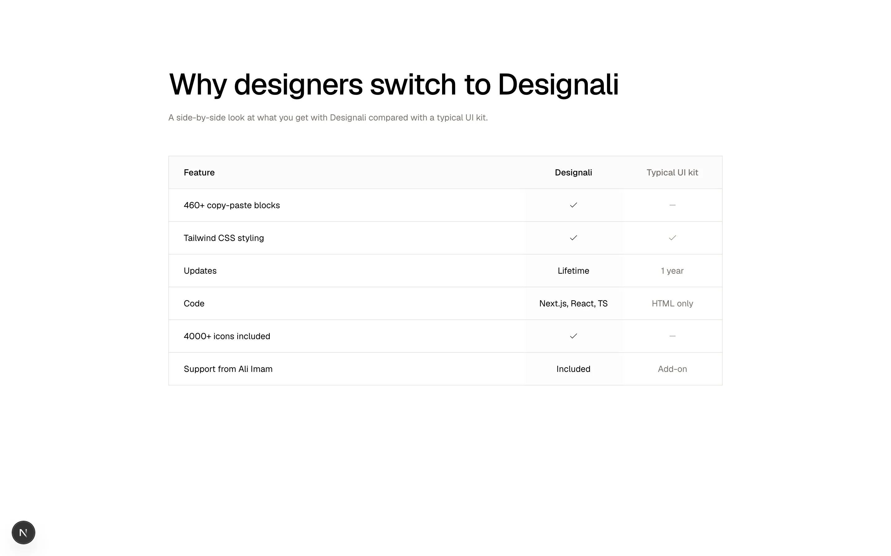
const rows = [
  { feature: "460+ copy-paste blocks", us: true, them: false },
  { feature: "Tailwind CSS styling", us: true, them: true },
  { feature: "Updates", us: "Lifetime", them: "1 year" },
  { feature: "Code", us: "Next.js, React, TS", them: "HTML only" },
  { feature: "4000+ icons included", us: true, them: false },
  { feature: "Support from Ali Imam", us: "Included", them: "Add-on" },
]

function Cell({ value }: { value: boolean | string }) {
  if (value === true) return <Check className="mx-auto size-4" />
  if (value === false)
    return <Minus className="mx-auto size-4 text-muted-foreground" />
  return <span>{value}</span>
}

export function Features10() {
  return (
    <section className="w-full bg-background px-6 py-20 md:py-28">
      <div className="mx-auto max-w-4xl">
        <h2 className="text-3xl font-medium tracking-tight md:text-5xl">
          Why designers switch to Designali
        </h2>
        <p className="mt-4 max-w-xl text-sm leading-7 text-muted-foreground">
          A side-by-side look at what you get with Designali compared
          with a typical UI kit.
        </p>
        <div className="mt-12 overflow-x-auto border border-border">
          <table className="w-full min-w-[520px] text-sm">
            <thead>
              <tr className="border-b border-border bg-muted/40 text-left">
                <th className="px-6 py-4 font-medium">Feature</th>
                <th className="w-40 px-6 py-4 text-center font-medium">
                  Designali
                </th>
                <th className="w-40 px-6 py-4 text-center font-medium text-muted-foreground">
                  Typical UI kit
                </th>
              </tr>
            </thead>
            <tbody>
              {rows.map((row) => (
                <tr
                  key={row.feature}
                  className="border-b border-border last:border-b-0"
                >
                  <td className="px-6 py-4">{row.feature}</td>
                  <td className="bg-muted/20 px-6 py-4 text-center">
                    <Cell value={row.us} />
                  </td>
                  <td className="px-6 py-4 text-center text-muted-foreground">
                    <Cell value={row.them} />
                  </td>
                </tr>
              ))}
            </tbody>
          </table>
        </div>
      </div>
    </section>
  )
}
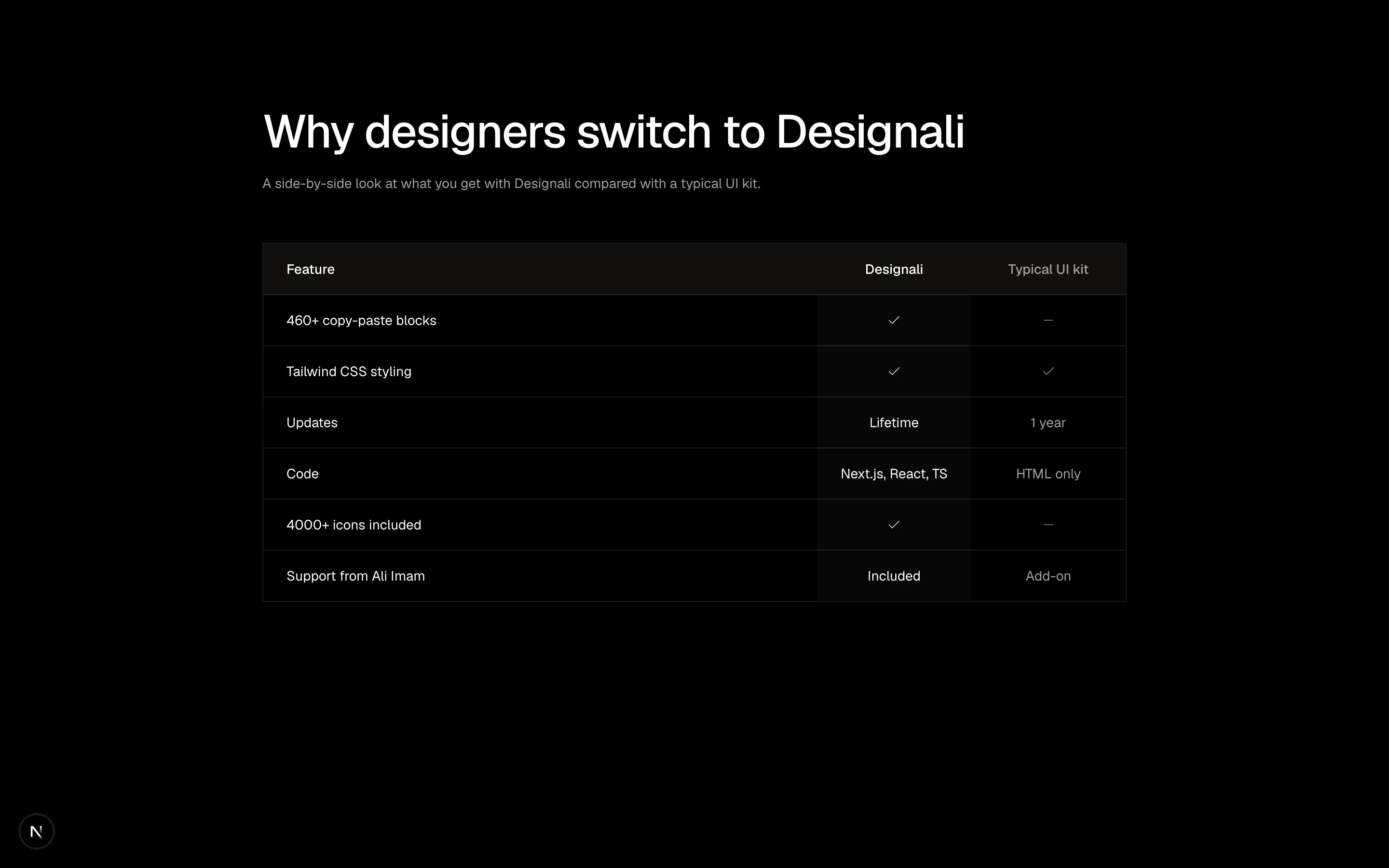
A feature comparison table against a typical competitor.
features-10
Files
"use client"

import { useState } from "react"
import {
  FingerprintPattern as Fingerprint,
  KeyRound,
  Lock,
  Shield,
} from "@designali/icons"

import { cn } from "@/lib/utils"

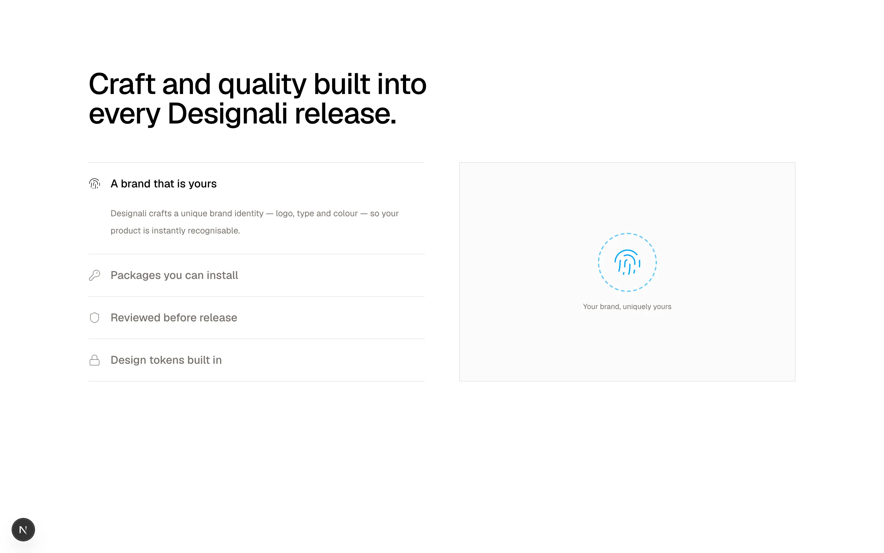
const items = [
  {
    icon: Fingerprint,
    title: "A brand that is yours",
    body: "Designali crafts a unique brand identity — logo, type and colour — so your product is instantly recognisable.",
    visual: "passkey",
  },
  {
    icon: KeyRound,
    title: "Packages you can install",
    body: "Icons, logos and vectors ship as npm packages, so the same assets work across every Designali template and block.",
    visual: "tokens",
  },
  {
    icon: Shield,
    title: "Reviewed before release",
    body: "Every block is checked for accessibility, responsiveness and dark mode before it lands on designali.com.",
    visual: "anomaly",
  },
  {
    icon: Lock,
    title: "Design tokens built in",
    body: "Semantic tokens keep colour, spacing and type consistent, so switching themes never breaks your layout.",
    visual: "encryption",
  },
]

function Visual({ kind }: { kind: string }) {
  if (kind === "passkey")
    return (
      <div className="flex flex-col items-center gap-4">
        <div className="flex size-24 items-center justify-center rounded-full border-2 border-dashed border-primary/60">
          <Fingerprint className="size-12 text-primary dark:text-primary" />
        </div>
        <span className="text-xs text-muted-foreground">Your brand, uniquely yours</span>
      </div>
    )
  if (kind === "tokens")
    return (
      <div className="w-full max-w-xs space-y-2 font-sans text-xs">
        {[
          ["@designali/icons", "4000+", "new"],
          ["@designali/logos", "brands", "new"],
          ["@designali/vectors", "shapes", "new"],
        ].map(([id, scope, exp]) => (
          <div key={id} className="flex items-center justify-between gap-2 border border-border bg-background px-3 py-2">
            <span>{id}</span>
            <span className="text-muted-foreground">{scope}</span>
            <span className="text-primary dark:text-primary">{exp}</span>
          </div>
        ))}
      </div>
    )
  if (kind === "anomaly")
    return (
      <div className="w-full max-w-xs space-y-2 text-xs">
        {[
          ["Hero block", "Passed", "text-primary dark:text-primary"],
          ["Pricing block", "Fix needed", "text-destructive dark:text-destructive"],
          ["Footer block", "Passed", "text-primary dark:text-primary"],
          ["Header block", "Review", "text-primary dark:text-primary"],
        ].map(([loc, status, tone], i) => (
          <div key={i} className="flex justify-between border border-border bg-background px-3 py-2">
            <span>{loc}</span>
            <span className={tone}>{status}</span>
          </div>
        ))}
      </div>
    )
  return (
    <div className="w-full max-w-xs space-y-2 font-sans text-xs">
      <div className="border border-border bg-background px-3 py-2">
        email: <span className="text-muted-foreground">hello@designali.com</span>
      </div>
      <div className="border border-border bg-background px-3 py-2">
        primary: <span className="text-primary dark:text-primary">var(--primary)</span>
      </div>
      <div className="border border-border bg-background px-3 py-2">
        radius: <span className="text-primary dark:text-primary">var(--radius)</span>
      </div>
    </div>
  )
}

export function Features11() {
  const [active, setActive] = useState(0)

  return (
    <section className="w-full bg-background px-6 py-20 md:py-28">
      <div className="mx-auto max-w-6xl">
        <h2 className="max-w-2xl text-3xl font-medium tracking-tight md:text-5xl">
          Craft and quality built into every Designali release.
        </h2>
        <div className="mt-14 grid gap-8 lg:grid-cols-2 lg:gap-14">
          <div className="border-t border-border">
            {items.map((item, i) => {
              const Icon = item.icon
              const open = i === active
              return (
                <div key={item.title} className="border-b border-border">
                  <button
                    type="button"
                    onClick={() => setActive(i)}
                    aria-expanded={open}
                    className="flex w-full items-center gap-4 py-5 text-left"
                  >
                    <Icon className={cn("size-5 shrink-0", open ? "text-foreground" : "text-muted-foreground")} />
                    <span className={cn("text-lg font-medium", !open && "text-muted-foreground")}>
                      {item.title}
                    </span>
                  </button>
                  <div className={cn("grid transition-all duration-300", open ? "grid-rows-[1fr] pb-6" : "grid-rows-[0fr]")}>
                    <p className="overflow-hidden pl-9 text-sm leading-7 text-muted-foreground">
                      {item.body}
                    </p>
                  </div>
                </div>
              )
            })}
          </div>
          <div className="flex min-h-80 items-center justify-center border border-border bg-muted/40 p-8">
            <Visual kind={items[active]!.visual} />
          </div>
        </div>
      </div>
    </section>
  )
}
Accordion list of security features that swaps a live mini-visual in an adjacent panel.
features-11
Files
import { CounterNumber } from "@/components/ui/counter-number"

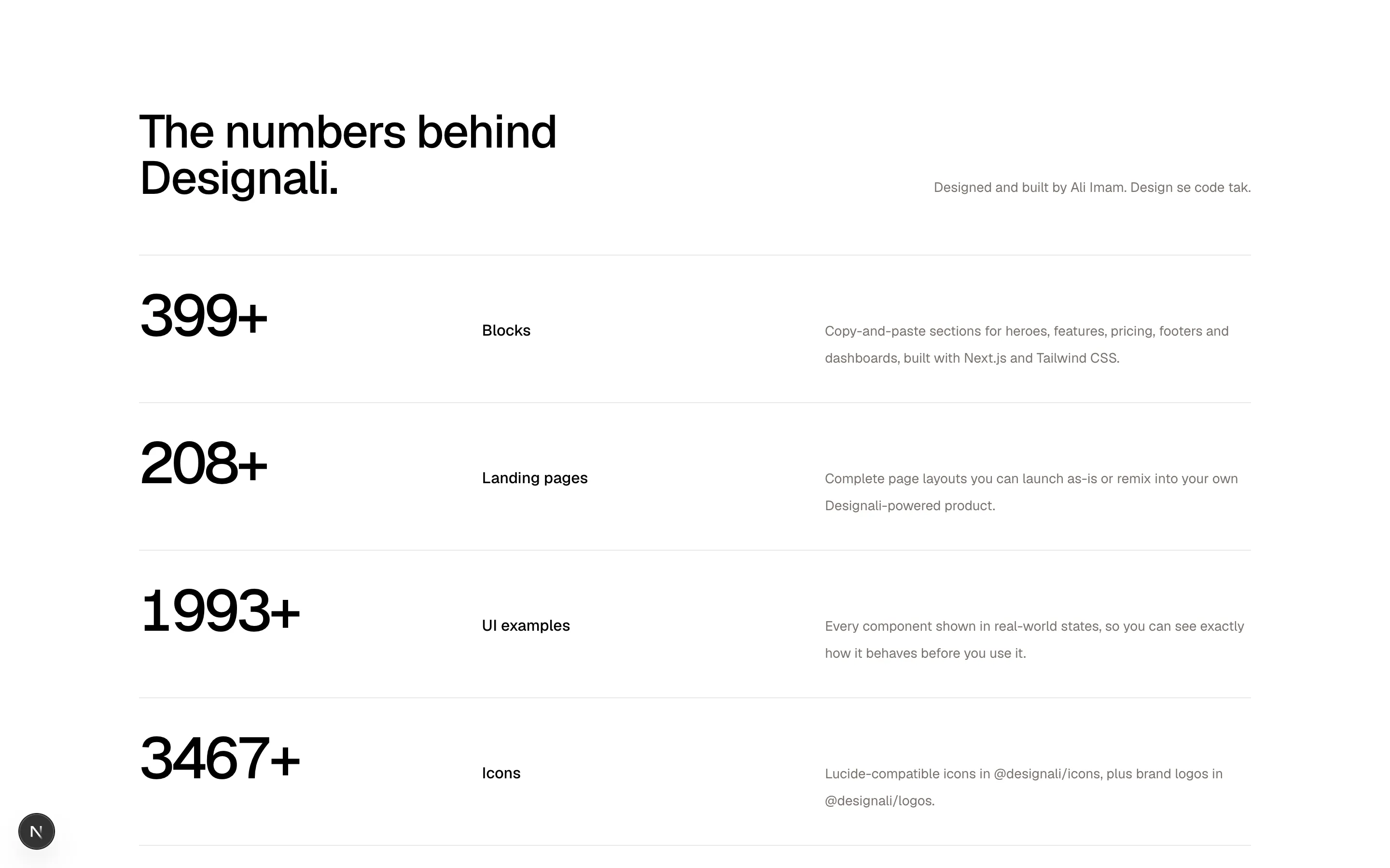
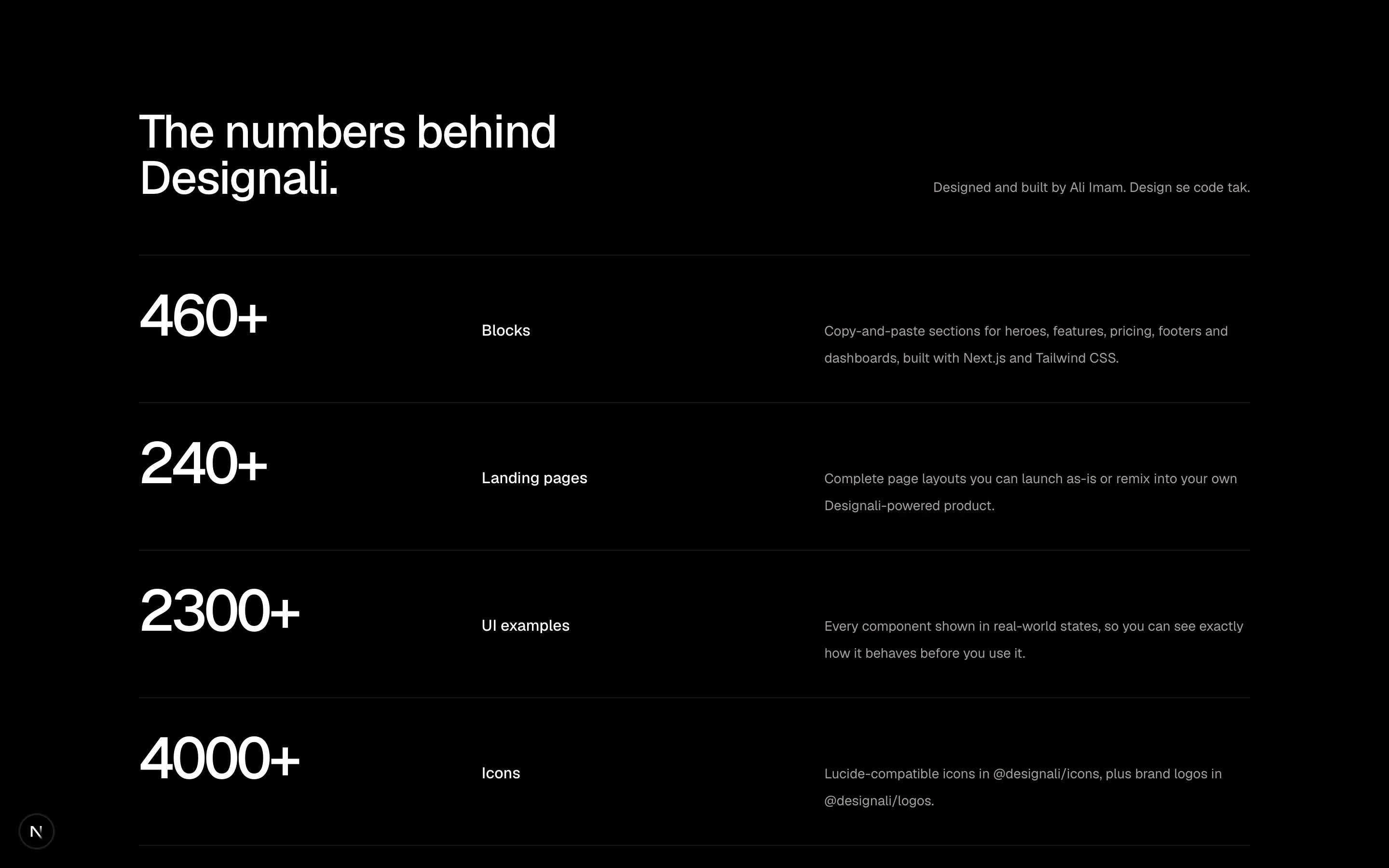
const rows = [
  {
    value: 460,
    label: "Blocks",
    body: "Copy-and-paste sections for heroes, features, pricing, footers and dashboards, built with Next.js and Tailwind CSS.",
  },
  {
    value: 240,
    label: "Landing pages",
    body: "Complete page layouts you can launch as-is or remix into your own Designali-powered product.",
  },
  {
    value: 2300,
    label: "UI examples",
    body: "Every component shown in real-world states, so you can see exactly how it behaves before you use it.",
  },
  {
    value: 4000,
    label: "Icons",
    body: "Lucide-compatible icons in @designali/icons, plus brand logos in @designali/logos.",
  },
]

export function Features12() {
  return (
    <section className="w-full bg-background px-6 py-20 md:py-28">
      <div className="mx-auto max-w-6xl">
        <div className="grid gap-6 md:grid-cols-2 md:items-end">
          <h2 className="text-3xl font-medium tracking-tight md:text-5xl">
            The numbers behind Designali.
          </h2>
          <p className="text-sm leading-7 text-muted-foreground md:text-right">
            Designed and built by Ali Imam. Design se code tak.
          </p>
        </div>
        <div className="mt-14 border-t border-border">
          {rows.map((row) => (
            <div
              key={row.label}
              className="grid gap-4 border-b border-border py-8 md:grid-cols-[1fr_1fr_1.4fr] md:items-baseline md:gap-10"
            >
              <CounterNumber
                value={row.value}
                suffix="+"
                separator=""
                size="xl"
                className="font-medium tracking-tighter md:text-6xl"
              />
              <div className="text-base font-medium">{row.label}</div>
              <p className="text-sm leading-7 text-muted-foreground">{row.body}</p>
            </div>
          ))}
        </div>
      </div>
    </section>
  )
}
Stat-led rows pairing a large monospace number with a label and supporting description.
features-12
Files
import {
  CircleCheck as CheckCircle2,
  FileText,
  Search,
  Send,
  WandSparkles as Wand2,
} from "@designali/icons"

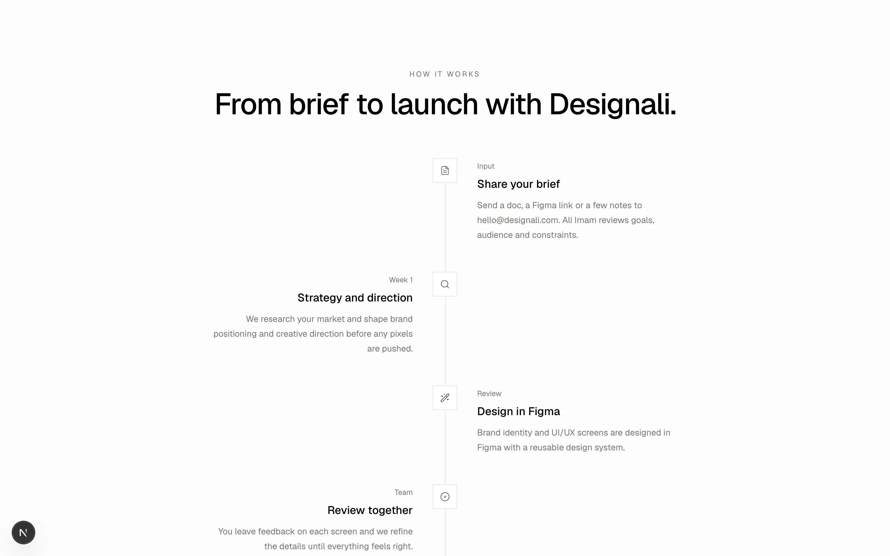
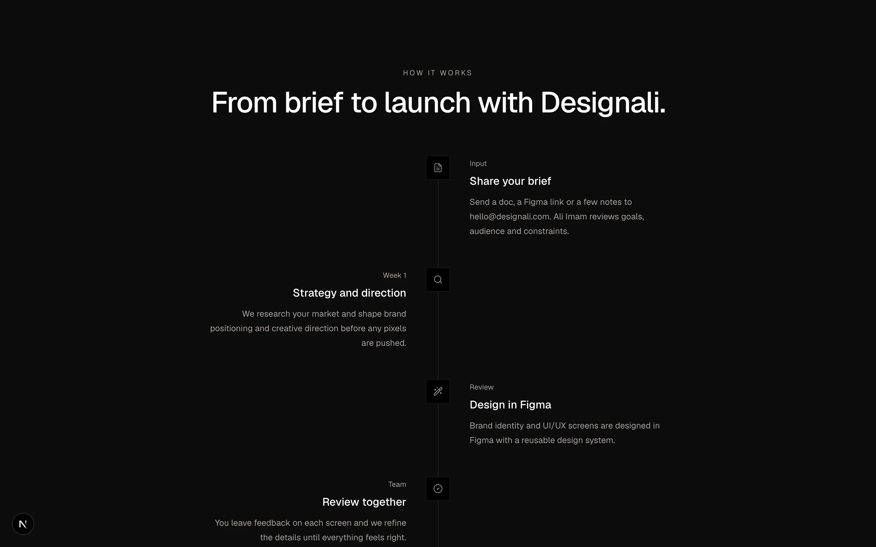
const steps = [
  {
    icon: FileText,
    title: "Share your brief",
    body: "Send a doc, a Figma link or a few notes to hello@designali.com. Ali Imam reviews goals, audience and constraints.",
    tag: "Input",
  },
  {
    icon: Search,
    title: "Strategy and direction",
    body: "We research your market and shape brand positioning and creative direction before any pixels are pushed.",
    tag: "Week 1",
  },
  {
    icon: Wand2,
    title: "Design in Figma",
    body: "Brand identity and UI/UX screens are designed in Figma with a reusable design system.",
    tag: "Review",
  },
  {
    icon: CheckCircle2,
    title: "Review together",
    body: "You leave feedback on each screen and we refine the details until everything feels right.",
    tag: "Team",
  },
  {
    icon: Send,
    title: "Build and launch",
    body: "Designs become production-ready Next.js code with Tailwind CSS, deployed on Vercel.",
    tag: "Output",
  },
]

export function Features13() {
  return (
    <section className="w-full bg-muted/30 px-6 py-20 md:py-28">
      <div className="mx-auto max-w-3xl">
        <p className="text-center text-xs tracking-[0.2em] text-muted-foreground uppercase">
          How it works
        </p>
        <h2 className="mt-4 text-center text-3xl font-medium tracking-tight md:text-5xl">
          From brief to launch with Designali.
        </h2>
        <ol className="relative mt-16">
          <span className="absolute top-2 bottom-2 left-5 w-px bg-border md:left-1/2" aria-hidden />
          {steps.map(({ icon: Icon, title, body, tag }, i) => (
            <li
              key={title}
              className="relative grid grid-cols-[40px_1fr] gap-5 pb-12 last:pb-0 md:grid-cols-[1fr_40px_1fr] md:gap-8"
            >
              <div className={i % 2 === 0 ? "hidden md:block" : "hidden text-right md:block"}>
                {i % 2 === 1 && (
                  <>
                    <span className="text-xs text-muted-foreground">{tag}</span>
                    <h3 className="mt-1 text-lg font-medium">{title}</h3>
                    <p className="mt-2 text-sm leading-6 text-muted-foreground">{body}</p>
                  </>
                )}
              </div>
              <span className="relative z-10 flex size-10 items-center justify-center border border-border bg-background">
                <Icon className="size-4" />
              </span>
              <div className={i % 2 === 1 ? "md:invisible" : ""}>
                <span className="text-xs text-muted-foreground">{tag}</span>
                <h3 className="mt-1 text-lg font-medium">{title}</h3>
                <p className="mt-2 text-sm leading-6 text-muted-foreground">{body}</p>
              </div>
            </li>
          ))}
        </ol>
      </div>
    </section>
  )
}
Vertical alternating timeline of five workflow steps with icon nodes on a center line.
features-13
Files
import {
  Bell,
  Cloud,
  Database,
  GitBranch,
  Mail,
  MessageCircle,
  Plug,
  Server,
  Webhook,
} from "@designali/icons"

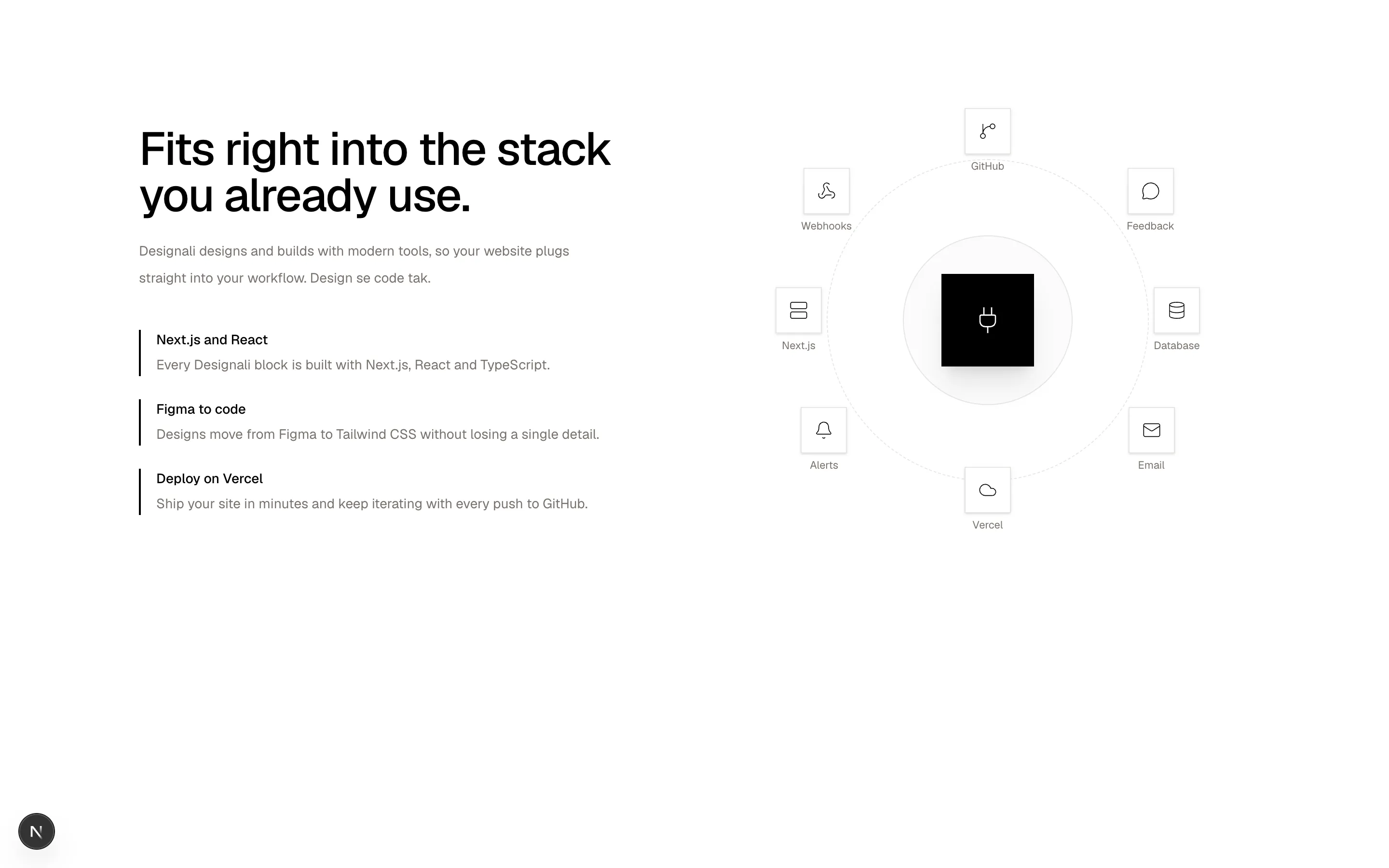
const nodes = [
  { icon: GitBranch, label: "GitHub", pos: "left-1/2 top-0 -translate-x-1/2" },
  { icon: MessageCircle, label: "Feedback", pos: "right-[6%] top-[14%]" },
  { icon: Database, label: "Database", pos: "right-0 top-1/2 -translate-y-1/2" },
  { icon: Mail, label: "Email", pos: "right-[6%] bottom-[14%]" },
  { icon: Cloud, label: "Vercel", pos: "left-1/2 bottom-0 -translate-x-1/2" },
  { icon: Bell, label: "Alerts", pos: "left-[6%] bottom-[14%]" },
  { icon: Server, label: "Next.js", pos: "left-0 top-1/2 -translate-y-1/2" },
  { icon: Webhook, label: "Webhooks", pos: "left-[6%] top-[14%]" },
]

const points = [
  ["Next.js and React", "Every Designali block is built with Next.js, React and TypeScript."],
  ["Figma to code", "Designs move from Figma to Tailwind CSS without losing a single detail."],
  ["Deploy on Vercel", "Ship your site in minutes and keep iterating with every push to GitHub."],
]

export function Features14() {
  return (
    <section className="w-full overflow-hidden bg-background px-6 py-20 md:py-28">
      <div className="mx-auto grid max-w-6xl items-center gap-16 lg:grid-cols-2">
        <div>
          <h2 className="text-3xl font-medium tracking-tight md:text-5xl">
            Fits right into the stack you already use.
          </h2>
          <p className="mt-5 max-w-md text-sm leading-7 text-muted-foreground">
            Designali designs and builds with modern tools, so your website
            plugs straight into your workflow. Design se code tak.
          </p>
          <dl className="mt-10 space-y-6">
            {points.map(([title, body]) => (
              <div key={title} className="border-l-2 border-foreground pl-4">
                <dt className="text-sm font-medium">{title}</dt>
                <dd className="mt-1 text-sm leading-6 text-muted-foreground">{body}</dd>
              </div>
            ))}
          </dl>
        </div>
        <div className="relative mx-auto aspect-square w-full max-w-[440px]">
          <div className="absolute inset-[12%] rounded-full border border-dashed border-border" />
          <div className="absolute inset-[30%] rounded-full border border-border bg-muted/40" />
          <div className="absolute top-1/2 left-1/2 flex size-20 -translate-x-1/2 -translate-y-1/2 items-center justify-center bg-foreground text-background shadow-xl md:size-24">
            <Plug className="size-8" />
          </div>
          {nodes.map(({ icon: Icon, label, pos }) => (
            <div key={label} className={`absolute flex flex-col items-center gap-1 ${pos}`}>
              <span className="flex size-11 items-center justify-center border border-border bg-background shadow-sm md:size-12">
                <Icon className="size-5" />
              </span>
              <span className="hidden text-[11px] text-muted-foreground sm:block">
                {label}
              </span>
            </div>
          ))}
        </div>
      </div>
    </section>
  )
}
Split integrations section with key points beside a radial hub of connector icons.
features-14
Files
"use client"

import { useState } from "react"
import {
  Check,
  Copy,
} from "@designali/icons"

import { cn } from "@/lib/utils"

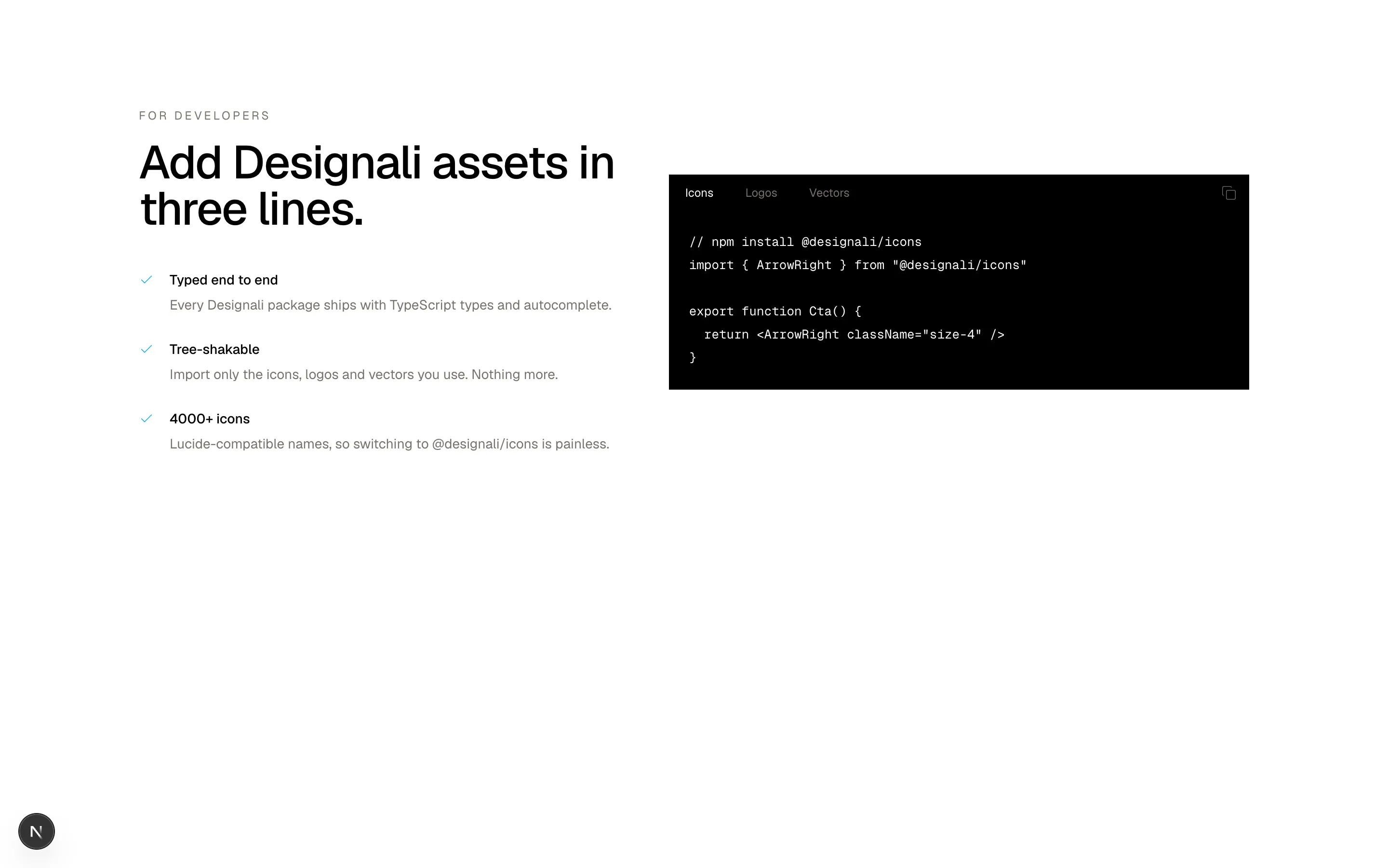
const snippets: Record<string, string> = {
  Icons: `// npm install @designali/icons
import { ArrowRight } from "@designali/icons"

export function Cta() {
  return <ArrowRight className="size-4" />
}`,
  Logos: `// npm install @designali/logos
import { Github, Vercel } from "@designali/logos"

export function Stack() {
  return (
    <>
      <Github size={24} />
      <Vercel size={24} />
    </>
  )
}`,
  Vectors: `// npm install @designali/vectors
import { Abstract12Shapes } from "@designali/vectors"

export function Hero() {
  return <Abstract12Shapes size={160} />
}`,
}

const features = [
  ["Typed end to end", "Every Designali package ships with TypeScript types and autocomplete."],
  ["Tree-shakable", "Import only the icons, logos and vectors you use. Nothing more."],
  ["4000+ icons", "Lucide-compatible names, so switching to @designali/icons is painless."],
]

export function Features15() {
  const langs = Object.keys(snippets)
  const [lang, setLang] = useState(langs[0]!)
  const [copied, setCopied] = useState(false)

  return (
    <section className="w-full bg-background px-6 py-20 md:py-28">
      <div className="mx-auto grid max-w-6xl gap-12 lg:grid-cols-[1fr_1.2fr] lg:items-center">
        <div>
          <p className="text-xs tracking-[0.2em] text-muted-foreground uppercase">
            For developers
          </p>
          <h2 className="mt-4 text-3xl font-medium tracking-tight md:text-5xl">
            Add Designali assets in three lines.
          </h2>
          <ul className="mt-10 space-y-6">
            {features.map(([title, body]) => (
              <li key={title} className="flex gap-4">
                <Check className="mt-0.5 size-4 shrink-0 text-primary dark:text-primary" />
                <div>
                  <div className="text-sm font-medium">{title}</div>
                  <p className="mt-1 text-sm leading-6 text-muted-foreground">{body}</p>
                </div>
              </li>
            ))}
          </ul>
        </div>
        <div className="min-w-0 border border-foreground bg-foreground text-background">
          <div className="flex items-center justify-between border-b border-foreground">
            <div className="flex overflow-x-auto">
              {langs.map((l) => (
                <button
                  key={l}
                  type="button"
                  onClick={() => setLang(l)}
                  className={cn(
                    "border-r border-foreground px-4 py-2.5 text-xs whitespace-nowrap transition-colors",
                    l === lang ? "bg-foreground text-background" : "text-muted-foreground hover:text-white"
                  )}
                >
                  {l}
                </button>
              ))}
            </div>
            <button
              type="button"
              aria-label="Copy code"
              onClick={() => {
                navigator.clipboard?.writeText(snippets[lang]!).catch(() => {})
                setCopied(true)
                setTimeout(() => setCopied(false), 1500)
              }}
              className="px-3 text-muted-foreground hover:text-white"
            >
              {copied ? <Check className="size-4" /> : <Copy className="size-4" />}
            </button>
          </div>
          <pre className="overflow-x-auto p-5 font-mono text-[13px] leading-6">
            <code>{snippets[lang]}</code>
          </pre>
        </div>
      </div>
    </section>
  )
}
Developer feature list beside a dark code window with language tabs and a copy button.
features-15
Files
"use client"

import { useRef } from "react"
import {
  Activity,
  ChevronLeft,
  ChevronRight,
  Gauge,
  Layers,
  Timer,
  TrendingUp,
  Users,
} from "@designali/icons"

import { Button } from "@/components/ui/button"

const cards = [
  { icon: Gauge, title: "Templates", body: "Polished Next.js templates for portfolios, agencies and SaaS, ready to customise and ship.", tone: "from-primary/15" },
  { icon: Timer, title: "Blocks", body: "460+ copy-and-paste sections for heroes, pricing, features, footers and more.", tone: "from-primary/15" },
  { icon: TrendingUp, title: "UI Designs", body: "2300+ UI examples showing every component in real-world states.", tone: "from-primary/15" },
  { icon: Users, title: "Icons", body: "4000+ lucide-compatible icons in @designali/icons, ready for any React project.", tone: "from-primary/15" },
  { icon: Activity, title: "Logos", body: "Brand and tech logos in @designali/logos for stacks, integrations and footers.", tone: "from-primary/15" },
  { icon: Layers, title: "Illustrations", body: "Abstract shapes and vectors from @designali/vectors to give every page character.", tone: "from-primary/15" },
]

export function Features16() {
  const track = useRef<HTMLDivElement>(null)
  const scroll = (dir: number) =>
    track.current?.scrollBy({ left: dir * 320, behavior: "smooth" })

  return (
    <section className="w-full overflow-hidden bg-background py-20 md:py-28">
      <div className="mx-auto max-w-7xl px-6">
        <div className="flex items-end justify-between gap-6">
          <h2 className="max-w-xl text-3xl font-medium tracking-tight md:text-5xl">
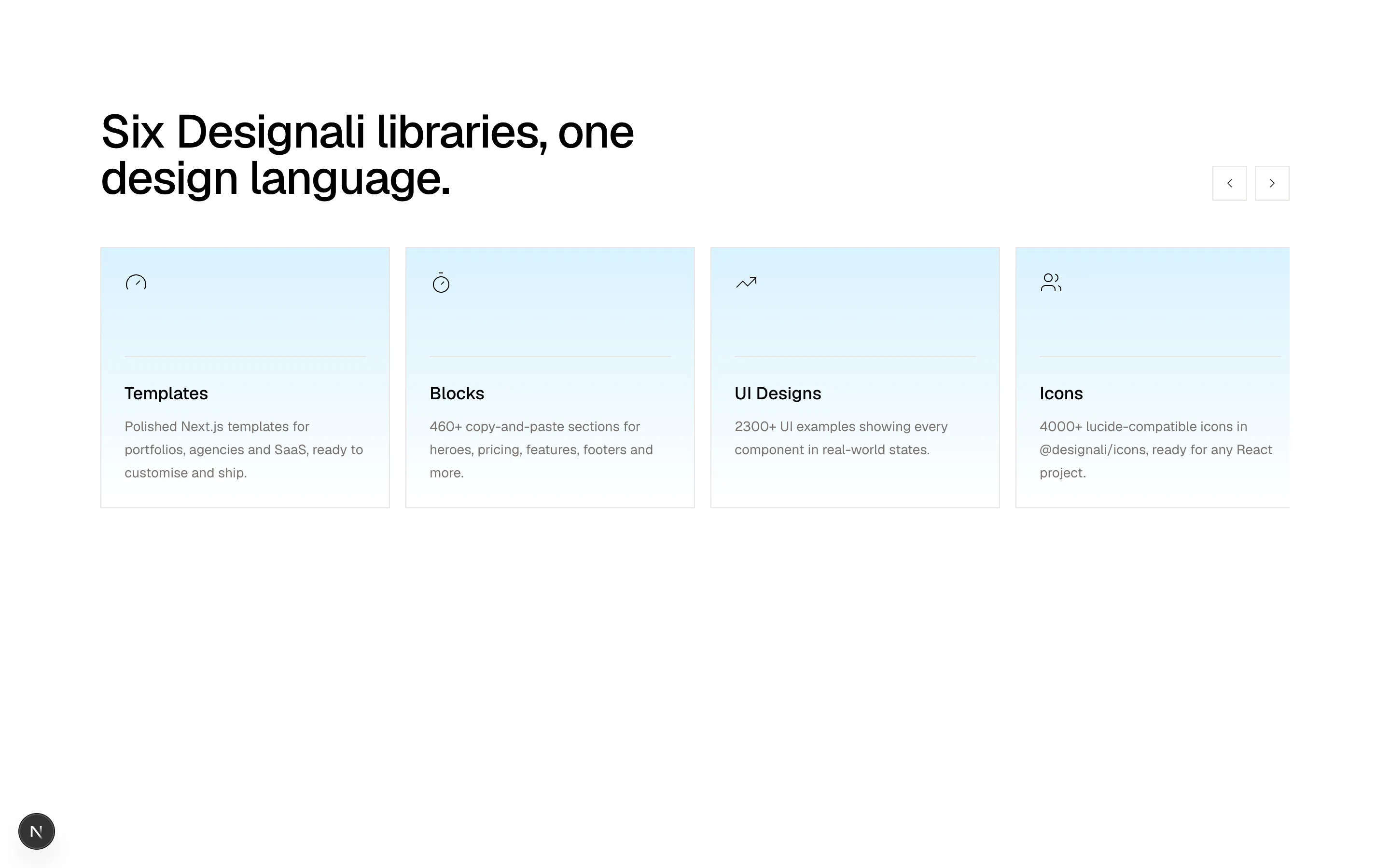
            Six Designali libraries, one design language.
          </h2>
          <div className="flex shrink-0 gap-2">
            <Button variant="outline" size="icon-lg" aria-label="Previous" onClick={() => scroll(-1)}>
              <ChevronLeft />
            </Button>
            <Button variant="outline" size="icon-lg" aria-label="Next" onClick={() => scroll(1)}>
              <ChevronRight />
            </Button>
          </div>
        </div>
        <div
          ref={track}
          className="mt-12 flex snap-x snap-mandatory gap-4 overflow-x-auto pb-4 [scrollbar-width:none] [&::-webkit-scrollbar]:hidden"
        >
          {cards.map(({ icon: Icon, title, body, tone }) => (
            <article
              key={title}
              className={`flex w-[80%] shrink-0 snap-start flex-col border border-border bg-gradient-to-b ${tone} to-transparent p-6 sm:w-[300px]`}
            >
              <Icon className="size-6" />
              <div className="mt-16 h-px w-full bg-border" />
              <h3 className="mt-6 text-lg font-medium">{title}</h3>
              <p className="mt-2 text-sm leading-6 text-muted-foreground">{body}</p>
            </article>
          ))}
        </div>
      </div>
    </section>
  )
}
Horizontally scrolling snap carousel of tinted feature cards with previous and next buttons.
features-16
Files
import {
  Bell,
  Heart,
  MessageCircle,
  Repeat2,
  Search,
  Smartphone,
} from "@designali/icons"

import { IPhone } from "@/components/ui/apple/iphone"

const left = [
  { icon: Search, title: "Instant search", body: "Find any Designali block, template or icon in seconds." },
  { icon: Bell, title: "Release updates", body: "Get notified when new blocks and templates drop." },
  { icon: Smartphone, title: "Mobile first", body: "Every layout is responsive from phone to Studio Display." },
]
const right = [
  { icon: Repeat2, title: "Copy and remix", body: "Copy any block and remix it into your own design." },
  { icon: MessageCircle, title: "Direct support", body: "Questions go straight to Ali Imam and the studio." },
  { icon: Heart, title: "Crafted with care", body: "Thoughtful details in every pixel and every line of code." },
]

function Column({ items, align }: { items: typeof left; align: "left" | "right" }) {
  return (
    <ul className="space-y-10">
      {items.map(({ icon: Icon, title, body }) => (
        <li
          key={title}
          className={`flex gap-4 ${align === "left" ? "lg:flex-row-reverse lg:text-right" : ""}`}
        >
          <span className="flex size-10 shrink-0 items-center justify-center border border-border bg-muted/60">
            <Icon className="size-4" />
          </span>
          <div>
            <h3 className="text-base font-medium">{title}</h3>
            <p className="mt-1 text-sm leading-6 text-muted-foreground">{body}</p>
          </div>
        </li>
      ))}
    </ul>
  )
}

export function Features17() {
  return (
    <section className="w-full bg-background px-6 py-20 md:py-28">
      <div className="mx-auto max-w-6xl">
        <h2 className="mx-auto max-w-2xl text-center text-3xl font-medium tracking-tight md:text-5xl">
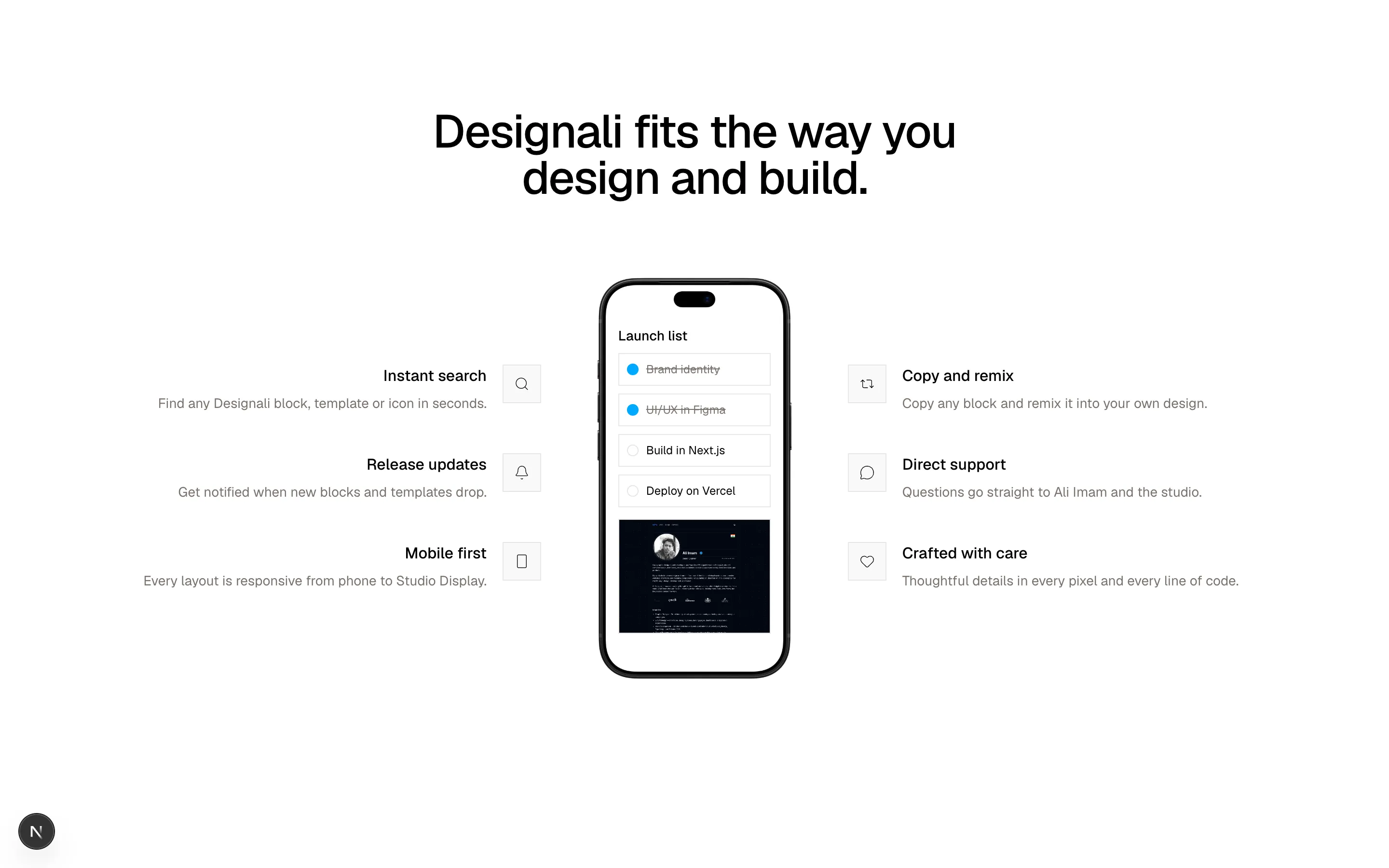
          Designali fits the way you design and build.
        </h2>
        <div className="mt-16 grid items-center gap-12 lg:grid-cols-[1fr_auto_1fr] lg:gap-14">
          <Column items={left} align="left" />
          <IPhone size="md" color="black" className="mx-auto">
            <div className="space-y-2 px-4 pt-12 pb-4">
              <div className="text-sm font-medium">Launch list</div>
              {["Brand identity", "UI/UX in Figma", "Build in Next.js", "Deploy on Vercel"].map(
                (t, i) => (
                  <div key={t} className="flex items-center gap-2 border border-border px-2 py-2 text-xs">
                    <span
                      className={`size-3 shrink-0 rounded-full border ${i < 2 ? "border-primary bg-primary" : "border-border"}`}
                    />
                    <span className={i < 2 ? "text-muted-foreground line-through" : ""}>{t}</span>
                  </div>
                )
              )}
              <img
                src="/images/templates/portfolio-simple.jpg"
                alt="Designali portfolio template"
                className="mt-3 aspect-[4/3] w-full border border-border object-cover"
              />
            </div>
          </IPhone>
          <Column items={right} align="right" />
        </div>
      </div>
    </section>
  )
}
Centered phone mockup flanked by two columns of icon features mirrored left and right.
features-17
Files
"use client"

import { useState } from "react"
import {
  Check,
  X,
} from "@designali/icons"

import { cn } from "@/lib/utils"

const rows = [
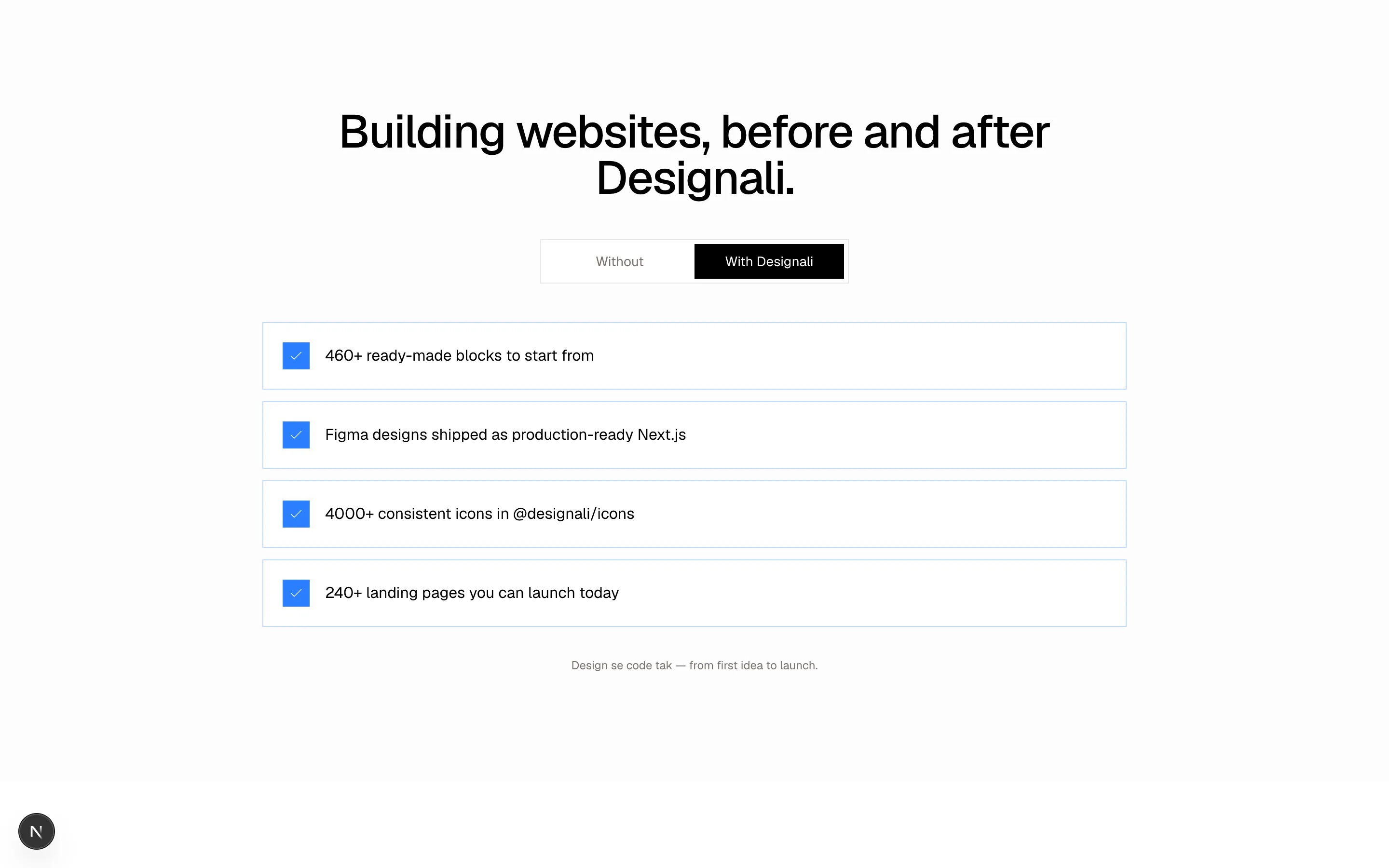
  { without: "Designing every section from a blank canvas", with: "460+ ready-made blocks to start from" },
  { without: "Hand-off files lost between design and code", with: "Figma designs shipped as production-ready Next.js" },
  { without: "Mixing icon sets from five different sources", with: "4000+ consistent icons in @designali/icons" },
  { without: "Weeks spent on a landing page", with: "240+ landing pages you can launch today" },
]

export function Features18() {
  const [mode, setMode] = useState<"without" | "with">("with")

  return (
    <section className="w-full bg-muted/30 px-6 py-20 md:py-28">
      <div className="mx-auto max-w-4xl">
        <h2 className="text-center text-3xl font-medium tracking-tight md:text-5xl">
          Building websites, before and after Designali.
        </h2>
        <div className="mx-auto mt-10 grid w-full max-w-xs grid-cols-2 border border-border bg-background p-1">
          {(["without", "with"] as const).map((m) => (
            <button
              key={m}
              type="button"
              onClick={() => setMode(m)}
              className={cn(
                "py-2 text-sm transition-colors",
                mode === m ? "bg-foreground text-background" : "text-muted-foreground hover:text-foreground"
              )}
            >
              {m === "with" ? "With Designali" : "Without"}
            </button>
          ))}
        </div>
        <ul className="mt-10 space-y-3">
          {rows.map((row) => (
            <li
              key={row.with}
              className={cn(
                "flex items-center gap-4 border p-5 transition-colors",
                mode === "with"
                  ? "border-chart-2/30 bg-background"
                  : "border-border bg-background/50"
              )}
            >
              <span
                className={cn(
                  "flex size-7 shrink-0 items-center justify-center",
                  mode === "with"
                    ? "bg-chart-2 text-white"
                    : "bg-destructive/10 text-destructive dark:bg-destructive/15 dark:text-destructive"
                )}
              >
                {mode === "with" ? <Check className="size-4" /> : <X className="size-4" />}
              </span>
              <span className={cn("text-sm md:text-base", mode === "without" && "text-muted-foreground")}>
                {mode === "with" ? row.with : row.without}
              </span>
            </li>
          ))}
        </ul>
        <p className="mt-8 text-center text-xs text-muted-foreground">
          Design se code tak — from first idea to launch.
        </p>
      </div>
    </section>
  )
}
Before and after toggle that flips a list of pain points into their solved counterparts.
features-18
Files
import {
  BadgeCheck,
  Check,
  Shield,
} from "@designali/icons"

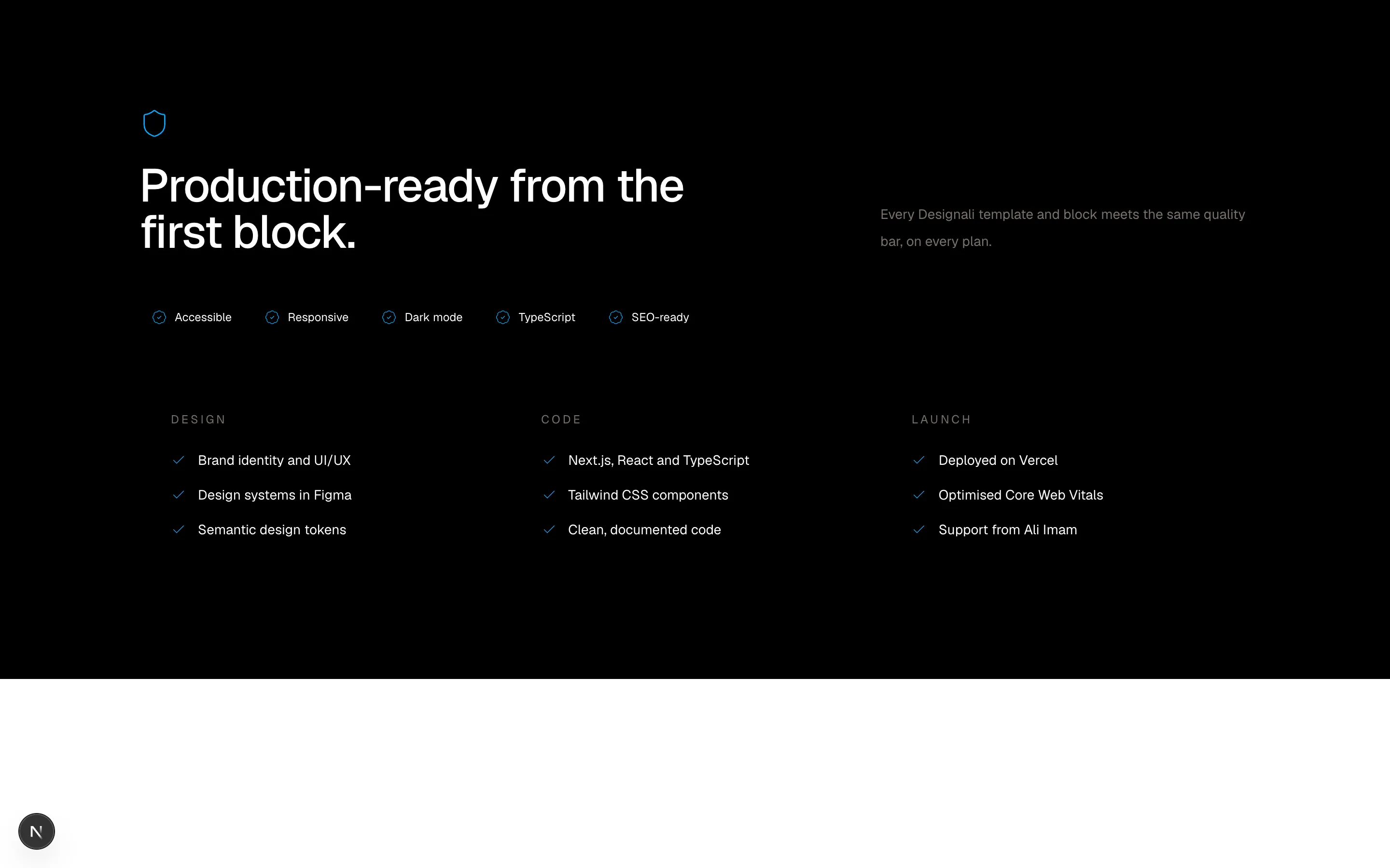
const badges = ["Accessible", "Responsive", "Dark mode", "TypeScript", "SEO-ready"]

const groups = [
  {
    title: "Design",
    items: ["Brand identity and UI/UX", "Design systems in Figma", "Semantic design tokens"],
  },
  {
    title: "Code",
    items: ["Next.js, React and TypeScript", "Tailwind CSS components", "Clean, documented code"],
  },
  {
    title: "Launch",
    items: ["Deployed on Vercel", "Optimised Core Web Vitals", "Support from Ali Imam"],
  },
]

export function Features19() {
  return (
    <section className="w-full bg-foreground px-6 py-20 text-background md:py-28">
      <div className="mx-auto max-w-6xl">
        <div className="flex flex-col gap-8 md:flex-row md:items-end md:justify-between">
          <div className="max-w-xl">
            <Shield className="size-8 text-primary" />
            <h2 className="mt-6 text-3xl font-medium tracking-tight md:text-5xl">
              Production-ready from the first block.
            </h2>
          </div>
          <p className="max-w-sm text-sm leading-7 text-muted-foreground">
            Every Designali template and block meets the same quality bar,
            on every plan.
          </p>
        </div>
        <div className="mt-12 flex flex-wrap gap-2">
          {badges.map((b) => (
            <span
              key={b}
              className="inline-flex items-center gap-2 border border-foreground bg-foreground px-3 py-2 text-xs"
            >
              <BadgeCheck className="size-4 text-primary" />
              {b}
            </span>
          ))}
        </div>
        <div className="mt-12 grid gap-px border border-foreground bg-foreground md:grid-cols-3">
          {groups.map((g) => (
            <div key={g.title} className="bg-foreground p-8">
              <h3 className="text-xs tracking-[0.2em] text-muted-foreground uppercase">{g.title}</h3>
              <ul className="mt-6 space-y-4">
                {g.items.map((item) => (
                  <li key={item} className="flex gap-3 text-sm">
                    <Check className="mt-0.5 size-4 shrink-0 text-primary" />
                    {item}
                  </li>
                ))}
              </ul>
            </div>
          ))}
        </div>
      </div>
    </section>
  )
}
Dark security section with compliance badge chips and three columns of control checklists.
features-19
Files
"use client"
import { useState } from "react"
import {
Moon,
Palette,
SlidersHorizontal,
Type,
} from "@designali/icons"
import { Slider } from "@/components/ui/slider"
import { Switch } from "@/components/ui/switch"
import { cn } from "@/lib/utils"
const swatches = [
{ name: "Ink", className: "bg-foreground dark:bg-foreground" },
{ name: "Ocean", className: "bg-chart-2" },
{ name: "Moss", className: "bg-chart-2" },
{ name: "Ember", className: "bg-primary" },
]
const accents: Record<string, string> = {
Ink: "bg-foreground text-white dark:bg-foreground dark:text-background",
Ocean: "bg-chart-2 text-white",
Moss: "bg-chart-2 text-white",
Ember: "bg-primary text-white",
}
export function Features20() {
const [accent, setAccent] = useState("Ocean")
const [size, setSize] = useState(16)
const [compact, setCompact] = useState(false)
return (
<section className="w-full bg-background px-6 py-20 md:py-28">
<div className="mx-auto max-w-6xl">
<h2 className="max-w-2xl text-3xl font-medium tracking-tight md:text-5xl">
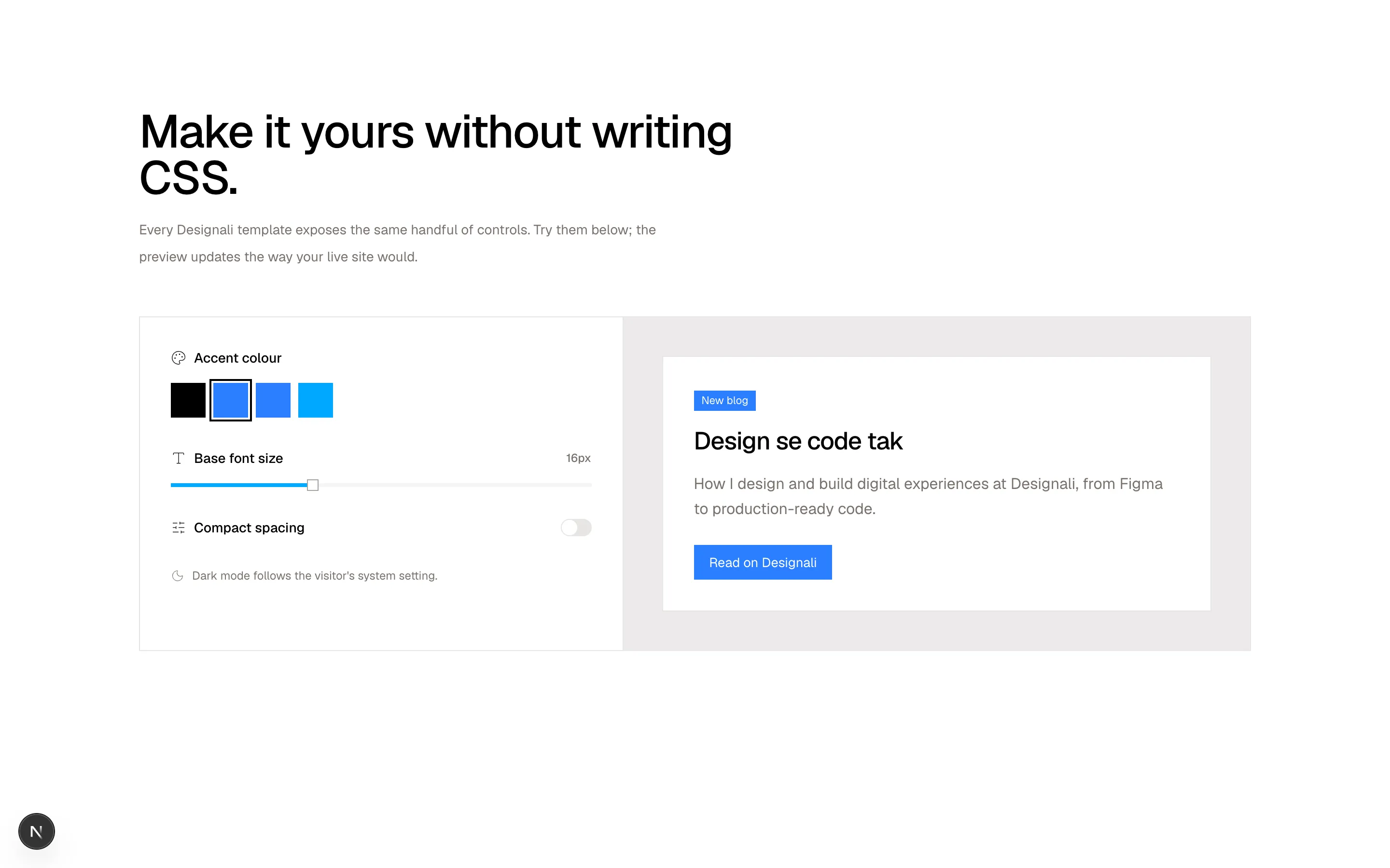
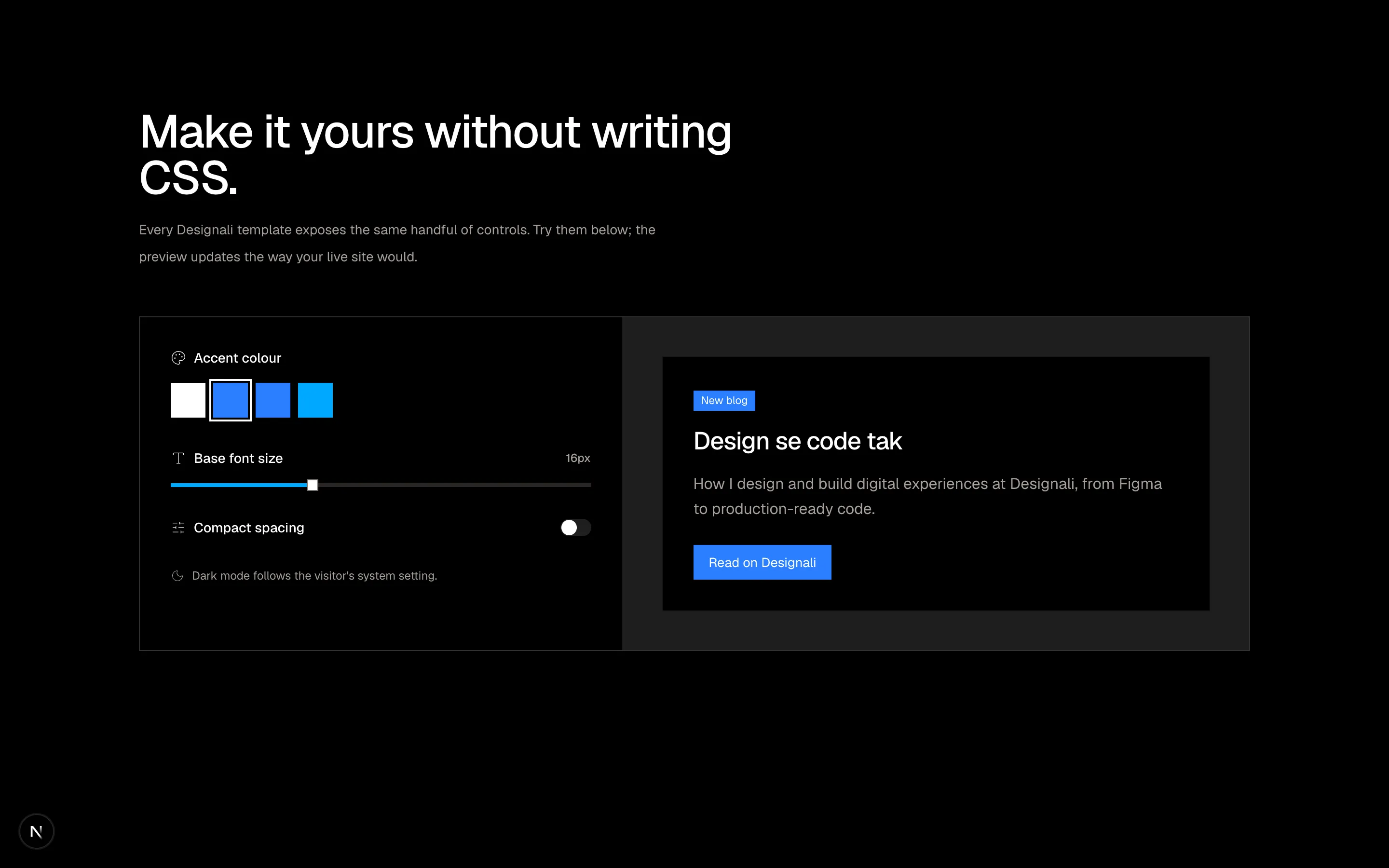
Make it yours without writing CSS.
</h2>
<p className="mt-4 max-w-xl text-sm leading-7 text-muted-foreground">
Every Designali template exposes the same handful of controls. Try
them below; the preview updates the way your live site would.
</p>
<div className="mt-12 grid gap-px border border-border bg-border lg:grid-cols-[1fr_1.3fr]">
<div className="space-y-8 bg-background p-6 md:p-8">
<div>
<div className="flex items-center gap-2 text-sm font-medium">
<Palette className="size-4" /> Accent colour
</div>
<div className="mt-4 flex gap-2">
{swatches.map((s) => (
<button
key={s.name}
type="button"
aria-label={s.name}
onClick={() => setAccent(s.name)}
className={cn(
"size-9 ring-offset-2 ring-offset-background transition",
s.className,
accent === s.name && "ring-2 ring-foreground"
)}
/>
))}
</div>
</div>
<div>
<div className="flex items-center justify-between text-sm font-medium">
<span className="flex items-center gap-2">
<Type className="size-4" /> Base font size
</span>
<span className="font-sans text-xs text-muted-foreground">{size}px</span>
</div>
<Slider
className="mt-4"
min={14}
max={20}
step={1}
value={size}
onValueChange={(v) => setSize(Array.isArray(v) ? v[0]! : v)}
/>
</div>
<label className="flex items-center justify-between text-sm font-medium">
<span className="flex items-center gap-2">
<SlidersHorizontal className="size-4" /> Compact spacing
</span>
<Switch checked={compact} onCheckedChange={setCompact} />
</label>
<div className="flex items-center gap-2 text-xs text-muted-foreground">
<Moon className="size-3.5" /> Dark mode follows the visitor's system setting.
</div>
</div>
<div className="bg-muted/40 p-6 md:p-10">
<div
className={cn("border border-border bg-background", compact ? "p-4" : "p-8")}
style={{ fontSize: size }}
>
<span className={cn("inline-block px-2 py-0.5 text-[0.7em]", accents[accent])}>
New blog
</span>
<h3 className={cn("font-medium tracking-tight", compact ? "mt-2" : "mt-4")} style={{ fontSize: "1.6em", lineHeight: 1.2 }}>
Design se code tak
</h3>
<p className={cn("leading-relaxed text-muted-foreground", compact ? "mt-2" : "mt-4")}>
How I design and build digital experiences at Designali, from
Figma to production-ready code.
</p>
<button type="button" className={cn("px-4 py-2 text-[0.85em]", compact ? "mt-3" : "mt-6", accents[accent])}>
Read on Designali
</button>
</div>
</div>
</div>
</div>
</section>
)
}
Interactive theme playground with accent, font size and spacing controls driving a live preview.
features-20