Hero
Bold and flexible hero sections to make a strong first impression.
Files
"use client";

import Link from "next/link";

import {
  ArrowDown,
  ArrowRight,
  Moon,
  Sun,
} from "lucide-react";

import { Button } from "@/components/ui/button";
import { Card } from "@/components/ui/card";
import { useTheme } from "next-themes";
import { useEffect, useState } from "react";
import { Logo } from "@/components/logo";

export function HeroSection() {
  const { theme, setTheme } = useTheme();
  const [mounted, setMounted] = useState(false);

  useEffect(() => {
    setMounted(true);
  }, []);

  return (
    <section className="min-h-screen w-full bg-background text-foreground">
      <div className="grid min-h-screen grid-cols-1 lg:grid-cols-2">

        <div className="relative flex min-h-screen flex-col border-r border-border">

          <div className="relative flex h-[150px] items-center overflow-hidden border-b border-border px-8 sm:px-12 lg:px-16">

            <div
              className="
                pointer-events-none
                absolute
                inset-0
                opacity-40
                dark:opacity-20
              "
              style={{
                backgroundImage:
                  "radial-gradient(circle, currentColor 1.5px, transparent 1.5px)",
                backgroundSize: "22px 22px",
              }}
            />


            <div className="pointer-events-none absolute inset-0 bg-gradient-to-r from-background/90 via-background/80 to-background" />

            {/* Logo */}
            <div className="relative z-10">
              <Link
                href="/"
                className="uppercase
                  text-4xl
                  font-medium
                  flex gap-4
                  items-center
                "
              >
                <Logo className="h-8 w-full" />
                designali
              </Link>
            </div>

            {/* Theme Button */}
            <div className="relative z-10 ml-auto">
              {mounted && (
                <Button
                  variant="outline"
                  size="icon"
                  className="rounded-full"
                  onClick={() =>
                    setTheme(theme === "dark" ? "light" : "dark")
                  }
                >
                  {theme === "dark" ? (
                    <Sun className="size-4" />
                  ) : (
                    <Moon className="size-4" />
                  )}

                  <span className="sr-only">
                    Toggle theme
                  </span>
                </Button>
              )}
            </div>
          </div>

          {/* --------------------------------------------- */}
          {/* CONTENT */}
          {/* --------------------------------------------- */}

          <div className="flex flex-1 flex-col justify-end px-8 py-12 sm:px-12 lg:px-16 lg:pb-14">

            <div className="max-w-[760px]">

              {/* Heading */}
              <h1
                className="
                  text-3xl
                  md:text-4xl
                  xl:text-5xl
                  font-medium
                "
              >
                We are a study of production creative
                for CGI, 3D, motion and development web.
              </h1>

              {/* Description */}
              <p
                className="
                  mt-8
                  text-muted-foreground
                "
              >
                Designali combines art direction, CGI, motion
                design, web development, and integrated AI
                workflows with ongoing R&D, experimentation,
                and production-ready execution for brands
                and agencies.
              </p>

              {/* Scroll */}
              <Button
                variant="outline"
                className="
                  mt-7
                  gap-3
                  text-xs
                  uppercase
                "
              >
                Scroll to explore
                <ArrowDown className="size-4" />
              </Button>
            </div>
          </div>
        </div>


        <div className="grid min-h-screen grid-rows-[1fr_auto]">

          <div className="relative min-h-[500px] overflow-hidden bg-muted">
            <video
              className="absolute inset-0 h-full w-full object-cover"
              src="/vid/colorful-spheres.mp4"
              autoPlay
              muted
              loop
              playsInline
            />
          </div>

          <div className="grid grid-cols-2">

            {/* WORK */}
            <Card
              className="
                group
                min-h-[280px]
                rounded-none
                border-0
                border-t
                p-7
                bg-background
                text-foreground
              "
            >
              <Link
                href="/work"
                className="
                  flex
                  h-full
                  flex-col
                  justify-between
                "
              >

                <div className="flex justify-end">
                  <ArrowRight
                    className="
                      size-5
                      text-muted-foreground
                      transition-transform
                      duration-300
                      group-hover:translate-x-2
                      group-hover:text-foreground
                    "
                  />
                </div>

                <div>
                  <h2
                    className="
                       text-xl
                      md:text-3xl
                    "
                  >
                    Work
                  </h2>

                  <p className="mt-2 text-sm text-muted-foreground sm:text-base">
                    Explore the portfolio
                  </p>
                </div>

              </Link>
            </Card>

            {/* CONTACT */}
            <Card
              className="
                group
                min-h-[280px]
                rounded-none
                border-0
                border-l
                border-t
                border-border
                bg-foreground
                p-7
                text-background
              "
            >
              <Link
                href="/contact"
                className="
                  flex
                  h-full
                  flex-col
                  justify-between
                "
              >

                <div className="flex justify-end">
                  <ArrowRight
                    className="
                      size-5
                      opacity-60
                      transition-transform
                      duration-300
                      group-hover:translate-x-2
                    "
                  />
                </div>

                <div>
                  <h2
                    className="
                    text-xl
                      md:text-3xl
                      font-medium
                    "
                  >
                    Contact us
                  </h2>

                  <p className="mt-2 text-sm opacity-60 sm:text-base">
                    Start your project
                  </p>
                </div>

              </Link>
            </Card>

          </div>
        </div>
      </div>
    </section>
  );
}
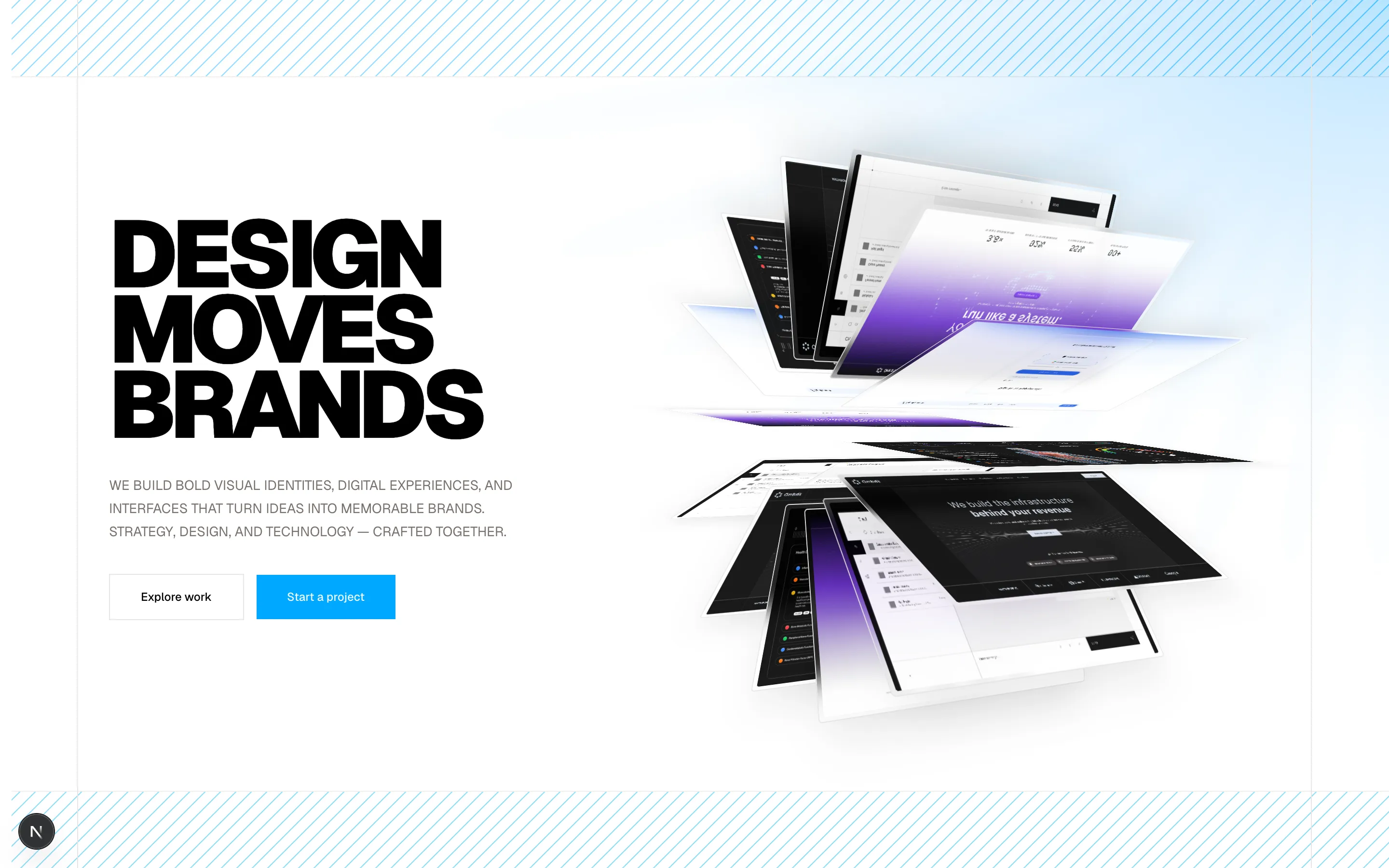
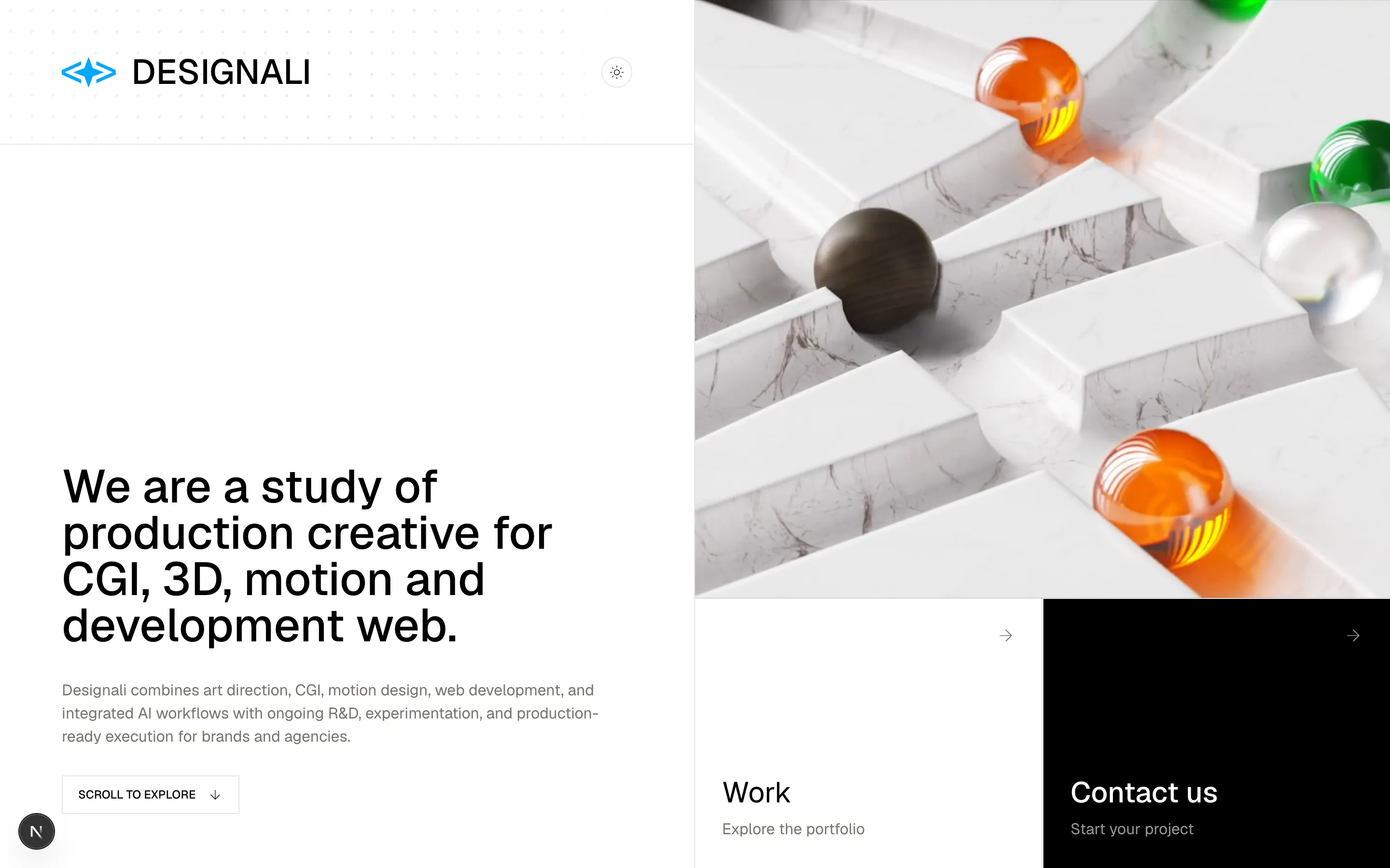
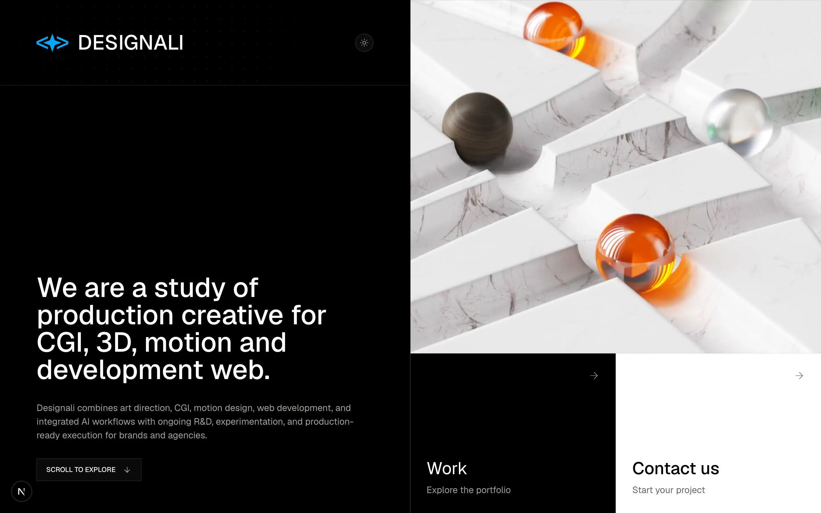
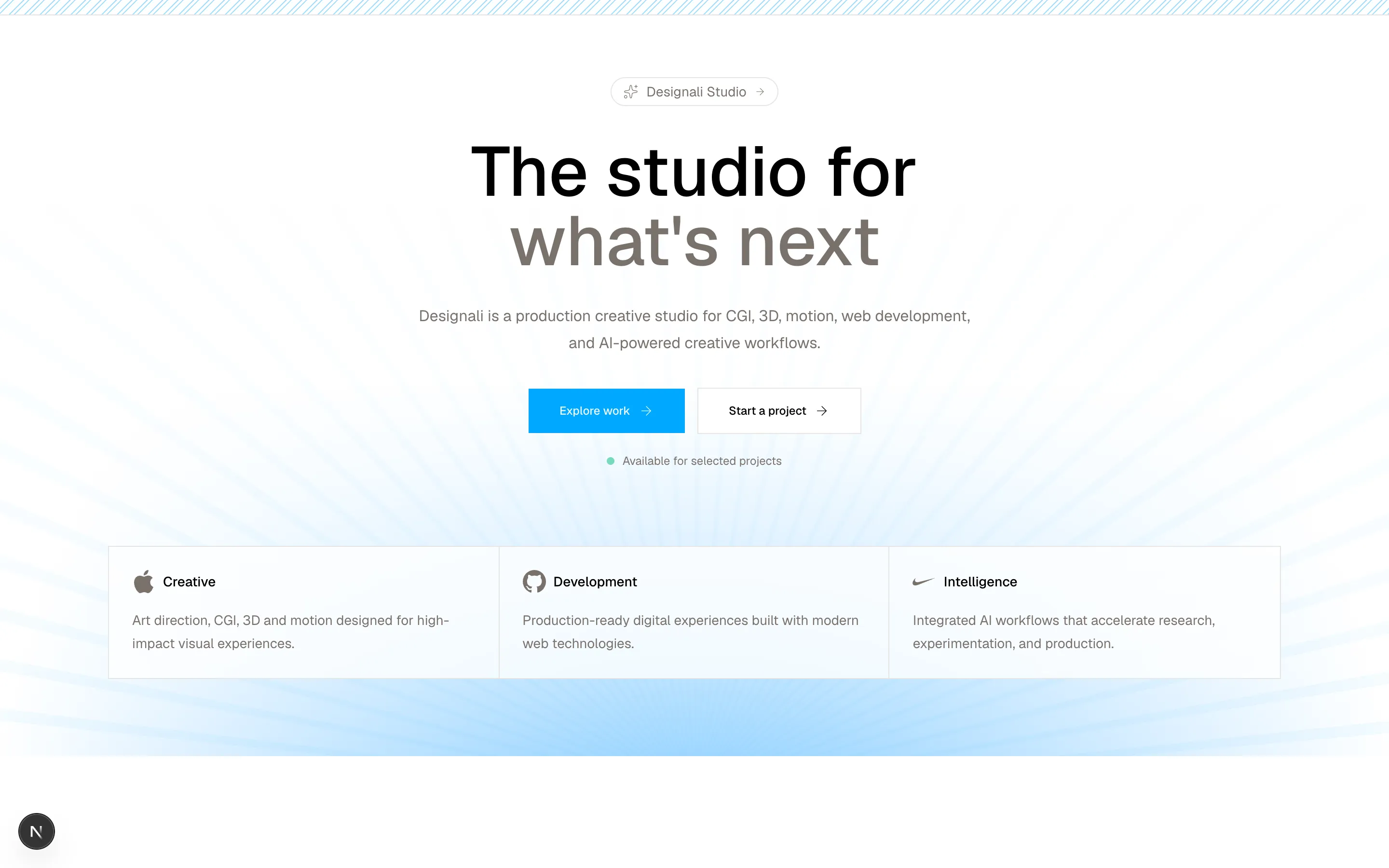
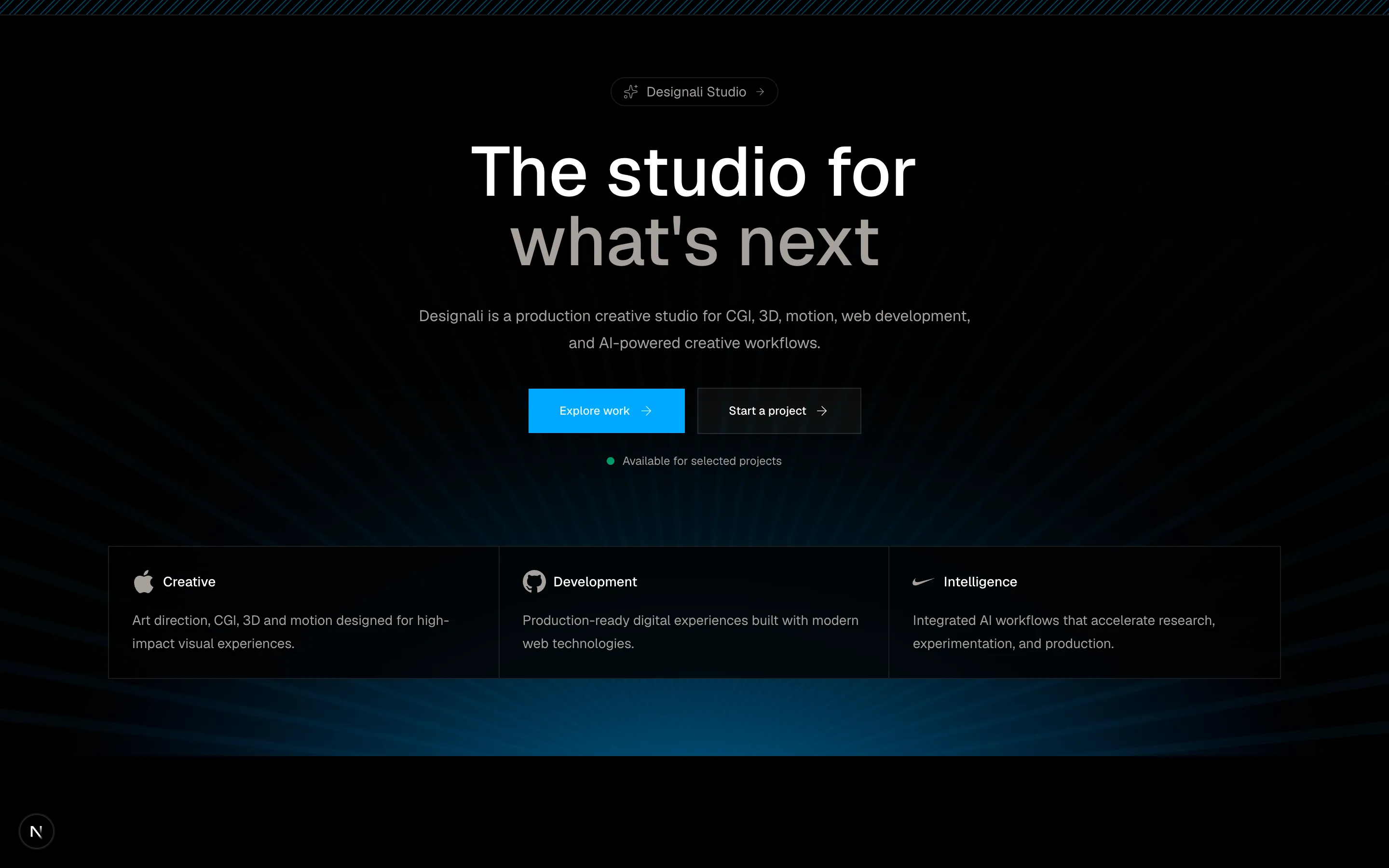
A split-screen hero section with branding, theme toggle, video, work, and contact cards.
hero-1
Files
"use client"
import Link from "next/link"
import { ArrowDown, Sparkles } from "lucide-react"
import { Button } from "@/components/ui/button"
import { Github, Apple, Nike } from "@designali/logos"
export function HeroSection() {
return (
<section className="relative overflow-hidden h-full w-full text-foreground">
<div
className="absolute inset-0 z-0"
style={{
background: 'linear-gradient(to bottom, var(--background) 0%, var(--background) 50%, rgba(255,255,255,0) 100%), radial-gradient(ellipse at 50% 150%, var(--primary) 0%, var(--background) 75%)',
opacity: 0.7
}}
>
<div
style={{
WebkitMaskImage: 'linear-gradient(to bottom, rgba(0,0,0,0) 15%, rgba(0,0,0,0.35) 100%)',
backgroundImage: 'repeating-conic-gradient(from 0deg at 50% 100%, var(--primary) 0deg, var(--primary) 1deg, transparent 1deg, transparent 4deg)',
bottom: '-5%',
height: '100%',
left: '50%',
maskImage: 'linear-gradient(to bottom, rgba(0,0,0,0) 15%, rgba(0,0,0,0.35) 100%)',
opacity: 0.2,
pointerEvents: 'none',
position: 'absolute',
transform: 'translateX(-50%)',
width: '300%'
}}
/>
</div>
<div className="absolute border-b h-4 w-full inset-0 overflow-hidden">
<div className="relative h-full w-full">
{Array.from({ length: 300 }).map((_, i) => (
<div
key={i}
className="outline-primary/40 absolute h-4 w-full origin-top-left -rotate-45 outline-[0.5px] outline-offset-[-0.25px]"
style={{
top: `${i * 16 - 120}px`,
left: "-10%",
width: "400%",
}}
></div>
))}
</div>
</div>
<div className="relative z-10 mx-auto flex max-w-7xl flex-col px-6 sm:px-8">
<div className="flex z-10 flex-1 flex-col items-center justify-center py-20 text-center">
{/* Eyebrow */}
<Link
href="/"
className="mb-8 border px-3 p-1 rounded-full inline-flex items-center gap-2 text-sm text-muted-foreground transition-colors hover:text-foreground"
>
<Sparkles className="size-4" />
Designali Studio
<ArrowDown className="size-3 -rotate-90" />
</Link>
{/* Heading */}
<h1 className="max-w-xl text-3xl font-medium md:text-7xl">
The studio for{" "}
<span className="text-muted-foreground">
what's next
</span>
</h1>
{/* Description */}
<p className="mt-7 max-w-xl leading-7 text-muted-foreground sm:text-md">
Designali is a production creative studio for CGI, 3D, motion,
web development, and AI-powered creative workflows.
</p>
{/* Buttons */}
<div className="mt-8 flex flex-wrap items-center justify-center gap-3">
<Button size="lg" className="gap-2">
Explore work
<ArrowDown className="size-4 -rotate-90" />
</Button>
<Button variant="outline" size="lg" className="gap-2">
Start a project
<ArrowDown className="size-4 -rotate-90" />
</Button>
</div>
{/* Availability */}
<div className="mt-5 flex items-center gap-2 text-xs text-muted-foreground">
<span className="size-2 rounded-full animate-pulse bg-emerald-500" />
Available for selected projects
</div>
<div className="relative overflow-hidden mt-20 border bg-background/80 backdrop-blur">
<div className="grid grid-cols-1 divide-y divide-border md:grid-cols-3 md:divide-x md:divide-y-0">
{/* Feature 1 */}
<div className="group p-6 text-left transition-colors hover:bg-muted/50">
<div className="mb-4 flex items-center gap-2">
<Apple className="size-6 text-muted-foreground" />
<span className="text-sm font-medium">
Creative
</span>
</div>
<p className="text-sm leading-6 text-muted-foreground">
Art direction, CGI, 3D and motion designed for
high-impact visual experiences.
</p>
</div>
{/* Feature 2 */}
<div className="group p-6 text-left transition-colors hover:bg-muted/50">
<div className="mb-4 flex items-center gap-2">
<Github className="size-6 text-muted-foreground" />
<span className="text-sm font-medium">
Development
</span>
</div>
<p className="text-sm leading-6 text-muted-foreground">
Production-ready digital experiences built with
modern web technologies.
</p>
</div>
{/* Feature 3 */}
<div className="group p-6 text-left transition-colors hover:bg-muted/50">
<div className="mb-4 flex items-center gap-2">
<Nike className="size-6 text-muted-foreground" />
<span className="text-sm font-medium">
Intelligence
</span>
</div>
<p className="text-sm leading-6 text-muted-foreground">
Integrated AI workflows that accelerate research,
experimentation, and production.
</p>
</div>
</div>
</div>
</div>
</div>
</section>
)
}A split-screen hero section with branding, theme toggle, video, work, and contact cards.
hero-2
Files
"use client"
import { Button } from "@/components/ui/button"
import * as React from "react"
const images = [
{ src: "/img/hero-1.jpg", alt: "Hero 1" },
{ src: "/img/chat-1-light.jpg", alt: "Chat UI" },
{ src: "/img/hero-2.jpg", alt: "Hero 2" },
{ src: "/img/dashboard-1-dark.jpg", alt: "Dashboard" },
{ src: "/img/login-1.jpg", alt: "Login Screen" },
]
function createCSS(
direction: 1 | -1,
id: string
) {
const keyframes: string[] = []
for (let i = 0; i <= 24; i++) {
const progress = i / 24
/*
* Apparent image size.
*
* Very small at the center.
* Grows gradually as it moves toward the sides.
*/
const scale =
(2.6 / 11.25) *
Math.pow(28 / 2.6, progress)
/*
* Convert apparent size into 3D depth.
*
* This is what creates the natural zoom
* through CSS perspective.
*/
const z =
30 * (1 - 1 / scale)
/*
* Move from the center toward the side.
*/
const rail =
44 -
(44 - -11) *
Math.pow(1 - progress, 3.3)
/*
* Gradually rotate the card.
*/
const turn =
6 +
(28 - 6) * progress
keyframes.push(
`${(progress * 100).toFixed(2)}%{` +
`transform:translate3d(` +
`${(direction * rail).toFixed(2)}cqw,0,` +
`${z.toFixed(2)}cqw)` +
`rotateY(${(-direction * turn).toFixed(2)}deg)` +
`}`
)
}
const animationName =
direction === 1
? `r-${id}`
: `l-${id}`
return `
@keyframes ${animationName} {
${keyframes.join("")}
}
`
}
export function HeroSection() {
const id = React.useId().replace(
/[^a-zA-Z0-9]/g,
""
)
/*
* Create BOTH directions.
*
* This was the issue in your previous code:
* createCSS() requires direction + id.
*/
const css = React.useMemo(
() =>
`
${createCSS(1, id)}
${createCSS(-1, id)}
`,
[id]
)
return (
<section className="relative flex min-h-screen w-full flex-col justify-between overflow-hidden bg-background text-foreground">
<div className="absolute w-full h-full z-0">
<div
style={{
WebkitMaskImage: 'linear-gradient(to bottom, #000 0%, transparent 75%)',
backgroundImage: 'repeating-linear-gradient(0deg, transparent 0px, transparent 3px, var(--primary) 3px, var(--primary) 4px)',
height: '40%',
left: '0',
maskImage: 'linear-gradient(to bottom, #000 0%, transparent 75%)',
opacity: '0.5',
pointerEvents: 'none',
position: 'absolute',
top: '0',
width: '100%'
}}
/>
</div>
<div className="pointer-events-none z-10 absolute left-5 top-5 z-30 h-12 w-12 border-l-8 border-t-8 border-primary" />
<div className="pointer-events-none z-10 absolute right-5 top-5 z-30 h-12 w-12 border-r-8 border-t-8 border-primary" />
<div className="pointer-events-none z-10 absolute bottom-5 left-5 z-30 h-12 w-12 border-b-8 border-l-8 border-primary" />
<div className="pointer-events-none z-10 absolute bottom-5 right-5 z-30 h-12 w-12 border-b-8 border-r-8 border-primary" />
<style>{css}</style>
{/* 3D Corridor */}
<div
className="relative flex min-h-screen w-full flex-col justify-between pt-[7vh] pb-[6vh] sm:pt-[9vh]"
style={{
containerType: "inline-size",
}}
>
<div className="relative z-10 pt-10 flex flex-col items-center justify-center">
<div className="select-none text-center">
<h1 className="text-[10vw] font-black uppercase leading-[0.8] tracking-[-0.065em] sm:text-[9vw] lg:text-[8vw]">
DESIGNING
</h1>
<h1 className="text-[10vw] font-black uppercase leading-[0.8] tracking-[-0.065em] sm:text-[9vw] lg:text-[8vw]">
WHAT MATTERS
</h1>
</div>
<p className="mt-10 max-w-[620px] px-6 text-center text-sm text-nuted-foreground">
WE CREATE VISUAL IDENTITIES, DIGITAL EXPERIENCES,
<br className="hidden sm:block" />
AND STORIES THAT MAKE BRANDS IMPOSSIBLE TO IGNORE.
<br className="hidden sm:block" />
STRATEGY, DESIGN, AND CREATIVITY — BUILT TOGETHER.
</p>
<div className="mt-8 flex flex-wrap items-center justify-center gap-3">
<Button size="lg" className="gap-2">
Explore work
</Button>
<Button variant="outline" size="lg" className="gap-2">
Start a project
</Button>
</div>
</div>
<div
className="pointer-events-none lg:-mt-20 -mt-40 relative"
style={{
perspective: "30cqw",
perspectiveOrigin: "50% 50%",
}}
>
<div
className="absolute inset-0"
style={{
transformStyle: "preserve-3d",
}}
>
{[1, -1].map((direction) => {
const animationName =
direction === 1
? `r-${id}`
: `l-${id}`
return Array.from(
{ length: 10 },
(_, index) => {
const image =
images.length > 0
? images[index % images.length]
: null
return (
<div
key={`${animationName}-${index}`}
className="absolute left-1/2 top-1/2 h-40 w-[20cqw] -ml-[10cqw] -mt-[5.625cqw] overflow-hidden rounded-sm border shadow-2xl/10"
style={{
animation: `${animationName} 22s linear infinite`,
animationDelay: `-${(index * 22) / 10}s`,
backfaceVisibility: "hidden",
}}
>
{image && (
<img
src={image.src}
alt={image.alt}
loading="lazy"
decoding="async"
draggable={false}
className="h-full w-full select-none object-cover"
/>
)}
</div>
)
}
)
})}
</div>
</div>
{/* Footer */}
<div className="relative z-20 flex w-full items-center justify-between px-10 text-xs tracking-wide text-foreground/60 sm:px-20">
<span>
EN IN
</span>
<div className="hidden text-center sm:block">
<div className="flex tracking-[1rem] pl-4 uppercase items-center">
Scroll
</div>
</div>
<span>
EST. 2026
</span>
</div>
</div>
</section>
)
}
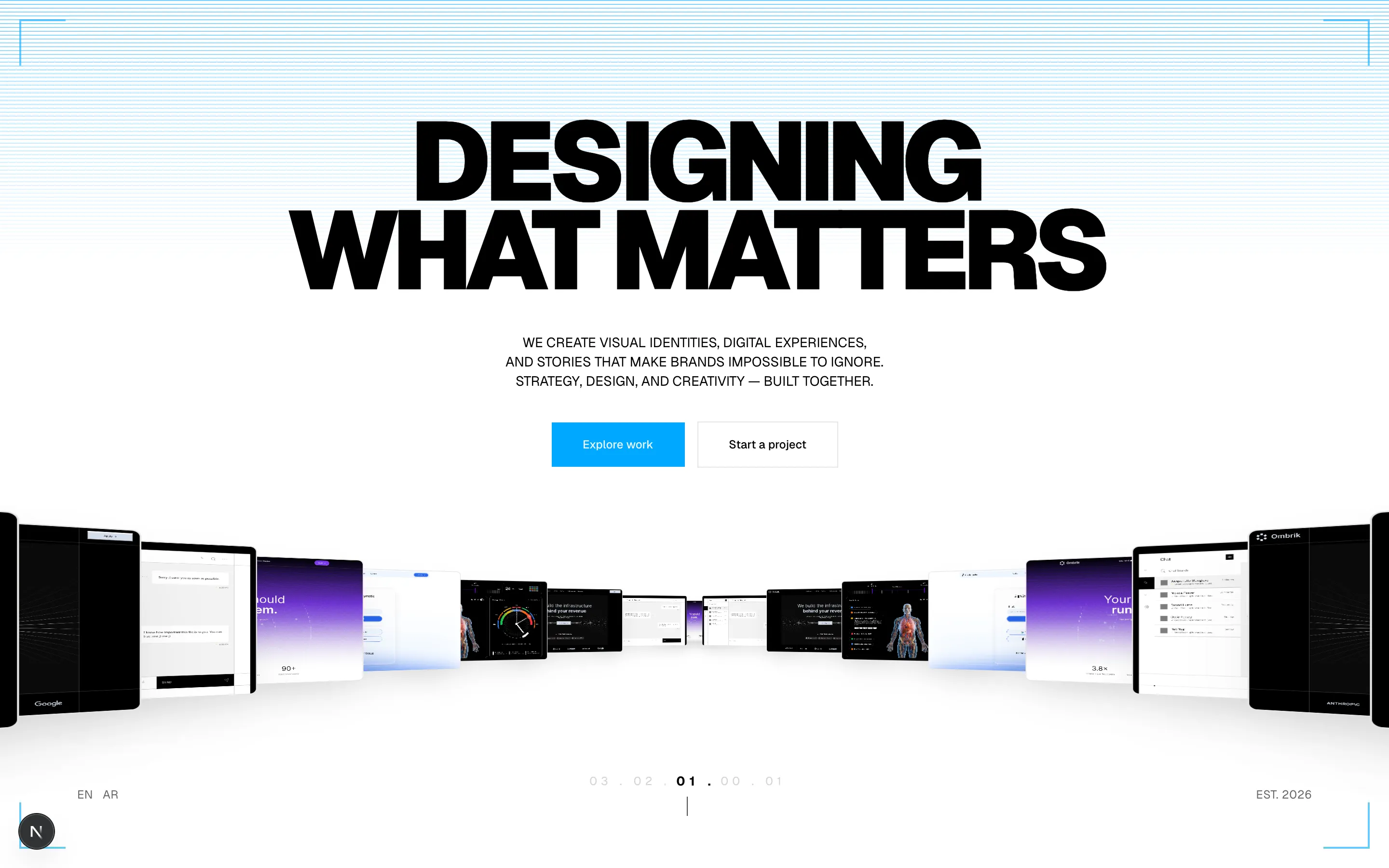
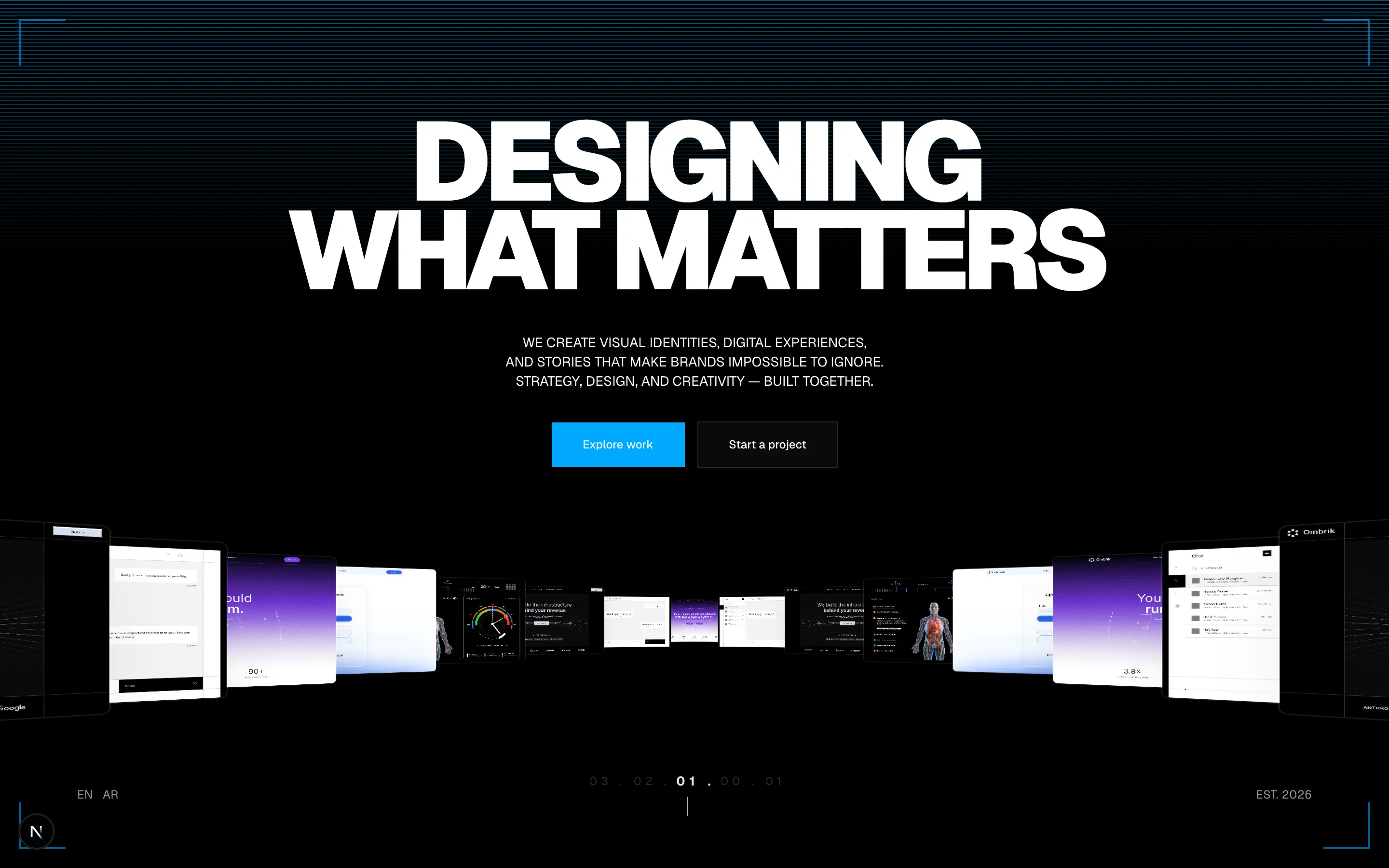
A split-screen hero section with branding, theme toggle, video, work, and contact cards.
hero-3
Files
"use client"

import { Button } from "@/components/ui/button"
import * as React from "react"

const images = [
  { src: "/img/hero-1.jpg", alt: "Hero 1" },
  { src: "/img/chat-1-light.jpg", alt: "Chat UI" },
  { src: "/img/hero-2.jpg", alt: "Hero 2" },
  { src: "/img/dashboard-1-dark.jpg", alt: "Dashboard" },
  { src: "/img/login-1.jpg", alt: "Login Screen" },
]

function createCSS(id: string) {
  return `
    @keyframes orbit-${id} {
      from {
        transform: rotateY(0deg);
      }

      to {
        transform: rotateY(-360deg);
      }
    }
  `
}

export function HeroSection() {
  const id = React.useId().replace(/[^a-zA-Z0-9]/g, "")
  const css = React.useMemo(() => createCSS(id), [id])

  const totalCards = 11
  const radiusCqw = 32

  return (
    <section className="relative h-screen w-full">

      <div className="relative border-x px-3 max-w-7xl mx-auto h-full w-full">

        <div className="relative border-x flex h-full w-full flex-col justify-between overflow-hidden">
        <div
          className="absolute h-full w-full z-0" >
          <div
            style={{
              WebkitMaskImage: 'linear-gradient(to bottom, rgba(0,0,0,0) 0%, rgba(0,0,0,0.5) 100%)',
              backgroundImage: 'linear-gradient(var(--primary) 1px, transparent 1px), linear-gradient(90deg, var(--primary) 1px, transparent 1px)',
              backgroundSize: '20px 20px',
              bottom: '0',
              height: '60%',
              left: '0',
              maskImage: 'linear-gradient(to bottom, rgba(0,0,0,0) 0%, rgba(0,0,0,0.3) 100%)',
              opacity: 0.5,
              pointerEvents: 'none',
              position: 'absolute',
              width: '100%'
            }}
          />
        </div>

          <style>{css}</style>
          <div
            className="relative flex w-full flex-col justify-between pt-[7vh] pb-[6vh] sm:pt-[9vh]"
            style={{ containerType: "inline-size" }}
          >
            {/* Hero Content */}
            <div className="relative z-10 flex flex-col items-center justify-center pt-10">
              <div className="select-none text-center">
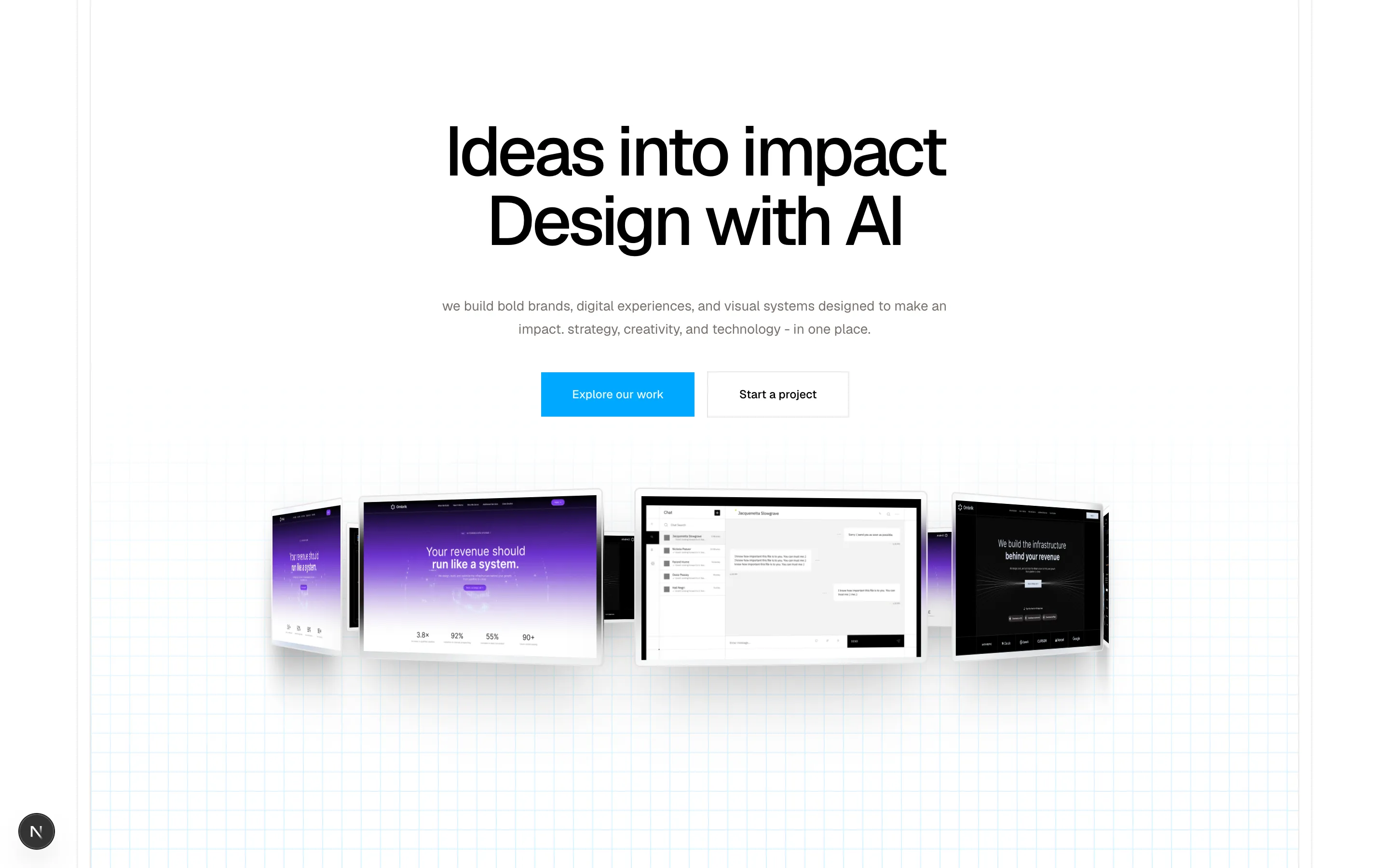
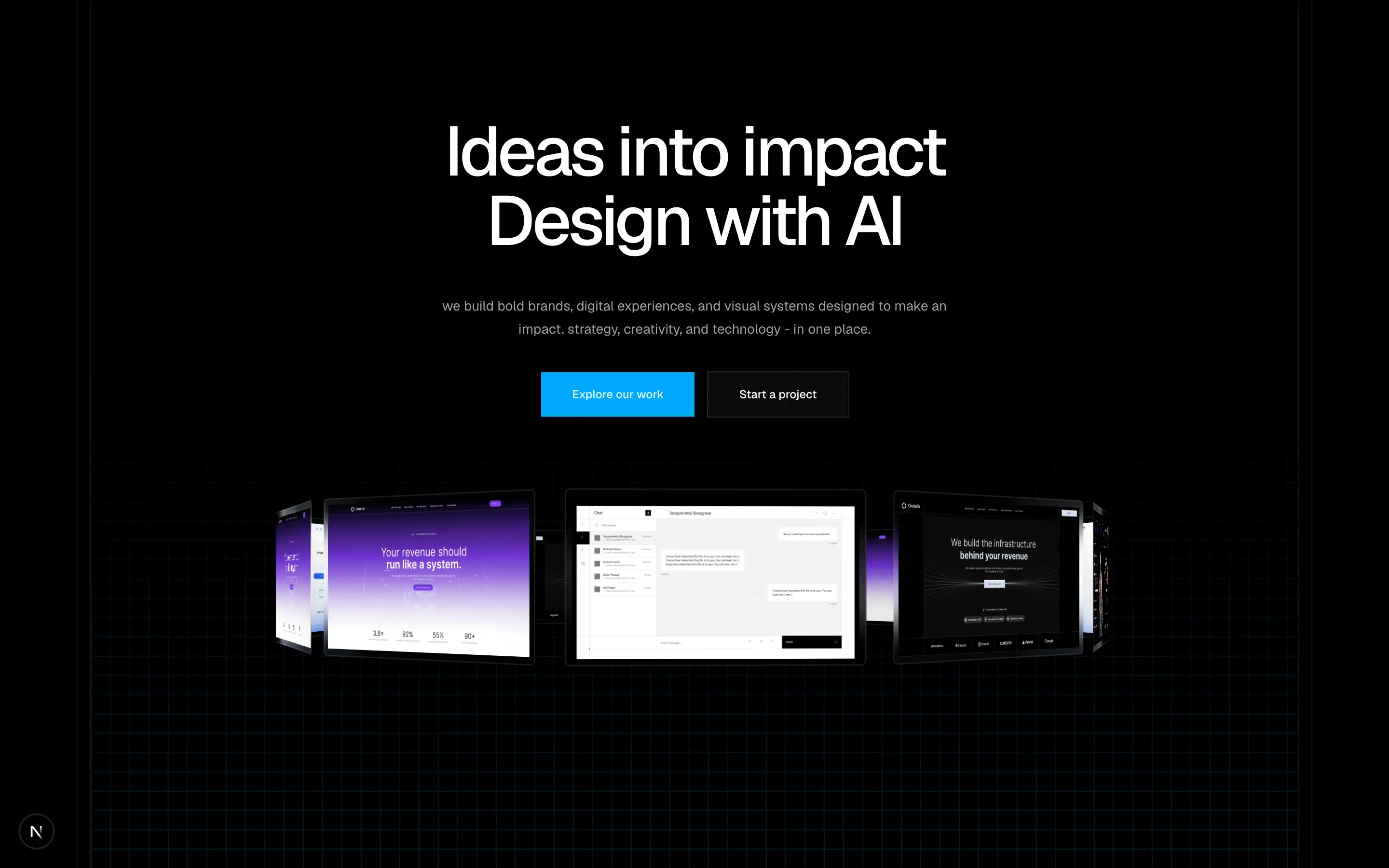
                <h1 className="text-4xl md:text-7xl font-medium tracking-tighter">
                  Ideas into impact <br /> Design with AI
                </h1>
              </div>

              <p className="mt-10 max-w-xl lowercase px-6 text-center text-sm leading-6 text-muted-foreground">
                WE BUILD BOLD BRANDS, DIGITAL EXPERIENCES,
                AND VISUAL SYSTEMS DESIGNED TO MAKE AN IMPACT.
                STRATEGY, CREATIVITY, AND TECHNOLOGY - IN ONE PLACE.
              </p>

              <div className="mt-8 flex flex-wrap items-center justify-center gap-3">
                <Button size="lg" className="gap-2">
                  Explore our work
                </Button>

                <Button variant="outline" size="lg" className="gap-2">
                  Start a project
                </Button>
              </div>
            </div>


            <div
              className="pointer-events-none relative my-auto mt-10 h-[20cqw] w-full"
              style={{
                perspective: "100cqw",
                perspectiveOrigin: "50% 50%",
              }}
            >
              <div
                className="absolute inset-0 flex items-center justify-center"
                style={{
                  transformStyle: "preserve-3d",
                  transform: "rotateX(-18deg) rotateY(0deg)",
                  animation: `orbit-${id} 40s linear infinite`,
                }}
              >
                {Array.from({ length: totalCards }, (_, index) => {
                  const angle = (index / totalCards) * 360
                  const image = images[index % images.length]

                  return (
                    <div
                      key={index}
                      className="absolute h-[10cqw] w-[17cqw] overflow-hidden backdrop-blur-md rounded border shadow-2xl"
                      style={{
                        transformStyle: "preserve-3d",
                        transform: `
                      rotateY(${angle}deg)
                      translateZ(${radiusCqw}cqw)
                    `,
                      }}
                    >
                      <img
                        src={image?.src ?? ""}
                        alt={image?.alt ?? ""}
                        loading="lazy"
                        decoding="async"
                        draggable={false}
                        className="h-full w-full select-none p-1 object-contain"
                      />
                    </div>
                  )
                })}
              </div>
            </div>
          </div>
        </div>
      </div>
    </section>
  )
}
A split-screen hero section with branding, theme toggle, video, work, and contact cards.
hero-4
Files
"use client"

import { Button } from "@/components/ui/button"
import * as React from "react"

const images = [
  { src: "/img/hero-1.jpg", alt: "Hero 1" },
  { src: "/img/chat-1-light.jpg", alt: "Chat UI" },
  { src: "/img/hero-2.jpg", alt: "Hero 2" },
  { src: "/img/dashboard-1-dark.jpg", alt: "Dashboard" },
  { src: "/img/login-1.jpg", alt: "Login Screen" },
]

function createCSS(id: string) {
  return `
    @keyframes horizontal-fan-${id} {
      0% {
        transform: rotateZ(0deg) rotateY(40deg) rotateX(0deg);
      }

      100% {
        transform: rotateZ(0deg) rotateY(0deg) rotateX(360deg);
      }
    }
  `
}

export function HeroSection() {
  const id = React.useId().replace(/[^a-zA-Z0-9]/g, "")
  const css = React.useMemo(() => createCSS(id), [id])

  const totalCards = 14

  return (
    <section className="relative h-screen px-3 w-full overflow-hidden">
      {/* Background */}
      <div className="absolute border-b h-20 w-full overflow-hidden">
        <div className="relative h-full w-full">
          {Array.from({ length: 300 }).map((_, i) => (
            <div
              key={i}
              className="outline-primary/40 absolute h-20 w-full origin-top-left -rotate-45 outline-[0.5px] outline-offset-[-0.25px]"
              style={{
                top: `${i * 16 - 120}px`,
                left: "-10%",
                width: "400%",
              }}
            />
          ))}

        </div>
      </div>

      <div className="absolute border-t bottom-0 h-20 w-full overflow-hidden">
        <div className="absolute h-full w-full">
          <div className="relative h-full w-full">
            {Array.from({ length: 300 }).map((_, i) => (
              <div
              key={i}
              className="outline-primary/40 absolute h-20 w-full origin-top-left -rotate-45 outline-[0.5px] outline-offset-[-0.25px]"
              style={{
                top: `${i * 16 - 120}px`,
                left: "-10%",
                width: "400%",
              }}
            />
            ))}
          </div>
        </div>
      </div>

      <div
        className="absolute inset-0 z-0"
        style={{
          background:
            "radial-gradient(ellipse at 100% 0%, var(--primary) 0%, var(--background) 35%)",
          opacity: 0.3,
        }}
      >
        {/* Rays */}
        <div
          className="absolute inset-0 blur-md"
          style={{
            WebkitMaskImage:
              "radial-gradient(ellipse 70% 70% at 100% 0%, rgba(0,0,0,0.4) 0%, rgba(0,0,0,0) 100%)",
            maskImage:
              "radial-gradient(ellipse 70% 70% at 100% 0%, rgba(0,0,0,0.4) 0%, rgba(0,0,0,0) 100%)",
            backgroundImage:
              "repeating-conic-gradient(from 0deg at 100% 0%, var(--primary) 0deg, var(--primary) 2deg, transparent 2deg, transparent 9deg)",
            pointerEvents: "none",
          }}
        />
      </div>
      <div className="relative mx-auto max-w-7xl border-x flex h-screen w-full flex-col justify-between">
        <style>{css}</style>

        <div
          className="relative flex h-full w-full items-center flex-col justify-between" >

          <div className="relative z-10 flex h-full w-full items-center px-8">
            {/* LEFT CONTENT */}
            <div className="w-full mt-auto mb-20 md:mb-0 md:mt-0 max-w-sm lg:max-w-md">
              <div className="select-none text-left">
                <h1 className="text-[12vw] font-black uppercase leading-[0.8] tracking-[-0.065em] sm:text-[9vw] lg:text-[6.8vw]">
                  DESIGN MOVES BRANDS
                </h1>
              </div>

              <p className="mt-8 max-w-md text-left text-xs md:text-sm md:leading-6 text-muted-foreground">
                WE BUILD BOLD VISUAL IDENTITIES, DIGITAL EXPERIENCES,
                AND INTERFACES THAT TURN IDEAS INTO MEMORABLE BRANDS.
                STRATEGY, DESIGN, AND TECHNOLOGY — CRAFTED TOGETHER.
              </p>

              <div className="my-8 flex flex-wrap gap-3">
                <Button
                  size="lg"
                  variant={"outline"}
                >
                  Explore work
                </Button>

                <Button

                  size="lg"

                >
                  Start a project
                </Button>
              </div>
            </div>
          </div>


          <div
            className="
            pointer-events-none
            absolute
            z-0
            top-1/3
            md:top-1/2
            md:left-[20%]
            w-full
            items-center
            justify-center
            flex
          "
            style={{
              perspective: "100cqw",
              perspectiveOrigin: "50% 50%",
            }}
          >
            <div
              className="relative flex h-full w-full items-center justify-center"
              style={{
                transformStyle: "preserve-3d",
                animation: `horizontal-fan-${id} 60s linear infinite`,
              }}
            >
              {Array.from({ length: totalCards }, (_, index) => {
                const angle = (index / totalCards) * 360
                const image = images[index % images.length]

                return (
                  <div
                    key={index}
                    className="absolute h-[14cqw] w-[24.5cqw] rounded border shadow-2xl/10 backdrop-blur-md"
                    style={{
                      transformStyle: "preserve-3d",
                      transformOrigin: "center center",
                      transform: `
                      rotateX(${angle}deg)
                      translateY(12cqw)
                    `,
                    }}
                  >
                    <div className="relative h-full w-full overflow-hidden p-1">
                      <img
                        src={image?.src ?? ""}
                        alt={image?.alt ?? ""}
                        loading="lazy"
                        decoding="async"
                        draggable={false}
                        className="h-full w-full rounded object-contain opacity-90 select-none"
                      />
                    </div>
                  </div>
                )
              })}
            </div>
          </div>
        </div>
      </div>
    </section>
  )
}
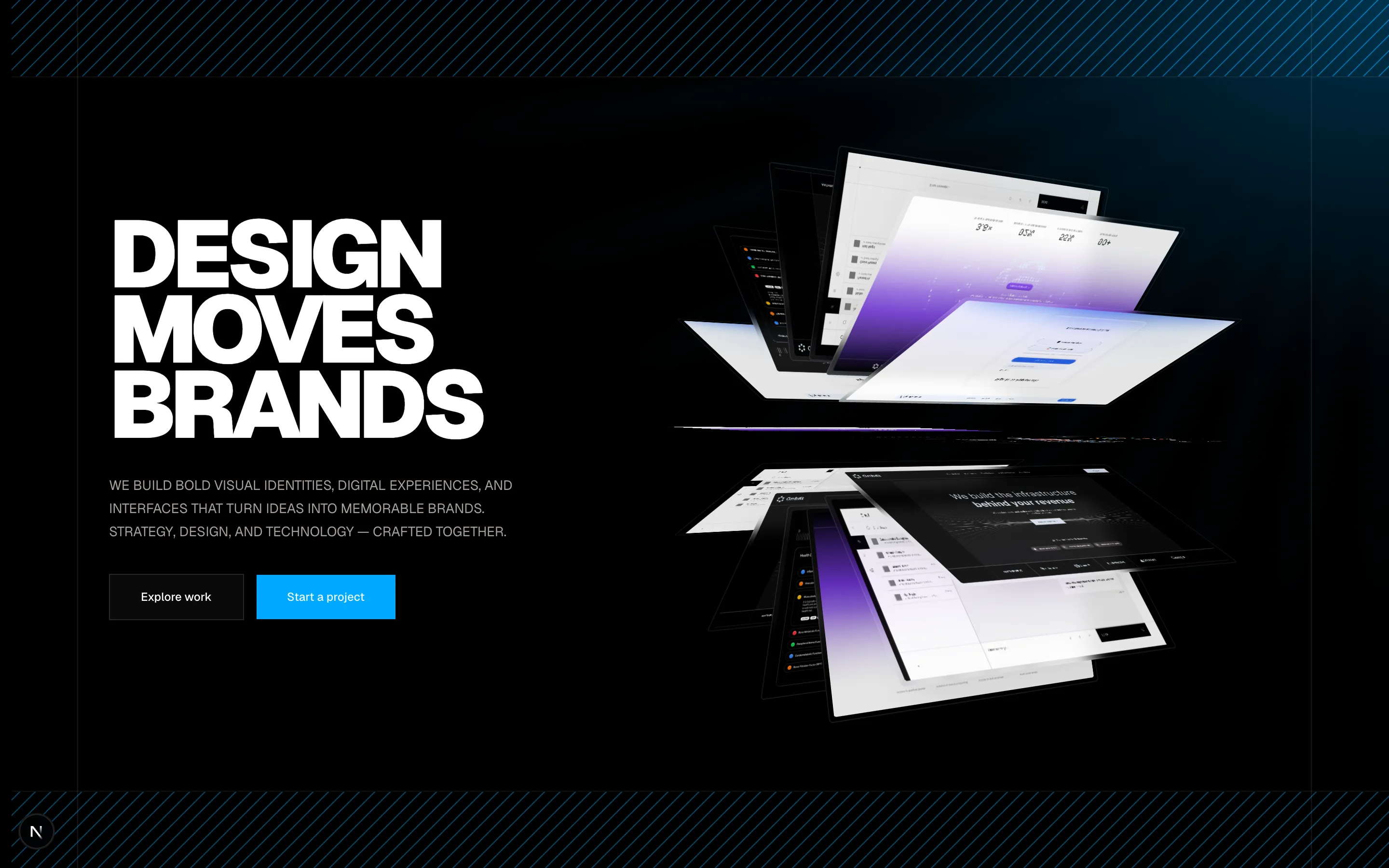
A split-screen hero section with branding, theme toggle, video, work, and contact cards.
hero-5