Files
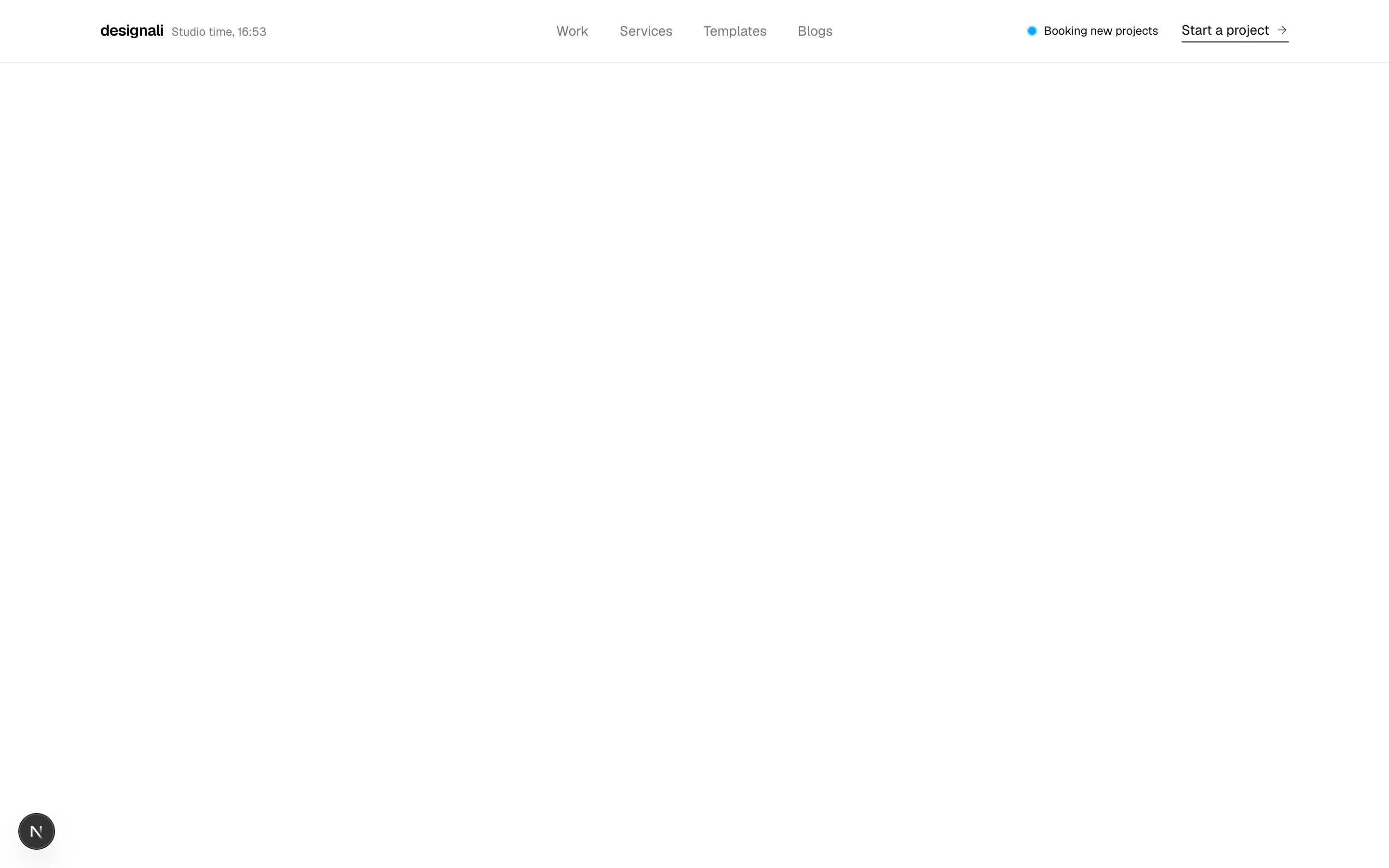
import { Header } from "@/components/header"

export function Header01() {
  return (
    <div className="flex min-h-screen w-full flex-col overflow-hidden">
      <Header />
      <main className="flex-1">
        <section className="flex h-screen items-center justify-center">
          <h1 className="text-4xl font-bold">Hero</h1>
        </section>

        <section className="flex h-screen items-center justify-center">
          <h1 className="text-4xl font-bold">Section</h1>
        </section>
      </main>
    </div>
  )
}
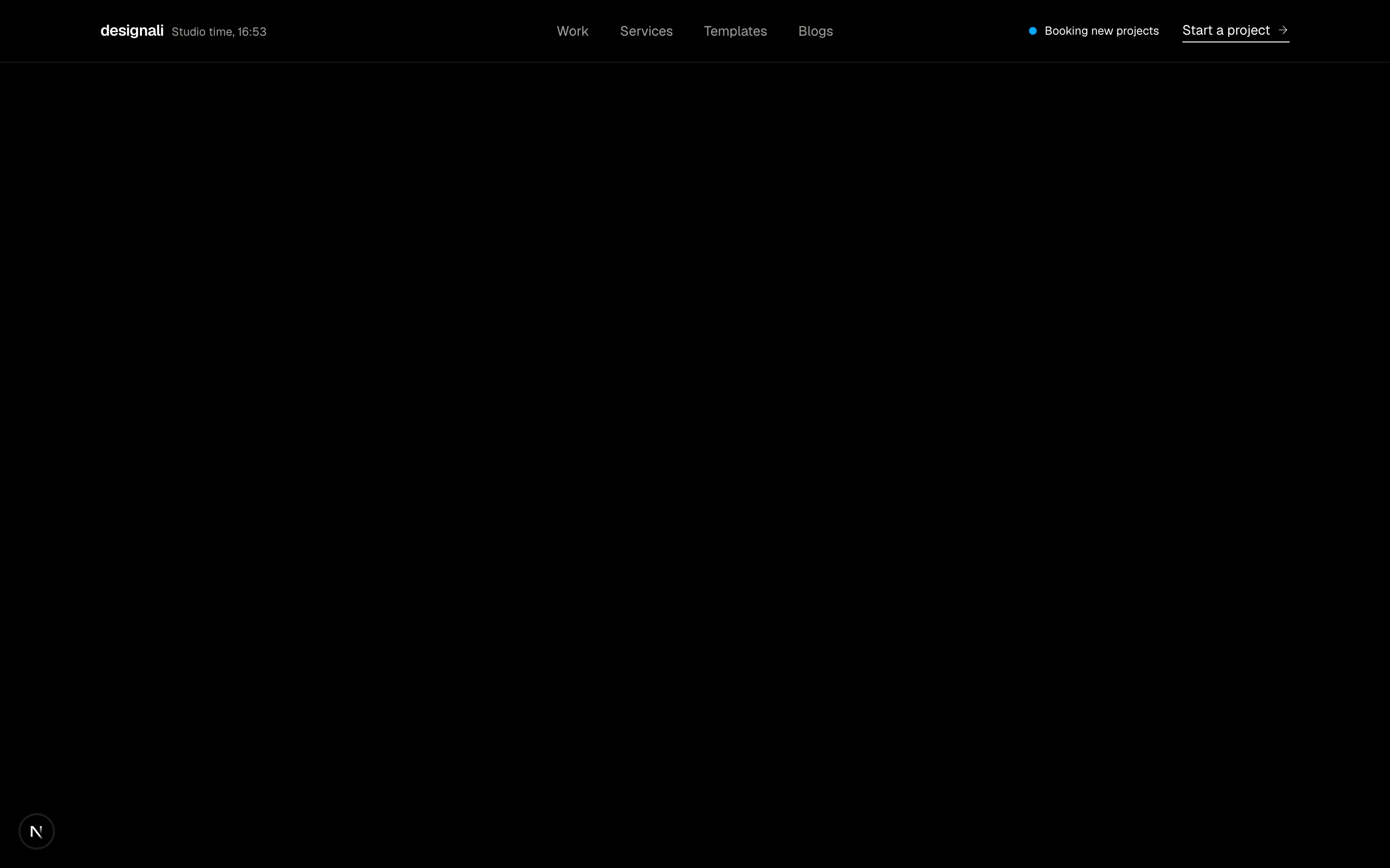
A simple header section.
header-01
Files
import { Header } from "@/components/header"

export function Header02() {
  return (
    <div className="flex min-h-screen w-full flex-col">
      <Header />
      <main className="flex-1">
        <section className="flex h-screen items-center justify-center">
          <h1 className="text-4xl font-bold">Hero</h1>
        </section>

        <section className="flex h-screen items-center justify-center">
          <h1 className="text-4xl font-bold">Section</h1>
        </section>
      </main>
    </div>
  )
}
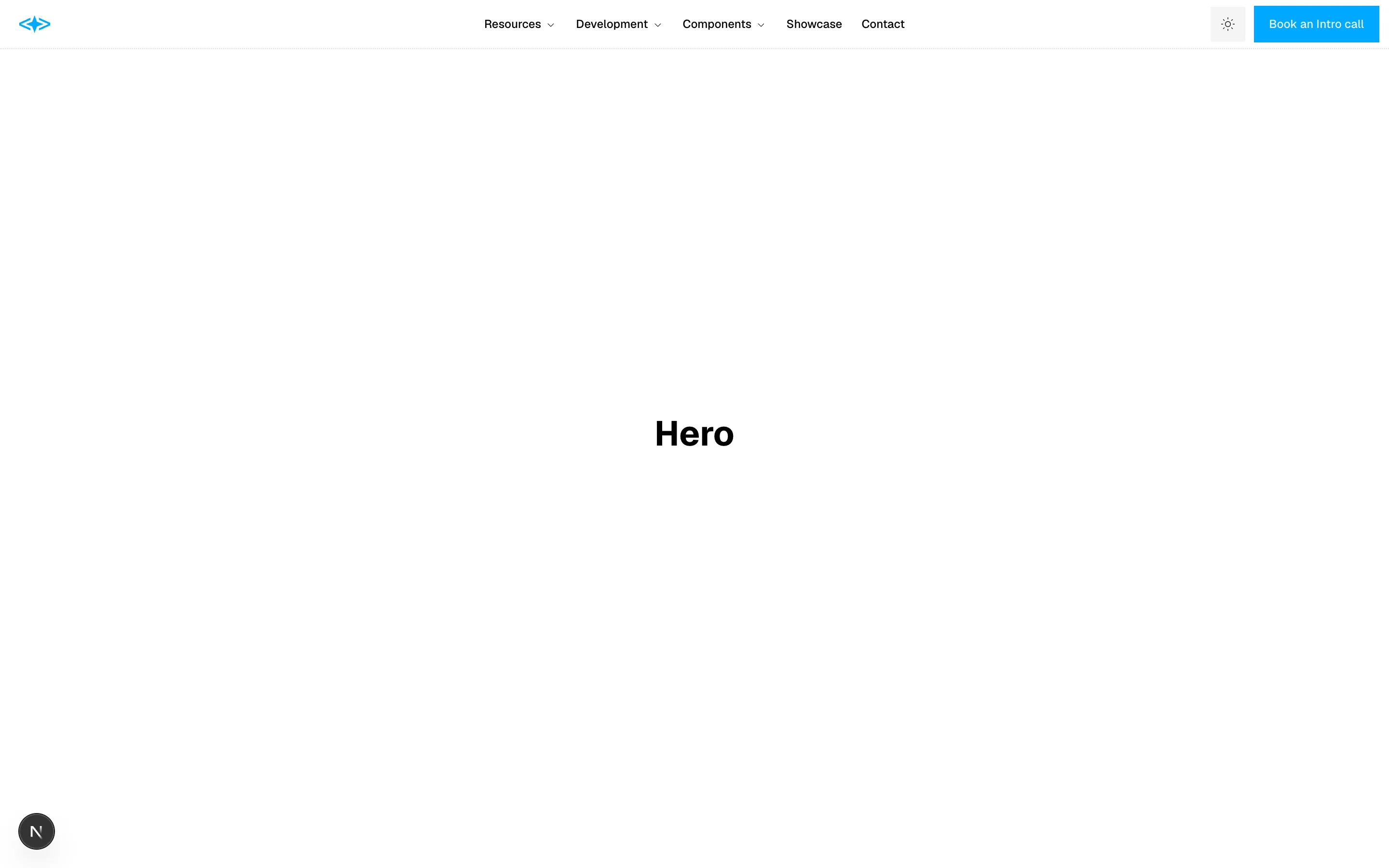
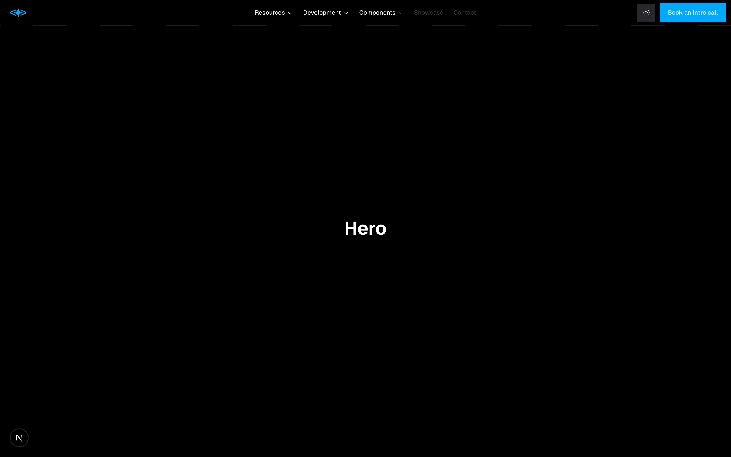
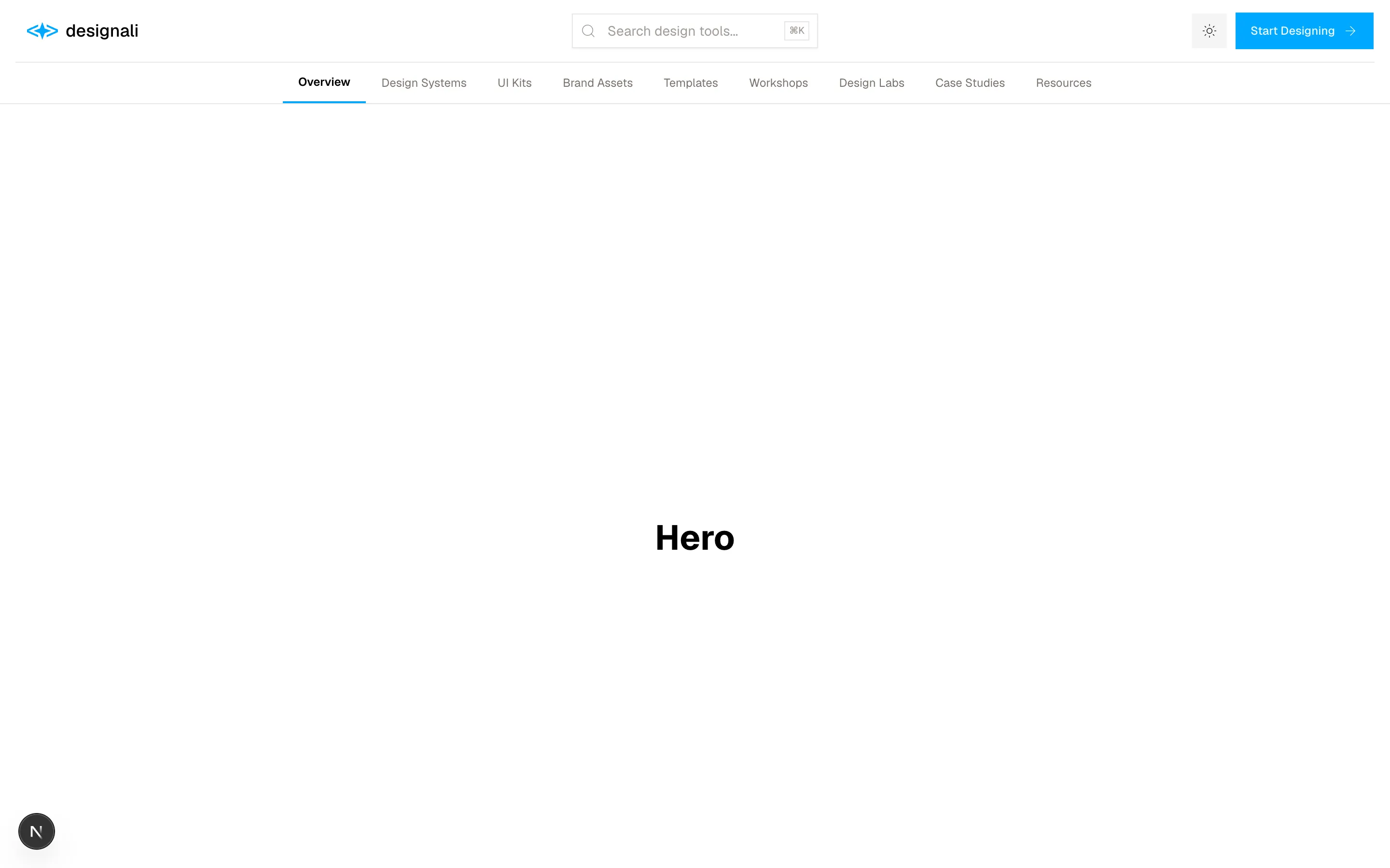
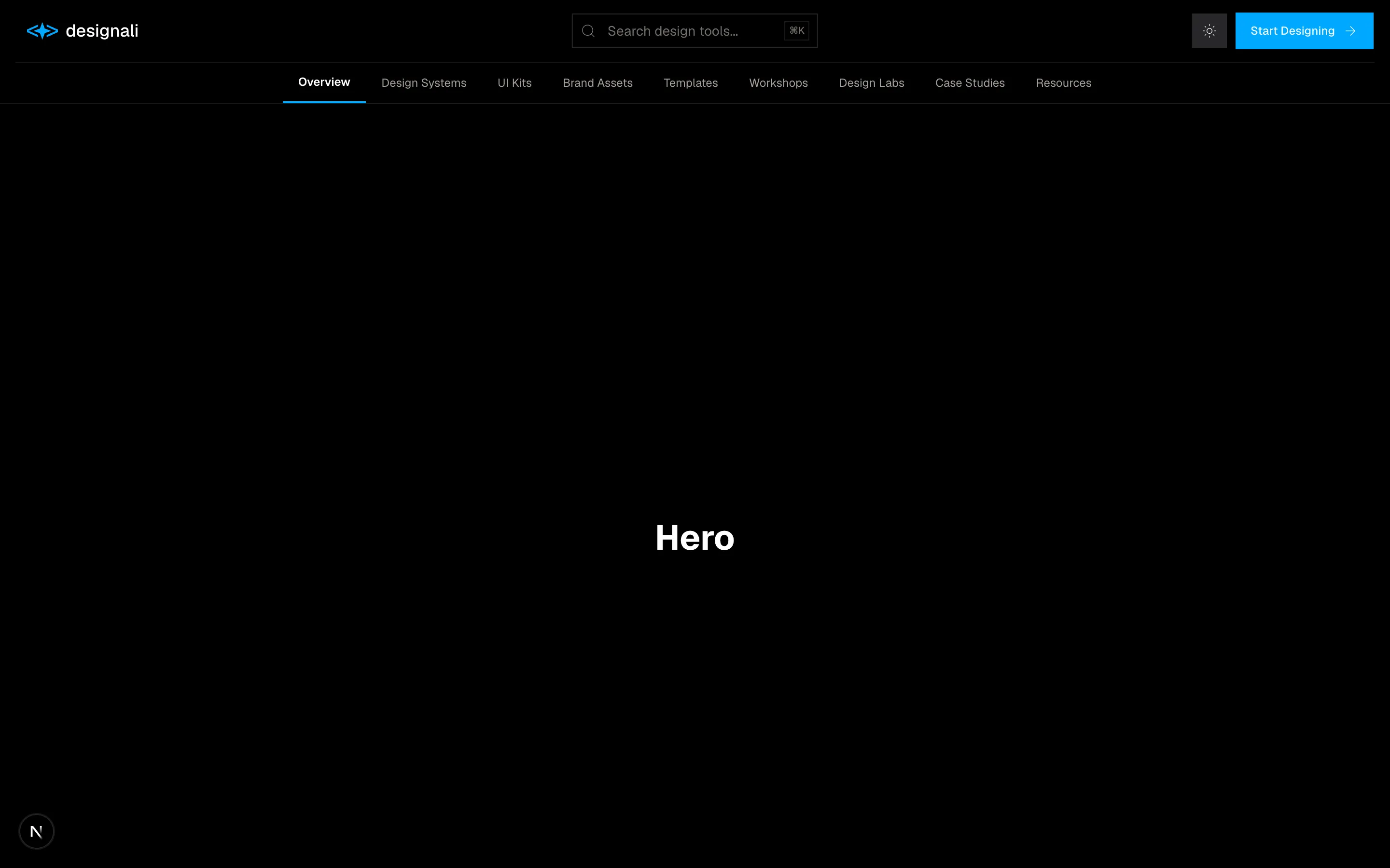
A simple header section.
header-02
Files
import { Header } from "@/components/header"

export function Header03() {
  return (
    <div className="flex min-h-screen w-full flex-col">
      <Header />
      <main className="flex-1">
        <section className="flex h-screen items-center justify-center">
          <h1 className="text-4xl font-bold">Hero</h1>
        </section>

        <section className="flex h-screen items-center justify-center">
          <h1 className="text-4xl font-bold">Section</h1>
        </section>
      </main>
    </div>
  )
}
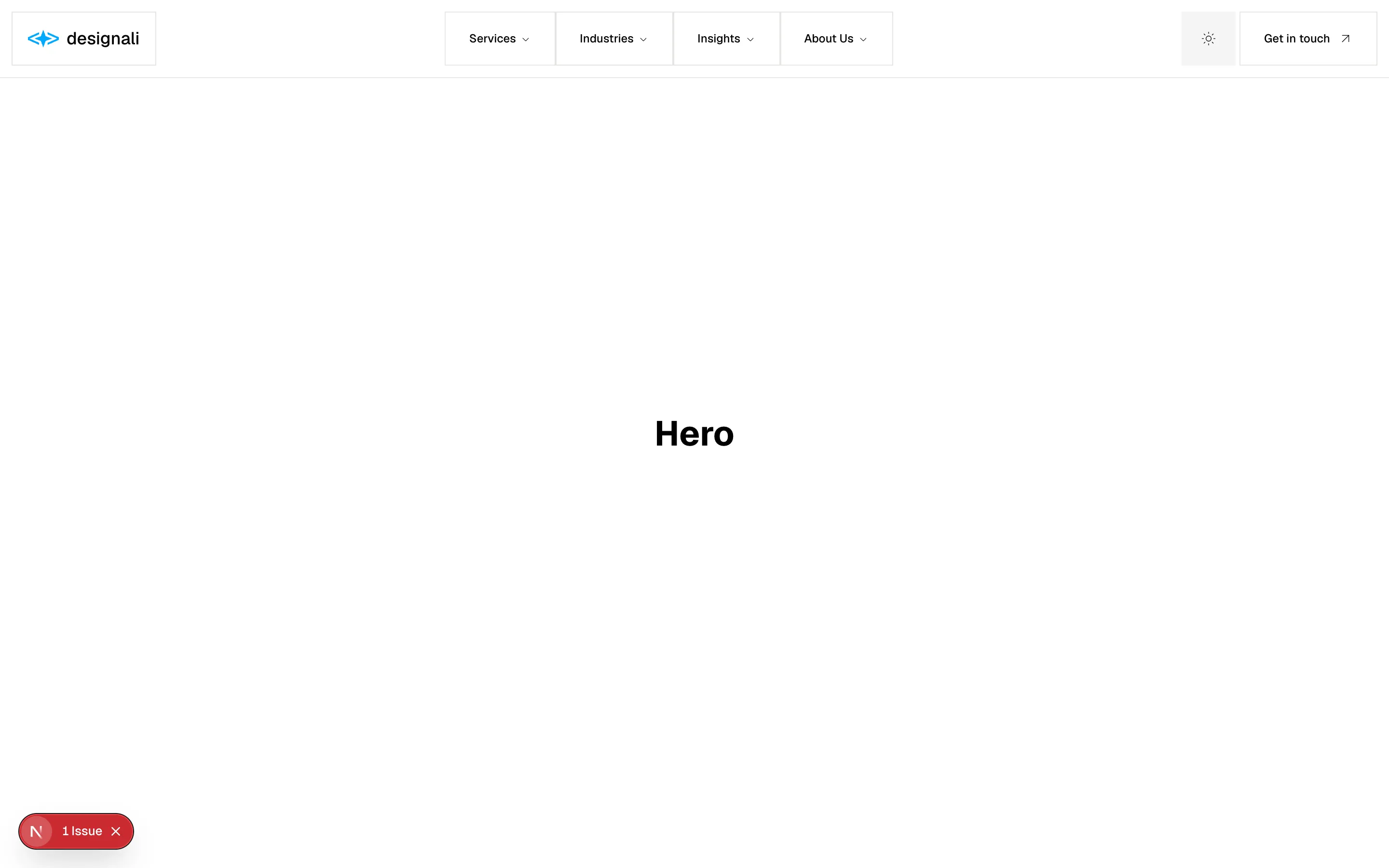
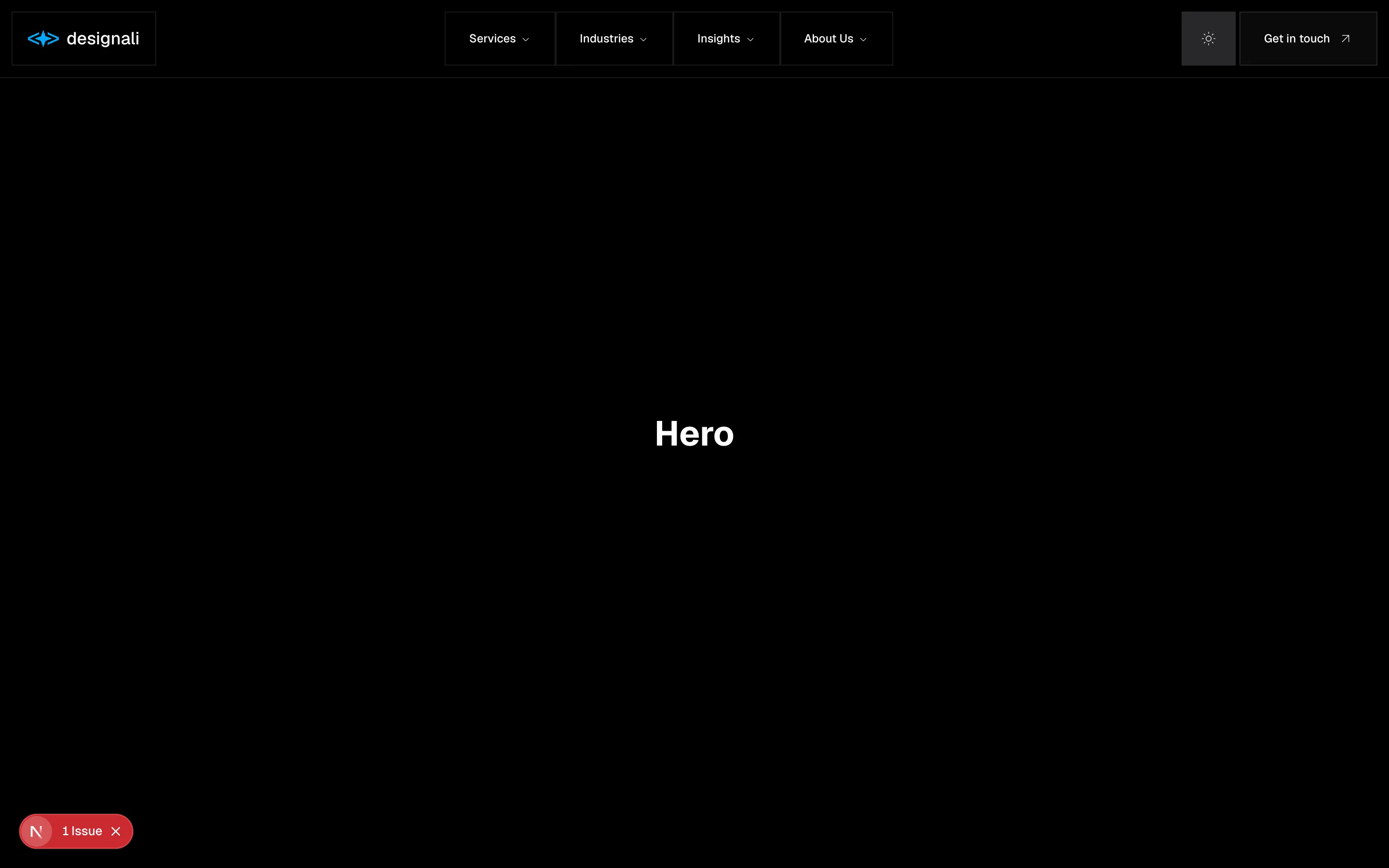
A simple header section.
header-03
Files
import { Header } from "@/components/header"

export function Header04() {
  return (
    <div className="flex min-h-screen w-full flex-col">
      <Header />
      <main className="flex-1">
        <section className="flex h-screen items-center justify-center">
          <h1 className="text-4xl font-bold">Hero</h1>
        </section>

        <section className="flex h-screen items-center justify-center">
          <h1 className="text-4xl font-bold">Section</h1>
        </section>
      </main>
    </div>
  )
}
A simple header section.
header-04
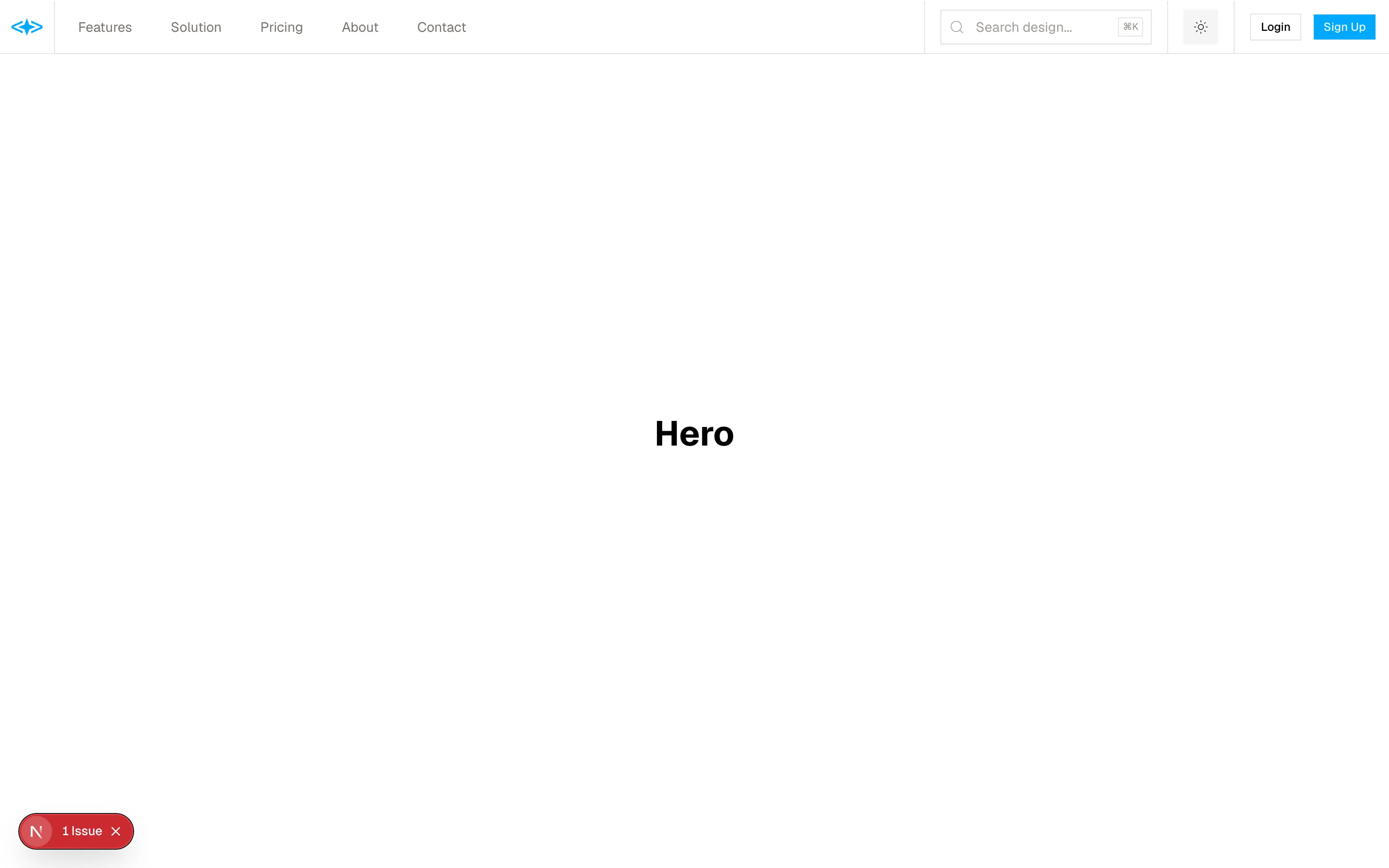
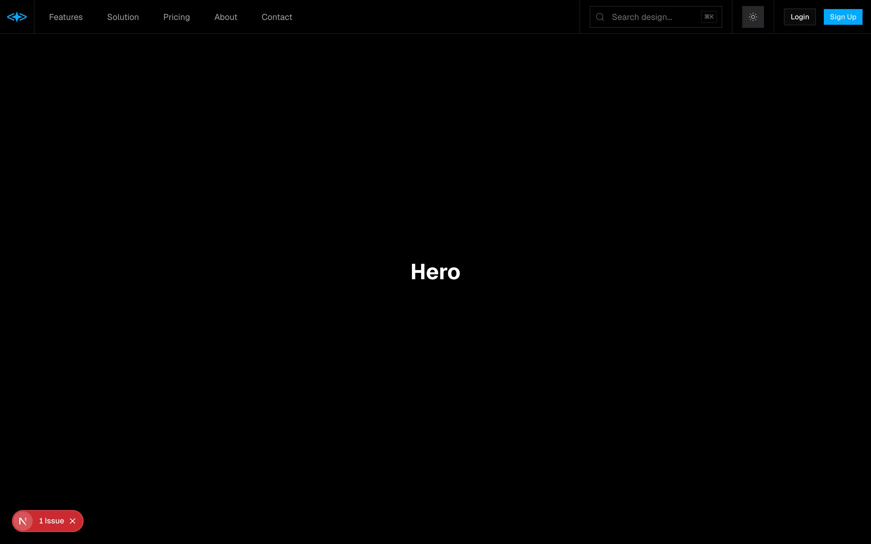
Files
import { Header } from "@/components/header"

export function Header05() {
  return (
    <div className="flex min-h-screen w-full flex-col">
      <Header />
      <main className="flex-1">
        <section className="flex h-screen items-center justify-center">
          <h1 className="text-4xl font-bold">Hero</h1>
        </section>

        <section className="flex h-screen items-center justify-center">
          <h1 className="text-4xl font-bold">Section</h1>
        </section>
      </main>
    </div>
  )
}
A simple header section.
header-05
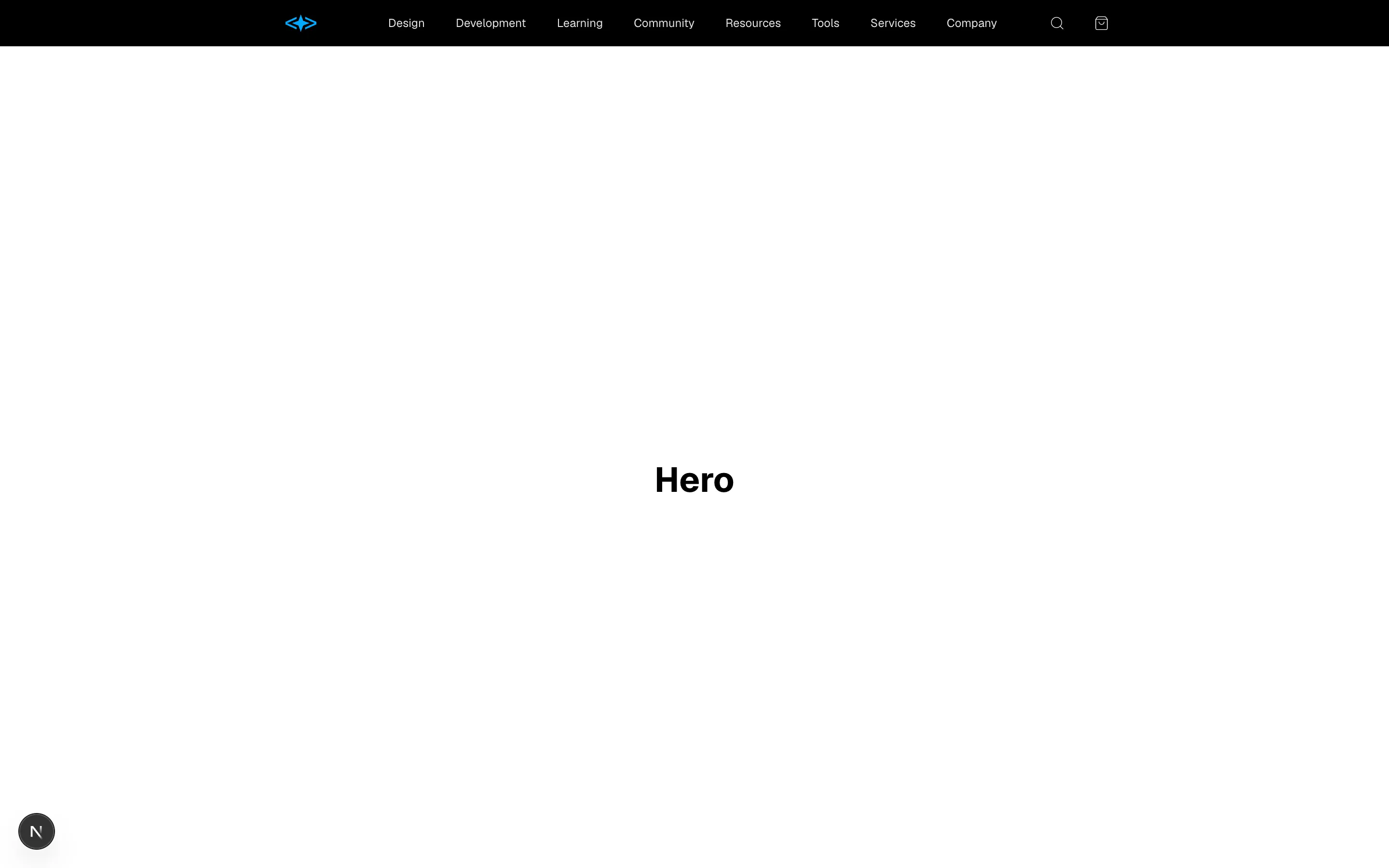
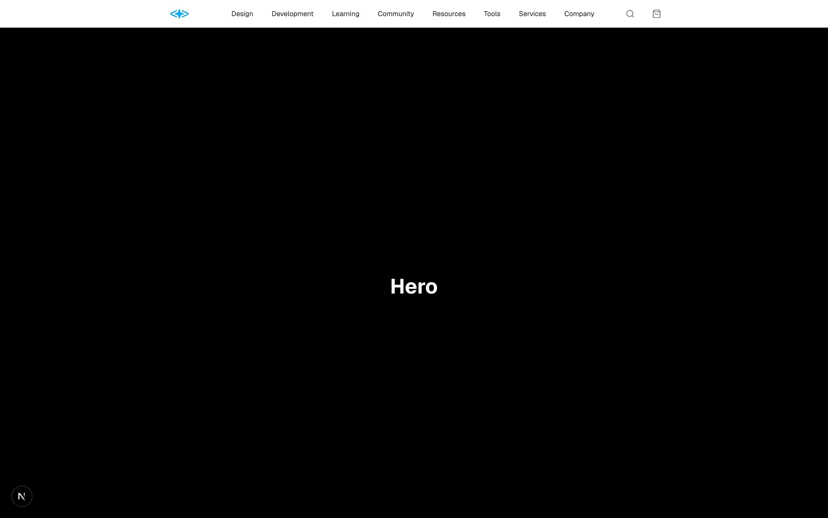
Files
import { Header } from "@/components/header"

export function Header05() {
  return (
    <div className="flex min-h-screen w-full flex-col">
      <Header />
      <main className="flex-1">
        <section className="flex h-screen items-center justify-center">
          <h1 className="text-4xl font-bold">Hero</h1>
        </section>

        <section className="flex h-screen items-center justify-center">
          <h1 className="text-4xl font-bold">Section</h1>
        </section>
      </main>
    </div>
  )
}
A simple header section.
header-06
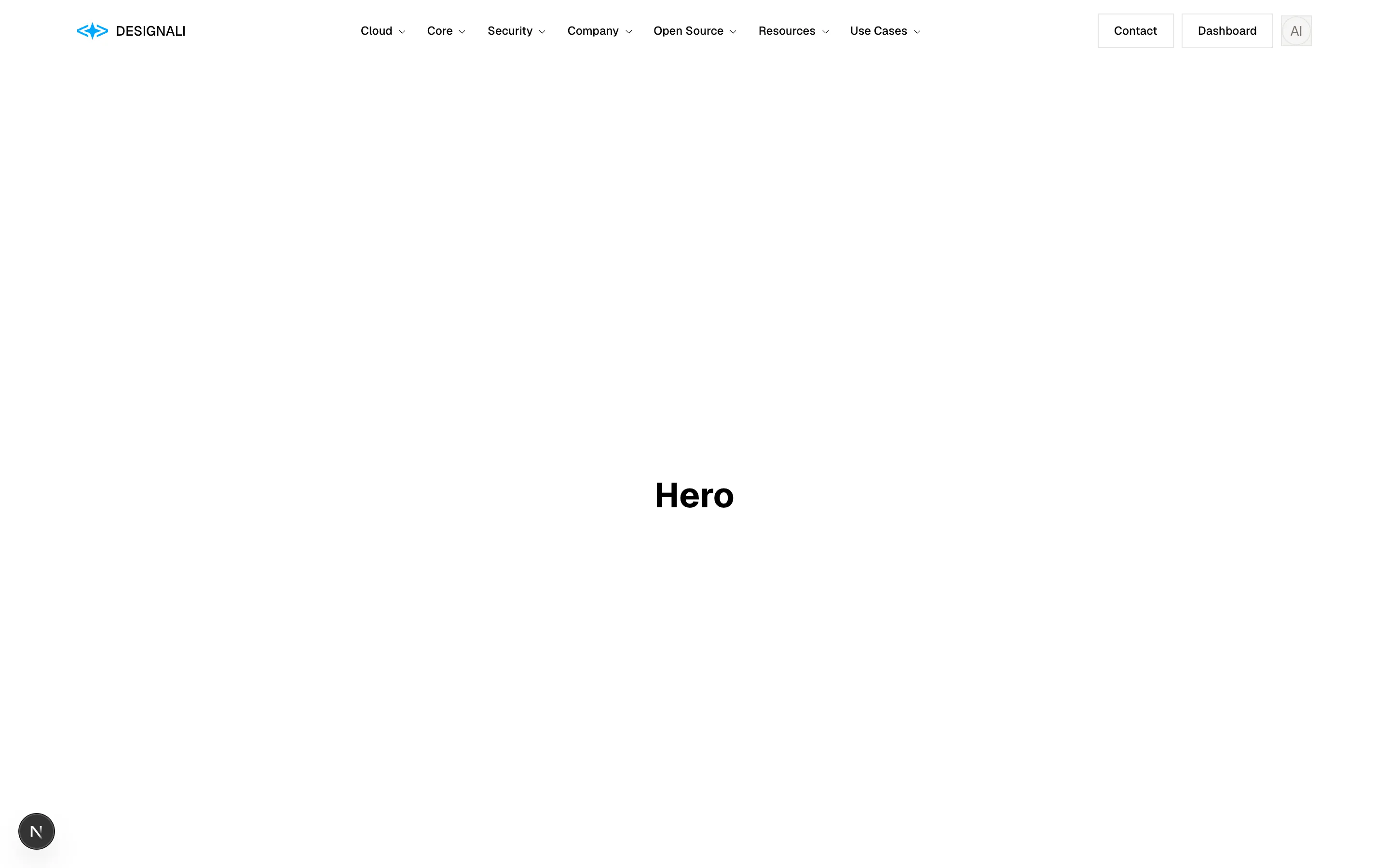
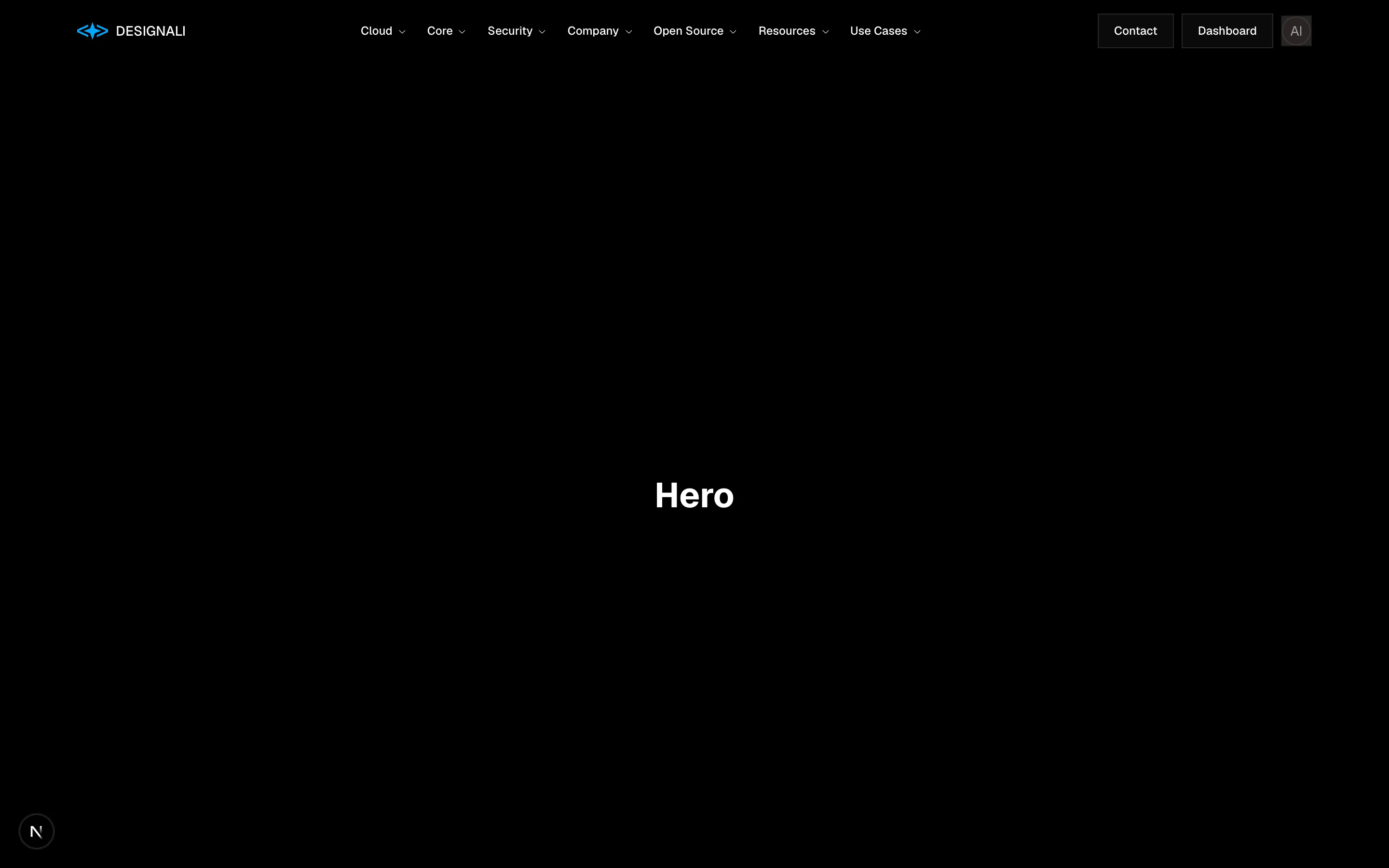
Files
"use client"

import { useState } from "react"
import {
  Menu,
  X,
} from "@designali/icons"

import { Button } from "@/components/ui/button"

const left = ["Templates", "Blocks", "UI Designs"]
const right = ["Pricing", "Docs"]

export function Header07() {
  const [open, setOpen] = useState(false)

  return (
    <section className="w-full border-b bg-background">
      <header className="mx-auto grid h-20 max-w-7xl grid-cols-[1fr_auto_1fr] items-center px-6">
        <nav className="hidden gap-8 text-sm md:flex">
          {left.map((link) => (
            <a key={link} href="#" className="text-muted-foreground transition-colors hover:text-foreground">
              {link}
            </a>
          ))}
        </nav>
        <Button
          variant="ghost"
          size="icon"
          className="md:hidden"
          aria-label="Toggle menu"
          onClick={() => setOpen(!open)}
        >
          {open ? <X /> : <Menu />}
        </Button>

        <a href="#" className="font-sans text-2xl tracking-[0.3em] uppercase">
          designali
        </a>

        <div className="flex items-center justify-end gap-8 text-sm">
          <nav className="hidden gap-8 md:flex">
            {right.map((link) => (
              <a key={link} href="#" className="text-muted-foreground transition-colors hover:text-foreground">
                {link}
              </a>
            ))}
          </nav>
          <a href="#" className="border-b border-foreground pb-0.5">
            Cart (2)
          </a>
        </div>
      </header>

      {open && (
        <nav className="border-t md:hidden">
          {[...left, ...right].map((link) => (
            <a key={link} href="#" className="block border-b px-6 py-4 text-lg last:border-b-0">
              {link}
            </a>
          ))}
        </nav>
      )}
    </section>
  )
}
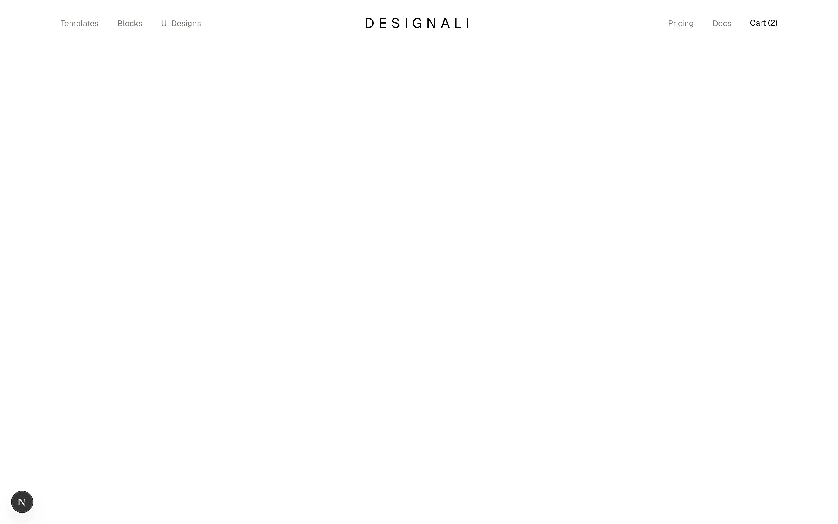
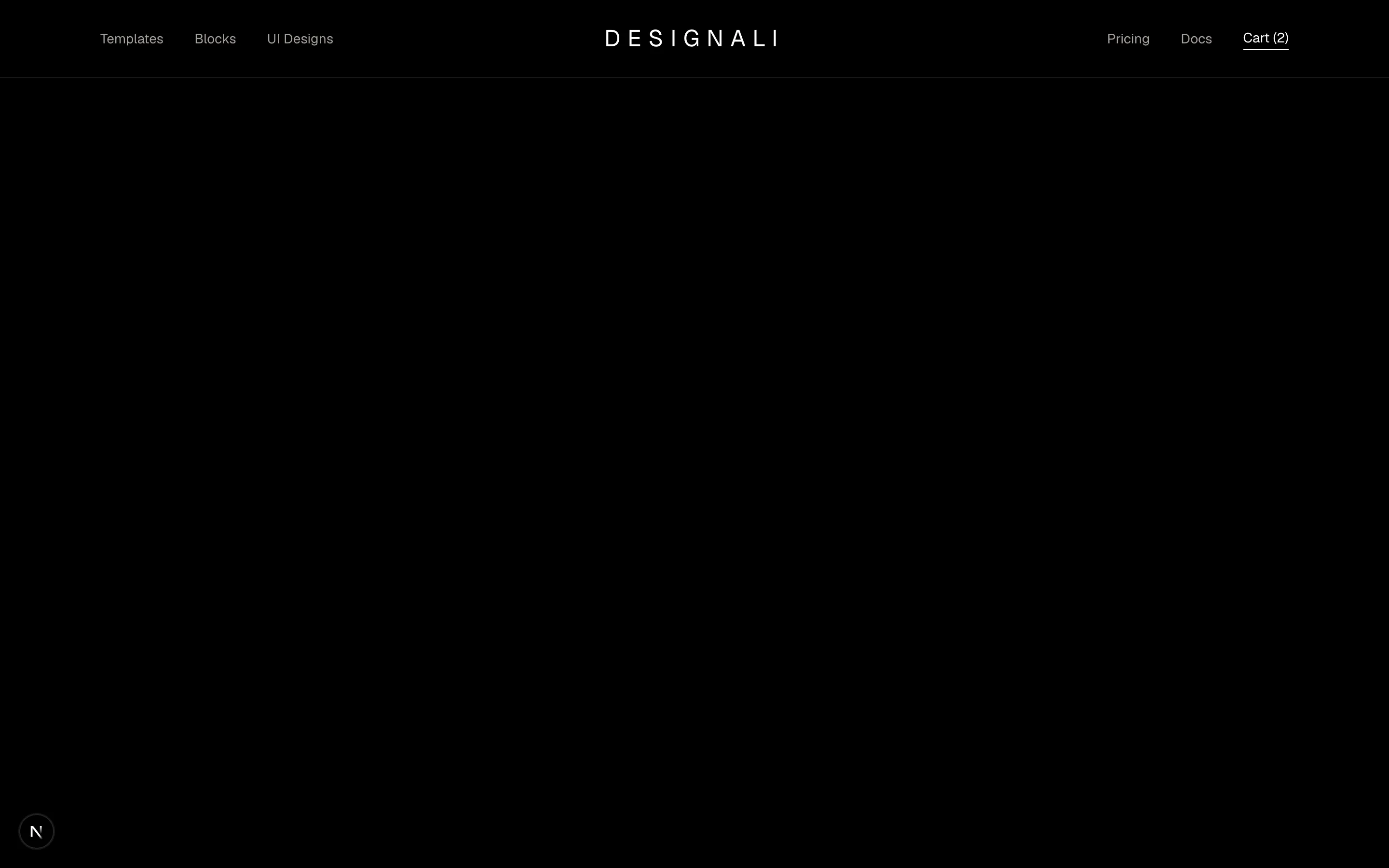
A centred-logo storefront header with split navigation and a mobile menu.
header-07
Files
"use client"

import { useState } from "react"
import {
  ArrowRight,
  Menu,
  X,
} from "@designali/icons"

import { Button } from "@/components/ui/button"
import { Logo } from "@/components/logo"

const links = ["Templates", "Blocks", "Icons", "Pricing", "Docs"]

export function Header08() {
  const [open, setOpen] = useState(false)
  const [banner, setBanner] = useState(true)

  return (
    <section className="w-full bg-background">
      {banner && (
        <div className="bg-foreground text-background">
          <div className="mx-auto flex max-w-7xl items-center justify-center gap-3 px-6 py-2.5 text-xs sm:text-sm">
            <span className="hidden bg-background/15 px-2 py-0.5 text-xs sm:inline">New</span>
            <a href="#" className="flex items-center gap-1.5 hover:underline">
              460+ blocks are now live on Designali
              <ArrowRight className="size-3.5" />
            </a>
            <button
              type="button"
              onClick={() => setBanner(false)}
              aria-label="Dismiss announcement"
              className="ms-auto opacity-60 hover:opacity-100 sm:absolute sm:end-6"
            >
              <X className="size-4" />
            </button>
          </div>
        </div>
      )}
      <header className="relative border-b">
        <div className="mx-auto flex h-16 max-w-7xl items-center gap-10 px-6">
          <a href="#" className="flex items-center gap-2 font-semibold tracking-tight">
            <Logo className="size-6" />
            designali
          </a>
          <nav className="hidden gap-6 text-sm lg:flex">
            {links.map((link) => (
              <a key={link} href="#" className="text-muted-foreground transition-colors hover:text-foreground">
                {link}
              </a>
            ))}
          </nav>
          <div className="ms-auto hidden items-center gap-2 lg:flex">
            <Button variant="ghost">Log in</Button>
            <Button variant="outline">Contact</Button>
            <Button>Get started</Button>
          </div>
          <Button
            variant="outline"
            size="icon-lg"
            className="ms-auto lg:hidden"
            aria-label="Toggle menu"
            onClick={() => setOpen(!open)}
          >
            {open ? <X /> : <Menu />}
          </Button>
        </div>
        {open && (
          <div className="border-t lg:hidden">
            <nav className="flex flex-col px-6 py-4">
              {links.map((link) => (
                <a key={link} href="#" className="border-b py-3 text-sm">
                  {link}
                </a>
              ))}
            </nav>
            <div className="grid grid-cols-2 gap-2 px-6 pb-6">
              <Button variant="outline">Log in</Button>
              <Button>Get started</Button>
            </div>
          </div>
        )}
      </header>
    </section>
  )
}
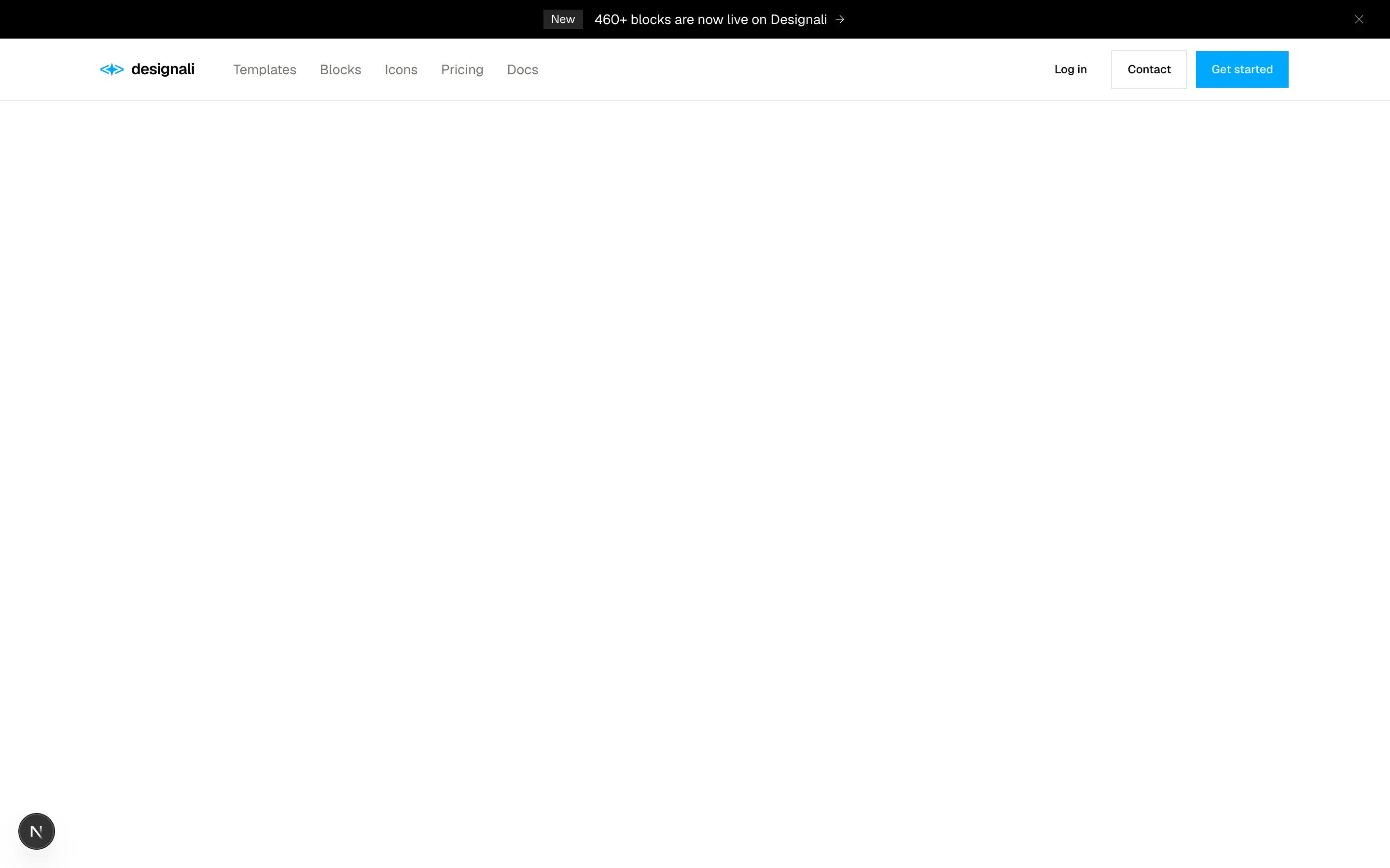
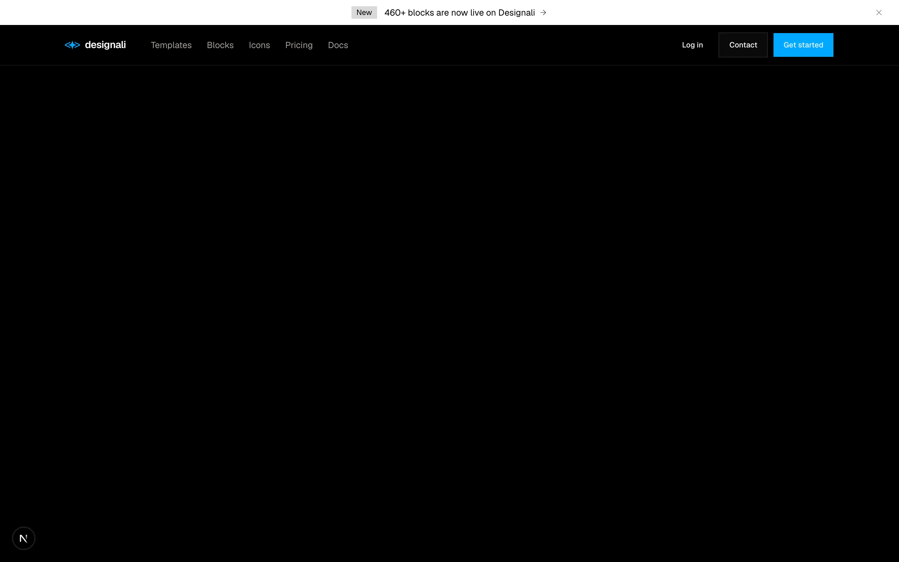
A dismissible announcement bar above a header with mega-menu style links.
header-08
Files
import {
  Bell,
  ChevronDown,
  Search,
} from "@designali/icons"

import { Input } from "@/components/ui/input"

const links = [
  { label: "Dashboard", active: true },
  { label: "Projects" },
  { label: "Templates" },
  { label: "Clients" },
  { label: "Invoices" },
]

export function Header09() {
  return (
    <section className="w-full bg-background">
      <header className="border-b">
        <div className="mx-auto flex h-14 max-w-7xl items-center gap-4 px-6">
          <a href="#" className="flex items-center gap-2 text-sm font-semibold">
            <span className="flex size-7 items-center justify-center bg-primary text-xs text-primary-foreground">
              D
            </span>
            Designali
          </a>
          <span className="hidden h-5 w-px bg-border sm:block" />
          <button
            type="button"
            className="hidden items-center gap-2 text-sm text-muted-foreground hover:text-foreground sm:flex"
          >
            Designali Studio
            <ChevronDown className="size-3.5" />
          </button>

          <div className="relative ms-auto hidden w-72 md:block">
            <Search className="absolute start-3 top-1/2 size-4 -translate-y-1/2 text-muted-foreground" />
            <Input placeholder="Search projects, templates..." className="h-9 ps-9" />
            <kbd className="absolute end-2 top-1/2 -translate-y-1/2 border px-1.5 font-mono text-[10px] text-muted-foreground">
              /
            </kbd>
          </div>

          <button
            type="button"
            aria-label="Notifications"
            className="relative ms-auto flex size-9 items-center justify-center border md:ms-0"
          >
            <Bell className="size-4" />
            <span className="absolute end-1.5 top-1.5 size-1.5 rounded-full bg-destructive" />
          </button>
          <span className="flex size-9 items-center justify-center rounded-full bg-gradient-to-br from-chart-1 to-chart-3 text-xs font-medium text-white">
            AI
          </span>
        </div>
        <nav className="mx-auto flex max-w-7xl gap-1 overflow-x-auto px-4">
          {links.map((link) => (
            <a
              key={link.label}
              href="#"
              className={
                link.active
                  ? "border-b-2 border-foreground px-3 pb-2.5 text-sm font-medium"
                  : "border-b-2 border-transparent px-3 pb-2.5 text-sm text-muted-foreground hover:text-foreground"
              }
            >
              {link.label}
            </a>
          ))}
        </nav>
      </header>
    </section>
  )
}
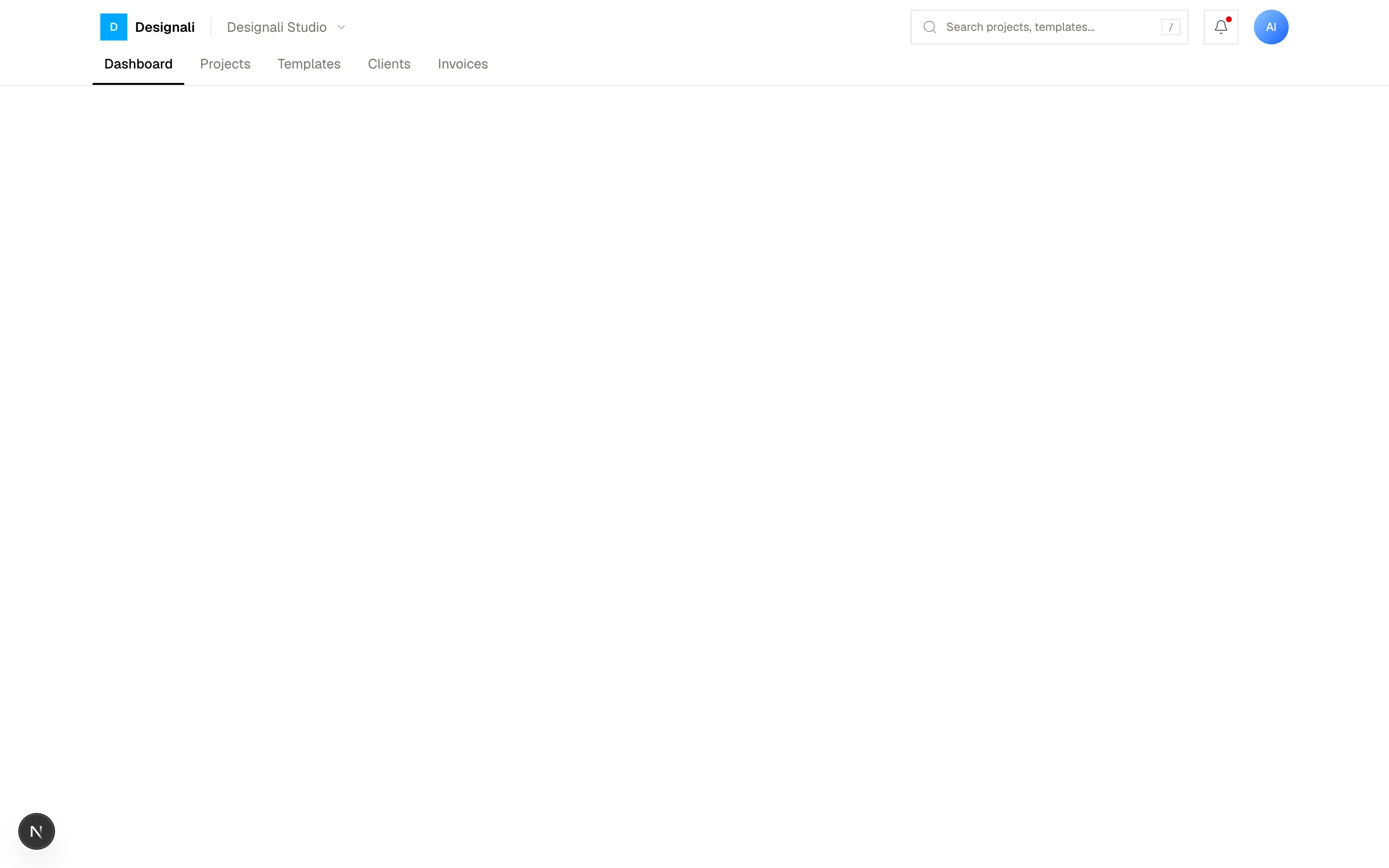
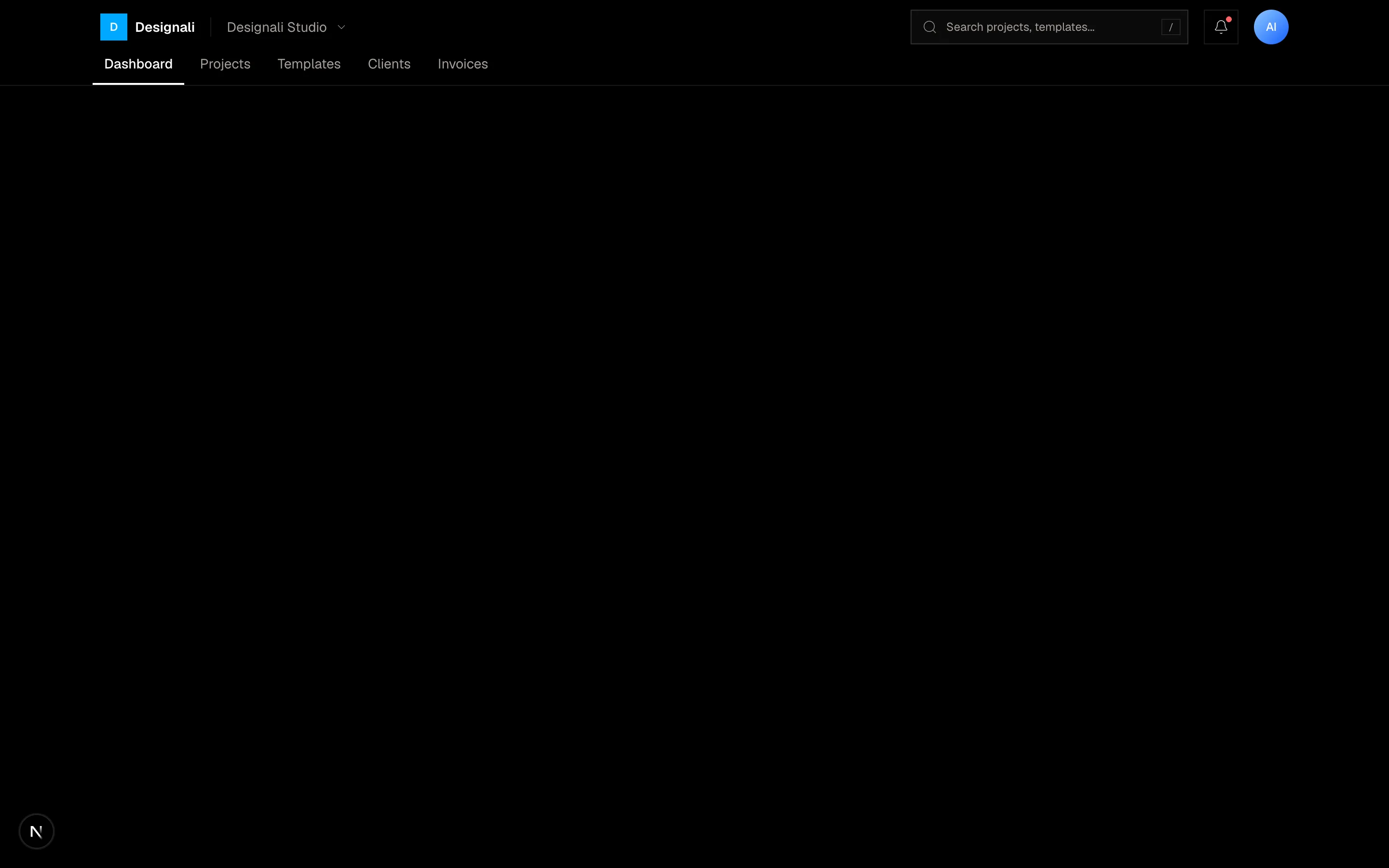
An app header with a search field, notifications and an account avatar.
header-09
Files
import {
  Search,
} from "@designali/icons"

const sections = [
  "Design",
  "Development",
  "Branding",
  "UI/UX",
  "Icons",
  "Templates",
  "AI Workflows",
  "Case Studies",
]

export function Header10() {
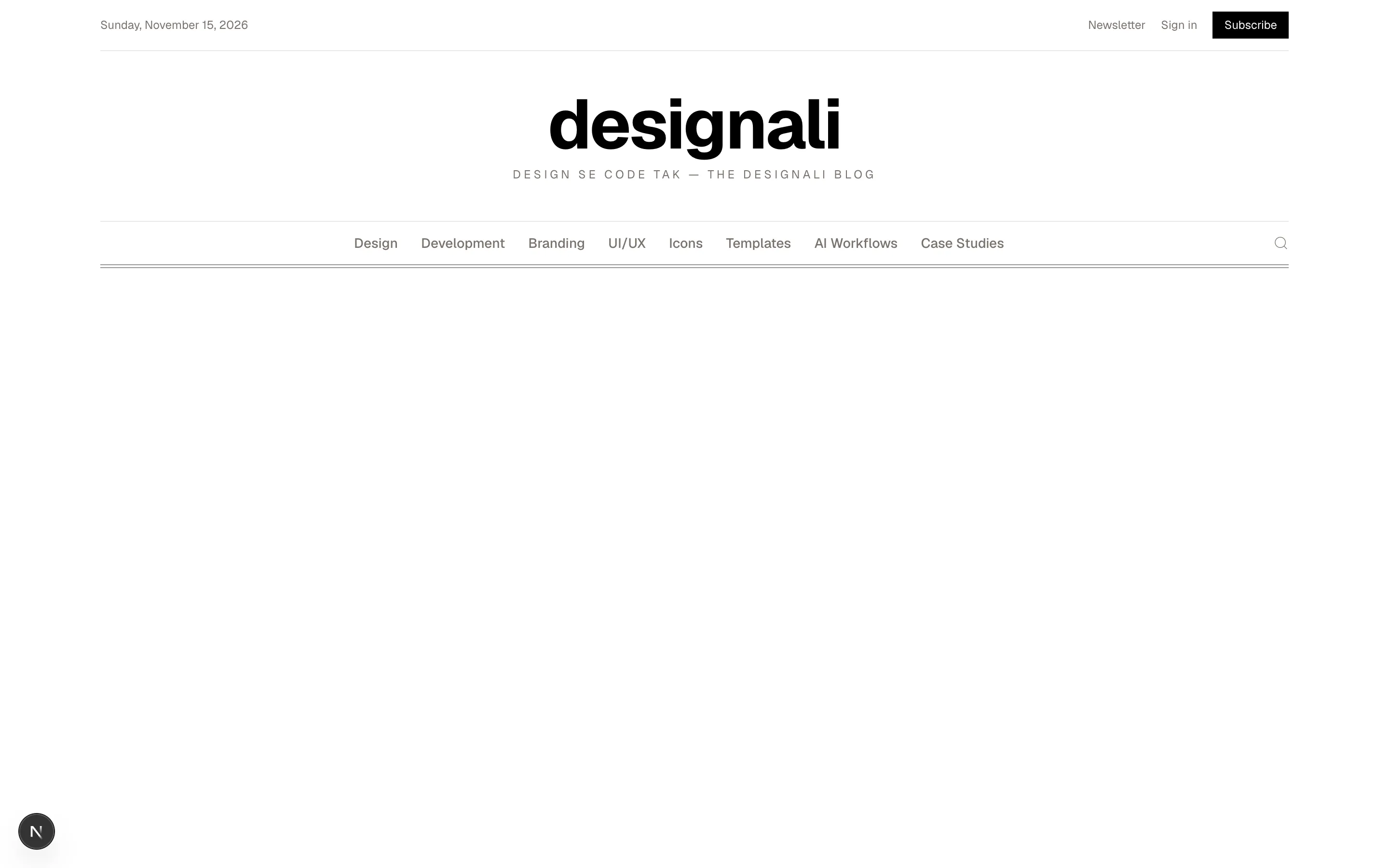
  const today = "Sunday, November 15, 2026"

  return (
    <section className="w-full bg-background">
      <header className="mx-auto max-w-7xl px-6">
        <div className="flex items-center justify-between border-b py-3 text-xs text-muted-foreground">
          <span>{today}</span>
          <div className="flex items-center gap-4">
            <a href="#" className="hover:text-foreground">
              Newsletter
            </a>
            <a href="#" className="hover:text-foreground">
              Sign in
            </a>
            <a href="#" className="bg-foreground px-3 py-1.5 text-background">
              Subscribe
            </a>
          </div>
        </div>

        <div className="border-b py-8 text-center md:py-10">
          <a
            href="#"
            className="font-sans text-5xl font-bold tracking-tight md:text-7xl"
          >
            designali
          </a>
          <p className="mt-2 text-xs tracking-[0.25em] text-muted-foreground uppercase">
            Design se code tak — the Designali blog
          </p>
        </div>

        <nav className="flex items-center border-b-4 border-double border-foreground/40">
          <ul className="flex flex-1 gap-6 overflow-x-auto py-3 text-sm md:justify-center">
            {sections.map((section) => (
              <li key={section} className="shrink-0">
                <a
                  href="#"
                  className="font-medium text-muted-foreground transition-colors hover:text-foreground"
                >
                  {section}
                </a>
              </li>
            ))}
          </ul>
          <button
            type="button"
            aria-label="Search"
            className="ms-4 shrink-0 text-muted-foreground hover:text-foreground"
          >
            <Search className="size-4" />
          </button>
        </nav>
      </header>
    </section>
  )
}
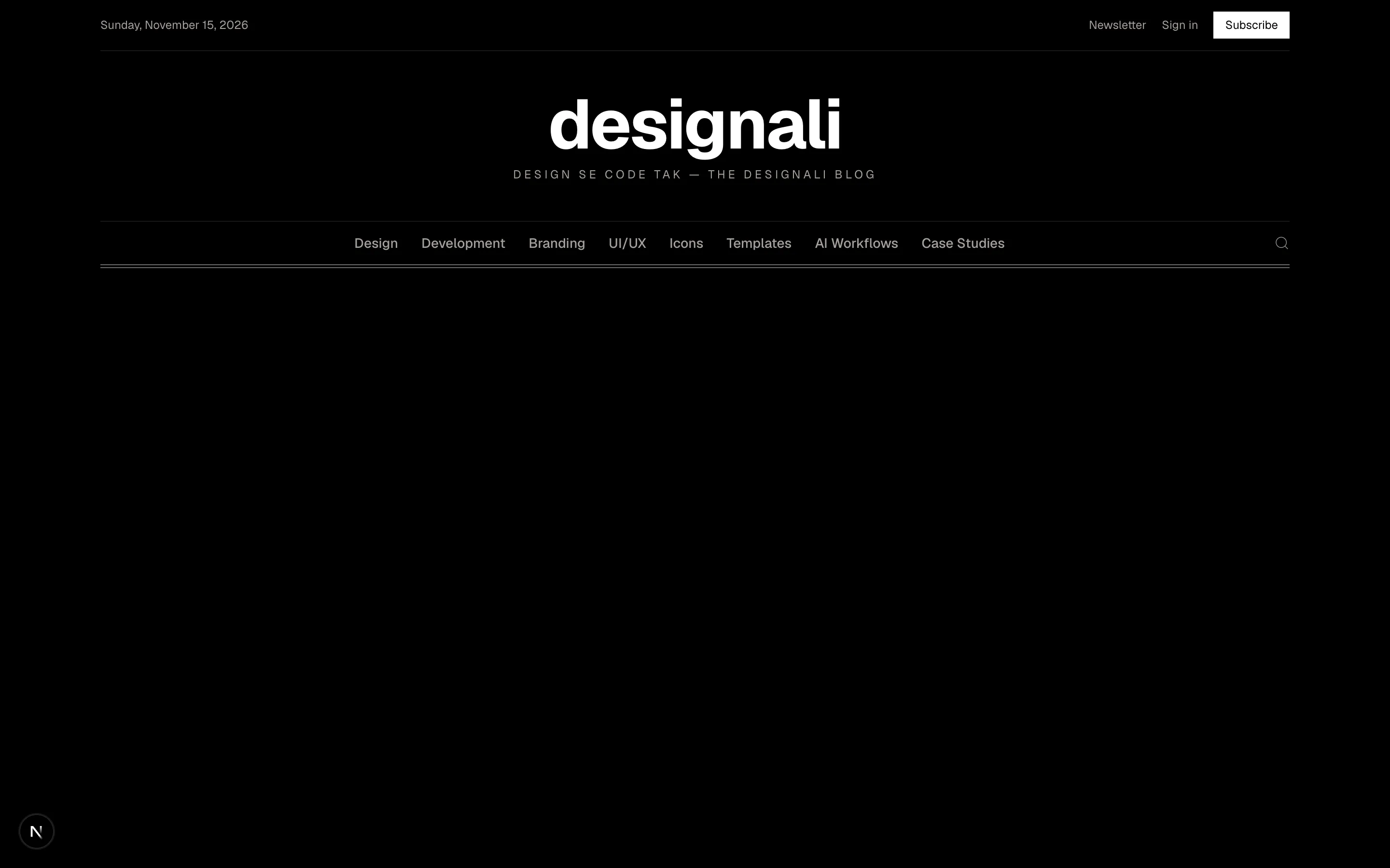
A newspaper-style masthead with a dateline, large title and section links.
header-10
Files
"use client"

import { useState } from "react"
import {
  ChartColumn as BarChart3,
  ChevronDown,
  Database,
  LifeBuoy,
  Menu,
  Shield,
  Workflow,
  X,
  Zap,
} from "@designali/icons"

import { Button } from "@/components/ui/button"
import { Logo } from "@/components/logo"

const products = [
  { icon: Database, title: "Templates", body: "Next.js templates ready to ship" },
  { icon: Workflow, title: "Blocks", body: "460+ copy-and-paste sections" },
  { icon: BarChart3, title: "UI Designs", body: "2300+ real-world UI examples" },
  { icon: Shield, title: "Icons", body: "4000+ icons in @designali/icons" },
]

const resources = ["Docs", "Blogs", "Logos", "Illustration"]

const links = ["Work", "Pricing", "Docs"]

export function Header11() {
  const [menu, setMenu] = useState(false)
  const [mobile, setMobile] = useState(false)
  const [mobileProducts, setMobileProducts] = useState(false)

  return (
    <section className="w-full bg-background">
      <header className="relative border-b" onMouseLeave={() => setMenu(false)}>
        <div className="mx-auto flex h-16 max-w-7xl items-center gap-8 px-6">
          <a href="#" className="flex items-center gap-2 font-semibold tracking-tight">
            <Logo className="size-6" />
            designali
          </a>
          <nav className="hidden items-center gap-6 text-sm md:flex">
            <button
              type="button"
              aria-expanded={menu}
              onClick={() => setMenu(!menu)}
              onMouseEnter={() => setMenu(true)}
              className="flex items-center gap-1 text-muted-foreground hover:text-foreground aria-expanded:text-foreground"
            >
              Products
              <ChevronDown className={`size-3.5 transition-transform ${menu ? "rotate-180" : ""}`} />
            </button>
            {links.map((link) => (
              <a
                key={link}
                href="#"
                onMouseEnter={() => setMenu(false)}
                className="text-muted-foreground transition-colors hover:text-foreground"
              >
                {link}
              </a>
            ))}
          </nav>
          <div className="ms-auto hidden items-center gap-2 md:flex">
            <Button variant="ghost" nativeButton={false} render={<a href="#" />}>
              Sign in
            </Button>
            <Button nativeButton={false} render={<a href="#" />}>
              Get started
            </Button>
          </div>
          <Button
            variant="outline"
            size="icon-lg"
            className="ms-auto md:hidden"
            aria-label="Toggle menu"
            aria-expanded={mobile}
            onClick={() => setMobile(!mobile)}
          >
            {mobile ? <X /> : <Menu />}
          </Button>
        </div>

        {menu && (
          <div className="absolute inset-x-0 top-full z-20 hidden border-b bg-background shadow-lg md:block">
            <div className="mx-auto grid max-w-7xl grid-cols-[2fr_1fr_1fr] gap-10 px-6 py-8">
              <div className="grid grid-cols-2 gap-2">
                {products.map((product) => (
                  <a key={product.title} href="#" className="flex gap-3 p-3 transition-colors hover:bg-muted">
                    <span className="flex size-9 shrink-0 items-center justify-center border bg-background">
                      <product.icon className="size-4" />
                    </span>
                    <span>
                      <span className="block text-sm font-medium">{product.title}</span>
                      <span className="block text-xs text-muted-foreground">{product.body}</span>
                    </span>
                  </a>
                ))}
              </div>
              <div>
                <p className="text-xs text-muted-foreground">Resources</p>
                <ul className="mt-3 space-y-2 text-sm">
                  {resources.map((item) => (
                    <li key={item}>
                      <a href="#" className="hover:underline">
                        {item}
                      </a>
                    </li>
                  ))}
                </ul>
              </div>
              <a href="#" className="flex flex-col justify-between bg-foreground p-5 text-background">
                <Zap className="size-5" />
                <span>
                  <span className="block text-sm font-medium">New: 460+ blocks</span>
                  <span className="mt-1 block text-xs opacity-70">
                    Explore the latest Designali release.
                  </span>
                </span>
              </a>
            </div>
          </div>
        )}

        {mobile && (
          <div className="border-t md:hidden">
            <nav className="flex flex-col px-6 py-2 text-sm">
              <button
                type="button"
                aria-expanded={mobileProducts}
                onClick={() => setMobileProducts(!mobileProducts)}
                className="flex items-center justify-between border-b py-3"
              >
                Products
                <ChevronDown className={`size-4 transition-transform ${mobileProducts ? "rotate-180" : ""}`} />
              </button>
              {mobileProducts && (
                <ul className="border-b py-2">
                  {products.map((product) => (
                    <li key={product.title}>
                      <a href="#" className="flex items-center gap-3 py-2 text-muted-foreground">
                        <product.icon className="size-4" />
                        {product.title}
                      </a>
                    </li>
                  ))}
                </ul>
              )}
              {links.map((link) => (
                <a key={link} href="#" className="border-b py-3">
                  {link}
                </a>
              ))}
              <a href="#" className="flex items-center gap-2 py-3 text-muted-foreground">
                <LifeBuoy className="size-4" />
                Support
              </a>
            </nav>
            <div className="grid grid-cols-2 gap-2 px-6 pb-6">
              <Button variant="outline" nativeButton={false} render={<a href="#" />}>
                Sign in
              </Button>
              <Button nativeButton={false} render={<a href="#" />}>
                Get started
              </Button>
            </div>
          </div>
        )}
      </header>
    </section>
  )
}
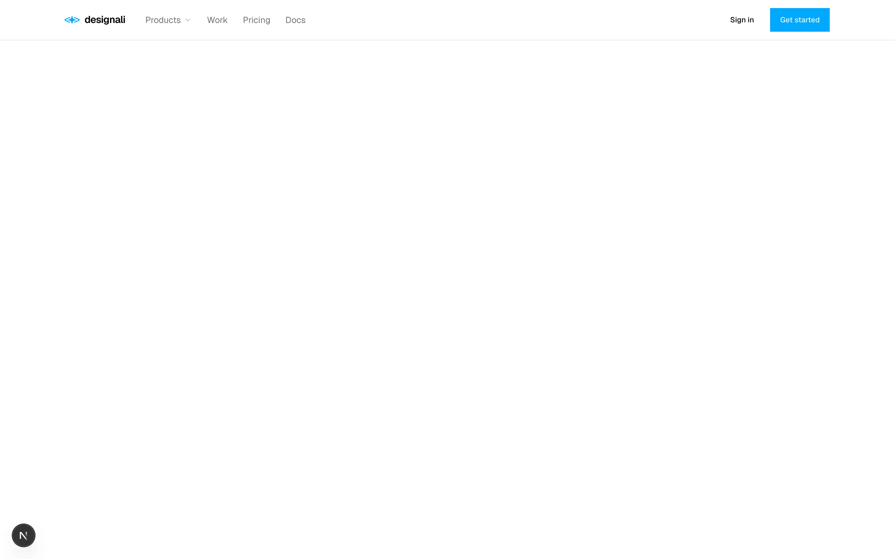
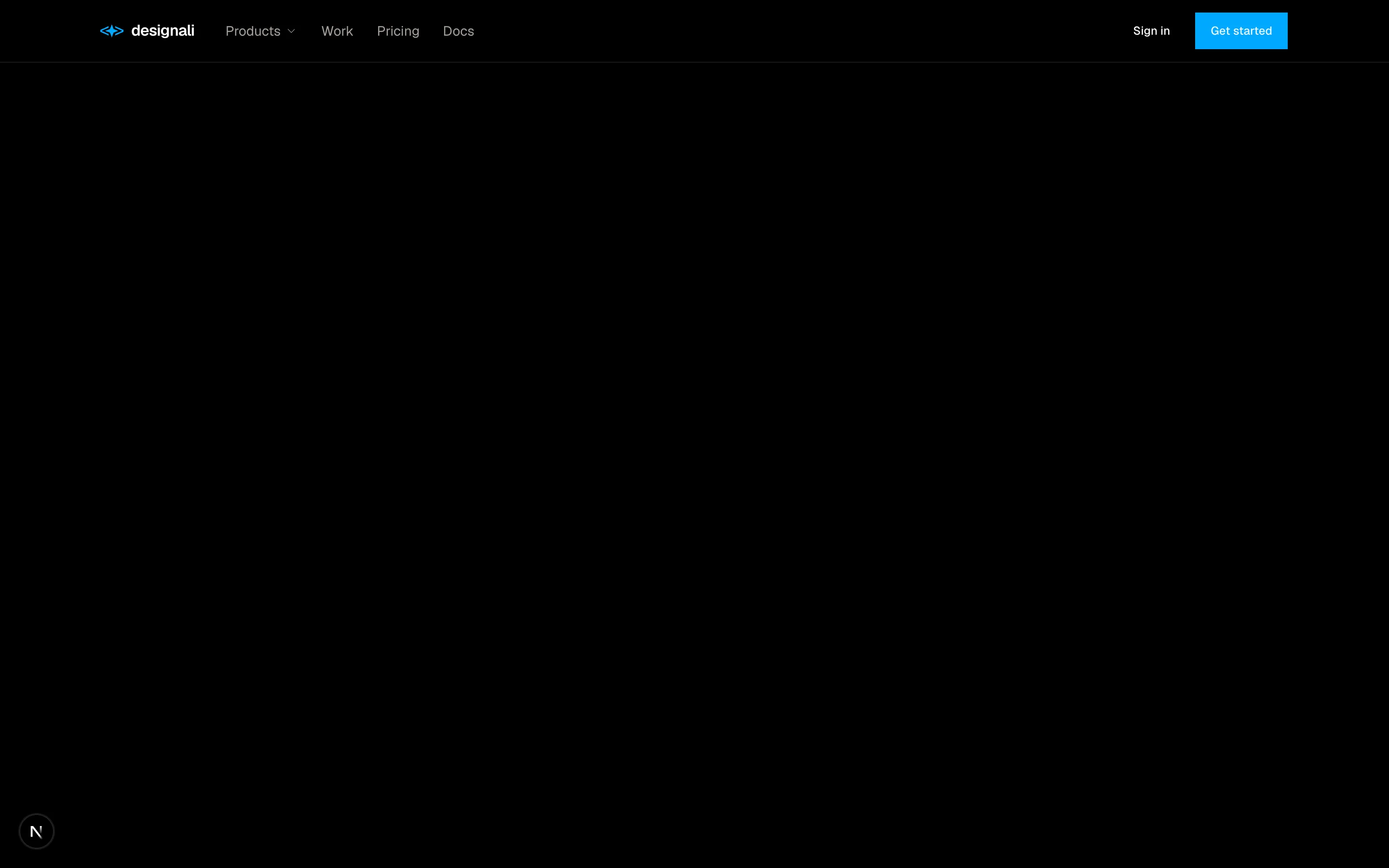
Header with a hover and click mega menu of product cards, resources and a promo tile, plus a mobile accordion menu.
header-11
Files
"use client"

import { useState } from "react"
import {
  ArrowUpRight,
  Menu,
  X,
} from "@designali/icons"

import { Button } from "@/components/ui/button"
import { Logo } from "@/components/logo"

const links = ["Templates", "Blocks", "Icons", "Pricing"]

export function Header12() {
  const [open, setOpen] = useState(false)

  return (
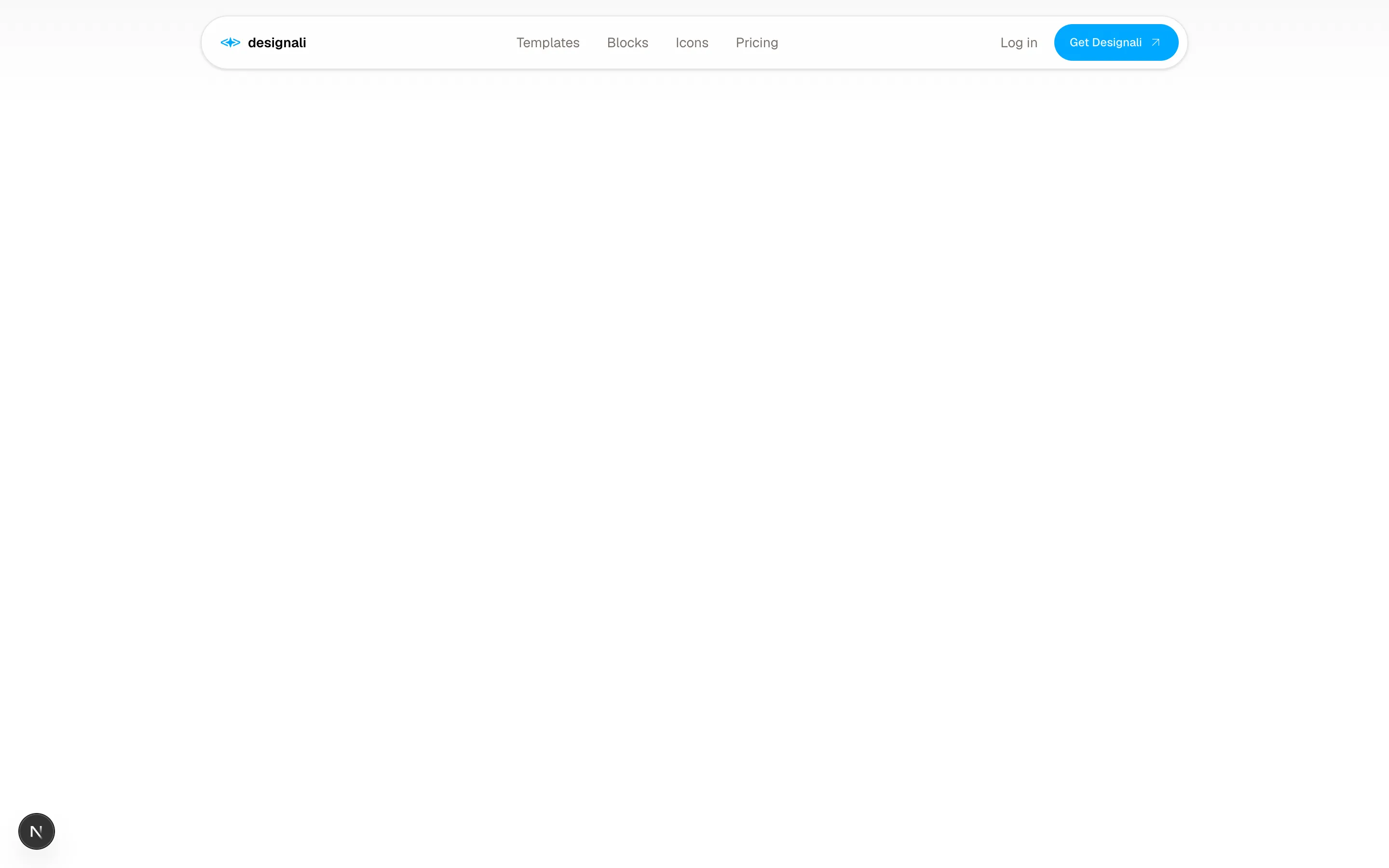
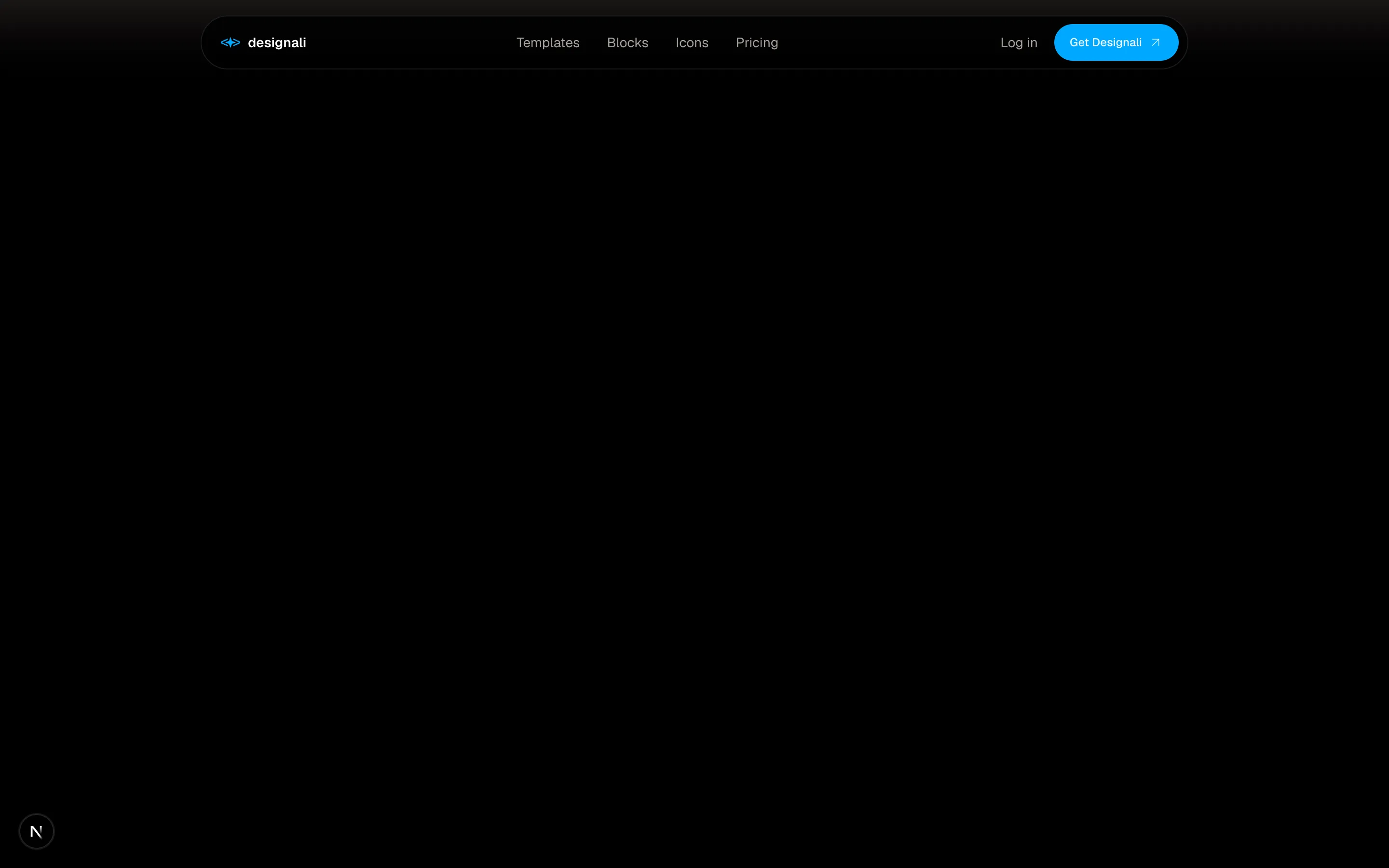
    <section className="w-full bg-gradient-to-b from-muted/60 to-background px-4 pt-4 pb-10 sm:px-6">
      <header className="relative mx-auto max-w-5xl">
        <div className="flex h-14 items-center gap-6 rounded-full border bg-background/80 ps-5 pe-2 shadow-sm backdrop-blur">
          <a href="#" className="flex items-center gap-2 text-sm font-semibold">
            <Logo className="size-5" />
            designali
          </a>
          <nav className="mx-auto hidden items-center gap-1 text-sm md:flex">
            {links.map((link) => (
              <a
                key={link}
                href="#"
                className="rounded-full px-3 py-1.5 text-muted-foreground transition-colors hover:bg-muted hover:text-foreground"
              >
                {link}
              </a>
            ))}
          </nav>
          <div className="ms-auto flex items-center gap-1 md:ms-0">
            <a href="#" className="hidden px-3 text-sm text-muted-foreground hover:text-foreground sm:block">
              Log in
            </a>
            <Button className="hidden rounded-full sm:inline-flex" nativeButton={false} render={<a href="#" />}>
              Get Designali
              <ArrowUpRight />
            </Button>
            <Button
              variant="ghost"
              size="icon-lg"
              className="rounded-full md:hidden"
              aria-label="Toggle menu"
              aria-expanded={open}
              onClick={() => setOpen(!open)}
            >
              {open ? <X /> : <Menu />}
            </Button>
          </div>
        </div>
        {open && (
          <div className="absolute inset-x-0 top-full z-20 mt-2 rounded-3xl border bg-background p-3 shadow-lg md:hidden">
            <nav className="flex flex-col">
              {links.map((link) => (
                <a key={link} href="#" className="rounded-2xl px-4 py-3 text-sm hover:bg-muted">
                  {link}
                </a>
              ))}
              <a href="#" className="rounded-2xl px-4 py-3 text-sm hover:bg-muted">
                Log in
              </a>
            </nav>
            <Button className="mt-2 w-full rounded-full" nativeButton={false} render={<a href="#" />}>
              Get Designali
              <ArrowUpRight />
            </Button>
          </div>
        )}
      </header>
    </section>
  )
}
Floating rounded pill navbar on a soft gradient with a detached dropdown card menu on mobile.
header-12
Files
"use client"
import { useEffect, useMemo, useRef, useState } from "react"
import {
ArrowRight,
BookOpen,
CornerDownLeft,
FileCode,
Hash,
Search,
X,
} from "@designali/icons"
const pages = [
{ title: "Getting started", section: "Guides", icon: BookOpen },
{ title: "Installation", section: "Guides", icon: BookOpen },
{ title: "Theming", section: "Guides", icon: BookOpen },
{ title: "@designali/icons", section: "Packages", icon: FileCode },
{ title: "@designali/logos", section: "Packages", icon: FileCode },
{ title: "Bento", section: "Components", icon: Hash },
{ title: "Number Counter", section: "Components", icon: Hash },
]
const links = ["Guides", "Components", "Packages", "Blogs"]
export function Header13() {
const [open, setOpen] = useState(false)
const [query, setQuery] = useState("")
const inputRef = useRef<HTMLInputElement>(null)
const results = useMemo(
() => pages.filter((page) => page.title.toLowerCase().includes(query.toLowerCase())),
[query]
)
useEffect(() => {
function onKey(event: KeyboardEvent) {
if ((event.metaKey || event.ctrlKey) && event.key.toLowerCase() === "k") {
event.preventDefault()
setOpen((value) => !value)
}
if (event.key === "Escape") setOpen(false)
}
window.addEventListener("keydown", onKey)
return () => window.removeEventListener("keydown", onKey)
}, [])
useEffect(() => {
if (open) inputRef.current?.focus()
}, [open])
return (
<section className="w-full bg-background">
<header className="relative border-b">
<div className="mx-auto flex h-14 max-w-7xl items-center gap-6 px-6">
<a href="#" className="flex shrink-0 items-center gap-2 text-sm font-semibold">
<span className="flex size-6 items-center justify-center bg-foreground font-sans text-[11px] text-background">
d/
</span>
Designali Docs
</a>
<nav className="hidden gap-5 text-sm lg:flex">
{links.map((link, index) => (
<a
key={link}
href="#"
className={index === 0 ? "text-foreground" : "text-muted-foreground hover:text-foreground"}
>
{link}
</a>
))}
</nav>
<button
type="button"
onClick={() => setOpen(true)}
className="ms-auto hidden h-9 w-full max-w-xs items-center gap-2 border bg-muted/40 px-3 text-sm text-muted-foreground transition-colors hover:bg-muted sm:flex"
>
<Search className="size-4" />
Search documentation
<kbd className="ms-auto border bg-background px-1.5 font-mono text-[10px]">Ctrl K</kbd>
</button>
<button
type="button"
onClick={() => setOpen(true)}
aria-label="Search documentation"
className="ms-auto flex size-9 items-center justify-center border sm:hidden"
>
<Search className="size-4" />
</button>
<a href="#" className="hidden shrink-0 items-center gap-1 text-sm md:flex">
Dashboard
<ArrowRight className="size-3.5" />
</a>
</div>
<nav className="flex gap-5 overflow-x-auto border-t px-6 py-2.5 text-sm lg:hidden">
{links.map((link, index) => (
<a
key={link}
href="#"
className={index === 0 ? "shrink-0 text-foreground" : "shrink-0 text-muted-foreground"}
>
{link}
</a>
))}
</nav>
{open && (
<div className="absolute inset-x-0 top-0 z-30 flex min-h-[420px] justify-center bg-background/70 px-4 pt-4 backdrop-blur-sm sm:pt-16">
<div className="h-fit w-full max-w-lg border bg-background shadow-2xl" role="dialog" aria-label="Search">
<div className="flex items-center gap-3 border-b px-4">
<Search className="size-4 text-muted-foreground" />
<input
ref={inputRef}
value={query}
onChange={(event) => setQuery(event.target.value)}
placeholder="Search guides and components..."
className="h-12 w-full min-w-0 bg-transparent text-sm outline-none placeholder:text-muted-foreground"
/>
<button type="button" onClick={() => setOpen(false)} aria-label="Close search">
<X className="size-4 text-muted-foreground" />
</button>
</div>
<ul className="max-h-72 overflow-y-auto p-2">
{results.length === 0 && (
<li className="px-3 py-8 text-center text-sm text-muted-foreground">
No results for “{query}”
</li>
)}
{results.map((page) => (
<li key={page.title}>
<a href="#" className="group flex items-center gap-3 px-3 py-2.5 text-sm hover:bg-muted">
<page.icon className="size-4 text-muted-foreground" />
<span className="min-w-0 flex-1 truncate">{page.title}</span>
<span className="text-xs text-muted-foreground">{page.section}</span>
<CornerDownLeft className="size-3.5 text-muted-foreground opacity-0 group-hover:opacity-100" />
</a>
</li>
))}
</ul>
</div>
</div>
)}
</header>
</section>
)
}
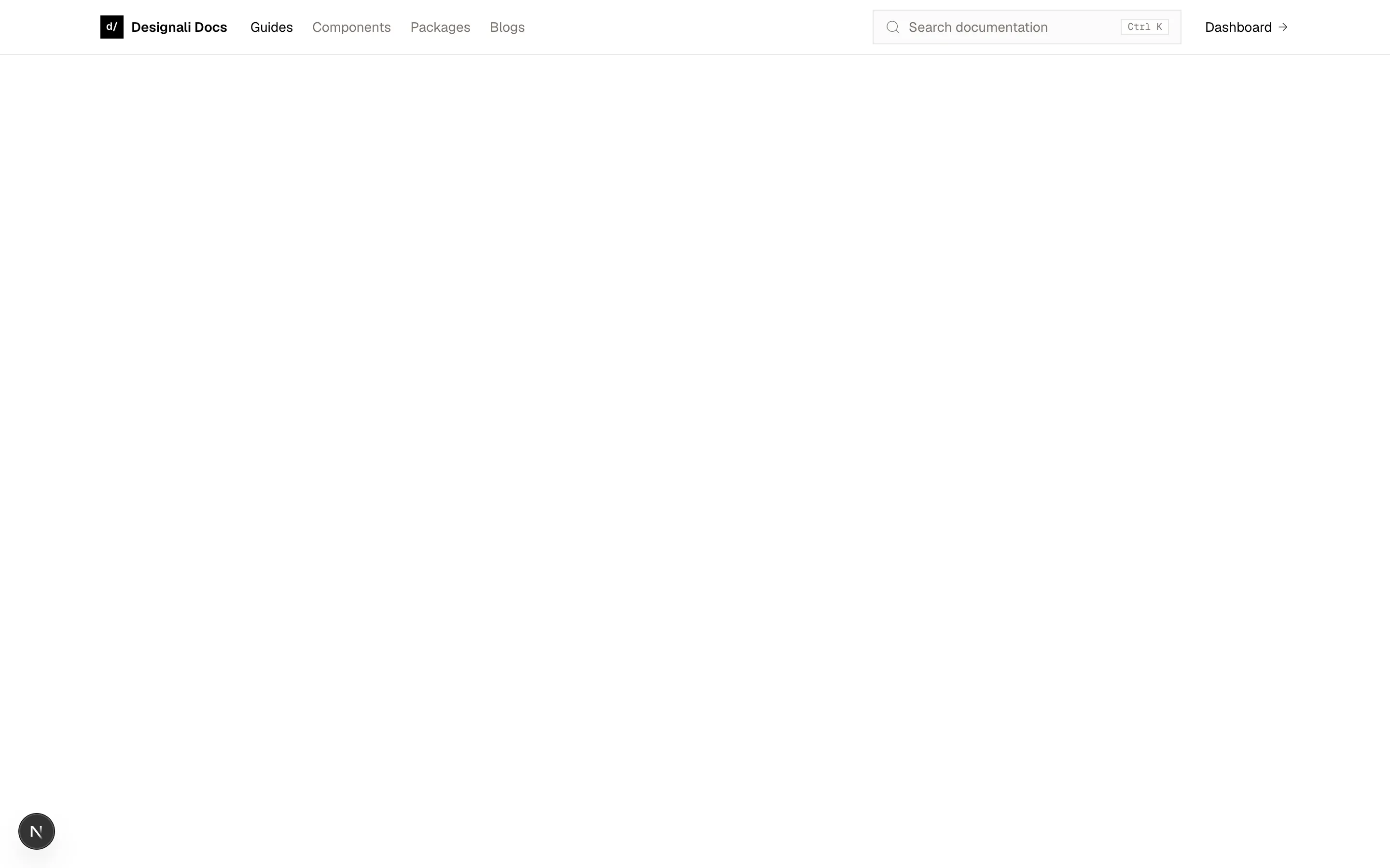
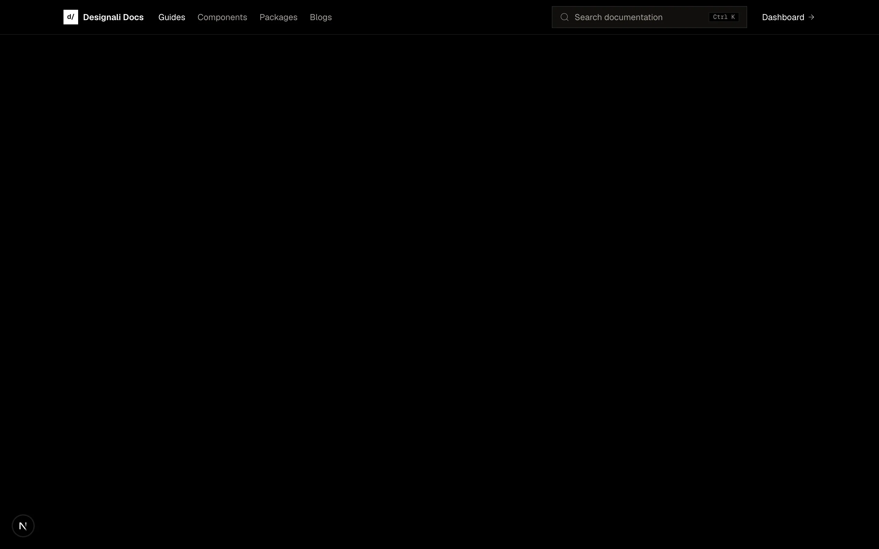
Docs header with a Ctrl+K command search overlay that filters guides and endpoints, plus a scrollable mobile nav row.
header-13
Files
"use client"

import { useState } from "react"
import {
  ChevronDown,
  Heart,
  Mail,
  Menu,
  Search,
  ShoppingBag,
  Download,
  User,
  X,
} from "@designali/icons"

const categories = ["New in", "Templates", "Blocks", "Icons", "Logos", "Sale"]

export function Header14() {
  const [open, setOpen] = useState(false)
  const [cart] = useState(3)

  return (
    <section className="w-full bg-background">
      <div className="bg-muted text-xs text-muted-foreground">
        <div className="mx-auto flex h-9 max-w-7xl items-center justify-between gap-4 px-6">
          <p className="flex items-center gap-2 truncate">
            <Download className="size-3.5 shrink-0" />
            Instant download on every Designali template and block.
          </p>
          <div className="hidden items-center gap-5 md:flex">
            <a href="#" className="flex items-center gap-1.5 hover:text-foreground">
              <Mail className="size-3.5" />
              hello@designali.com
            </a>
            <a href="#" className="hover:text-foreground">
              Contact
            </a>
            <button type="button" className="flex items-center gap-1 hover:text-foreground">
              USD
              <ChevronDown className="size-3" />
            </button>
          </div>
        </div>
      </div>

      <header className="border-b">
        <div className="mx-auto flex h-16 max-w-7xl items-center gap-4 px-6">
          <button
            type="button"
            aria-label="Open menu"
            onClick={() => setOpen(true)}
            className="-ms-2 flex size-9 items-center justify-center lg:hidden"
          >
            <Menu className="size-5" />
          </button>
          <a href="#" className="font-sans text-2xl tracking-tight">
            designali
          </a>
          <nav className="ms-8 hidden gap-6 text-sm lg:flex">
            {categories.map((category) => (
              <a
                key={category}
                href="#"
                className={
                  category === "Sale"
                    ? "text-destructive hover:underline dark:text-destructive"
                    : "hover:underline underline-offset-8"
                }
              >
                {category}
              </a>
            ))}
          </nav>
          <div className="ms-auto flex items-center gap-1">
            <label className="hidden h-9 w-56 items-center gap-2 border px-3 text-sm md:flex">
              <Search className="size-4 text-muted-foreground" />
              <input
                placeholder="Search templates"
                className="w-full min-w-0 bg-transparent outline-none placeholder:text-muted-foreground"
              />
            </label>
            <button type="button" aria-label="Search" className="flex size-9 items-center justify-center md:hidden">
              <Search className="size-5" />
            </button>
            <a href="#" aria-label="Account" className="hidden size-9 items-center justify-center sm:flex">
              <User className="size-5" />
            </a>
            <a href="#" aria-label="Wishlist" className="hidden size-9 items-center justify-center sm:flex">
              <Heart className="size-5" />
            </a>
            <a href="#" aria-label={`Cart, ${cart} items`} className="relative flex size-9 items-center justify-center">
              <ShoppingBag className="size-5" />
              <span className="absolute end-0 top-0 flex size-4 items-center justify-center rounded-full bg-foreground text-[10px] text-background">
                {cart}
              </span>
            </a>
          </div>
        </div>
      </header>

      {open && (
        <div className="fixed inset-0 z-50 lg:hidden" role="dialog" aria-modal="true" aria-label="Menu">
          <button
            type="button"
            aria-label="Close menu"
            onClick={() => setOpen(false)}
            className="absolute inset-0 bg-foreground/40"
          />
          <div className="relative flex h-full w-[85%] max-w-sm flex-col bg-background">
            <div className="flex h-16 items-center justify-between border-b px-6">
              <span className="font-sans text-xl">designali</span>
              <button type="button" aria-label="Close menu" onClick={() => setOpen(false)}>
                <X className="size-5" />
              </button>
            </div>
            <nav className="flex flex-col px-6 py-2">
              {categories.map((category) => (
                <a
                  key={category}
                  href="#"
                  className={
                    category === "Sale"
                      ? "border-b py-4 text-destructive dark:text-destructive"
                      : "border-b py-4"
                  }
                >
                  {category}
                </a>
              ))}
            </nav>
            <div className="mt-auto space-y-3 border-t px-6 py-6 text-sm text-muted-foreground">
              <a href="#" className="flex items-center gap-3">
                <User className="size-4" /> Sign in or create account
              </a>
              <a href="#" className="flex items-center gap-3">
                <Heart className="size-4" /> Wishlist
              </a>
              <a href="#" className="flex items-center gap-3">
                <Mail className="size-4" /> hello@designali.com
              </a>
            </div>
          </div>
        </div>
      )}
    </section>
  )
}
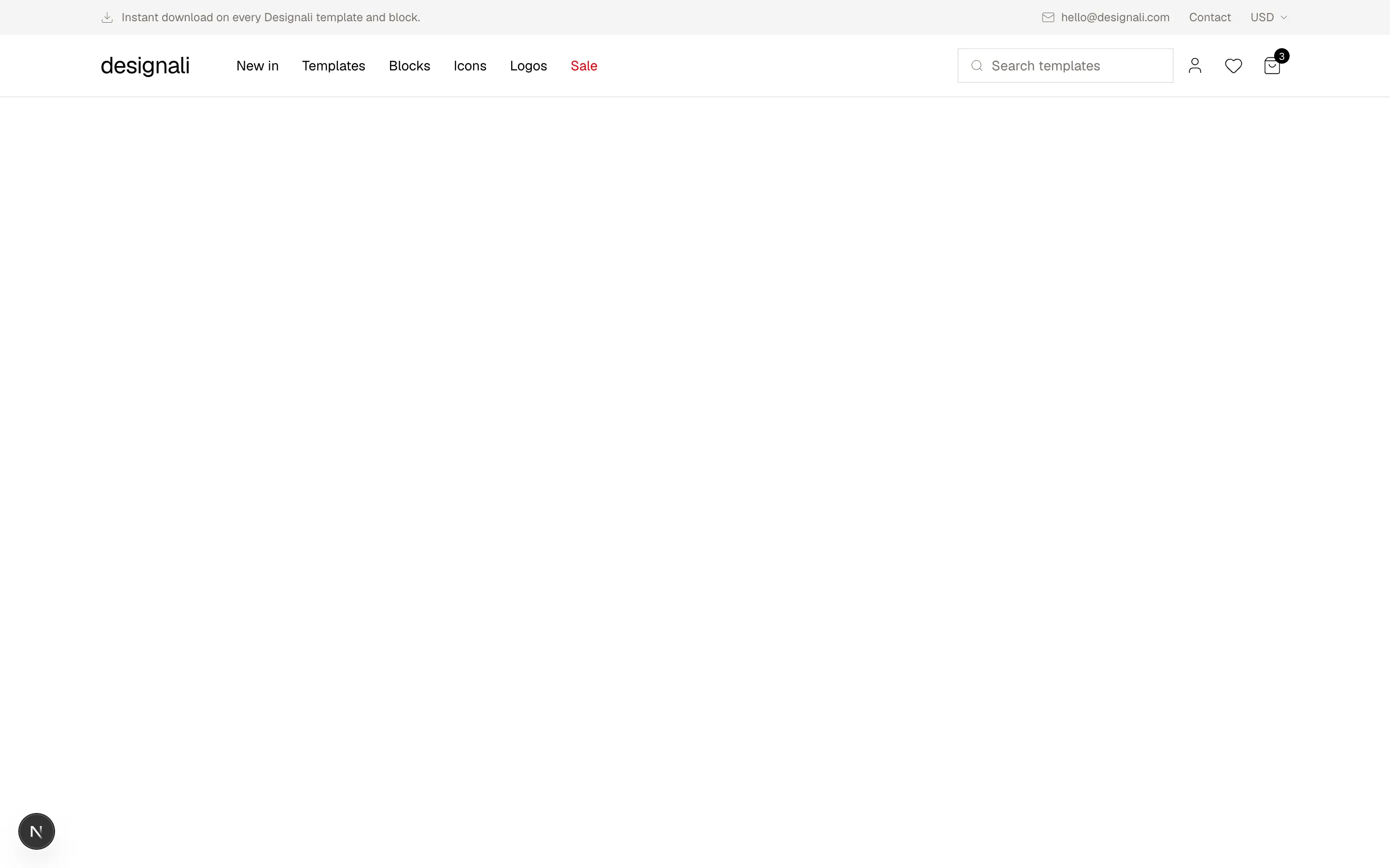
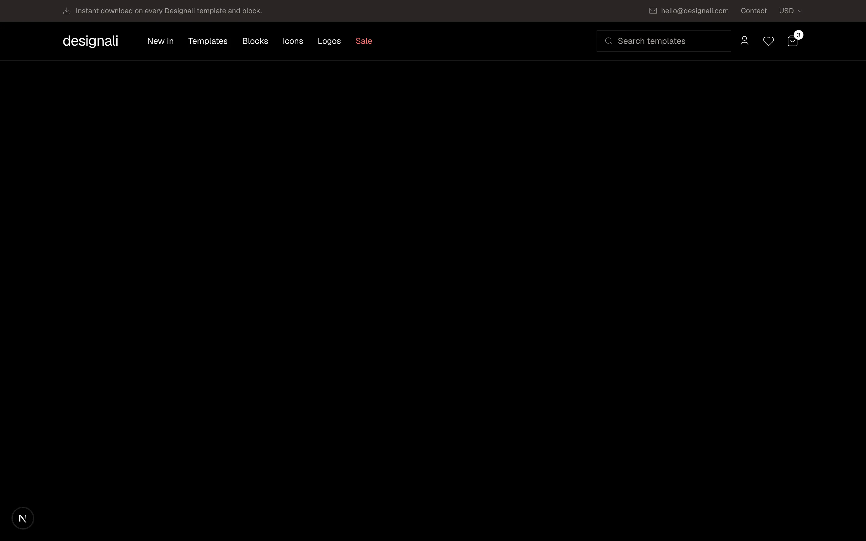
Ecommerce header with a utility bar, category nav, search, account, wishlist and cart badge, and a slide-in mobile drawer.
header-14
Files
"use client"

import { useState } from "react"
import {
  ChevronDown,
  GitFork,
  Menu,
  Moon,
  Star,
  Sun,
  X,
} from "@designali/icons"

const links = ["Docs", "Components", "Blocks", "Blogs"]
const versions = ["v5.1 (latest)", "v5.0", "v4.x"]

export function Header15() {
  const [open, setOpen] = useState(false)
  const [version, setVersion] = useState(versions[0]!)
  const [versionOpen, setVersionOpen] = useState(false)
  const [dark, setDark] = useState(false)

  return (
    <section className="w-full bg-background">
      <header className="sticky top-0 z-20 border-b bg-background/90 backdrop-blur">
        <div className="mx-auto flex h-14 max-w-7xl items-center gap-3 px-6">
          <a href="#" className="flex items-center gap-2 font-sans text-sm font-semibold">
            <span className="text-muted-foreground">~/</span>
            designali
          </a>
          <div className="relative">
            <button
              type="button"
              aria-expanded={versionOpen}
              onClick={() => setVersionOpen(!versionOpen)}
              className="flex items-center gap-1 border px-2 py-0.5 font-sans text-[11px] text-muted-foreground hover:text-foreground"
            >
              {version.split(" ")[0]}
              <ChevronDown className="size-3" />
            </button>
            {versionOpen && (
              <ul className="absolute start-0 top-full z-30 mt-1 w-36 border bg-background py-1 shadow-md">
                {versions.map((item) => (
                  <li key={item}>
                    <button
                      type="button"
                      onClick={() => {
                        setVersion(item)
                        setVersionOpen(false)
                      }}
                      className={`w-full px-3 py-1.5 text-start font-sans text-xs hover:bg-muted ${
                        item === version ? "text-foreground" : "text-muted-foreground"
                      }`}
                    >
                      {item}
                    </button>
                  </li>
                ))}
              </ul>
            )}
          </div>
          <nav className="ms-6 hidden gap-6 text-sm md:flex">
            {links.map((link, index) => (
              <a
                key={link}
                href="#"
                className={index === 1 ? "font-medium text-foreground" : "text-muted-foreground hover:text-foreground"}
              >
                {link}
              </a>
            ))}
          </nav>
          <div className="ms-auto flex items-center gap-1">
            <a
              href="#"
              className="hidden h-8 items-center border text-xs sm:flex"
              aria-label="Star the designali repository"
            >
              <span className="flex h-full items-center gap-1.5 border-e px-2.5">
                <GitFork className="size-3.5" />
                Star
              </span>
              <span className="flex h-full items-center gap-1 px-2.5 tabular-nums text-muted-foreground">
                <Star className="size-3" />
                2.1k
              </span>
            </a>
            <button
              type="button"
              aria-label="Toggle colour preview"
              aria-pressed={dark}
              onClick={() => setDark(!dark)}
              className="flex size-8 items-center justify-center text-muted-foreground hover:text-foreground"
            >
              {dark ? <Moon className="size-4" /> : <Sun className="size-4" />}
            </button>
            <button
              type="button"
              aria-label="Toggle menu"
              aria-expanded={open}
              onClick={() => setOpen(!open)}
              className="flex size-8 items-center justify-center md:hidden"
            >
              {open ? <X className="size-4" /> : <Menu className="size-4" />}
            </button>
          </div>
        </div>
        {open && (
          <nav className="grid grid-cols-2 gap-px border-t bg-border md:hidden">
            {links.map((link) => (
              <a key={link} href="#" className="bg-background px-6 py-4 text-sm">
                {link}
              </a>
            ))}
            <a href="#" className="col-span-2 flex items-center gap-2 bg-background px-6 py-4 text-sm text-muted-foreground">
              <GitFork className="size-4" />
              Source code / 2.1k stars
            </a>
          </nav>
        )}
      </header>
    </section>
  )
}
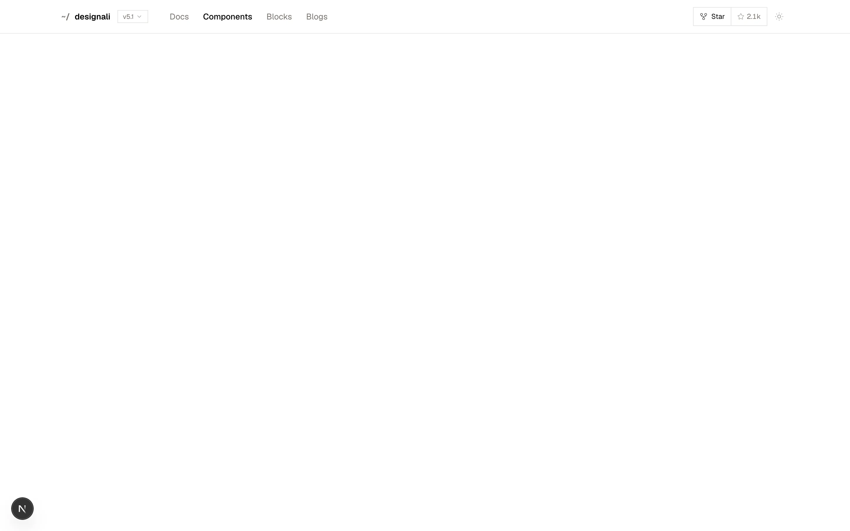
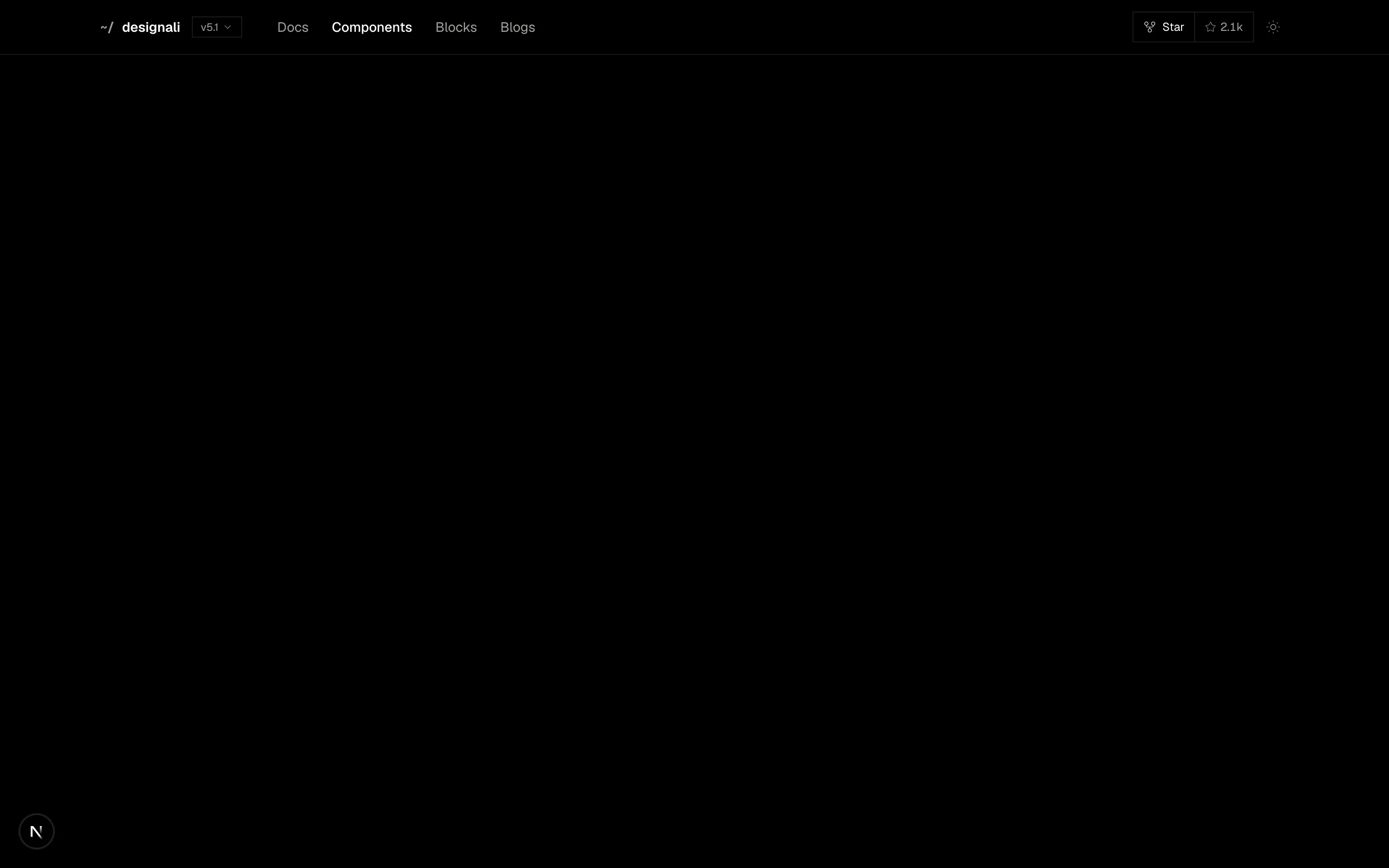
Open-source library header with a version picker, star counter, theme toggle and a two-column mobile grid menu.
header-15
Files
"use client"

import { useState } from "react"
import {
  Check,
  ChevronsUpDown,
  GitBranch,
  Rocket,
  Slash,
} from "@designali/icons"

import { Button } from "@/components/ui/button"
import { Logo } from "@/components/logo"

const projects = ["designali-web", "portfolio-template", "dalim-ui"]
const tabs = ["Overview", "Deployments", "Logs", "Analytics", "Settings"]

export function Header16() {
  const [project, setProject] = useState(projects[0]!)
  const [open, setOpen] = useState(false)
  const [tab, setTab] = useState(tabs[0]!)

  return (
    <section className="w-full bg-background">
      <header className="border-b">
        <div className="mx-auto flex h-14 max-w-7xl items-center gap-2 px-6">
          <a href="#" aria-label="Designali home" className="flex size-7 shrink-0 items-center justify-center bg-foreground">
            <Logo className="size-5" />
          </a>
          <Slash className="size-4 shrink-0 -rotate-12 text-muted-foreground/50" />
          <a href="#" className="hidden items-center gap-2 text-sm sm:flex">
            <span className="flex size-5 items-center justify-center rounded-full bg-gradient-to-br from-chart-2 to-chart-4 text-[9px] font-medium text-white">
              DS
            </span>
            Designali Studio
          </a>
          <Slash className="hidden size-4 shrink-0 -rotate-12 text-muted-foreground/50 sm:block" />
          <div className="relative min-w-0">
            <button
              type="button"
              aria-expanded={open}
              onClick={() => setOpen(!open)}
              className="flex min-w-0 items-center gap-1.5 px-1.5 py-1 text-sm font-medium hover:bg-muted"
            >
              <span className="truncate">{project}</span>
              <ChevronsUpDown className="size-3.5 shrink-0 text-muted-foreground" />
            </button>
            {open && (
              <ul className="absolute start-0 top-full z-30 mt-1 w-56 border bg-background p-1 shadow-lg">
                <li className="px-2 py-1.5 text-xs text-muted-foreground">Projects</li>
                {projects.map((item) => (
                  <li key={item}>
                    <button
                      type="button"
                      onClick={() => {
                        setProject(item)
                        setOpen(false)
                      }}
                      className="flex w-full items-center justify-between px-2 py-1.5 text-start text-sm hover:bg-muted"
                    >
                      {item}
                      {item === project && <Check className="size-3.5" />}
                    </button>
                  </li>
                ))}
              </ul>
            )}
          </div>
          <span className="ms-1 hidden items-center gap-1.5 border px-2 py-0.5 font-sans text-[11px] text-muted-foreground md:flex">
            <GitBranch className="size-3" />
            main
          </span>
          <span className="hidden items-center gap-1.5 text-xs text-muted-foreground lg:flex">
            <span className="size-1.5 rounded-full bg-primary" />
            Ready, 4m ago
          </span>
          <div className="ms-auto flex shrink-0 items-center gap-2">
            <a href="#" className="hidden text-sm text-muted-foreground hover:text-foreground md:block">
              Feedback
            </a>
            <Button size="md">
              <Rocket />
              <span className="hidden sm:inline">Deploy</span>
            </Button>
            <span className="flex size-8 items-center justify-center rounded-full bg-gradient-to-br from-chart-1 to-chart-5 text-[10px] font-medium text-white">
              AI
            </span>
          </div>
        </div>
        <nav className="mx-auto flex max-w-7xl gap-1 overflow-x-auto px-4">
          {tabs.map((item) => (
            <button
              key={item}
              type="button"
              onClick={() => setTab(item)}
              className={
                item === tab
                  ? "shrink-0 border-b-2 border-foreground px-3 py-2.5 text-sm"
                  : "shrink-0 border-b-2 border-transparent px-3 py-2.5 text-sm text-muted-foreground hover:text-foreground"
              }
            >
              {item}
            </button>
          ))}
        </nav>
      </header>
    </section>
  )
}
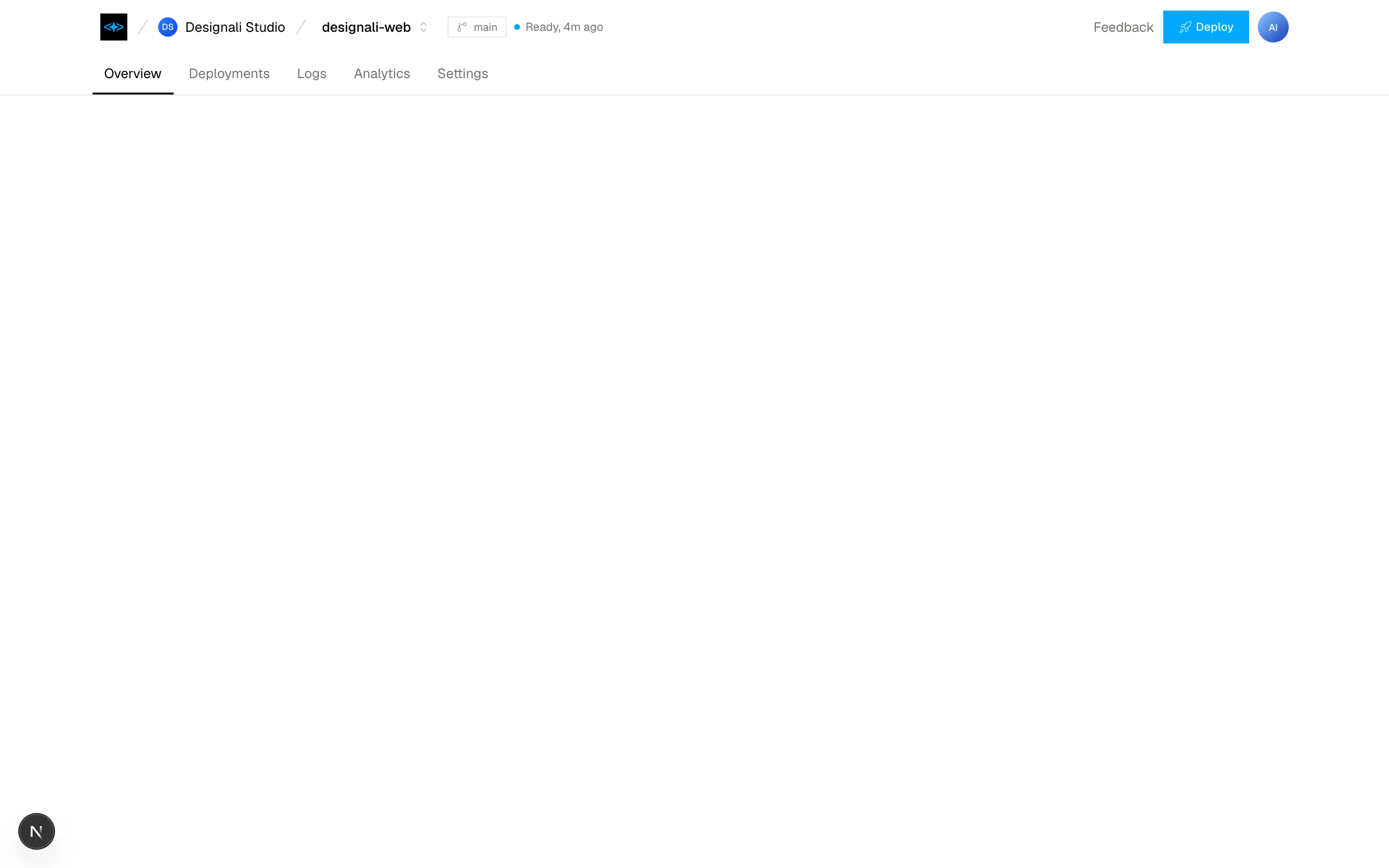
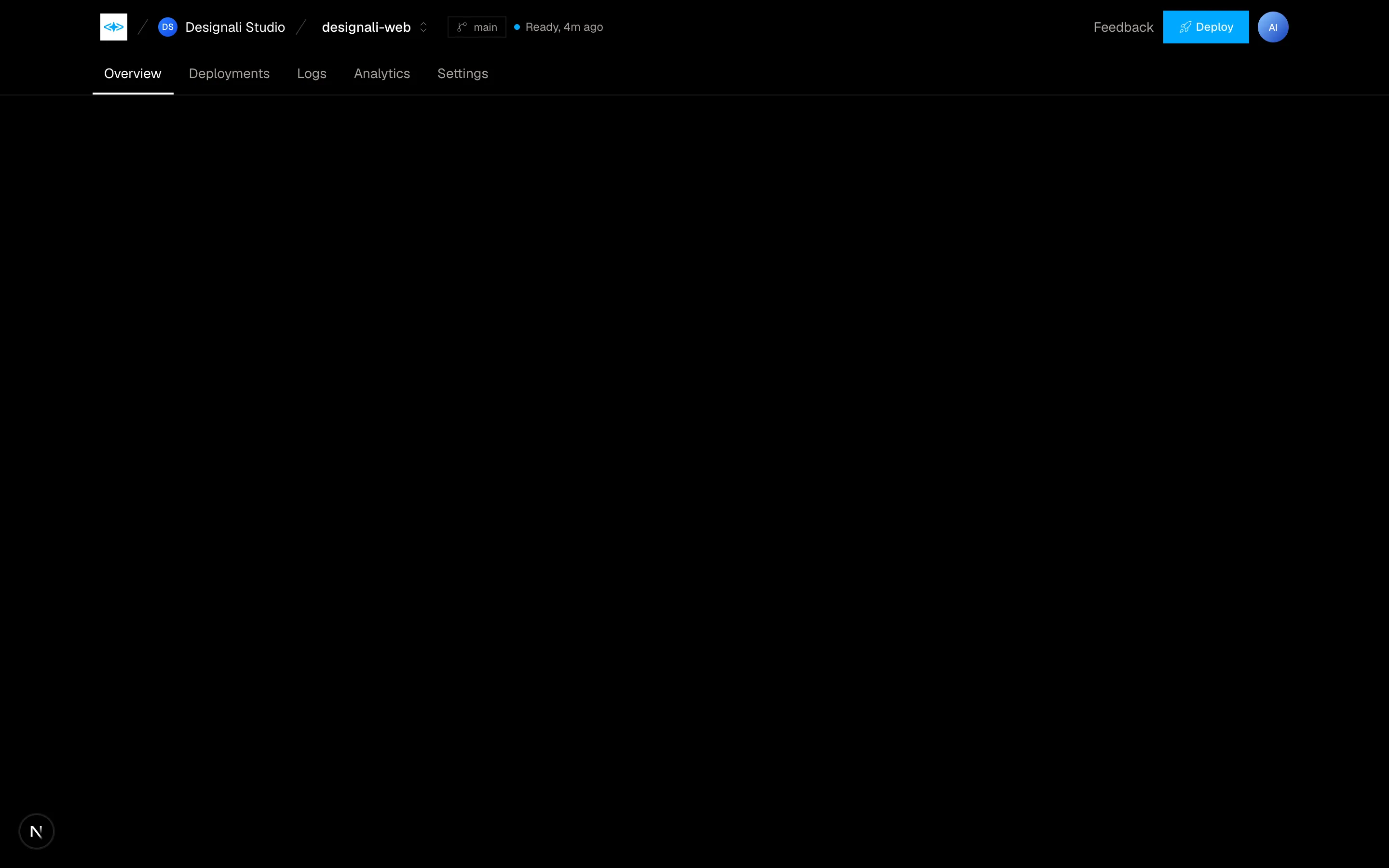
App workspace header with team and project breadcrumb switcher, branch and deploy status, and a tab bar.
header-16
Files
"use client"

import { useEffect, useState } from "react"
import {
  ArrowUpRight,
} from "@designali/icons"

const links = [
  { label: "Work", count: "24" },
  { label: "Studio", count: "" },
  { label: "Services", count: "8" },
  { label: "Blogs", count: "41" },
  { label: "Contact", count: "" },
]

export function Header17() {
  const [open, setOpen] = useState(false)

  useEffect(() => {
    function onKey(event: KeyboardEvent) {
      if (event.key === "Escape") setOpen(false)
    }
    window.addEventListener("keydown", onKey)
    return () => window.removeEventListener("keydown", onKey)
  }, [])

  return (
    <section className="relative w-full bg-background">
      <header className="relative z-40">
        <div className="mx-auto flex h-20 max-w-7xl items-center justify-between px-6">
          <a
            href="#"
            className={`text-lg font-semibold tracking-tight transition-colors ${open ? "text-background" : ""}`}
          >
            designali
          </a>
          <button
            type="button"
            aria-expanded={open}
            onClick={() => setOpen(!open)}
            className={`flex items-center gap-3 text-sm transition-colors ${open ? "text-background" : ""}`}
          >
            {open ? "Close" : "Menu"}
            <span className="relative block h-3 w-6">
              <span
                className={`absolute inset-x-0 h-px bg-current transition-transform duration-300 ${
                  open ? "top-1.5 rotate-45" : "top-0"
                }`}
              />
              <span
                className={`absolute inset-x-0 h-px bg-current transition-transform duration-300 ${
                  open ? "top-1.5 -rotate-45" : "top-3"
                }`}
              />
            </span>
          </button>
        </div>
      </header>

      <div
        aria-hidden={!open}
        className={`absolute inset-x-0 top-0 z-30 min-h-[560px] bg-foreground text-background transition-[clip-path] duration-500 ease-out ${
          open ? "[clip-path:inset(0_0_0_0)]" : "pointer-events-none [clip-path:inset(0_0_100%_0)]"
        }`}
      >
        <div className="mx-auto grid max-w-7xl gap-12 px-6 pt-28 pb-12 md:grid-cols-[2fr_1fr]">
          <nav className="flex flex-col">
            {links.map((link) => (
              <a
                key={link.label}
                href="#"
                tabIndex={open ? 0 : -1}
                className="group flex items-start gap-3 border-b border-background/15 py-3 text-4xl font-medium tracking-tight transition-opacity hover:opacity-70 sm:text-6xl"
              >
                {link.label}
                {link.count && <sup className="mt-2 text-xs font-normal opacity-60">{link.count}</sup>}
                <ArrowUpRight className="ms-auto mt-2 size-6 opacity-0 transition-opacity group-hover:opacity-100" />
              </a>
            ))}
          </nav>
          <div className="space-y-8 text-sm md:pt-4">
            <div>
              <p className="opacity-50">New business</p>
              <a href="#" tabIndex={open ? 0 : -1} className="mt-1 block hover:underline">
                hello@designali.com
              </a>
            </div>
            <div>
              <p className="opacity-50">Founder</p>
              <p className="mt-1 leading-6">
                Ali Imam
                <br />
                Design engineer
              </p>
            </div>
            <div>
              <p className="opacity-50">Follow</p>
              <div className="mt-1 flex gap-4">
                {[
                  ["Instagram", "https://www.instagram.com/designali.code/"],
                  ["X", "https://x.com/designali_com"],
                  ["LinkedIn", "https://www.linkedin.com/company/designali-com/"],
                ].map(([item, href]) => (
                  <a key={item} href={href} tabIndex={open ? 0 : -1} className="hover:underline">
                    {item}
                  </a>
                ))}
              </div>
            </div>
          </div>
        </div>
      </div>

      <div className="mx-auto max-w-7xl px-6 pt-10 pb-24">
        <p className="max-w-2xl text-3xl font-medium tracking-tight text-muted-foreground md:text-5xl">
          Brand identity, UI/UX and production-ready websites. Design se code tak.
        </p>
      </div>
    </section>
  )
}
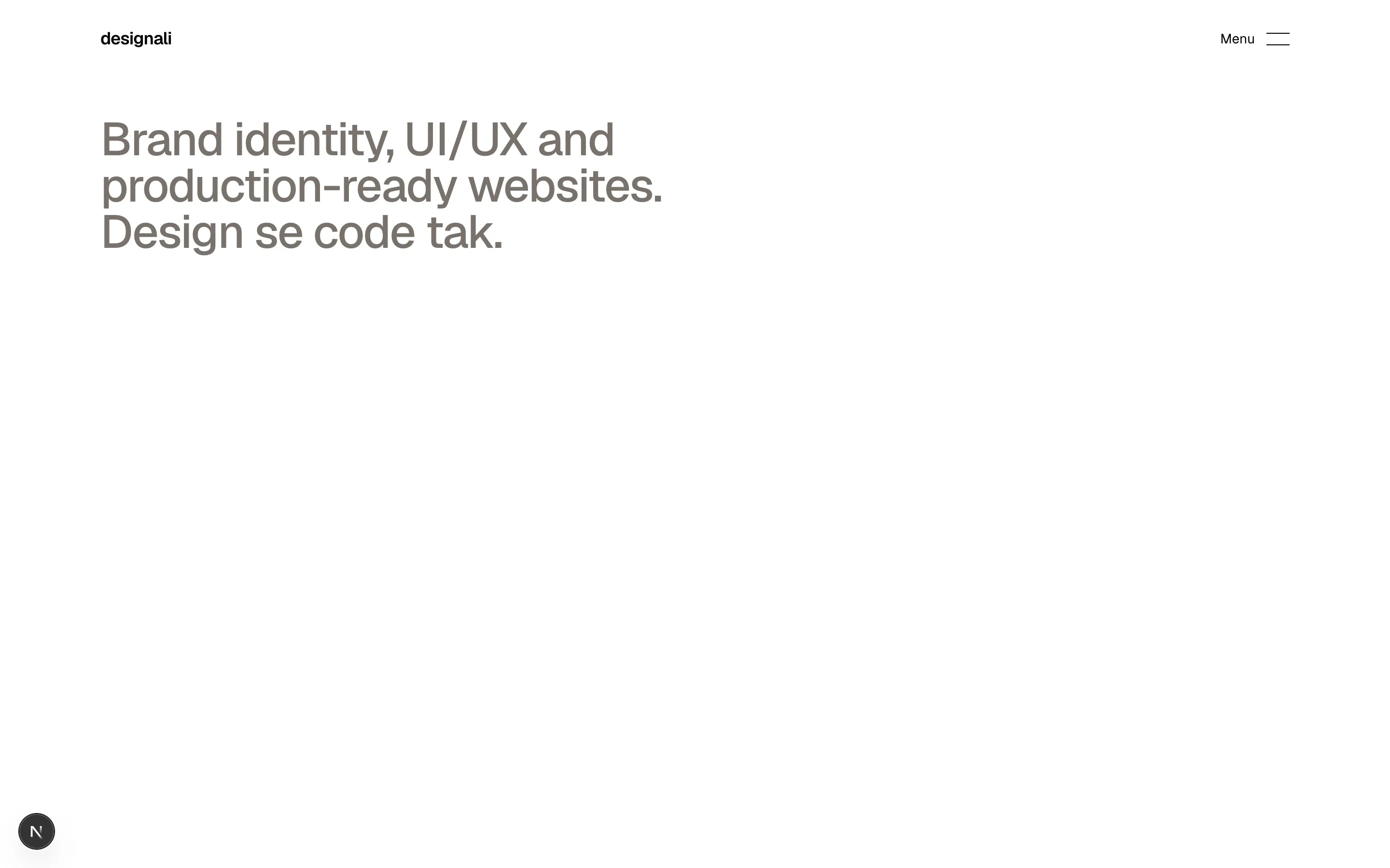
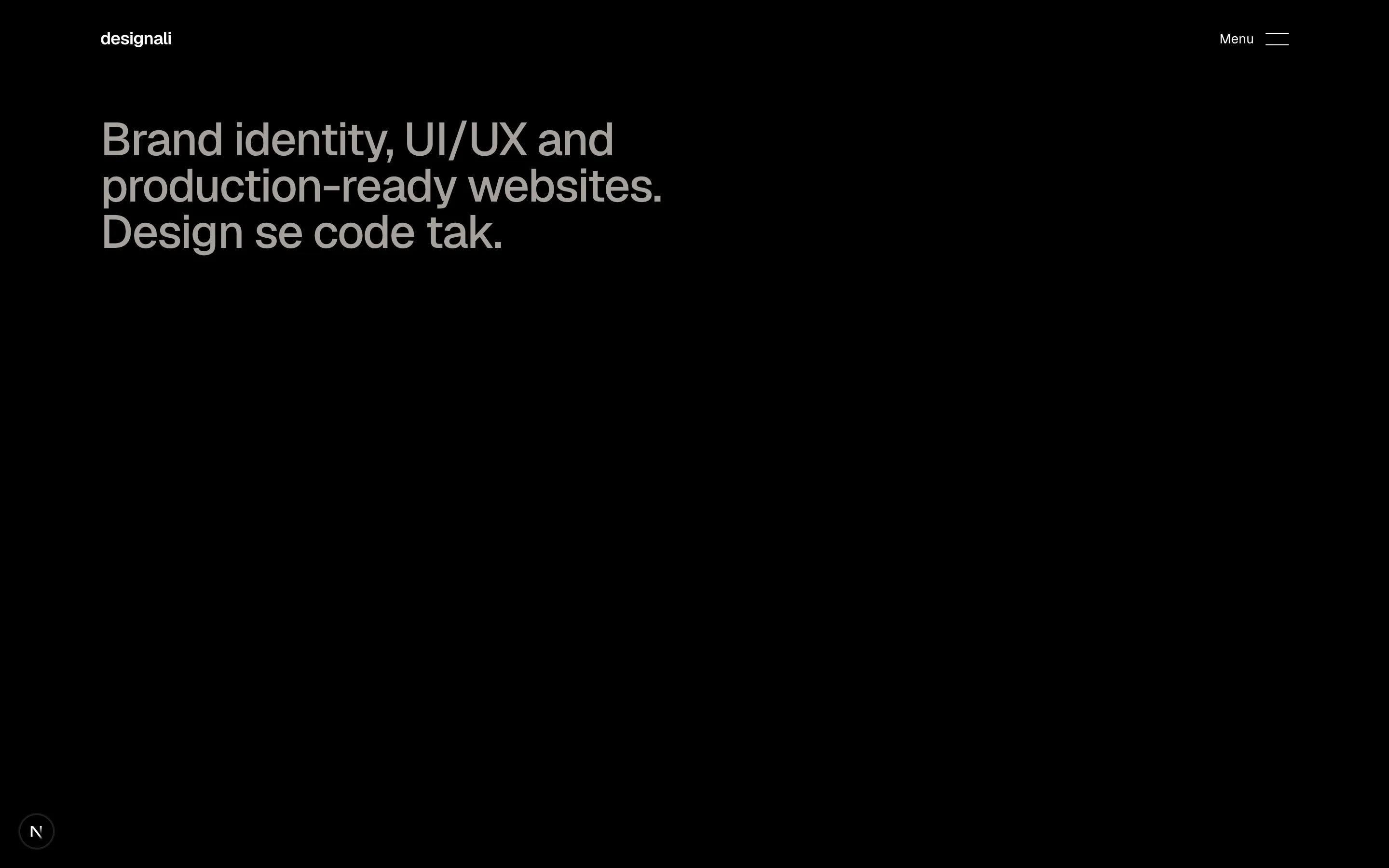
Minimal agency header whose animated Menu button reveals a full-width inverted overlay with large links and contact details.
header-17
Files
"use client"

import { useState } from "react"

import { Button } from "@/components/ui/button"
import { Logo } from "@/components/logo"

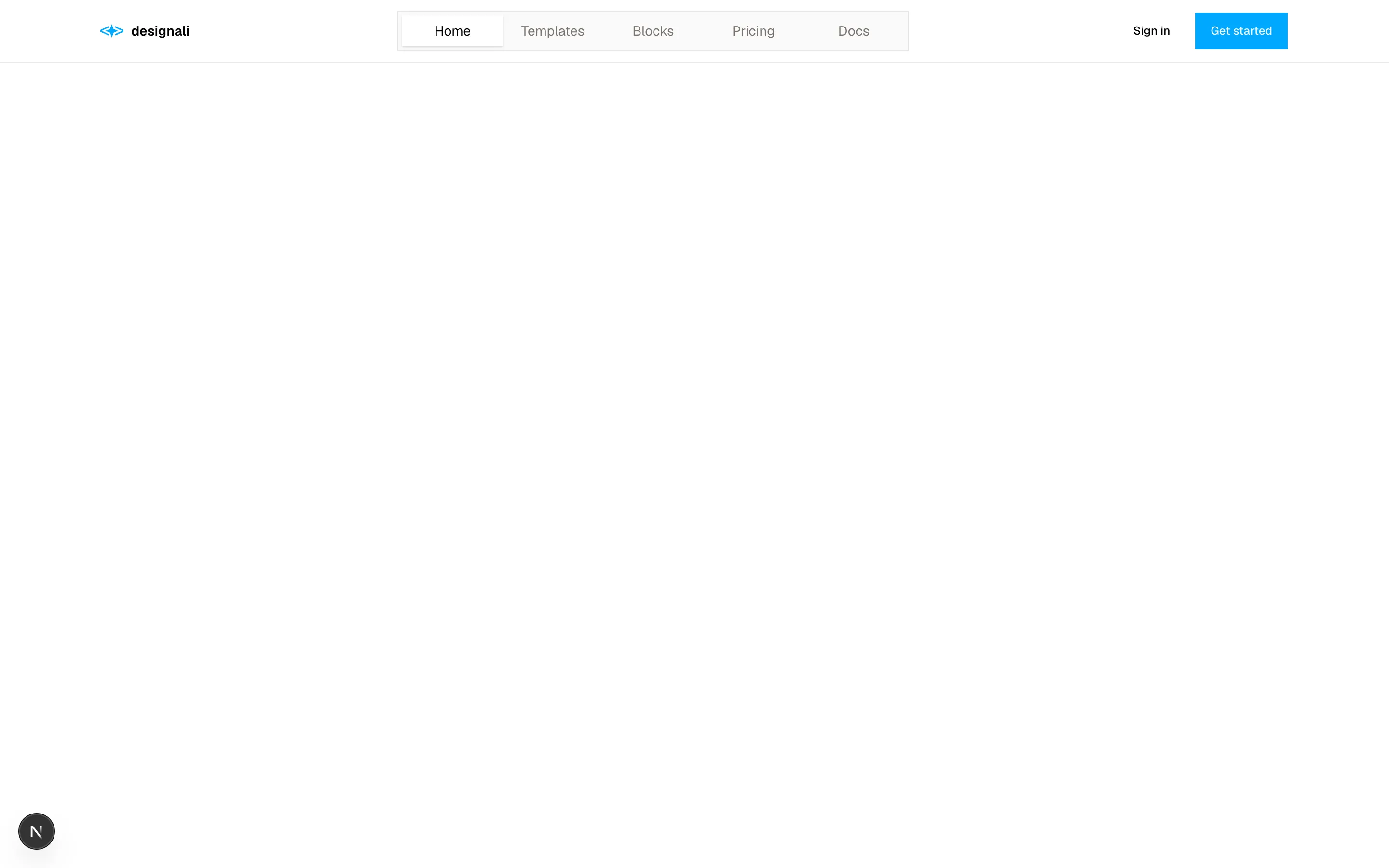
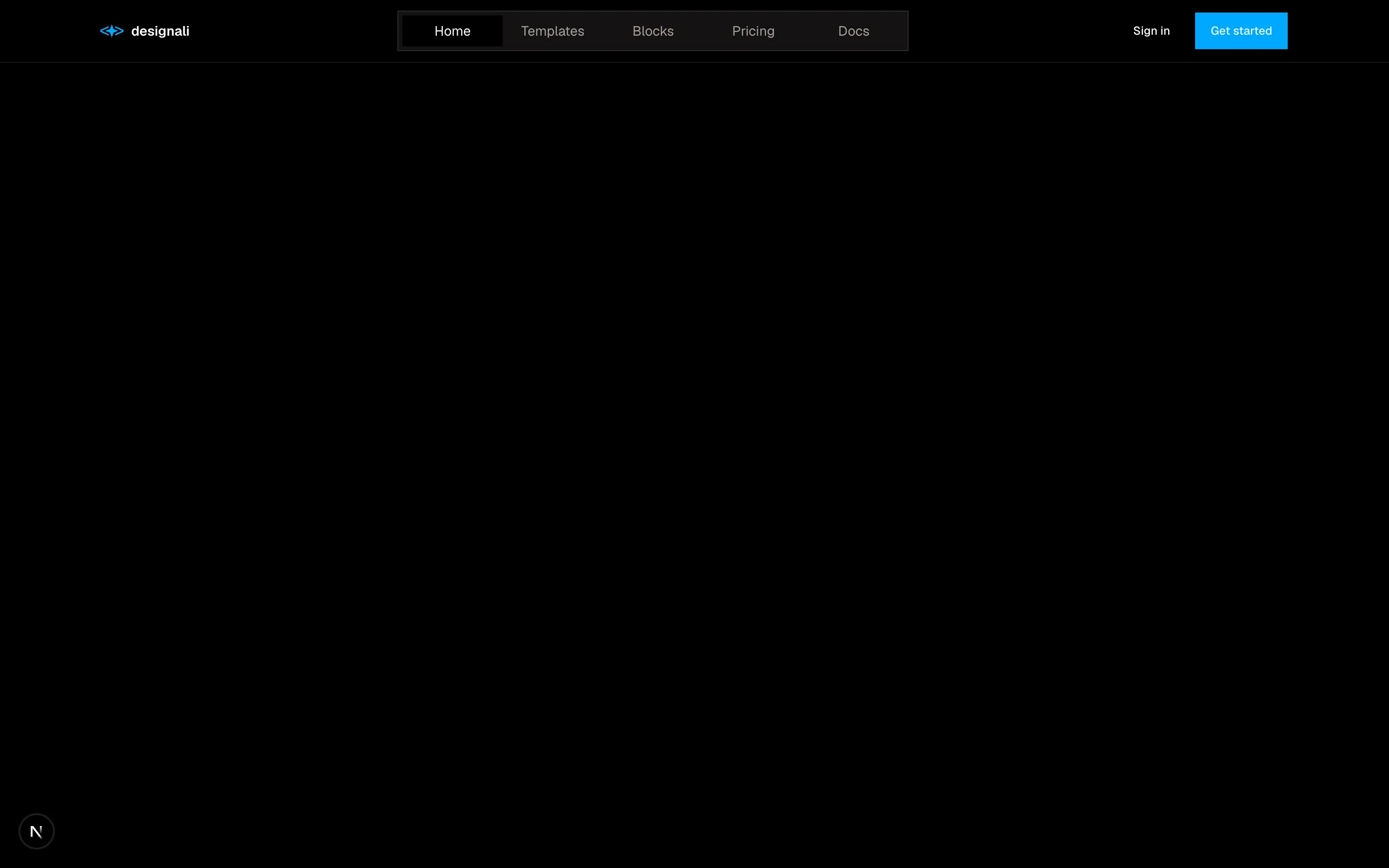
const links = ["Home", "Templates", "Blocks", "Pricing", "Docs"]

export function Header18() {
  const [active, setActive] = useState(0)

  return (
    <section className="w-full bg-background">
      <header className="border-b">
        <div className="mx-auto flex h-16 max-w-7xl items-center justify-between gap-4 px-6">
          <a href="#" className="flex items-center gap-2 text-sm font-semibold">
            <Logo className="size-6" />
            designali
          </a>
          <nav className="relative hidden border bg-muted/50 p-1 md:block">
            <span
              aria-hidden
              className="absolute top-1 bottom-1 bg-background shadow-sm transition-transform duration-300 ease-out"
              style={{ width: "6.5rem", transform: `translateX(${active * 6.5}rem)` }}
            />
            <ul className="relative flex">
              {links.map((link, index) => (
                <li key={link}>
                  <button
                    type="button"
                    onClick={() => setActive(index)}
                    aria-current={index === active ? "page" : undefined}
                    className={`w-[6.5rem] py-1.5 text-center text-sm transition-colors ${
                      index === active ? "text-foreground" : "text-muted-foreground hover:text-foreground"
                    }`}
                  >
                    {link}
                  </button>
                </li>
              ))}
            </ul>
          </nav>
          <div className="flex items-center gap-2">
            <Button variant="ghost" className="hidden sm:inline-flex" nativeButton={false} render={<a href="#" />}>
              Sign in
            </Button>
            <Button nativeButton={false} render={<a href="#" />}>
              Get started
            </Button>
          </div>
        </div>
        <nav className="border-t md:hidden">
          <ul className="flex gap-1 overflow-x-auto px-4 py-2">
            {links.map((link, index) => (
              <li key={link} className="shrink-0">
                <button
                  type="button"
                  onClick={() => setActive(index)}
                  aria-current={index === active ? "page" : undefined}
                  className={`px-3 py-1.5 text-sm transition-colors ${
                    index === active ? "bg-foreground text-background" : "text-muted-foreground"
                  }`}
                >
                  {link}
                </button>
              </li>
            ))}
          </ul>
        </nav>
      </header>
    </section>
  )
}
Header with a centered segmented nav and sliding active indicator, falling back to scrollable pills on mobile.
header-18
Files
import {
  Check,
  ChevronLeft,
  LockKeyhole,
} from "@designali/icons"

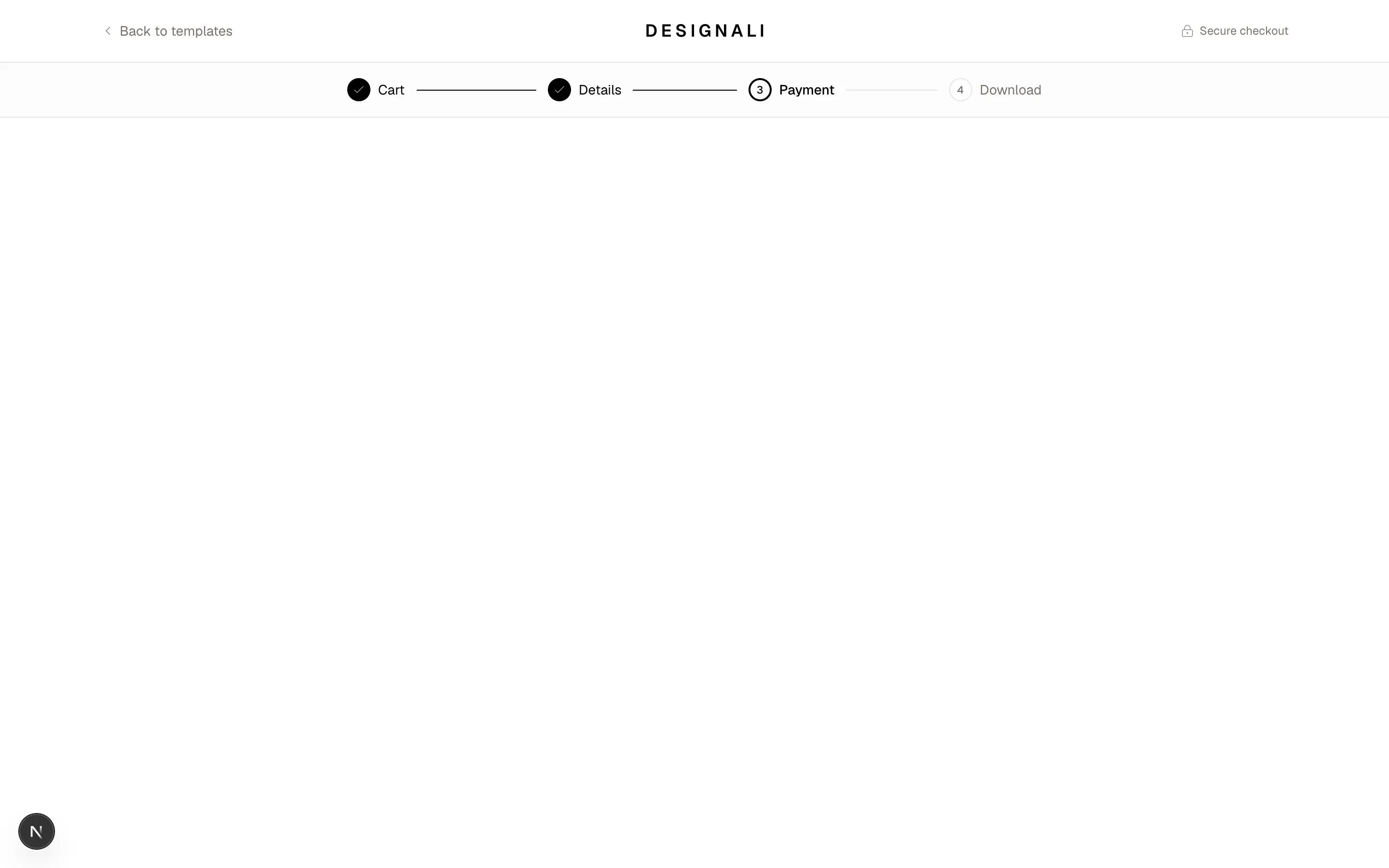
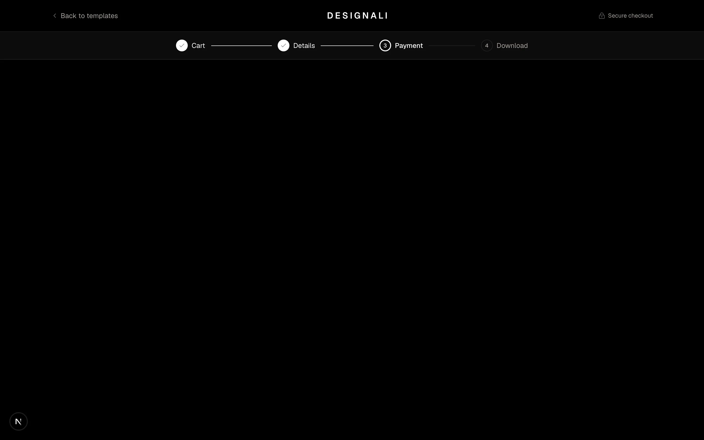
const steps = ["Cart", "Details", "Payment", "Download"]
const current = 2

export function Header19() {
  return (
    <section className="w-full bg-background">
      <header className="border-b">
        <div className="mx-auto grid h-16 max-w-7xl grid-cols-[auto_1fr_auto] items-center gap-4 px-6">
          <a href="#" className="flex items-center gap-1 text-sm text-muted-foreground hover:text-foreground">
            <ChevronLeft className="size-4" />
            <span className="hidden sm:inline">Back to templates</span>
          </a>
          <a href="#" className="justify-self-center text-lg font-semibold tracking-[0.2em] uppercase">
            designali
          </a>
          <p className="flex items-center gap-1.5 text-xs text-muted-foreground">
            <LockKeyhole className="size-3.5" />
            <span className="hidden sm:inline">Secure checkout</span>
          </p>
        </div>
      </header>
      <div className="border-b bg-muted/30">
        <ol className="mx-auto flex max-w-3xl items-center px-6 py-4">
          {steps.map((step, index) => {
            const done = index < current
            const active = index === current
            return (
              <li key={step} className="flex flex-1 items-center last:flex-none">
                <span className="flex items-center gap-2">
                  <span
                    className={`flex size-6 shrink-0 items-center justify-center rounded-full text-[11px] font-medium ${
                      done
                        ? "bg-foreground text-background"
                        : active
                          ? "border-2 border-foreground"
                          : "border text-muted-foreground"
                    }`}
                  >
                    {done ? <Check className="size-3.5" /> : index + 1}
                  </span>
                  <span
                    className={`text-sm ${active ? "font-medium" : done ? "" : "text-muted-foreground"} ${
                      active ? "" : "hidden sm:inline"
                    }`}
                  >
                    {step}
                  </span>
                </span>
                {index < steps.length - 1 && (
                  <span className={`mx-3 h-px flex-1 ${done ? "bg-foreground" : "bg-border"}`} />
                )}
              </li>
            )
          })}
        </ol>
      </div>
    </section>
  )
}
Checkout header with back link, centered wordmark, secure badge and a four-step progress indicator.
header-19
Files
"use client"

import { useEffect, useState } from "react"
import {
  ArrowRight,
  Menu,
  X,
} from "@designali/icons"

const links = ["Work", "Services", "Templates", "Blogs"]

function useLocalTime(timeZone: string) {
  const [time, setTime] = useState<string | null>(null)
  useEffect(() => {
    const format = () =>
      new Intl.DateTimeFormat("en-GB", { hour: "2-digit", minute: "2-digit", timeZone }).format(new Date())
    const first = setTimeout(() => setTime(format()), 0)
    const id = setInterval(() => setTime(format()), 30_000)
    return () => {
      clearTimeout(first)
      clearInterval(id)
    }
  }, [timeZone])
  return time
}

export function Header20() {
  const [open, setOpen] = useState(false)
  const time = useLocalTime("Asia/Kolkata")

  return (
    <section className="w-full bg-background">
      <header className="border-b">
        <div className="mx-auto grid h-16 max-w-7xl grid-cols-[1fr_auto] items-center gap-6 px-6 lg:grid-cols-[1fr_auto_1fr]">
          <a href="#" className="flex items-baseline gap-2">
            <span className="text-base font-semibold tracking-tight">designali</span>
            <span className="hidden text-xs text-muted-foreground sm:inline">Studio time, {time ?? "--:--"}</span>
          </a>
          <nav className="hidden gap-8 text-sm lg:flex">
            {links.map((link) => (
              <a key={link} href="#" className="text-muted-foreground transition-colors hover:text-foreground">
                {link}
              </a>
            ))}
          </nav>
          <div className="flex items-center justify-end gap-6">
            <span className="hidden items-center gap-2 text-xs md:flex">
              <span className="relative flex size-2">
                <span className="absolute inset-0 animate-ping rounded-full bg-primary opacity-60" />
                <span className="relative size-2 rounded-full bg-primary" />
              </span>
              Booking new projects
            </span>
            <a href="#" className="group hidden items-center gap-1.5 border-b border-foreground pb-0.5 text-sm lg:flex">
              Start a project
              <ArrowRight className="size-3.5 transition-transform group-hover:translate-x-0.5" />
            </a>
            <button
              type="button"
              aria-label="Toggle menu"
              aria-expanded={open}
              onClick={() => setOpen(!open)}
              className="flex size-9 items-center justify-center border lg:hidden"
            >
              {open ? <X className="size-4" /> : <Menu className="size-4" />}
            </button>
          </div>
        </div>
        {open && (
          <div className="border-t lg:hidden">
            <nav className="mx-auto max-w-7xl px-6 py-4">
              {links.map((link, index) => (
                <a key={link} href="#" className="flex items-baseline gap-4 border-b py-4 text-2xl font-medium tracking-tight">
                  <span className="font-sans text-xs text-muted-foreground">0{index + 1}</span>
                  {link}
                </a>
              ))}
            </nav>
            <div className="mx-auto flex max-w-7xl flex-col gap-4 px-6 pb-6">
              <span className="flex items-center gap-2 text-xs text-muted-foreground">
                <span className="size-2 rounded-full bg-primary" />
                Booking new projects
              </span>
              <a href="#" className="flex items-center justify-between bg-foreground px-4 py-3 text-sm text-background">
                Start a project
                <ArrowRight className="size-4" />
              </a>
            </div>
          </div>
        )}
      </header>
    </section>
  )
}
Studio header with live local time, availability pulse and underline CTA, opening a numbered large-type mobile menu.
header-20