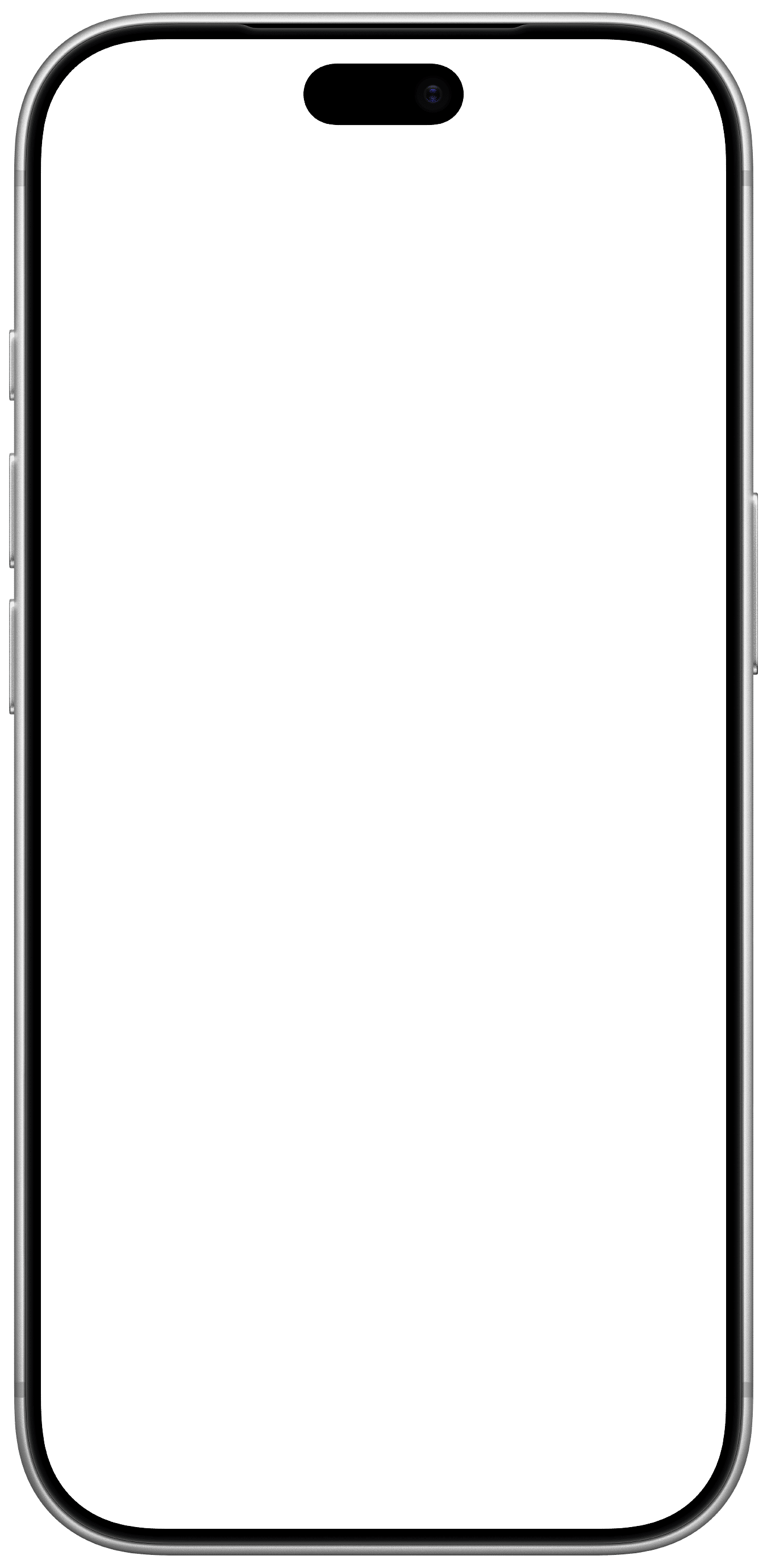
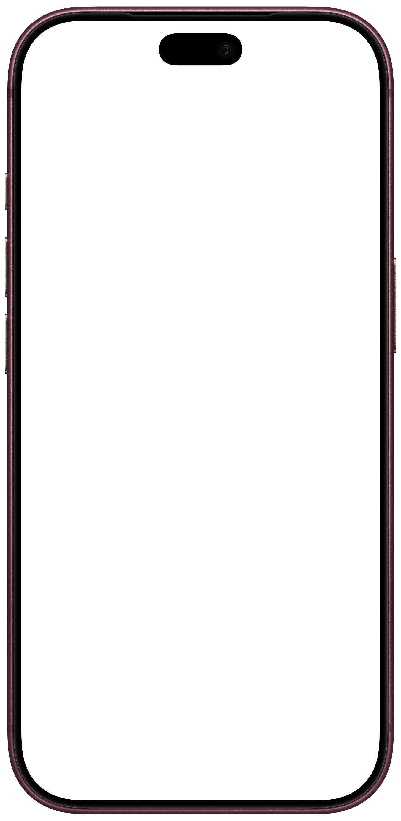
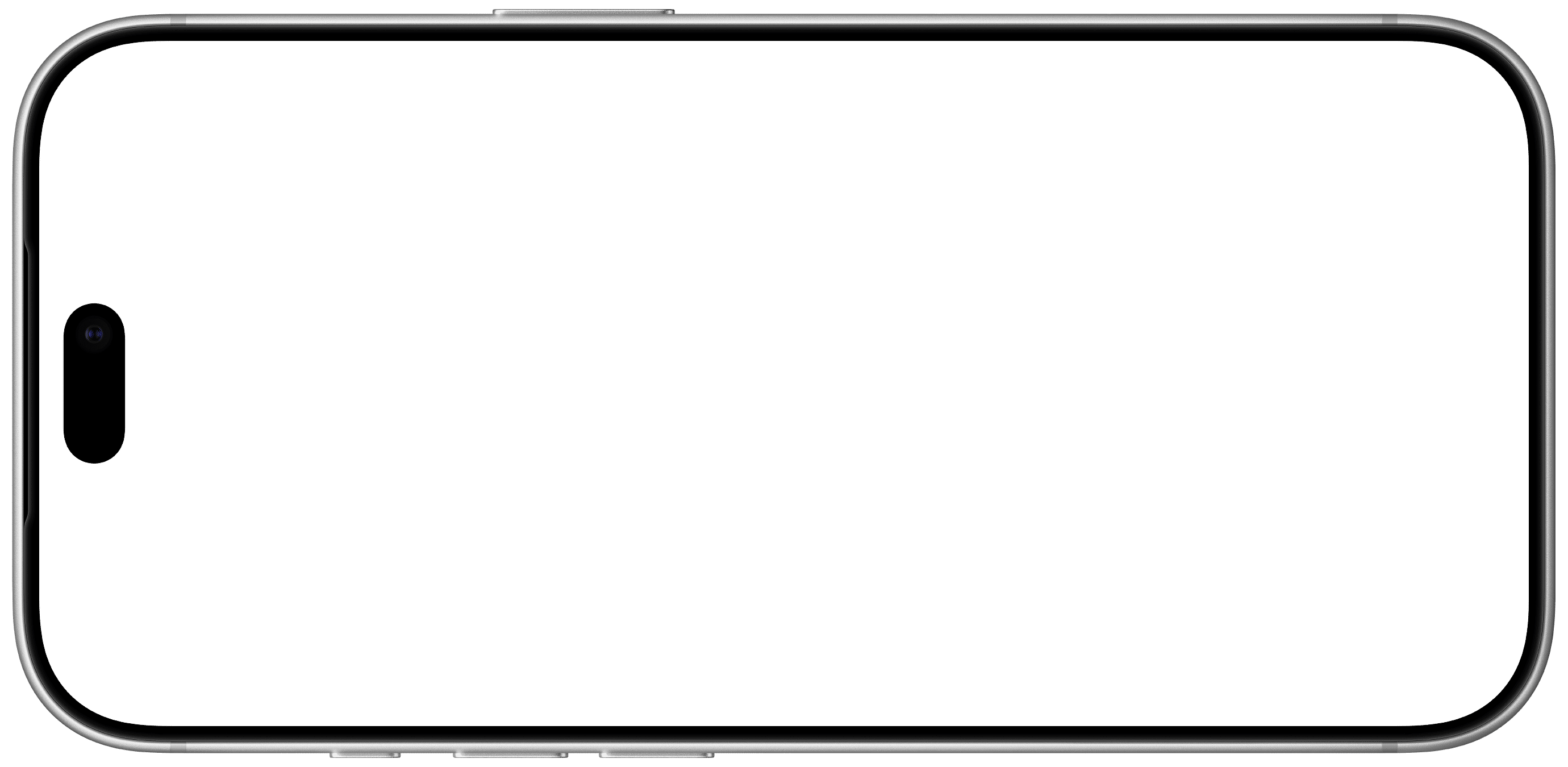
iphone-01
Loading...
iphone-02
Loading...
iphone-03
Loading...
iphone-04
Loading...
iphone-05
Loading...
Installation
Usage
import { IPhone } from "@/components/ui/iphone"<IPhone>
<div className="p-6">Your content here</div>
</IPhone>Variant
<IPhone variant="18-pro-max">
<div className="p-6">iPhone 18 Pro Max</div>
</IPhone>Size
<IPhone size="lg">
<div className="p-6">Large iPhone</div>
</IPhone>Orientation
<IPhone orientation="landscape">
<div className="p-6">Landscape iPhone</div>
</IPhone>Color
<IPhone color="burgundy">
<div className="p-6">Burgundy iPhone</div>
</IPhone>Custom frame image
<IPhone>
<div className="p-6">Custom frame</div>
</IPhone>Props
| Prop | Type | Default |
|---|---|---|
children | ReactNode | — |
className | string | — |
variant | "18-pro" | "18-pro-max" | "18-pro" |
size | "sm" | "md" | "lg" | "xl" | "md" |
orientation | "portrait" | "landscape" | "portrait" |
color | "black" | "glacier" | "silver" | "burgundy" | "silver" |
Notes
- The screen area is an absolutely positioned container, so
childrenscroll vertically inside it when they overflow. - The iPhone is sized by height, and the width follows from the aspect ratio (
9/19.5in portrait,19.5/9in landscape). - All four colors are available for both variants.
- Passing
imageoverridesvariant,orientationandcolorfor the frame.